Your Ultimate Guide to Travel Logo Design
Posted on September 12, 2017 by Logo Design Tips and Tricks

$2.7 billion is the average amount travelers in the United States, both resident and international, spend per day. And the United States travel industry generates $2.3 trillion each year.
To survive in this massive industry and maintain growth, you need to adapt to the trends and find ways to stand out from the competition.
Creating a memorable logo is one of the best ways to do this. A travel logo that catches someone’s eye, tells the nature of your business, and represents your brand can have a tremendous impact on the overall growth of your company.
But how do you create a logo with such a strong impact? This guide will tell you everything you need to know about travel logo design.
Know Your Audience
To create the perfect travel logo design, you need to understand your target audience.
Think about the kind of travelers you attract or would like to attract. Are they luxury travelers? Budget backpackers? College students on spring break?
Whatever the case, your logo needs to speak to them.
For example, if you’re trying to attract luxury travelers looking for holiday accommodation, you’ll want to create a logo that has a sleek and elegant design. Think about using colors that promote sophistication, such as black and gold.
Trying to attract more of the party-going crowd? Then you’ll want a logo that’s bright, bold and fun.
Consider Symbols
Symbols are a big part of the travel industry.
Planes, arrows, compasses, and suitcases are all commonly used to symbolize an escape from everyday life.
Using a symbol can be a good way to let your audience members know you’re a travel company. However, if you choose to use a common symbol, make sure it has a unique twist to it so your audience members can easily distinguish it.
Choose Colors Carefully
Just like symbols, colors are a great way to evoke emotion.
Several studies point to the fact that color can actually affect people’s perception of a brand.
So, choose your colors wisely.
Black and gold are great colors if you want to evoke sophistication. Yellow, pink, and orange are great if you want to exude a fun, youthful attitude. Green is often associated with the environment and is a great color if you’re an eco-friendly travel company. For adventure travelers, you might want to go for a bold color like red.
Incorporate Location
Implementing elements of your local culture can be a great way to set your travel logo apart if you’re located in a specific location.
For example, if you’re located in Colorado, you might want to consider incorporating mountains into your logo. Or, if you’re located in Florida, you might want to add elements of the ocean into your logo.
Travel Logo Design: Wrap Up
We hope this article helped inspire you to start creating your travel logo.
Got any questions about getting started on your design? Drop us a comment below.
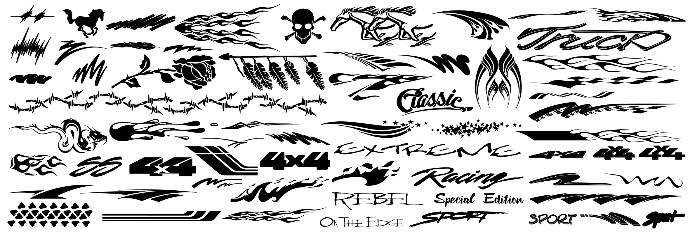
4 Tips to Designing a Memorable Auto Logo
Posted on September 08, 2017 by Logo Design Tips and Tricks
What do companies like Nike, Apple, and McDonald’s have in common? When you think of them, the image that comes to your head first is most likely their logo.
If you are an automobile dealer, it is very important that you have a memorable auto logo so your products stay in your client’s minds and the public consciousness.
Here are 4 tips to designing a one-of-a-kind, creative logo:
Choose The Right Font
People without an artistic eye may not realize that font is an extremely important aspect of an effective logo. The font you decide will dictate how people perceive your brand.
You want your logo to communicate professionalism and sophistication. If you choose a font that is too casual or light-hearted you may not be taken seriously by your consumer base.
For example, fonts that are more square exude trustworthiness, while rounded fonts are more suited for lifestyle or entertainment companies. Your font is even more important if you want your logo to be font-only.
Many companies go this route successfully. But you should hire someone to design a unique font just for your company so that you font-only logo still stands out.
Decide On A Color Scheme
Colors can also go a long way to communicate your brand to your consumers. The color you choose speaks to consumers about the types of services you offer.
For example, brighter colors typically represent energy, youthfulness, and passion. Darker colors represent comfort, simplicity, and elegance. An auto logo would likely feature darker colors, but it depends on how you want to be represented.
If you want to appeal to a younger generation of car consumers, a brighter color scheme might work. But you may be choosing those colors at the expense of other demographics, like families.
When it comes to colors, your target audience is everything. Once you decide on who you are trying to appeal to, cater your strategy toward them.
Narrow Down the Design
After picking the font and the color scheme, make sure you choose a unique design that works perfectly for where you will be placing it.
If you plan on selling merchandise, choose a logo design that people might want to wear on a t-shirt. If your logo will be on a sign outside of your business, make sure it draws people in without being too distracting.
The best logos straddle the line between familiarity and freshness. You want your consumer base to trust you and your products while also exhibiting a contemporary sense of style.
An Auto Logo Should Be Simple
For an automobile dealer like Wackerli Subaru, simplicity is key. You want your logo to reflect the same understated elegance of your cars. If you over do it, you risk losing credibility with your target audience.
Also, the less of your logo there is, the easier it will be for your audience to remember it. Your logo should be designed to stand the test of time while being creative enough for your consumer base to resonate with it.
The Takeaway
Make sure your logo accurately communicates everything you want your brand to stand for, and you will connect with your audience in a substantial way.
If you have any more questions about designing an auto logo, please contact us!
How to Create a Spa Logo Design for a Growing Business
Posted on September 07, 2017 by Logo Design Tips and Tricks

The scent of lavender and tea tree oil fill the senses while relaxing music fills the air. While a calming effect immediately begins to take over the body, a clean robe is offered and services begin.
A hallowed place for most anyone on the planet to experience, booking an appointment at a spa can rejuvenate the body and pacify the soul.
The global wellness industry generates over 3.7 trillion U.S. dollars due to the rising popularity of wellness and healthy living. So, it’s no wonder that day spa logos are focused on zen designs.
But what exactly makes a perfect spa logo design to use for a new business focused on health and wellness?
Check out some of these helpful design ideas and tips to plan the perfect logo.
Achieve Zen With These Spa Logo Design Ideas
Sure, to begin a spa business correctly, things such as building location, employees, spa management software, and prices for service must be considered.
However, to really advertise to potential clients, it’s important to create the perfect spa logo design.
People chose to visit a spa because they want to relax and rejuvenate. Designing a logo that is calm, serene, and peaceful is the best way to reinforce these client goals.
Here are some of the key concepts to consider when creating a spa logo:
The Image
First, make sure to consider services rendered.
If the spa is focusing on a total body experience, choose an image that showcases the human body. If the spa experience is focused on facials and other services that revolve around the face (i.e permanent makeup, waxing, botox, etc) – consider a profile image of a body from the neck up.
The Color Palette
Color is key to evoking the perfect spa experience. So, the perfect spa logo design should focus on cool or neutral colors that evoke a feeling of peace.
There are 3 main color choices that have the ability to calm the mind and reduce stress:
Green
With the ability to conjure feelings of peace and tranquility, this is a great color option to choose for a spa logo design.
Blue
Blue hues can create feelings of calmness and well-being. Said to have a sedative effect, the color blue has been shown to lower blood pressure and body temperature.
Purple
Purple has the ability to create an overall mental calming effect. Used as a primary color in helping to soothe mental distress and nervousness, this hue is a perfect addition to any spa logo design.
The Name
Fonts are the finishing touches to a perfect spa logo. Choosing a font to showcase the spa name is integral in finalizing a relaxing, rejuvenating representation of the business and the services.
Choose something light and airy.
Avoiding bold and dynamic fonts can ensure that potential clients are not immediately overwhelmed with a name, but instead focused on relaxing colors and light strokes of a calming font.
Let The Zen Begin
Once the image, the color palette, and the font have been decided for the perfect spa logo design, clients can begin experiencing a mental and physical escape to utter relaxation.
Designing a spa logo that creates feelings of peacefulness and serenity doesn’t have to be a daunting task. Using a logo maker can be the best, easiest, and most effective way to create the perfect design.
Need some inspiration? Try using a template to create the perfect spa logo.
Sex Sells: Erotic Logo Design
Posted on September 01, 2017 by Logo Design Tips and Tricks

You don’t have to have seen an episode of Mad Men to know that sex and marketing go hand-in-hand.
Turn on the television, open a magazine, or browse the Internet. You’ll see dozens of companies using sex to attract customers and push their product.
We’re used to seeing half-naked models selling us everything from perfume to cheeseburgers. But advertising is not the only place companies can use sex appeal to market themselves.
An erotic logo can have as much of an impact as a sexy advertisement.
Read on to learn more about incorporating a sexy design into your logo, and how it can help your business.
Why Does Sex Sell?
The psychology behind using an erotic logo is simple but fascinating.
Basically, there is a part of our brain that is specifically responsible for thinking about sex.
This part of our brain is always working, even when we aren’t aware of it, which is why sexual messaging appeals to us.
Anytime a person sees a sexual image, this part of their brain takes over. The pull of the sexual image becomes impossible to ignore.
That’s why using an erotic logo is the perfect way to catch someone’s attention.
The whole point of a logo is to make your business stand out. You want a customer to see your logo and instantly feel like they need to know more about who you are and what you do.
Incorporating an erotic image into your logo is automatically intriguing. It will make anyone who sees it want to dig deeper.
How To Know if An Erotic Logo is Right For You
Any logo you choose will represent your business. It should be designed with a specific audience in mind.
If you’re thinking about designing an erotic logo, think about what message that will communicate to your audience and if it’s appropriate for your business.
For example, this kind of logo would make perfect sense for a company like Bathmate Direct.
Because this company sells a product meant to improve your sexual experience, a logo in this vein will appeal directly to their target audience.
Other industries, like fashion or beauty, also often make use of sexual marketing.
The truth is, though, this type of logo could be used across almost every industry. Even if someone has never heard of your company before, a sexy logo will make them stop and want to know more.
Just be sure you have a target audience in mind, and that this logo would appeal to them.
Ready to Start Designing? Start Here!
Take some time to think about who your target audience is, and what kind of logo would appeal to them.
You want your logo to represent your company in a visually pleasing way. Also, keep in mind that using a combination of graphic and text elements is usually best.
When you’re ready to start designing, a design tutorial is a great way to get started.
If you need any help getting inspired for your logo or have any other questions, please feel free to contact us at any time.


