How to Convey Trust in Security Logo Design
Posted on September 29, 2017 by Logo Design Tips and Tricks

The latest study from the Edelman Trust Barometer found that trust in all business institutions has plummeted over the last few years.
This data certainly isn’t exactly encouraging for security companies that rely so heavily on having their customers’ trust.
But don’t panic!
There are lots of ways you can adjust your company’s branding efforts to promote trustworthiness to potential customers, but one of the best ways is through your company’s logo.
Keep reading to learn how to convey trust through your security logo design.
Focus on Your Font
A high-quality logo will make all the difference in your branding efforts. One of the easiest ways to boost the quality of your security logo is to choose the right font.
Businesses that rely on the trust of their customers — security firms, financial institutions, etc. — often use modern fonts for their logo.
Modern fonts are elegant and feature a contrast between thick and thin strokes. They send off a calm, in-control message, which makes them perfect for security logos.
Modern fonts also strike a perfect balance between new and old. They’re not too “trendy,” which can indicate a lack of experience, but they’re not too old-fashioned, either, which can indicate being out of touch.
Use Capital Letters
Security logos can also benefit from using all capital letters. A study published by the British Journal of Psychology found that customers are more likely to remember a brand name if its logo is written in capital letters.
Capital letters are more recognizable and, therefore, more memorable for a lot of people. There’s also something more attention-grabbing about a logo written in capitals.
Use Geometric Shapes
Strong geometric shapes like triangles and circles send the message that your security business is steadfast and reliable. Triangles have a solid foundation but also indicate that progress is possible. Circles are also a good choice, as they signify continuity and stability.
Choose the Right Colors
Just like fonts, colors have a huge impact on the message your security logo conveys. Certain colors emphasize specific traits.
For a security business, blue, gray, and black are all good colors to utilize to convey a sense of authority and credibility.
Blue symbolizes protection, security, authority, and boldness. It’s often used in logos for companies that sell electronics. Zions Security also uses it in their logo and throughout their website to subtly send the message that they are a trustworthy organization.
Black and grey both symbolize authority, practicality, and earnestness. Both of these colors are common in corporate logos.
Make it Versatile
No matter which colors and fonts you use for your security logo, make sure that the design is highly versatile. Customers need to be able to read it at any size, from billboards to social media profile pictures.
Although your logo’s color is important, there are going to be times when your logo can only be printed in black and white. So, you need to make sure that it’s still readable even without color. This way, it will look good no matter where it’s featured.
Need Help Creating Your Security Logo?
Now that you know what to include in your security logo, it’s time to start designing. If you’re new to the design world, check out our free logo design tool today. We can’t wait to see what you create!
Why It’s Important To Have A High Quality Logo
Posted on September 28, 2017 by Logo Design Tips and Tricks

When you think of the largest companies in the world, what do you see?
Chances are that for almost all of them it’s a logo.
Whether it’s the Nike Swoosh or the Starbucks Mermaid, businesses have capitalized on the power of having a high quality logo as a means of leaving a strong and lasting impression.
Though easily taken for granted, it’s hard not to underestimate the significance of having a visual brand signifier to help your business stand out.
Below we take a look at four reasons your business needs a high quality logo.
The Logo Is the Brand
Gaining visibility in any marketplace is a struggle. One of the easiest ways to draw attention to your brand is with a striking logo.
Think of Apple: while their products are firmly within the consumer electronics category, they are all bound by the bitten-apple logo. There’s so much power in this visual that people wear it on clothing and put its sticker on the bumpers of their cars. You could even go to The Memories Place and get all your favorite logos printed on a blanket and be left with a desirable item.
Such is the strength of their brand that such a simple logo can carry such cultural cachet.
The Most Powerful Marketing Tool
When brands tease upcoming products, how do they often do it?
Mercedes-Benz, for example, will often show a car lost in shadows or obscured by cloth, only the familiar three-pointed star visible.
Why would they do this? As an auto manufacturer, shouldn’t they focus on the actual vehicles?
Any car is representative of a specific moment in time. The Mercedes-Benz badge, on the other hand, speaks to an entire history of the automobile. It draws on the strength of every successful vehicle they’ve had without being bound by a specific time period.
It’s An Invitation to Customers
Both the Apple and Mercedes-Benz logos, through their history of success, have an even greater strength: aspiration.
Our Mercedes ad from above is so effective because knowing that there’s a new Mercedes available, regardless of specifications, is enough to pique most people’s interest.
The idea that a brand’s logo can imbue us with an increased sense of worth is incredibly powerful. By creating a high quality logo you increase your chances of joining these ranks.
A Good Logo Is Welcome Anywhere
Packaging is an important part of any goods being sold. Even beyond exterior wrapping, placing a great logo right on your products creates awareness.
While a poor logo can be distracting, a high quality logo can easily be placed in any number of places. On products, advertisements or promotional materials, it’s wise to rely on the power of a simple, well-designed logo to convey your brand’s story.
Final Thoughts On a High Quality Logo
Whatever your business, whatever your market, having a great logo helps your brand stand out from the crowd. It has the ability to take your brand’s message and easily share it with the world.
If you’re in need of a logo, or just want some more information, give us a shout. We’re always here to help.
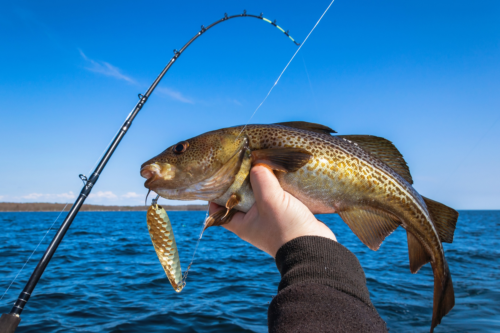
Designing a Fishing Logo to Reel in Charters
Posted on September 18, 2017 by Logo Design Tips and Tricks

Charter fishing is a sport that’s fun for participants and lucrative for professionals.
This industry has approximately 50 million licensed fishers, who generate a whopping $48 billion in revenue. Anyone looking to get a slice of this pie needs to make their business stand apart from the competition.
To attract this crowd, charter companies need to create an amazing fishing logo while building a brand.
This guide teaches all about designing a logo with pizazz, in order to generate some revenue and succeed for years.
Consider these tips when hunting down that amazing logo.
Make A Fishing Logo That Is Fun And Inviting
Companies often make the mistake of getting too serious when it comes to their brand.
People want to think about fun and excitement when booking a charter fishing trip, so make sure the logo reflects that. Skip the realism and have a logo designer create something that is fun and cartoony instead.
Don’t forget the smile!
Making the fishing logo smile can be the difference between looking too serious and creating an emotional response in customers. An emotional response is crucial, because it opens the door for ongoing business.
This is especially important for charter fishing companies that cater to the vacation crowd. Companies like Dos Hermanos Charters have thrived in vacation spots like Cabo San Lucas, by bridging that gap and forging a bond with their customers.
Create Some Subtlety In The Message Sent
Avoid being “on the nose” when it comes to creating a logo.
While there’s power in simplicity, it’s important to create double entendres with the fishing logo. Making logos that mean more than one thing plays a fun little psychological game with the viewer.
Think about it. The dance and flirtation are half the battle. By enticing the customer, they’ll be intrigued to find out more about the charter fishing company.
Most importantly, this type of logo will stand out from the rest, making it easier to draw in new revenue.
Work With A Company That Is Familiar With The Fishing Industry
While there are many talented graphic designers, the true results come by getting on the same page with a company that understands fishing.
When searching for a logo design company, ask if they’ve ever done logos for other fishing businesses. Not only does this ensure they understand the nuances of logo creation, but also the intricacies of the fishing business.
Shop around for prices on a brand new logo, to stick to a strict budget.
A fresh new logo can cost anywhere between $85 and more than $300. This price depends on the experience of the logo designer and the amount of work that goes into this particular idea.
The more digging you do, the better understanding you’ll have on how much you can expect to pay for your logo.
Using these three tips will help to find a great logo designer.
The logo is a critical marketing tool, so never cut corners.
Follow these tips and request a meeting with a logo designer today.
5 Iconic Baby Logos to Inspire Your Parenting Brand
Posted on September 15, 2017 by Logo Design Tips and Tricks

Nearly 4 million babies were born in 2014. That means a whole lot of new parents and a whole new market for advertising and marketing.
If your business has anything to do with parenting or young children, you already know the importance of important branding.
Let’s take a look at some of the most famous and inspiring baby logos to kick start your brand’s inspiration.
Five Unforgettably Iconic Baby Logos
Gerber
Arguably one of the most famous baby logos, Gerber is synonymous with all things related to baby food, baby nutrition, and overall baby health.
The logo here is simple and clean, in an inviting blue shade, with a picture-perfect image of an adorable open-mouthed child that’s now recognized all over the world.
What’s an even cooler fun fact about this brand? In 1928, Gerber ran an advertising campaign to find the right image.
Pampers
Diapers and pull-ups — any Proud Mummy knows they’re the necessary evil of parenting. However, this winning combination incorporates a cool, green logo with a clean and optimistic font. The cheery yellow flower shape softens the blow of cleaning up after baby messes.
Take note: simple, appealing colors sell. Happy images sell, too!
With this brand, in particular, the message is loud and clear — less is more.
Wet Ones
Wet wipes. Can you ever really have enough of these bad boys? Wet ones have become a household brand name, and we don’t believe it’s due to pure downright luck.
For one, the font color is a casual and inviting blue color (evoking a peaceful sense of calm). The font also has the appearance of “looking wet,” which simply reminds the consumer of what they’re purchasing.
Fisher-Price
Known for all things fun (toys, games, outside equipment), Fisher-Price is one of those baby logos that you could pick out anywhere.
Here’s why: it’s bright red (very noticeable), in a simple and clean font, and in a distinct baby shape which almost looks like curtains, which just inherently look inviting. If a picture can tell a thousand words, a shape may be able to tell us two thousand.
Parents love it. Kids love it. What’s not to love?
Baby Einstein
Maybe it’s the bright rainbow colors. Or maybe it’s the fun, childlike font. Maybe it’s the cute cartoon-like figure with glasses.
We think it’s a combination of all of the above that has made this education company famous across the country for its learning products.
If you’re feeling stuck, take note of their fun color palette and casual, youthful font. This appeals to both children and their parents. It’s a win-win for everyone.
Final Thoughts
Developing the right baby logo for your brand needs to incorporate the right colors, font, and shape. Take some time with your project! Play around with what works best. Ask others for feedback.
And, be sure to check out our comprehensive tutorial guide for step-by-step instructions and guidance for the logo of your dreams.


