What Makes a Highly Successful Casino Logo?
Posted on October 08, 2017 by Logo Design Tips and Tricks
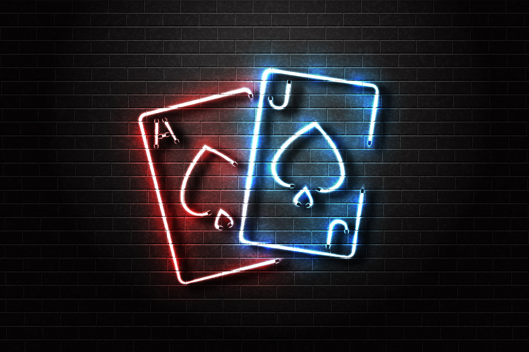
Few aspects of your business are as important as your marketing logo. It’s how your casino is represented to the world. And since you’re facing some pretty remarkable competition, you’ll need to make sure you’re getting the most out of your logo.
Whether you’re starting a brand new casino business or just looking for a redesign, you don’t have to be an artist to create a great-looking logo.
Here are some of the most important elements to help you create a successful casino logo.
Elegance And Simplicity
Some logos are just too busy for their own good. Be it too many colors or too many images, your customer can get distracted quite easily if you’re not careful.
That’s why it’s important to make efficiency and simplicity your biggest target goals. After all, some of the most effective logos in history are simple. Apple’s famous logo doesn’t even feature any text!
Sensory overload is a very real phenomenon. So when you’re beginning to design your casino logo, ask yourself, “Could this be simplified?”
It Sets Your Business Apart
There’s no shortage of competition within the casino industry. Accordingly, you’re going to need to set yourself apart from the competition.
And while this may sound difficult if not hopeless, there are a few easy things you can do to diversify.
First, look at your competition’s logo. Take some time to digest their logo, including geometric shapes, colors, text, and images. While there will undoubtedly be a bit of overlap, try your best not to replicate their design.
You can also incorporate local elements into your design to give your casino logo a more region-specific design. MPL Casino does a great job of this. Notice the small leaf on their design, as well as the Canada-specific color scheme.
A Great Casino Logo Incorporates Color Psychology
Psychology has actually been a huge part of casino design for decades now, and you can use it within your logo. People have unique reactions to certain colors and associate them with certain feelings or memories.
For an example, think about reds, oranges, and yellows. You likely think of fall when the three colors are combined.
You’ll want to incorporate this same general principle into your logo design. What kind of mood are you trying to set with your logo? Simple and subdued (cool colors) or exciting and energetic (warm colors)?
Research color psychology and determine how you can use color to set the right mood with your logo.
Your Brand Should Steal The Show
It’d be great if every business was as successful as Apple, you’ll want to ensure that your brand is front and center. While it doesn’t need to be the largest graphic on the logo, it should be sizable enough that it can be read at a distance.
And each of the previous elements should be incorporated into your text. Remember, simplicity and elegance are key and you can use colors to set a mood.
Your Logo Design Matters
You can’t afford to have a poorly designed casino logo, so take efforts into your own hands. Use our software to create an exciting and effective new logo that your audience is sure to love.
You can have a brand new logo in just 5 minutes! Sign up today and see just how much of a difference your gorgeous new logo can make.
What Etsy Can Teach You About Wedding Logo Design
Posted on October 05, 2017 by Logo Design Tips and Tricks
Every spring, fresh editions of magazines flood the shelves. They feature gorgeous new ideas for wedding inspiration for brides-to-be.
As you pour through those glossy pages you will find articles on everything. It can range from the proper way to set a table, to ideas for wedding logo design.
Having a well-themed wedding is the central focus for these magazines and the goal of every new bride.
But what does it take to create one of the stunning images you see gracing dancefloors and envelopes? How can you create a professional looking logo for your own wedding? Continue reading to find out.
Using a Wedding Logo Design
From the moment your guests walk into your wedding venue you will need to give them information about things like where to go and what the seating arrangements are.
Creating a custom sign to place outside the venue is a great way to give your guests information they need about the event.
Some venues host multiple weddings on the same day and giving your guests this extra hint will make sure everyone finds everything they need. By including your logo you are ensuring that they know they are going to the right place.
Wedding Attire
You might be surprised to find that there are multiple opportunities for you to feature your wedding logo design in your outfit.
In fact, some innovative brides have even begun to create personalized jewelry featuring their logo.
Other brides have chosen to embroider their veils and handkerchiefs. If that is still a little too obvious for you then embroidering your wedding logo design in blue on the inside of your dress is a beautiful option. For many women this makes their dress feel truly unique.
Dining
The most obvious place to use your image is on the paper products you use for the day of the event. From cocktail napkins to menus, there will be plenty of opportunities for you to feature your beautiful design.
Accent plates could also be purchased that feature your chosen design. You can use it to trademark your party favors, adorn your wedding cake with it, or simply use it to embroider the tablecloths.
Some women have even used it on glass jars from sandsationalsparkle.com. Sand ceremonies are popular and work for any wedding. This personal touch really takes it to the next level.
The Importance of Consistency
After you have chosen to design a logo for your wedding, you will want to head over to Etsy to get some inspiration. Once you have scanned many of the options there, you will have a better idea of what you want yours to look like.
You will see design ideas for different fonts and sizes that can shape the most basic outline of what you want to make. The angle of every item in your logo is very important. By changing it you will change the way the eye moves over it and this has a significant impact on perception.
If you are ready to begin creating today, try this online logo maker. It has some really great and easy-to-use features that will allow you to create a custom design that will leave all your guests dazzled.
How to Design an Inviting Nightclub Logo
Posted on October 03, 2017 by Logo Design Tips and Tricks

Why is the logo you choose for your business so important? It’s the same reason why your business name is important.
If you can make it memorable, it will make your brand easier to stick in the minds of your audience. And that’s the top priority of marketing – to make consumers think of your company when they need your product or service.
As for your logo, its sole purpose is to help consumers identify your company and its products. If you own a nightclub, then you know how brightly lit signs and logos can attract party goers.
But the question here is how should you design your nightclub logo?
Well, let’s review a few tips to help you along.
Brainstorming Your Nightclub Logo Design
What’s great about logos is that you can place them anywhere. Once you design one, you can use it for your pens, magnets, business cards, fliers, t-shirts, signs and other marketing collateral.
This also means you need to give a lot of thought to your nightclub logo design. After all, you don’t want to have to rebrand your business with a new logo down the road, especially if you’ve already gained some recognition.
So as you’re planning out your logo, consider the niche area of your nightclub, the customers you want to attract and location of the club.
For instance, if you’re a high-end restaurant bar with rich clientele, you could go with a logo that’s classy. Then if it’s in a prestigious neighborhood or an urban area, the logo would vary greatly.
Keep your customers in mind; what’s acceptable to one group may not be acceptable to another. For instance, a lasso and horse may be attractive in urban Texas communities, but wouldn’t fly in a prestigious neighborhood.
Selecting the Colors and Font
If you haven’t done so already, you should read into the psychology of colors and even font styles. The type of letters and colors you choose play a big role in the branding of your company.
For instance, you may want to go with bold colors for a nightclub that has pizzazz. Red and gold are great options in this case. For instance, you may find this being used to promote the Scandal Guestlist.
Or if you want to get people excited about your new nightclub, you can use varying textures in your logo. This will make it interesting and hopefully intrigue folks to check out your club.
Other than going with flashy logos, you can opt for something that’s dignified and strong. This is ideal for brands that have a more serious tone and atmosphere.
DIY Logo Design
Now, it’s time to decide how you’re going to create your nightclub logo. If you know exactly what you want, you don’t need to hire someone to design it for you.
All you need is the right software to create it yourself. The DIY route is popular these days, thanks to tools like Onlinelogomaker.com.
This is a quick and easy-to-use online software made specifically for designing logos. If you’re trying to redesign or design a new logo for your nightclub, then check out Onlinelogomaker.com today.
Dropping the Pot Leaf: 10 Sleek Cannabis Logo Designs
Posted on October 02, 2017 by Logo Design Tips and Tricks

Do you think it’s time to lose the leaf in cannabis logos? We do.
Since 2001, every dispensary, grower, and supplier put a marijuana leaf in the logo. Worse than being cliche is the fact that all the logos look the same. There isn’t any distinction between brands to convey quality, products or type of business.
The sale of medicinal and recreational cannabis is evolving into a billion dollar industry in the US and Canada. As the marijuana market evolves the logos become sophisticated branding tools.
In the beginning, everyone was happy at the prospect of legal marijuana. They didn’t care about specifics. Now the cannabis business has matured, and so have consumer preferences. It’s important for customers to be able to recognize and differentiate between brands and companies.
Ten of the best leafless logos are shown below.
10 Sleek Cannabis Logo Designs
-
Dope Mail
Dope Mail’s logo uses a fresh, modern font paired with a lively green bud. It’s a clean, readable logo. The name conveys the Dope Mail weed online service dedicated to safe, legal, and discreet doorstep delivery via Canada Post. The company name is a fun play on words since dope is slang for awesome.
-
Wyld Canna
Wyld Canna is a Pacific Northwest company that celebrates adventurous lifestyles. The deer antler logo conjures images of the great outdoors and wildlife.
-
Aurora. The Healing Power of Nature
A mountain, water, sun, and wind are arranged on each side of a plus sign to represent elements in harmony. Aurora plants are grown in the foothills of the Canadian Rockies with mountain water, gentle breezes, and ideal lighting conditions.
-
Emblem Corporation
An informal red graphic of a hunter and a deer is simple, bright, and recognizable. It evokes the image of traditional outdoor activities. The idea matches the tagline “cultivated with love, and locally grown.”
-
Aphria, Inc.
Aphria has a sleek, modern logo that uses blue and green to represent the earth and sky. The letter A wrapped in a circle of fresh, natural colors symbolizes 100% greenhouse grown in natural sunlight.
-
Canopy Growth Corporation
Canopy is the most corporate-looking logo on the list. It shows how the industry has changed. Instead of a leaf, a mighty oak represents strength and longevity. Canopy is a diversified cannabis company that operates a collection of brands.
-
Emerald Health Botanicals
The Emerald logo depicts a drop of oil in the shape of an e. Cool greens and blues are soothing, as are the words Health Botanicals. The logo illustrates the goal of bridging the gap between cannabinoids and medicine.
-
Ionic
Iconic’s logo is a slick gold wordmark with two distinct red circles hovering above it. The logo acknowledges the past but reaches for the future with inspired luxury. The elegant Ionic logo is iconic.
-
Burnwell Cannabis Company
Burnwell’s logo is a B knocked out of gorgeous nature backgrounds on its website. The company is focused on sustainability and green business practices. The simple B logo seems determined not to intrude on its surroundings.
-
Marley Natural
Marley Natural previously had cannabis leaves in its logo. The company has grown into a strong, socially conscious brand of products and outreach. That mission is reflected in the proud lion and clean bold type on their new logo.
Today, cannabis is a professional industry dedicated to helping people who suffer from a number of conditions and disorders. The logos need to be eye-catching, informative and engaging to keep pace with the changing marijuana industry.


