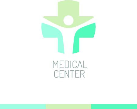
3 Tips For The Perfect Medical Logo Design
Posted on November 01, 2017 by Logo Design Tips and Tricks
Whether you’ve recently decided to open a new medical practice or you’re in the process of rebranding your old one, your medical logo design should be the first thing you think about.
After all, your logo serves as the foundation for all your future branding decisions.
In short, it’s incredibly important.
Not sure where to start? Need a little help understanding what design elements help you connect to more patients?
Read on to learn how to create the most effective — and most interesting — design.
1. Communicate Your Niche
One of the most important functions of your medical logo design? To communicate your specific niche to potential patients.
For example, if you’re a cardiology practice, your logo design should include a heart, or perhaps a more creative print-out of a heart rate monitor.
If you’re an OB/GYN, then your logo could include a pregnant woman’s belly, with the name of your practice written on the stomach. If you provide vasectomy services, then your logo could show a man shaking hands with a doctor.
Remember, your logo has less than two-tenths of a single second to make an impression on potential patients.
Remember the three C’s: your logo should be creative, clear, and communicative.
2. Keep It Legible
One of the biggest mistakes we see people make when it comes to logo design? Picking detailed images and fancy fonts.
While these might read wonderfully on larger billboards or as a banner on your website, they won’t work as well in smaller spaces. The last thing you want is for your logo to end up looking like a bunch of blobs and random squiggles.
When you’re first creating your design, choose an image and text that will look just as good on your social media avatar as it will in a print advertisement.
Try testing out resizing options before you finalize your design, and ask others to read the text in a variety of sizes to be certain.
3. Don’t Overload on Trends
We know that your medical practice is up-to-date on all the latest health developments and treatment plans.
But the last thing you want is to design a medical logo that is so trend-centric that you’ll end up having to redesign it by next season.
It’s up to you to strike a balance between classic and modern.
For example, you might choose to include a common and recognizable medical symbol, like a first aid cross, in your design. That’s the classic element. To keep it modern without having it look overly trendy, we love the idea of having that first aid cross drawn by hand.
Another way to merge trendy and classic design options?
By having your own unique font, also known as typography, created specifically for your medical practice. This will help you stand out from the crowd, maintain brand consistency and increase consumer recognition.
Ready to Create Your Medical Logo Design?
Thanks to this post, we hope you now have a clearer vision for your practice’s logo design.
When you’re ready to start creating, be sure to use our free online logomaker tool. That way, you can create several different options, and even poll your employees and patients to determine the favorite.
Looking for more advice about logo creation and branding in general? Then be sure to check out our blog for more invaluable tips.
The 3 Most Important Elements of an Effective REALTOR(R) Logo
Posted on October 30, 2017 by Logo Design Tips and Tricks

A bad logo can make a company fail before it even get’s started.
Picking a successful logo isn’t random. There’s a fair amount of science behind the way our brains see a logo.
Logos need to stick in client’s heads but in a positive way. People need to remember you, but not for how ridiculous your logo looks.
Most of the time, a logo is the first thing potential clients see. You need to create a REALTOR(R) logo that will make a good first impression without intimidating the viewer.
Below are 3 of the most important tips when designing a logo for your realty business.
Simple and Industry Specific
As is the case with any industry, a REALTOR(R) logo has to be appropriate for the industry. If you make a logo with a dancing bunny eating a carrot, people might remember it, but not know what business it was referencing.
A silhouette of a house is a popular selection for realtors. Companies like Liberty Management, Inc. have used them with success. Take a look at what other successful realtors use to get some inspiration.
At the same time, don’t get too complicated with your logo. People are more likely to associate a bad feeling with a busy logo they don’t recognize.
Choosing the Color of Your REALTOR(R) Logo
Choosing a color is one of the most important steps in creating a logo.
In the real estate industry, blue reigns supreme. If you want to stand out from the pack, try choosing red or green as a primary color. It might help make you more memorable when people see it on the street.
Societies have been ascribing meaning to color since the beginning of time. It helps to know these associations for reference, but don’t let it dissuade you from using a particular color.
Choose a color that you think will make your logo pop.
Simplicity is essential in color as well. Don’t try to stuff as many colors as you can into your logo. Pick two and move on. The simpler your colors, the more memorable your logo is going to be.
Design With Purpose
The shape of your logo is another critical design choice.
As humans, it’s natural to find meaning in shapes. With this in mind, create a logo that will subtly or explicitly hint at the real estate industry.
If you’ve ever seen the FedEx logo, you may have noticed the subtle arrow present between the E and the X. This was an intentional design choice, allowing the viewer to associate an action with the logo subliminally.
The mind attributes meaning to logos, even if it’s not intentional. Take control of what the viewer sees instead of allowing them to form their own association.
A Successful Real Estate Logo
The most straightforward REALTOR(R) logo is often the most effective. Be mindful of what potential clients will see, and don’t try to do too much.
Control what the viewer sees, make it stick in their mind, and you’ll have yourself a successful piece of advertising.
Take a look at our blog for other helpful tips on creating your logo!
3 Logo Design Ideas for Your Flight Comparison Business
Posted on October 11, 2017 by Logo Design Tips and Tricks
Comparing flights is a tricky business. Not only do you want to provide the best product for your customers, you have to be able to market yourself properly.
Here are some logo design ideas you should consider for your flight comparison business:
How To Get The Best Logo Design
Scope Out the Competition
Unsure about where to start? Look at what your competitors are doing. Scoping out the marketing tactics of other successful businesses can help you find your footing.
Are there any competitors in your market that particularly resonate with their customers? Their logo probably goes a long way to establish a meaningful connection.
If you’re just getting your flight comparison business off the ground, you don’t want to seem too much like an outsider. Customers might feel intimidated, depending on your marketing strategy.
When conducting competitive analysis, figure out what works with other company’s logos and apply your own creative sensibilities for a unique result.
Focus on Appeal
When designing a logo, you have to know your customers. Try to put yourself in their shoes and figure out what will appeal to them.
Are you trying to reach young professionals with your business? Make sure your logo is modern and attractive. If you’re trying to appeal to the older generation, like retirees, you might want to aim to be more subtle.
Font and color play a huge part in whether or not your logo is appealing. It’s important to have these elements tested and retested by a focus group to decide whether or not they are right for your company.
You should also consider demographics. Is your audience primarily Spanish-speaking? Do you specialize in booking flights to Spanish-speaking countries? If so, instead of “cheap flights” as your tagline, you should use “vuelos baratos.”
Get into the mind of a consumer and find out what will make them want to use your service.
Simplicity Matters
As stated before, font and color are everything when it comes to logo design. But you want to be careful not to overdo it. Logos that are too complex can turn a customer away.
Your business has to make sense to the customer or they will not want to use your product. It starts with effective communication.
Your logo is the ultimate communication tool. What do you want your customers to know about your company? What information is valuable to them during the decision-making process?
Make sure this information comes across, and that’s it. Anything more runs the risk of confusing your customer.
Save Your Logo Design Ideas
Designing a logo takes time. But during the process, it’s imperative that you save every logo your design team creates. All your logo design ideas are valuable because you never know which logo will resonate the most with your customers.
It is also always a good idea to have a bank of options for your focus groups or test audiences.
Need help getting started? Contact us for more information on how you can create the perfect logo for your flight comparison business.
How Staffing Agencies Can Benefit From A Free Custom Logo
Posted on October 11, 2017 by Logo Design Tips and Tricks

When starting a new company or re-branding an existing one, your logo can mean the difference between catching someone’s attention or watching them pass you by. Staffing agencies have the added challenge of appealing to both job-seekers and employers, making an eye-catching logo a must.
But how do companies come up with an enticing logo? There are a few things to keep in mind as you brainstorm design options.
What Staffing Agencies Need to Know About Logo Design
A logo is often the first thing people notice about a brand. Take a look around and note of all of the items around you with prominent logos and labels.
From your laptop to your bottle of water, to your sneakers; all of these product brands can be easily identified according to their logo.
As a staffing agency, you want to be seen as approachable, reliable, and effective in finding the right candidate for a job. When designing a logo, think of these traits and how you can get them across visually.
If your agency’s name is evocative of an item, consider how you can incorporate that in your design. For example, think of Apple and their easily recognized logo.
Also, think about which colors best represent your company. If you want to highlight professionalism and trustworthiness, blue is your color. If you want to signify growth and learning, green will work well.
It all boils down to what you want people to think of when they see your logo.
Having a focus group to come up with words or phrases may help in determining what type of style, color, and imagery will help you accomplish your goals.
Need more inspiration? Take a look at the logo for Scope Recruiting, which incorporates geometric shapes in different shades of blue. The color blue makes them feel professional, while the different shades and shapes have a modern appeal to them.
How to Get Started with Logo Design
Thanks to free online web tools, custom logo design has become very user-friendly.
You can upload an image you’d like to incorporate, you can add text and adjust the size and fonts, add shapes, symbols, and more.
Again, you’ll want to do some basic brainstorming before getting started so you’ll have an idea of how you want the logo to look. Once you have that in mind, you can get started adding these features and see how they all come together.
And with free custom logos available, you won’t have to break the budget. No need to hire a professional designer or agency – you’re in control of the process from start to finish.
Reaping the Benefits of Your Logo
All businesses benefit from building a consistent brand image. Staffing agencies in particular need to work extra hard since individuals and companies are looking to them as experts in the field.
Having a well-thought-out logo will instill a greater sense of confidence that you have the skills and resources to get the job done.
In addition, as your agency builds a strong online presence and reputation, people will start to recognize your logo on its own. It also builds a foundation for a unified online presence, not only through your website but also through blogging and social media. Your logo can be used as a profile image across all networks.
To get started, check out this tutorial on how to build a free custom logo.


