Starting a Blog? Here’s Why You Need a Blog Logo
Posted on August 07, 2018 by Logo Design Tips and Tricks

Do you need a blog logo?
That’s a question many beginner bloggers ask themselves.
Here’s how you answer that question. Do you want an easy way to stand out from other bloggers in your niche? Do you plan to promote your blog on Facebook, Instagram, or Pinterest? Do you want people to remember your blog?
If you answered yes to these questions, then your blog needs a logo.
Are you ready to learn why a blog logo is important and how to design one?
Let’s get started.
What Does a Logo Do?
Your content and good headlines are critical components of your blog. Even if you have those pieces down pat, do you still need a logo?
Yes, and here’s why.
A logo is the visual identity of your blog. It’s also what your readers will remember. They won’t remember your great headlines or your well-written content.
They’ll remember what they felt about your content and they’ll connect that emotion to your logo.
Almost 93% of communication is visual. In conversation, you process someone’s gestures more than what they’re saying. The same is true with reading. You’ll remember posts with images over the actual content of the post.
Here are a few examples. Can you name any of Nike’s shoes besides Air Jordans? No, but you remember the iconic swoosh.
Same with Adidas. You probably can’t name their product lines, but you know the three stripes.
Types of Logos
As you start thinking about designing a logo for your blog, take a look at the different types of logos.
Wordmark: Google and FedEx are good examples of a wordmark logo. It’s a stylized version of your blog’s name. This is a way to draw attention to the name of your blog and help people remember what it’s called.
A good wordmark logo is clear and readable in small and large image sizes. It’s unique so it’s memorable, but not so unique it detracts from your blog.
Lettermark: This is similar to a wordmark, but uses initials instead of the entire name of the blog.
Symbol: This is a symbol that uses little to no text, like Apple’s logo, the three stripes of Adidas or Nike’s swoosh.
Combination: This is a combination of a watermark and symbol. This is a great option for a blog because you can incorporate your blog’s name and have a symbol to help people remember your blog.
Creating Your Blog Logo
How do you go about creating your logo? Start with your blog and your audience. You want your blog to connect with your audience. You also want your logo to connect with your audience, too.
Your Blog’s Audience
Who do you want to read your blog? You can start with their basic demographic information. Know their age, gender, education, and total household income (THI).
What do they need when they come to your blog? When they discover and visit your blog, what are they looking for? They’re trying to solve a problem or answer a question. You need to uncover what that is.
Are there other brands that they love and trust? Why do they love those brands?
Knowing these basic insights about your reader will make it much easier to create a logo that resonates with them. It will also help you craft your blog content just for your readers and offer solutions.
Does Your Blog Have a Personality?
When you’re creating your blog logo, you’re essentially aligning your blog’s personality with your readers’ personality. The logo visually ties the two together. That’s how you attract the right readers to your blog.
Back to your blog’s personality. If you don’t know the answer or your blog doesn’t have a personality, here’s how you create one.
Would you describe Your blog as fun or serious?
When you approach your blog, is it with a lot of playful energy or are you a bit more cautious?
Do you see your blog being approachable or professional?
Is your blog an upscale or premium brand? Is it an accessible brand?
What are other brands that have a similar personality?
By answering these questions, you’ll have a solid idea as to what your brand’s personality is.
Choosing Typography to Match Your Personality
Remember, you want your font to express your personality and your reader’s personality. If you discovered that your blog and readers have a fun personality, the font should match.
The font also needs to be functional. It has to be legible in different sizes on your site and in your social media images.
You can then go onto sites like Google Fonts to experiment with different fonts. FontSquirrel and FontSpace are other good sources for fonts.
You can experiment and test different fonts to see which ones work best.
Color
Color also matters in creating your logo. People process color and interpret its meaning quickly at an unconscious level.
How a color in processed and interpreted is largely based on an individual’s personal experiences that have shaped their worldview.
Take the color red, for example. In Western culture, it conveys love and passion. Other cultures will tell a different story.
In India, red runs the gamut of emotions. It’s associated with fear, wealth, fire, purity, and seduction for starters.
In South Africa, it’s associated with violence and mourning.
You need to choose a color that best reflects the emotional appeal of your blog to your audience.
Create Your Blog Logo
If you were on the fence about getting a blog logo, you should understand by now why it’s an important piece of your blog.
It reflects the personality of your readers and your blog. It’s also how people remember your blog.
The good news is that it doesn’t take much to design one. You can create a logo is less than 10 minutes with Online Logo Maker. It has plenty of font and symbol options, so you can create a combination logo with no problem.
If you want to give logo design a try, check out our easy to use tool today.
A Complete Guide to Types of Logos (And When to Use Them)
Posted on August 04, 2018 by Logo Design Tips and Tricks

Our brains process images 60,000 times faster than we process words. That means your potential customers are taking in your logo… fast!
It could be your chance at a first impression before they even read any of your content. You’ve got to make that logo count.
But what types of logos are best for your industry and how should you use them?
We’ve got you covered. Check out our complete guide with all the types of logos and how to use them.
Types of Logos
There are several different types of logos to choose from for your business. They all have different purposes and attributes.
Here’s a breakdown.
1. Lettermarks
Does your company have a long name? Then this could be the logo for you.
Think CNN, NBC, NFL… see a trend here? They’re all companies or organizations with really long names.
They also turned those long names into acronyms. And made that acronym their logo!
These logos are typography based and comprised generally of the company’s initials. It’s simple, clean, and is attached to the actual name of the business making the long name more memorable.
Also… How much easier is it to say IBM than International Business Machines?
If you’re looking to brand your company in a simple way, this could be for you.
2. Pictorial Mark
These are the logos people will remember when a brand has serious power. Think Apple, Twitter, Target…
You immediately can think of their logo. And they’re all simple symbols that represent multi-million dollar companies.
A true pictorial mark is only an image. Because of this, they can be tricky for brands that are just starting out.
Consider what symbol you want to be associated with your brand if you go this route. It will be attached to your company forever.
Think about:
- Do you want to evoke emotion?
- Create a pun that plays on words?
- Imply a deeper meaning?
Whatever it is, your logo symbol has to do something in order to be memorable. So choose wisely.
3. Emblem Logo
This looks like a badge, seal, or crest. There is typography inside of an icon and both are incorporated into one logo.
Think Starbucks or Harley Davidson.
4. Mascot Logo
Mascots can be great marketing tools. They can also work really well in a logo.
Think Wendy’s or KFC.
Your mascot is simply an illustrated character that represents your brand. Like a pictorial symbol, it needs to have some sort of purpose.
They’re kind of like a business ambassador. And at the end of the day, they’re great for companies looking to create a wholesome sentiment around their brand.
5. Abstract Mark
This is kind of like a pictorial image. But with one major difference.
The logo image is an abstract work of art rather than a purely recognizable symbol, such as a bird.
An abstract mark can make a very attractive marketing logo. It allows you to create something truly unique that no other brand will have anything like.
Think of Pepsi’s interesting spherical logo symbol. Or Adidas’ symbol with three peaks and stripes.
The benefit of choosing abstract imagery is you can create a meaning around it… such as how the Nike swoosh represents movement or freedom.
6. Combination Mark
This is a (you guessed it!) combination of multiple types of logos. For example, there may be a pictorial image with a wordmark.
Or an abstract symbol with a lettermark.
Whatever the combination is, anytime there is more than one style present it’s considered a combination logo.
These are great for companies looking to be a bit more expressive by creating their own unique cocktail of a logo.
Think of a logo like Lacoste which has a gator and the companies name in typography.
7. Wordmark
This is like a lettermark but with the full name of the company. It’s simply typography with the business’ name as the primary focus.
For example, Coca-Cola’s logo is a wordmark type logo.
Any company that has a succinct and notable name can benefit from this type of logo.
The real key when making a logo like this is the typography. It is the visual component at the forefront of the logo’s design.
When to Use Logos
You probably have a good idea by now which type of logo is right for your business and brand needs.
But here are some key points to consider when choosing types of logos.
- Abstract marks should only be done by professionals who understand shape and color. Otherwise, you’ll create some that are not quite memorable.
- The point of an abstract mark is to create something entirely unique.
- Mascot logos are great if you’re trying to create an impression on children or families. A mascot can also be a great tool for social media or marketing event.
- Wordmark logos should only be used if your company’s name is memorable and short.
- Lettermark logos are great if you can easily make a memorable acronym from your company’s long name.
- Typography will be the most important thing in either a watermark or lettermark type design.
- Abstract logos can be difficult to decipher if they are too abstract. Make sure there is a meaning behind them that your consumers can understand.
- A pictorial mark is a great way to represent your brand. But if you’re just starting out, keep in mind the recognition can be trickier to build.
Can’t decide?
That’s okay! There’s always the option to make a combination logo.
Choose the two elements you know you definitely want in your logo. Play with design and see if you can incorporate them both into one.
This is a great way to not compromise and create something entirely unique.
In the end, the number one thing to keep in mind is this:
Your logo needs to have meaning, be memorable, and represent your brand.
Next Steps
Now that you’re all brushed up on the different types of logos and how to use them…
You’re probably ready to get your own!
Many people want to design their own logo. It’s less expensive than hiring a brand designer… Plus you have more control over the finished product.
Sound like what you want? Check out how to make a free logo here.
Font vs. Typeface: What’s the Difference?
Posted on August 03, 2018 by Logo Design Tips and Tricks

Whether you need to write a business proposal or an email, you’re faced with choosing how you want your letters to look.
While Times New Roman is often the basic standard for corporations and students alike, no one dares use the highly loathed Comic Sans for anything in the business world — unless you want your colleagues to think you’re a six-year-old.
Knowing the importance of how your letters look means you get to make choices. But sometimes those choices can get confusing when it comes to the technicality of it all. Words like type font vs typeface sometimes seem as if they mean the same thing – but they don’t.
Don’t fret, though, because we are here to help you make sense of these often mixed-up terms. Continue reading for the full explanation.
The History of Typography
In order to have a better understanding of the difference between font vs typeface, we’re going to take it all the way back to 1st century Rome. After the Latin alphabet was created, several centuries would pass before lowercase letters would appear.
Students of the Holy Roman Empire were required to write in a standardized combination of upper and lower-case script. As the style of writing evolved, it wouldn’t be until the 11th century that a more uniform look would emerge.
Scribes took great lengths to transform the alphabet’s fluidity in style. Thicker type bodies were replaced with thinner, more elegant shapes and strokes became thicker and heavier. Fifteenth-century black letter would become the foundation for the modern-day type we know called Gothic.
Gothic type was often used in Germany for printing biblical passages and laws. However, the Italians felt the medieval look of Gothic was out of step with the Humanist movement. It would be the look of an early edition of a Cicero that prompted the 15th-century introduction to Antiqua – a nod to a typeface of yesteryears.
Antiqua would soon become what is known today as roman type. It grew in popularity throughout western Europe, despite its rejection in Germany, who still preferred Gothic. Gothic type would eventually retire in 1940 from its beloved dominance after an order was given to cease printing.
The creation of italics had roots in ancient scribe writings as well. Based on cursive, italics were meant to be written in quick bursts to make the clerks work faster. Claude Garamond and Simon de Colines, both well-known printers in France, would also heavily influence the development of the elegant 16th-century type known as Garamond.
With the onset of the Gutenberg printing press, Gothic, Roman, Garamond, and italics were detrimental typeface styles that would shape the world of printing as it is recognized today.
What Became of Calligraphy?
Although the time-honored art of calligraphy has faded since the introduction of the printing press, it still heavily influences a variety of typestyles. Frequently used for wedding invitations, birth announcements, and family tree records, the elegance, and grace of calligraphy’s artistic strokes have international roots.
The Arabic, Indian, Korean, Persian, Chinese, and Islamic languages all have this type of lettering that is handwritten in pen and paintbrush.
Bibles frequently used calligraphy in its texts, as did other religious scriptures, often beginning the first letter of every sentence with a calligraphy letter. Calligraphy influences can be found on your computer in today’s Unicode “Script” and Latin alphabets like “Fraktur.”
Font vs Typeface
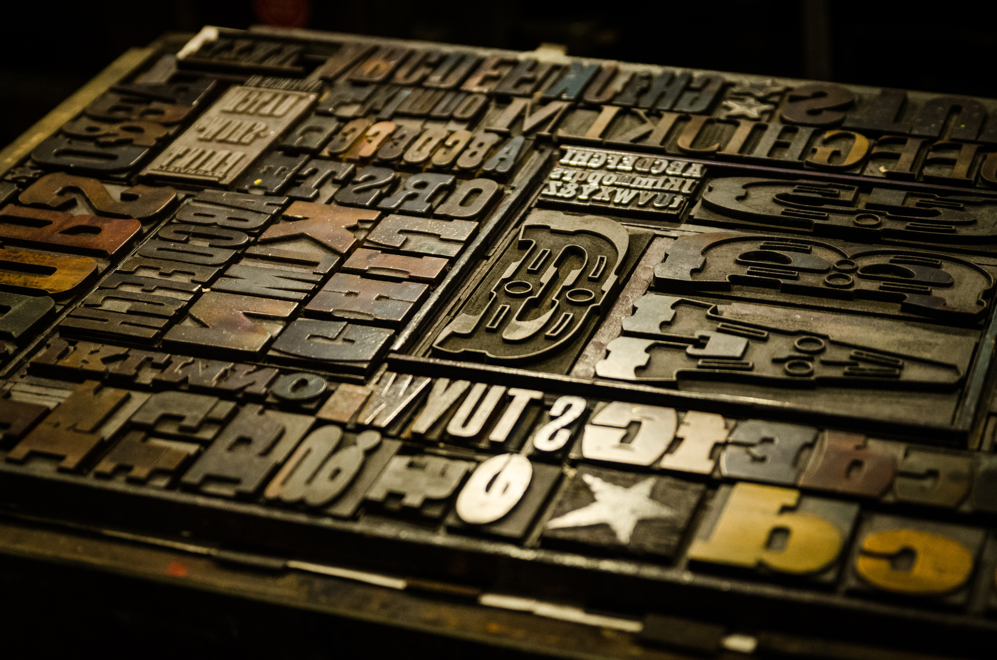
So now that we’ve got the history of type behind us, let’s dig into the difference between font vs typeface. In the past, a page layout for any type of printed materials needed a few important things: metal letters, a frame, ink, and paper.
Among the hundreds, if not thousands, of metal letter blocks, were characters known as typeface. For each typeface, no matter what style, a separate block was used for every size and weight imaginable.
Typeface is the name of the style of each one of those tiny metal blocks in the same exact style as one another. For example, the Garamond alphabet and numerals are all in the same typeface because of the way it was designed.
Font is often a term that is confusing. Although it relates to typography, a font is actually very different than typeface. Fonts describe the variety of how the typeface is presented through weight and size.
An easy way to tell the difference is by the specifics. For example, the font of Gothic 11-point in italics looks very different from a bolded Gothic 22-point font. Same goes for an italicized bold Garamond 22 point versus an unbolded Garamond 14-point font.
Cut Through the Confusion
Although our computers don’t seem to help us understand these differences, the words simply reflect the fact that we are not choosing individual metal blocks for our emails and college term papers. Because we are frequently asked in our writing program’s drop-down window to choose a “font”, it only adds to the confusion.
So when it comes to the style of the letters, remember that font means how the letters look. To communicate your ideas to a designer, keep these terms in mind if you’re creating a company logo. If you wanted a more literal term from days gone by, then typeface is the precise word choice.
Ready to Create the Ultimate Logo?
We hope we cleared up any misconceptions you might have had about these two terms. Now that you know the difference between font vs typeface, you can move forward with confidence that you are using the right words.
For more helpful logo tips and articles, make sure to visit our blog and also check out our free logo maker tutorial today!
Do You Have a Logo or a No-Go? A Beginner’s Guide to Creating a Logo People Will Remember
Posted on July 30, 2018 by Logo Design Tips and Tricks

It’s possibly the most significant choice you will make for your new business, and it will impact the company into the foreseeable future.
You’re creating a logo.
It seems so simple, brainless even. After all, Coca-Cola got by with a fancy font and red letters. More thought goes into a logo than customers realize, and you’re about to find out just how much.
Do you want a logo that doesn’t stink? That’s unforgettable and inspiring?
We’ll walk you through the basic steps so that your company’s symbol doesn’t fall through the cracks.
Is It That Important?
No. It’s even more important than “that.”
Studies show 67% of 2 to 3-year-olds can successfully match logos with products. That leaps to 100% by the time those children reach 8 years of age.
Furthermore, logos have jumped off of ads and into consumers’ pockets and bags. Purchasers see them every day when they use a product or swipe through an app. This intimacy results in a higher sense of ownership and loyalty.
Research indicates this sense is so strong customers are willing to pay more for these products because they have touched them. If they see your logo and interact with it, they are more likely to buy from you.
Nowadays, encouraging those interactions is easier than ever. You can print logos on merchandise, business cards, and brochures. You can even use your logo on advertisements sent through the mail. Best of all, many companies offer printing services at an affordable price, as you can see on this website.
Creating a Logo
So how do you go about creating a logo that customers can interact with? There are a number of tricks, and we’ll share them all.
1. Know Your Company
Before you begin to imagine your logo, you must think long and hard about your company. Many entrepreneurs skip this step with devastating results.
A good logo holds hours of thought and research in its simple design. Empower your entire team to think about your logo.
Issie Lapowsky of Inc. writes, “The most iconic logos were conceptualized for millions of dollars employing teams of professional creative directors, art designers, and focus groups.” Then again, the Twitter logo was reportedly purchased from an artist for $6.
Either way, don’t assume that because you’re the head of a company or an executive you have a clear understanding of what your company offers the world. Assembling a team is an easy way to get diverse opinions and to test a logo for its overall success.
Ask yourself these questions:
- What is the company’s mission in my own words?
- In three or fewer words, what are its core values?
- How do I want people to feel when they think of the business?
- What products or services does it offer?
Write down your answers. They provide vital information you will use later on.
2. Research Competition
You’re still not quite ready to design. Now it’s time to research your competition.
What are other businesses using in their logos? Make a list or print them off on a single sheet.
Your goal is to make a logo that stands out, so try to rule out the images, shapes, fonts and color schemes you see consistently.
3. Decide on a Basic Image
Finally, it’s time to consider your image or words. Whatever you decide should pertain to your company and your customers.
Starbucks, for instance, has the drawing of a siren. What does this have to do with coffee?
Not much, but it has everything to do with the company’s core value and the emotion they want to invoke in customers: desire. It’s implying a commitment to give customers what they want. Just as sirens seduce sailors, your barista prepares your cup of coffee to your taste to seduce you.
Add a dash of creativity here:
- Two images wrapped into one
- One single, simple image
- The company name
- Include an image using letters or vice versa, as seen in the FedEx logo
The options are endless. One good piece of advice is to use a dynamic image, which implies movement.
Studies show dynamic images increase customer engagement. If these images connect with the business’s services or products, they boost consumer attitudes about the brand.
4. Select an Appropriate Shape
Shapes also say more than you might have bargained for.
Circular shapes convey a positive, emotional message that implies community or friendship. Squares and triangles suggest stability and efficiency.
Vertical and horizontal lines add even more emotion. Vertical lines give off feelings of masculinity, strength, and aggression while horizontal ones encourage feelings of calmness, community, and peace.
Also, consider the ease with which you can print or transfer a shape or transferred when deciding on one for your logo.
5. Consider Color Psychology
Color also plays into logos. Starbucks’s green connects to their commitment to sustainable coffee. McDonald’s yellow and red colors make viewers hungry.
The main deciding factor here is how you want consumers to feel. We’ve broken down some of the basic connotations of colors to make it easier:
- Red – intensity and passion
- Blue – depth and stability
- Yellow – energy and joy
- Green – nature
- Purple – luxury
- Orange – happiness
Color is so significant that 84.7% of customers cite it as the primary reason for a purchase. Use only one or two colors to avoid sensory overload, and make sure they relate to your company values.
Whatever main image you choose should function well in black and white, as well as in color to give the logo more marketing versatility.
6. Reflect on Typography
Font choice is as important as color should you use words in your logo.
There are two basic types of fonts: serif and sans-serif. Serif fonts are the ones with the fancy embellishments at the tips of letters. These are your Times New Roman and Century fonts.
Serif fonts evoke feelings of old-school belief systems, class and timelessness. They are professional and upstanding.
Sans-serif fonts don’t have those neat little embellishments. However, they are being used more and more in logos and marketing, as they appeal to the newer generations. These fonts emphasize youth, minimalism, out-of-the-box thinking and fashion.
Which fits your company?
7. Contemplate Symmetry and Size
You’ve gotten most of the tough stuff out of the way. Now, consider symmetry and size.
Too big and your logo risks making people run away. Too small and it appears weak. Find the size that’s just right.
The same rule applies to fonts and images. Emphasize certain parts of the logo by making them larger, but be leery.
Likewise, take a look at your symmetry. Humans like symmetry. People associate symmetry with beauty and perfection.
But it can create a cool, otherworldly sensation when used in a logo. This is the exact reason you’ll see the nose of Starbucks’s mermaid is longer on one side. Without it, she appeared frightening, so the designers changed it.
They may have been onto something. Recent studies confirm that asymmetry evokes subjective arousal and brand excitement.
8. Watch the Negative Space
Negative space is the area between images and fonts that consumes a logo if there is too much. If there is too little negative space, the logo appears cluttered.
Finding balance is integral in creating a successful logo.
Use negative space to create secondary images or to add a sense of balance to the logo. You can even use it to create shadows, to turn a “flat” image into a dynamic one or to give a 3-D feel to it.
This creates further engagement.
9. Keep It Simple and Timeless
Keep it simple. Simple is strong and timeless.
It’s also easy for your customers to remember.
This isn’t a rule, per se. First and foremost, logos should convey something about a company. If you want your company’s image to be one of nuance and intricacy, your logo should be, too.
10. Suggest a Story
Your logo should have a story behind it. Nike’s symbol isn’t just a “swish.” It’s a wing.
In fact, it’s a Greek goddess’s wing.
Whatever logo you settle on, it should tell a story. Sometimes, this implication is in the image’s simplicity or, like Starbucks’s mermaid, in curiosity about its connection to the company.
11. Create and Test
Once you’ve created several designs, go back through the checklist to see if your design holds up to all the characteristics mentioned here. If it does, it’s time to create it online.
Use our free online logo maker to test it out and play with the elements. Don’t restrict yourself and save several different designs.
Print them off and show them to your team. Ask for their first impressions and after-impressions. Discuss, re-evaluate and try again.
Eventually, you’ll decide on a logo everyone likes. But don’t stop there. Show it to random acquaintances who aren’t familiar with the company to get their opinions, too.
Strong Symbols
If you follow these 11 steps, you’ll find success in creating a logo that people will remember. Take your time, don’t be afraid to mess up and have fun with it.
If you’re ready to start, read over our article about logo grids before fashioning your first designs! Logo grids can save you tons of time and center your focus. Read all about them here.
Now it’s time to take a breath, pick up a pen or pencil and let your imagination roam.

