How to Create a Classic Logo Design for Your Healthcare Business
Posted on October 06, 2018 by Logo Design Tips and Tricks

It’s difficult to define exactly what comprises classic logo design, but what we do know is that some logos make a more lasting impression than others.
The world’s best-known logos all have a few things in common. Here’s how you can imitate their timeless style.
Use these design guidelines to craft a logo to take your healthcare brand to the next level.
Classic Logo Design Should be Simple
People don’t want to spend time figuring out what your logo means. There are enough complications in the modern world.
An intricate logo implies chaos. That’s the last impression you want to give customers about your healthcare business.
The cleaner, neater and more obvious your logo is, the better. These kinds of logos are recognizable and memorable. They look good in print, on merchandise and online.
Do some research to get inspiration for designing a logo that works in the medical industry.
Don’t Be Too Generic
Simple doesn’t mean you need to download the first clipart image you see.
A stethoscope is too generic. Try to think of items you use in your practice every day that you could use as part of your logo.
Symbols that represent good health can be very effective in medical logo design too.
Images that suggest growth and renewal are a good match for a rehabilitation center or mental health clinic.
You can turn to nature for inspiration in this regard. Creating a logo that features symbolic shapes like water and greenery will inspire people to find out more about what you have on offer.
Keep it Classy
Medicine is serious business. Gaudy colors and haphazard design will not create the professional impression you want.
Think about what your patients want from you when how to design a logo
Green and blue are popular colors for medical logo design as they have a calming and soothing effect on people. Red and yellow can represent vitality and happiness.
The same applies to your choice of font. Choose a clear, simple, elegant font to get your message across.
Shapes Matter
Placing your logo inside a circle or choosing a circular design will soften the edges, giving it a comforting feel.
Studies show that circular logos give the impression that your company is caring, warm, and sensitive.
Logos with hard edges create an aura of reliability and durability. This can work well for a laboratory or pharmaceutical logo.
Triangles are usually associated with religion, science, law, and power.
Getting Down to It
When you think you’ve ticked all the boxes about classic logo design for your healthcare business, it’s time to get started on designing a logo for yourself.
You can either do it yourself or get a professional graphic designer trained in how to design logos to do it.
No matter how much time and money your logo costs, the right design will be worth it in the end.
How to Follow the Logo Design Process That the Pros Use
Posted on October 06, 2018 by Logo Design Tips and Tricks

Ever stopped to marvel at distinct company logos everyone can remember? Almost everyone can, in the blink of an eye, identify the logos for Nike, McDonald’s, Starbucks, and Apple.
Speaking of Apple, did you know its market dominance with smartphones is at 12.1% globally? A big reason behind this isn’t because of the iPhone’s capabilities but of brand recognition. People know the logo, they trust the brand and hence buy their products.
As a small business, this is a good example to follow. That said, you need to have a good grasp of the logo design process companies use since it helps people understand your brand.
Experts don’t make logos on a whim.
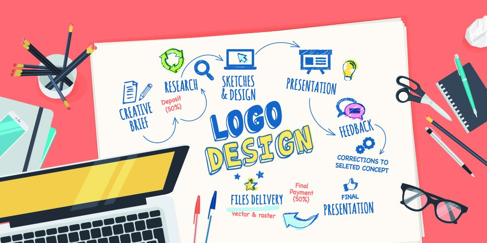
There are intricate steps that most logo design professionals follow. Not sure what these steps are? Read on to learn every step and what you can do to make the best logo possible:
1. Discover the Client
One of the first steps to create a logo is for the logo maker to have a long conversation with their client. This meeting helps them learn a lot more about your company’s culture as well as your values and your means of doing business. This allows them to show off that message when designing your company’s logo.
After all, aspiring for a great logo means expressing your company’s values and reflects the ideals you want to show people. You can compare this to an employee with the sole purpose of representing your company in its best possible light while maintaining its distinctive features. You can’t give a good representation without making the wrong assumptions if you aren’t asking for professional help.
Completing this step ensures that the designer creates a logo that you and everyone in your company can relate with. It’s important that they ask the personality you want your brand to project and the kind of customers you have.
2. Discover the Industry
After getting to know your company, the designer then attempts to know your company’s audience and your competition. Knowing the former allows them to have the understanding of the specific kind of logo style you need to appeal to them. For example, working in a market that caters to teenagers needs something mainstream and catchy.
That’s the reason designers will ask for thorough answers when it comes to the customers that you cater to. The more they know about it, the easier it is for them to give the logo your audience can appreciate and get behind with.
Knowing your competition is a more important part of the process. They need to know if there are other logos out there that look similar to something they might design. Doing a logo identical to your competitors’ is a big business blunder, so it’s important that they design one that sets you apart from the key competitors that need your consideration.
3. Discover Logo Usage
This step in the logo designing process is about the designer knowing how and where the logo gets usage. Logo application refers to the different possible uses of your company’s logo. It’s important since it allows the designer to set what can and what cannot happen in terms of the logo’s design perspective.
Web-based companies, for example, can let designers use the full spectrum of the RGB for the logo. After all, the digital devices that view it won’t have problems with the color. It helps the logo stand out but it can become horrible when printed as physical copies.
With this, you need to consult your designer and tell them the medium you’ll use for the logo. This ensures that they only use the ideas your company can execute without having to spend more.
4. Lots of Sketching
Some design schools urge their students to formulate around 100 ideas before deciding the right pick amongst the bunch. It’s a practice that ensures you have a lot of choices. It allows your designer to separate the good ideas you have from the bad ones.
It’s a simple truth but if you want your logo to have the identity it deserves, your designer needs to sketch lots of logo ideas while brainstorming. Once they do, they pick from a handful of decent designs to present to you. It might sound difficult, but the process isn’t that long since it can take less than a minute to sketch each depending on the complexity of the logo.
5. Design Drafts
After sketching, your designer will now pick the top 5-7 of their ideas and create drafts of its designs. They aren’t necessarily the nicest-looking designs but they all have the capability to make you stand out in the industry. They will often present the black and white versions of their designs, keeping them focused on the ideas without the need to gloss over the tiny details.
You need to give them the feedback for the rough ideas. It helps them know which ones are worth refining.
6. Refining Logos
This logo creation process step is the longest. The reason is the fact that it needs lots of back and forth when it comes to the necessary improvements and updates to the drafts they present to you. There are times when you pick one idea from their drafts but it’s often ideal to pick at least three and see where they end up once they get refined.
This is the part where they add the colors and details. It’s up to you if you wish to add, change, or throw away the ideas that don’t appeal to you. Once the final logo gets chosen, you can now help in developing its identity and use it for your company’s sake.
Learn the Logo Design Process Today!
With branding firms asking for at least $1,000-$50,000 to help develop your brand identity, you need to know the logo design process to ensure you get what you pay for. Of course, there are some cheap ones out there but you don’t want to pay those since they don’t give you the best results. It becomes worse if you ask people to do it for free.
It all comes to how much you’re willing to spend. In any case, you often get what you pay for.
Do you need answers for your logo-making questions? Contact us today and we’re more than happy to assist you.
5 Awesome Ideas for Designing Your Escape Room Logo
Posted on October 04, 2018 by Logo Design Tips and Tricks

Escapes rooms can generate upwards of $125,000 per year if they manage to just sell out most weekends. Add to that doing well during the week, and with an escape room, you have a recipe for a massive revenue generator.
That being said, given the opportunities escape rooms represent, more companies are getting in on the trend. This is driving up the competition.
If you’re looking to create or already own an escape room, it’s integral that you leverage good branding to cut through the clutter and become a crowd favorite.
The first component of your brand you should be investing your time in is your logo. Below, our team has compiled a list of escape room logo tips to help you create something that will draw in customers!
1. People Should Know What You Are at a Glance
Your logo shouldn’t have to say “Escape Room” on it for people to get a sense of the fact that you’re an escape room.
Therein lies the challenge of utilizing imagery in your logo that communicates effectively. There’s no straightforward solution to being successful on this front.
Our recommendation is to scour the web for escape room logos that are successful at communicating with their imagery and draw inspiration from them for your logo.
2. Leverage Color
Color is an excellent tool when creating an escape room logo as it allows you to invoke emotions in onlookers. Escape rooms are high-intensity. They make you think. They can even be scary.
Use colors like red, black, or purple to convey those emotions.
3. Consider What Makes Your Room Special
Now that you have an idea of what your logo might look like, it’s time to make sure that it doesn’t feel generic.
What makes your room special? Do you have a certain room theme that people request more often than not? Is your escape room’s location somewhere noteworthy?
We recommend incorporating elements of your escape room theme and your city (ex: Los Angeles) into your logo to make it feel original and unique to your area.
4. Steer Clear of Trendy and Aim for Durability
People who built their logo around “hashtags” a couple of years ago are now starting to see the trend die down.
Guess what that means? Their logos don’t make as much sense as they did.
Don’t fall into that trap with the logo for your escape room. Be sure to incorporate elements into it that are sure to stand the test of time so you don’t have to rebrand later.
5. Keep It Simple
At the end of the day, great logos keep things simple. Don’t inundate your logo with tons of elements. Don’t make it difficult to interpret.
Just work to find that balance between simple and unique, and you’ll be sure to create a logo that helps scale your business!
Wrapping up Tips to Create an Escape Room Logo
There you have it! 5 tips you can lean on to create a stunning escape room logo.
If you’re looking for world-class tools to help you with your logo creation journey, look no further than Online Logo Maker. Online Logo Maker has helped over 2 million entrepreneurs create stunning logos. Let us help you too. Get started for free!
9 Cloud Logo Design Tips for Managed Services Providers (MSPs)
Posted on October 04, 2018 by Logo Design Tips and Tricks

As a managed service provider, you’re well aware of the fact that there’s a lot of confusion surrounding what your company has to offer other businesses.
Your job is to make life easier for businesses in a wide variety of industries by offering things like cloud-based web hosting services, general IT services, assistance with payroll and compliance, and much more.
Looking for a better way to instantly let leads know exactly what you have to offer?
The right cloud logo design can help to clear up any confusion when it comes to the specific services you provide.
So, what makes a strong cloud logo design?
Keep on reading this post to find out.
1. Minimalism Matters
The first thing that you need to keep in mind when you’re dreaming up your cloud logo design?
As a managed service provider, it’s your goal to increase the operating efficiency of the businesses you work with. You want to make it easier for them to find the files they need, and to ensure that they have a safe and secure space to both store and access their data.
What doesn’t communicate that?
A cluttered, over-the-top cloud logo design.
Especially in the world of cloud-based services, simplicity is key.
We strongly suggest using no more than three colors in your entire logo design — and less if you can help it. Your central image should be crisp, include lots of white space, and should be easy to replicate on a variety of surfaces.
Avoid anything that suggests digital clutter. This includes hard-to-read fonts, overly detailed images, and clashing colors. This will only hurt your business.
2. Avoid Cliches When Designing Logos with Clouds
As a primarily cloud-based business, we know that it can be a serious challenge to make sure that your leads know what you have to offer without creating a cloud logo that looks like a carbon copy of your competitors’.
While your logo will likely include some sort of cloud image, there are lots of ways that you can breathe new life into the design.
First of all, remember that you can place your text inside the cloud. You could also place images of gears, a computer desktop, or even a lock inside the cloud.
This helps to separate you from other businesses in your industry. It also suggests to customers that your cloud is a protective space for their data.
Avoid having raindrops or fog leaking from the cloud, as this can quickly call to mind security breaches and a loss of data.
You can also use unconventional colors for your cloud — in other words, there’s more to good design than blue cloud logos!
Use the psychology of color to help you decide on a hue that will best pique the interests of your target market.
Finally, if you’re ready to think outside the cloud image, try an interlocking shape of your own creation. Things like a three-dimensional box, an octagon, or even a circle will still hint at a sense of protection but will be a bit less common.
3. Aim For Visual Balance
Scalability is key in logo design — but so is ensuring that there’s a strong visual balance within all the elements of your design.
If you have a tagline, is it properly centered underneath your company name and central image? Is your central image in proper balance with the size of your font, or does it seem to overwhelm the entire design?
Discover more about how to create a logo design with the right visual balance by looking on the Jaguar PC website. First of all, their logo design uses two colors to ensure that the design is easy to read.
But we especially love the look of the “g,” which is unique enough to immediately imprint on the minds of potential customers. Plus, the orange hue of the logo communicates a sense of authority and dominance.
This design can also easily be adjusted when it comes to size and scale — so it will never end up looking cramped or cluttered.
This is the perfect example to draw inspiration from when creating your own design.
4. Keep It Current
Finally, especially in the world of managed service providers, your cloud logo needs to communicate to customers that you’re with the times.
The last thing that you want is for an outdated logo to make potential clients think that your services also haven’t been updated in a while.
When you’re designing your logo, make sure that it gives you opportunities to update the design in the future. Make sure updating doesn’t compromise your branding.
For example, think about how Apple consistently changes the color of its logo to account for trends and announce new products. What about how Google changes its homepage and font design to celebrate holidays?
Your logo design should possess the flexibility to be able to do the same.
Ready to Create the Perfect Cloud Logo?
We hope that this post has made it easy to understand the essential elements that a compelling cloud logo should contain.
Remember to focus on creating balance in your cloud logo design, and to ensure that your logo can be updated as your company grows.
Looking to dream up a few potential designs?
Use our simple logo design tool to make it happen.
Then, continue coming back to us for more invaluable design and branding advice that will help your managed service provider business to make it to the big leagues.
We can’t wait to see what you accomplish next.
