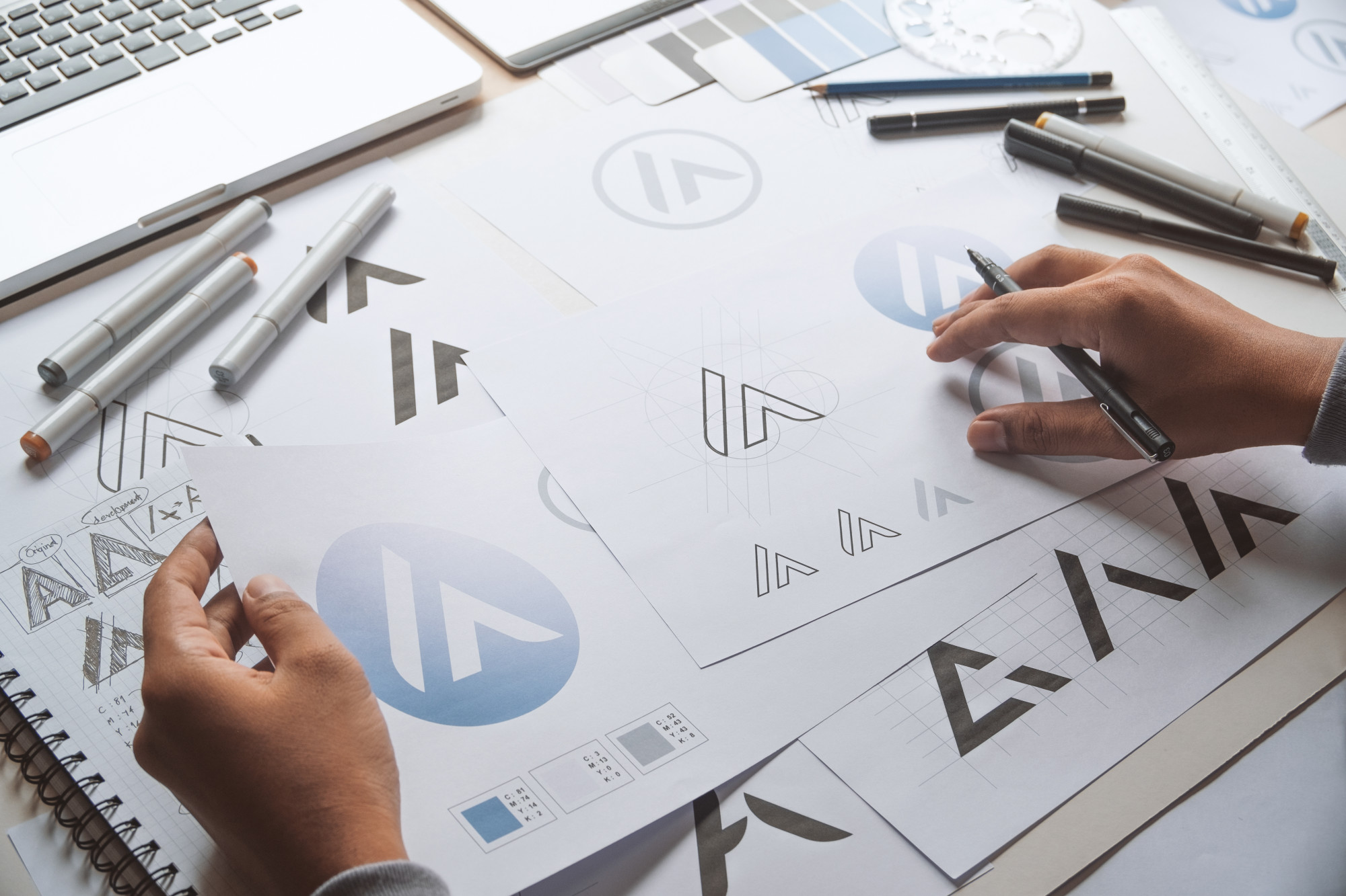
Logo Design Principles: How to Create a Remarkable Company Logo
Posted on August 25, 2019 by Logo Design Tips and Tricks

Did you know the hidden arrow in the FedEx logo represents precision and speed?
Are you looking to design your logo but not sure where to begin? Not to worry! In this guide, we’ll go over design principles to use as you create your logo.
Want to learn more? Keep reading to find out.
Keep It Simple
Take a moment to think of the most famous brands in the world. Did you think of McDonald’s or Apple? Those two companies have a simple logo that’s recognized around the globe.
When working on your logo, go simple instead of complex. A simplistic logo is easy to print and can engage your audience instead of confusing them.
Choose a Balanced Logo
A logo is an icon no matter if it’s a graphic symbol or text. When creating a logo, you want to maintain a sense of balance. Don’t place elements together at random.
When thinking about the look, keep your audience, and services in mind. Pick a logo that has a balanced appearance reflecting your business.
Think About Symbols
Your logo doesn’t have to describe what your business does. For example, most shoe manufacturers don’t choose a shoe as their logo.
Pick an icon that can still communicate your brand without using the company name. This way, you can use the icon as an image that stands alone on the packaging.
If it’s too obvious, a viewer won’t experience the sense of discovery. Try not to go too abstract.
Easy to Adapt
Your logo should work on a small business card or a massive billboard. Use it on a t-shirt, brochures, or stamps. A strong logo will look great with different colors or one color.
When working on your logo, imagine how it will look on different marketing materials. This will help you make sure it’s flexible and looks striking in various formats.
Take Your Time Deciding on Colors
Before picking a color, think about what message you’ll send to customers. Do the colors reinforce the mood you’re trying to communicate? Blue can express loyalty, freshness, and trust. Green symbolizes cleanliness and nature.
Think about what colors work well with white and black backgrounds. Don’t include more than three colors in a logo. Too many colors will increase the cost when you have to print materials.
Uniqueness Factor
Will your logo stand out from the competition? Keep working on your logo if you think it’s too predictable or bland. You don’t want it to become invisible to your audience. Avoid typical cliches like pinwheels and clip art.
Research your competition. If your business is a PayStubCreator, research the industry and watch for patterns. Avoid mimicking those logos and create something that stands out.
Logo Design Principles
We hope you found this guide on creating a memorable logo helpful. With these logo design principles, brainstorm your company’s future logo.
Don’t forget to bookmark our site. This way, you won’t miss out on any of our resources.
A Quick Guide to the Different Types of Logos (And How to Use Them)
Posted on August 21, 2019 by Logo Design Tips and Tricks

While some brands have spent hundreds of millions of dollars on logos, other brands like Twitter have famously spent around $10 for theirs. When you’re thinking about what types of logos are right for your brand, you have to start by knowing what all of the types are. Logotypes carry with them some meaning and requirements.
Here are some of the most common types of logos that brands around the world are using.
Monogram Logos
These are the logos that are based on the brand’s name. They often entail a unique font put together in a unique way. Usually, companies create their own special fonts for these logos.
Look at NASA, HBO, or CNN for this type of logo. These should be used when the name of the company or brand is much longer than you’d want to have to repeat again and again. When the brand is better known by the acronym or monogram than the full title, more is invested in these logos than full names.
Typography-based logo design relies on just a few letters. These logos are all about minimalism. They help to streamline your brand with a longer than usual name. Remembering the name National Aeronautics and Space Administration is a little more work than NASA.
Wordmarks
While you might have a font for monogram logos, logotypes or wordmarks aren’t focused on the acronym. They use the whole name of the company drawn out.
CocaCola is one of the most famous as well as Disney. Lots of people try to play on these logos or to rip them off as satire. That’s because they’re so powerful and ubiquitous.
A wordmark logo works when a brand has a name that’s unique and easy to remember. Attractive words and things that sound good together really hit home the power of the logo and font.
The point here is to capture the essence of the word or the brand.
Symbols
In these cases, a simple shape or symbol is the main aspect of the logo. While some times the name of the brand is placed side by side with the logo, other times, the logo is a stand-in for the brand name.
Think about the logos for Apple or Target. How often do you just see the logo and know exactly what brand is being depicted?
Choosing a logo symbol means choosing an image to embody your brand. That’s hard when you want to have a broad appeal. How do you showcase a broader meaning with a simple logo?
That’s why so many brands spend millions trying to reinvent their look. For some ideas, take the time to view more options available.
Going Abstract
Logos with pictures but no literal interpretation are common among some of the biggest brands in the world. The Nike logo is one of the famous and most ubiquitous of these types of logos. While it might mean something, the image itself is pretty abstract.
Abstract logos still confine a business to a single pictorial representation, so make sure that you agree with the way that your brand is being depicted. Consider all of the negative consequences or the worse possible interpretations. While it’s unlikely that your representation is going to mean the worst, it’s important to explore the edges of interpretation.
An abstract logo is great for conveying a brand’s purpose symbolically. Look at the Nike logo again. It has freedom and movement all in one simple gesture.
Mascot Logos
Can your brand handle a mascot? Depending on the types of products and services you’re dealing with, it can be a blessing or a curse.
Most of the time, you find them on brands that are more oriented toward kids and families. They’re meant to be cartoonish, vibrant, and exciting. Creating something unique to represent your brand is the goal when you’re choosing a mascot.
The mascot that you choose is an ambassador of your brand. Food brands and sports teams are some of the most common brands using these types of logos. They are fun on t-shirts, hats, and all kinds of swag.
When your goal is to create a positive and fun atmosphere related to your brand, these are the way to go.
Letterforms
Letterforms take the minimalism of monogram logos to another level. They’re also called letter logos. These brand marks have to be bold and beautiful, using powerful colors and memorable shapes. It’s challenging to think of just one letter to represent your brand, but it’s powerful when it works.
These logos are great because they can be used as small images for the web and printed big and bold on billboards. A well-designed letter logo can invoke your brand no matter where they are.
Design is everything when you’re choosing just one letter. It needs to be strong and memorable and use a color that’s bold and exciting. The letter needs to pop and be able to resonate when people see it.
McDonald’s has long been the leader in this type of logo but Yahoo! and Netflix have their own powerful and memorable versions.
Different Types of Logos Bring Different Associations
As stated above, the types of logos available bring certain requirements from brands and designers alike. Using the wrong type could be presumptuous while another type could limit your brand’s reach. It’s all about knowing what you represent as a brand.
When you’re trying to design the perfect logo, consider using a logo maker tool to help support your efforts.
The Importance of Logo Design (It’s Everything!)
Posted on August 08, 2019 by Logo Design Tips and Tricks

Research shows it takes around 5-7 impressions before someone remembers your brand.
However, there’s a good chance you can reduce that figure by giving your brand a good logo.
Now, creating a good logo isn’t easy, and you probably have a lot of questions about how you should do things. Do you need to hire a designer? Can you create a logo on your own?
Below you’ll learn more about the importance of logo design and how you can create a brilliant logo for your business. If you want to stand out from the crowd, the tips in this post will help make your brand more memorable.
Let’s begin!
Why You Need to Take Logo Design Seriously
Your logo will have a big impact on how people perceive your brand, and so it’s something you should take seriously. That’s because if your logo doesn’t look that good, people may start to question the quality of your goods/services.
That said, it’s easy to get caught up with logo design, and you can easily spend too much time on this aspect of your business. This is something you need to be wary of, as falling into this trap can lead to a lot of wasted time.
Thankfully, you can avoid this issue by hiring designers or by using powerful design tools – all of which we’ll explore in the sections below.
Finding Someone to Design Your Logo
If you’ve never needed a logo before, you might not know how to find someone that can help you with this task.
One option is to use a site like Fiverr, where you can have a logo designed for around five dollars.
Now, the quality of this logo might not be that high, as you’re only paying a small amount. But it can be a good option if you want to quickly get a logo you can use on your business card or website.
If you want to take things to the next level, then you should think about using a site like 99 designs.
When you use 99 designs, you start off by providing a brief for what you want your logo to look like. Upon doing so, a wide range of designers will then create a logo based on this brief. You can then pick the one you like and pay whatever the designer has quoted.
Should You Design Your Own Logo?
If you really want to keep your costs low, then there’s also the option of designing your own logo.
Of course, if you have little to no design experience, you may think that this is an impossible task.
However, you’ll be happy to know that this task isn’t as hard as it sounds, as you can use tools like Adobe Spark Post to help you get the job done.
This tool provides you with a ton of templates you can use as a basis for the design of your logo. You can adjust these templates so that you eventually end up with something that looks totally unique.
Do You Appreciate the Importance of Logo Design?
You should now appreciate the importance of logo design, as well as how you can actually develop a good logo for your business.
If you find yourself overwhelmed by this process, you should try to get the opinion of someone you trust.
This is especially helpful if you’re struggling to choose from a wide range of potential logo designs. With the help of a friend, it becomes a lot easier to tell the good logos from the bad.
Of course, if you pick a logo and then regret your choice at a later date, that’s okay. It’s an easy mistake to recover from as you can always update it at some point in the future.
Do you have any tips regarding logos? If you do, please share your thoughts in the comments section!
Top 8 Design Elements That Make a Bad Logo
Posted on August 02, 2019 by Logo Design Tips and Tricks

A company’s logo is one of the most prominent parts of its identity. When you see Nike’s ‘swoosh’ or McDonald’s golden arches, you instantly know who it is and what feeling you get from them. Being easily recognizable is a big goal for all businesses that the logo helps to achieve.
However, a logo gone wrong can lead you in the opposite direction of where you want your company to be. The best way to avoid this is to make sure you don’t commit some of the common design mistakes. Keep reading to check out 8 design elements that make a bad logo.
1. Excessive Elements
If you think about it, some of the most distinguishable logos are the really simple ones. They’re not overdone and don’t look like just a bunch of elements thrown into one place. You can avoid making a bad logo by keeping it simple.
Logos don’t need to be cluttered to make a point. Save some space by decreasing the number of additions and increase the focus and quality of some core elements of the logo. It will confuse people and be harder to convey the message if it becomes busy and unappealing.
2. Poor Color Choice
Have you ever seen someone walking down the street with an outfit that doesn’t quite match because they were wearing too many colors? This is the risk you take when you’re designing a logo without considering a cohesive color scheme.
The psychology of color is why most companies have chosen specific shades to represent their brand. Incorporating a smooth palette where the colors compliment and balance each other helps people to digest your brand more. It can also save you from creating a bad logo.
3. Word Overkill
Sometimes logos have words in them and that’s alright. But a logo is supposed to be a bit-sized symbol of your business. Cramming a bunch of words (or even too many letters if you’re using acronyms) can take away from the cleanness and professionalism of the logo.
Try shortening any phrases, names or acronyms that you feel are necessary to use. Always keep in mind that the whole goals is for people to be able to easily remember your company.
4. Unattractive or Confusing Typography
Here’s the thing — even if you did include some really cool, very savvy words, it won’t matter too much if no one understands them. Choosing the right typography for a logo is important so that people don’t misunderstand what your business is actually about.
Typography doesn’t just include picking a good font that works well with your brand identity. It also accounts for the sizing and spacing of letters too. Make sure your characters aren’t too close or far spread (otherwise it could look like a completely different word).
5. Plagiarizing Others
The only thing worse than a bad logo is an unoriginal one. As mentioned, your logo is a very distinctive piece of your overall brand. If you’ve decided to copy someone else’s logo, then that already takes you out of the running for being noticeable.
Besides the fact that plagiarism in marketing is morally tasteless and unacceptable, you could also put yourself in position for some legal concerns if the other party finds out that you’ve stolen their ideas. This isn’t to say that you can’t be inspired by other logos. However, there’s a thin line between using elements from something you really admire and making a close replica of it.
6. Poor Formatting
We live in a world where almost everything is running digitally. This means that your logo will probably be viewed by people on screens a large majority of the time. But all screen are not created equally and if you don’t take this into consideration it could come back to bit you in the long run.
Each time you place your logo a different place (website, social media, etc.) it’ll call for a specific format. If you haven’t formatted your logo for multiple placements, as well as devices (phones, computers, etc.), you could be losing out on quality big time.
Making sure your vectorized logos are able to scale correctly is an important step in avoiding a bad logo. You should also try to stay away from stock photos. If you want to know more about making a universal logo you can discover more here.
7. Disregarding Instructions
If you’re working with a client or on a team, it’s important to help to create the vision that was laid out. Trailing to far away from the original idea could turn the logo into something completely different and this might be a disaster. It may also upset the people that you’re working with.
Follow the directions that you’ve been given as much as possible. If you do want to add in some creative direction, be sure to run it past the person in charge of the project. This avoids making a bad logo and creating conflict.
8. Not Timeless
You might be tempted to follow trends when creating your logo. But you want your logo to last for a long time and trends don’t do this. So it’s best to go for a timeless design when creating your logo.
Think of your company logo through a longterm lens. This means focus on certain shapes, sizes and images that can stand the test of time and remain relevant to your audience. You can still be bold and edgy without using trends that could be easily forgotten within the next decade.
Got More Questions on Avoiding a Bad Logo For Your Company?
Creating the perfect logo for your company isn’t something that you should rush. You may have to go through a few rounds of logos to get to the right design. The most beneficial thing to do is to keep editing until it feels like the best representation for your business.
You can take these tips on how to avoid making a bad logo into consideration to put you on the right track. If you’re interested in starting the logo creation for your company, check out our blog for more tips and tricks.
