Are you stuck with a boring ranch logo? A logo says quite a bit about a business and having the wrong logo can send the wrong message to customers.
Many dude ranches want to invoke a theme of the old west. Some ranchers will have guests work while others are meant for a true vacation.
You might have a great logo design but maybe the colors are off. Our brains are wired to perceive certain feelings depending on the color. Different colors can make people feel different emotions.
The logo of your company reflects how it appears to the world.
Having a badly designed logo can make your business look unprofessional. In this article, you will learn how to choose the perfect colors for ranch logos.
Choose Colors that Invoke the Outdoors
A ranch is all about being located away from the concrete jungle of a city. You’ll want to have this natural feel reflected in logo color choices. Colors that bring to mind images of nature include brown, yellow, and green.
Many leading agricultural companies feature green in their logo for this reason.
It’s isn’t always best to focus on only one color. Your ranch logo may feature the brown of a cabin paired with green grass and a shining yellow sun.
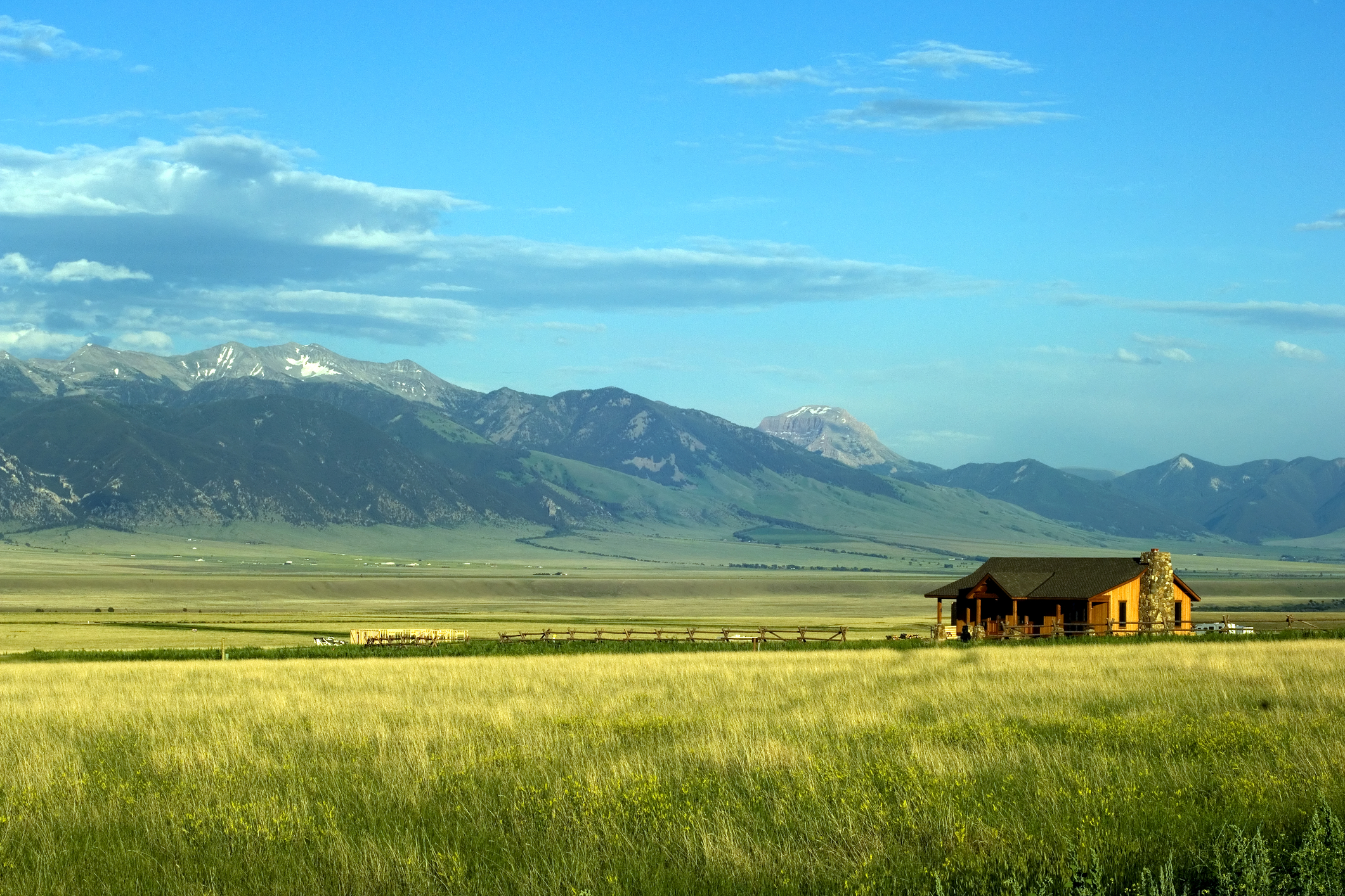
Matching the right colors to a niche lets a customer instantly know what your company is about. For example, a company offering land for sale in Montana should include greens and/or yellows in their logo.
Colors for Ranch Logos Need to be Inviting
Matching colors to your business is important. Some of the largest companies in the world know the power of inviting colors.
Blue is the most preferred color choice for citizens around the world. You may want to include a nice blue to color the skies above your ranch. Blue combines elements of nature and trust making it a great color choice for ranch logos.
Don’t be Afraid to Include Uncommon Colors
You won’t often see many ranches with a pink or purple logo. Some may view these colors to be too feminine for a ranch. Purple is a color associated with wisdom but is difficult to use for this application.
It’s a great idea to include at least one surprise color in your ranch logos. Having a great logo is about standing out without going overboard. As an example, a ranch used for vacations could include orange which people view as a friendly color. Creating a perfect logo takes time. Including color combinations helps to ensure you don’t miss any winning ideas.
Creating a perfect logo takes time. Spend some time thinking about your color combinations to help ensure you don’t miss any winning ideas.
Adding color accents help to make logos have that extra visual appeal.You might not think that gray would be a popular color for a ranch. However, gray is a color used to promote feelings of balance and calmness.
You don’t want a boring logo that looks identical to your competitors. Think of what emotions you want your ranch to invoke. The key to great logo color schemes show what a business is about while appealing to their target audience.
Adventure vacations are a growing part of the travel industry. More people want to make physical activity, nature, and cultural immersion a significant part of their leisure travel.
Agencies that specialize in adventure vacations need a logo that does more than stand out in a crowd. Their logo must convey a sense of exploration and inspire trust.
Here are 5 tips for designing a travel logo to help grab the attention of an adventure traveler.
Ideal Customer
The most important aspect of award-winning logos can’t be seen: an understanding of the ideal or target customer. Effective logos start with a clear understanding of the people who buy the kind of product or service the company sells.
And, the more precise the description of the ideal customer can be, the greater the likelihood of creating a knock-out logo.
Color
Color in a travel logo is essential to setting the right tone for marketing materials in print, online, and clothing and other merchandise.
According to general color theory, orange creates a sense of joy, freedom, and optimism. For adventure travel in natural environments, orange is a good choice. It can work well with green, blue and brown, the colors of plants, water, and earth.
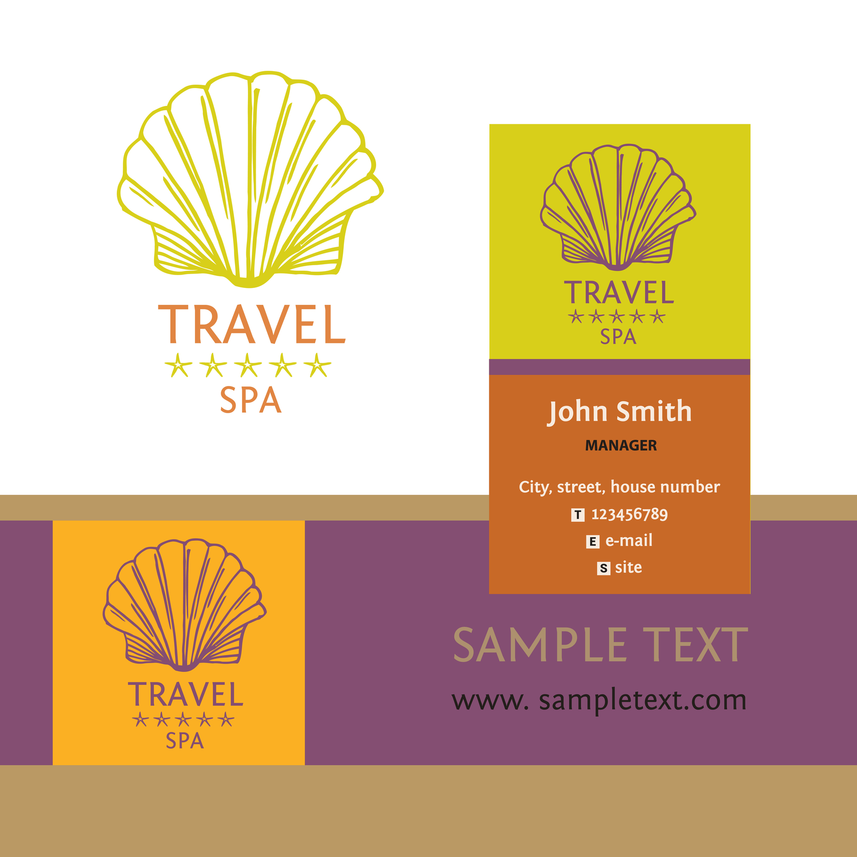
Pairing orange with purple — the color of royalty, reflection, and intuition — can create a striking yet elegant logo, which might be suitable for luxury resorts.
Blue and red are generally not the best choices as the primary color of a logo for adventure travel. Blue is too often seen as cold, official, and staid. Red does convey passion but just as easily represent anger and danger.
Font
Logos often include the name of the company or a tagline. Those that seek to convey strength, adventure, and excitement, use a font with a modern typeface.
Modern fonts convey strength and style. They are seen as progressive, assertive, and chic, three descriptions that align with adventure travel. Examples of modern fonts are Bodoni and Elephant.
Using Didot Italic can heighten the sense of luxury.
Symbols
Logos that use representative graphics and shapes instead of literal ones, allow the client to find a more personal connection to it.
Examples of symbols that can evoke thoughts and memories of adventure are a compass, the globe, mountains, and exotic trees.
For adventure travel agencies that specialize in specific activities such as hot air ballooning, parasailing, or rain forest excursions, using relevant silhouette imagery can be powerful.
Simplicity
The goal of a logo for an adventure travel agency is to instill excitement, trust, and a feeling of possibility in the customer, not overwhelm them with information.
Logos that are simple are more easily recognized and pleasing to look at. They are also more versatile than intricate and complex ones. A good logo can be used in almost any situation without creating visual conflict.
Keeping It in Perspective
Creating a logo is important because it speaks for the company. But it’s not written in stone. Every company has modified their logo over time. So don’t worry if it’s not perfect.
Use these tips to create a great travel logo to attract the right customers. Then, as your business grows and you gain feedback, modifications can be made, if necessary.
Like with adventure travel, the journey is part of the fun.


