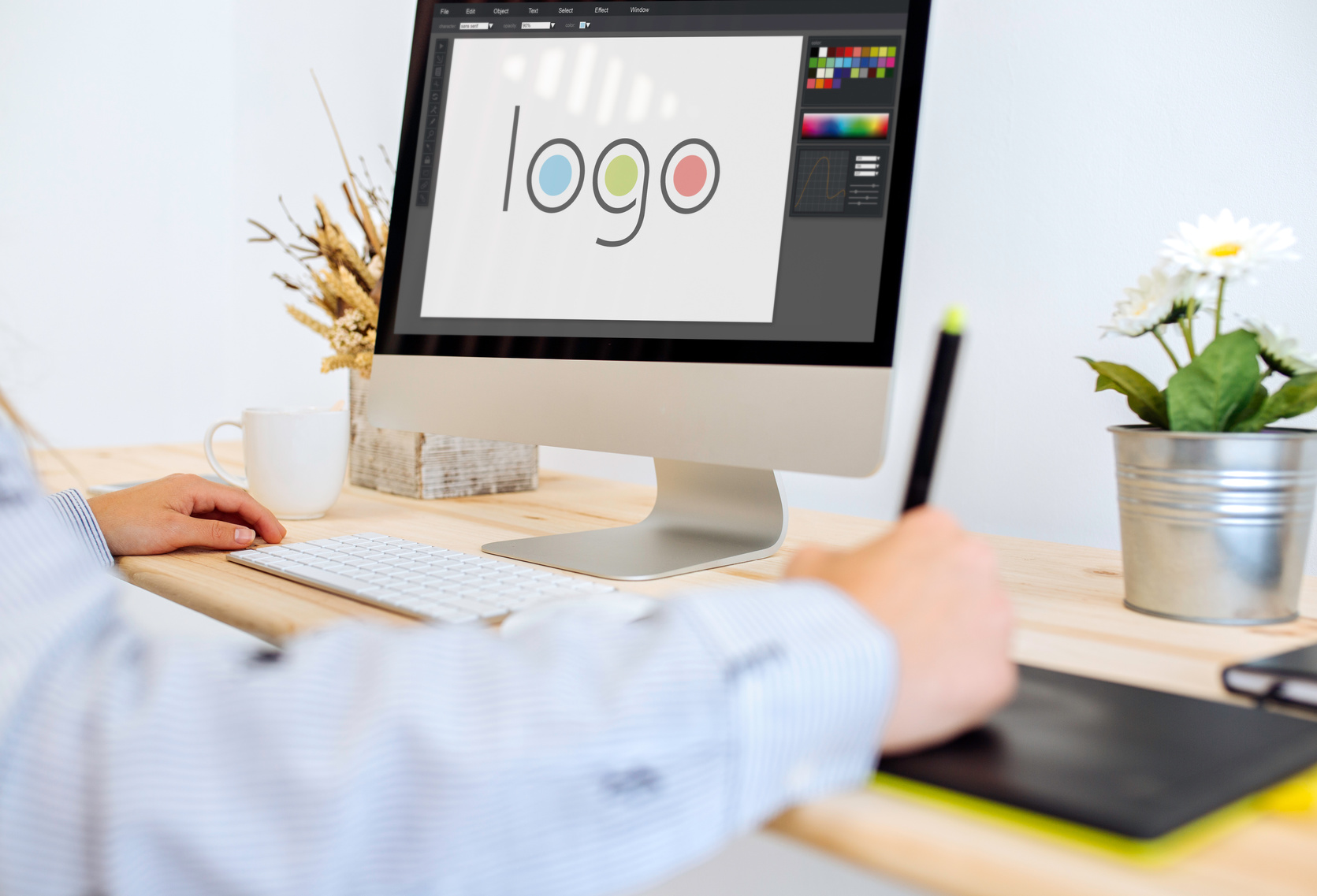
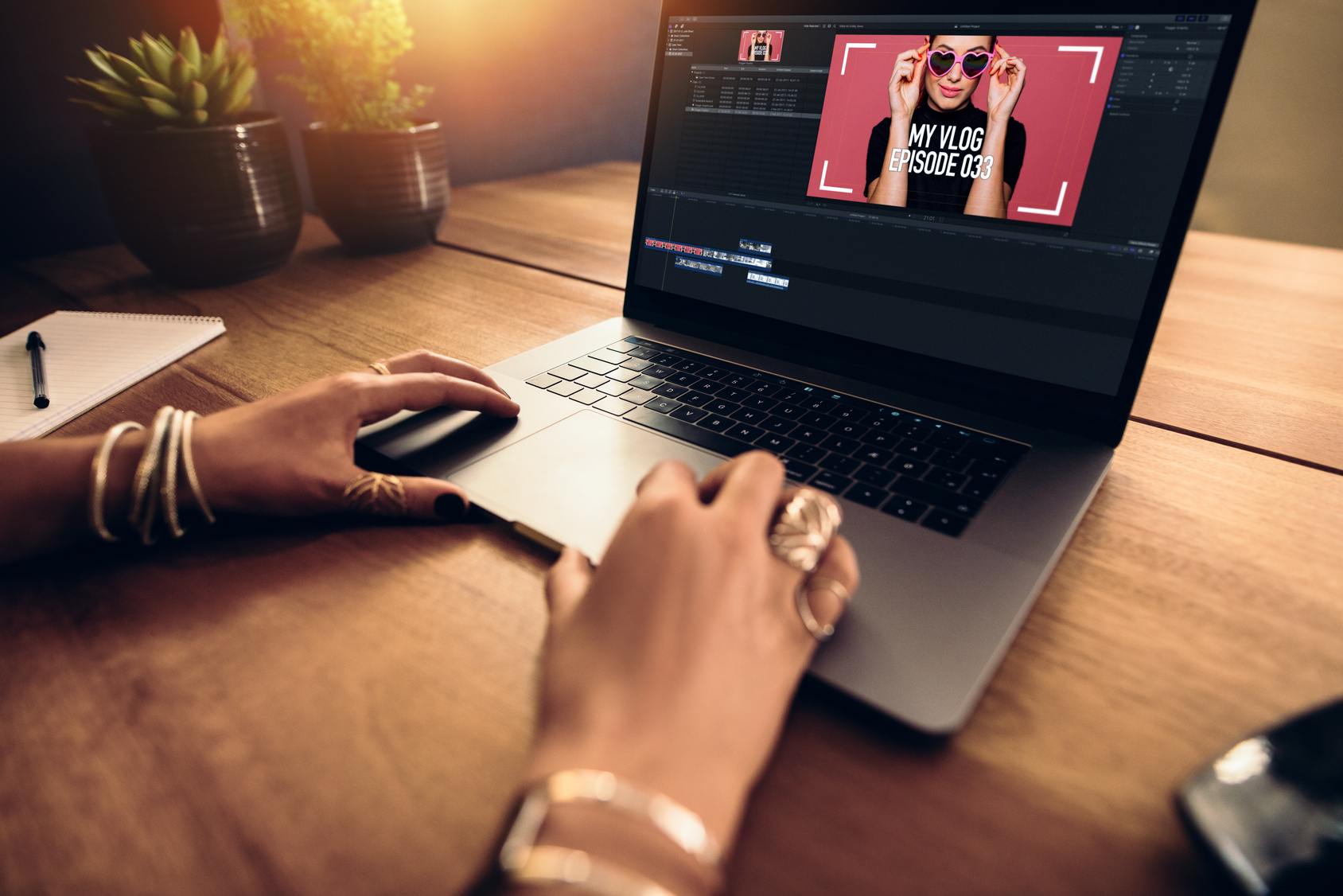
3 Tips for Developing a Software or App Logo
Posted on August 29, 2017 by Logo Design Tips and Tricks

Are you ready to release a piece of software or an app in the near future? If so, one thing you may have forgotten about is a logo. Without a logo, your brand is incomplete.
Though small, a logo is a defining part of your company. A logo gives your brand visual identity. A proper logo will make your business unforgettable.
Before releasing your creation, take the time to create an app.
Importance of a Memorable App Logo
There are more than 2.8 million apps available for download. With competition at an all-time-high, the icon you create for your app must be well designed.
When users browse the app store, the first impression of your app is the logo. With this said, creating a catchy icon is a must.
Here are 3 for tips for designing an awesome app logo.
1. Make it Unique
The app icon you provide has to be identifiable among dozens of other icons. Each of the shapes, colors, and textures used need to resonate.
Keep novelty in mind when creating an app logo. You don’t want a bland icon, but you also don’t want to go over-the-top.
To boost your icon’s uniqueness:
- Create several versions. Line them up and determine which one catches your eye first.
- Avoid overly bland and overly complicated designs. You want to use shapes and colors that are unique to your app brand.
- Look at the most popular app icons. What makes them pop? Incorporate these factors into the icon you create.
2. Focus on Scalability
Your icon will be used in many places throughout the platform. This means that the icon will need to be scalable. No matter the size, the icon needs to be legible.
To make an app icon more scalable:
- Don’t cram too much into the logo
- Have a single focal point
- Avoid using text
- Test the icon on a variety of backgrounds
Take the time to ensure the icon looks great on every screen size.
3. Be Consistent
The purpose of your app should be obvious when looking at the app logo.
For example, if your app offers interpreter scheduling software, consider using a speech bubble or a person’s face.
Users should know what your app offers before they ever download it. Having a unified image throughout the app boosts product satisfaction. It also increases virality and memorability.
The take away here? Use an app icon that gives your app meaning from the first glance.
Create a Memorable App Logo
Looking to make the logo creation process as simple as possible? Want to use a high-quality product that offers logo templates?
If so, now is the time to check out Online Logo Maker. Our website is designed to make the process of branding your business quick and easy.
We offer all sorts of design assets that allow you to create a unique logo.
The Online Logo Maker team understands the importance of a memorable logo. You can count on our product to help you develop an awesome icon.
Contact us today to get started.
How to Create a High Quality Tech Logo
Posted on August 17, 2017 by Logo Design Tips and Tricks

When people look at your tech logo, you want them to put you in the same class as brands like Microsoft, Apple, and Google.
Every company starts logo development with an idea of what they want to tell the world through their logo. Once you’ve created your brand style and voice, how will you use your logo to convey that?
Here are the tips you need to know!
The Basics for Tech Logo Creation
It doesn’t matter if you’re sitting in your office or at a computer gaming desk, your business can’t truly begin until you have a logo.
What is the first thing that you notice about your competitors and their logos? What makes them stand out and what does it say about their company?
Your logo should do the same thing for yours. For inspiration, look no further than Google.
Every part or branch of their business, everything that company represents, is right in the logo. Now, how do you duplicate this kind of success?
Colors
Think about the tech companies you admire. Their logos are probably using simple color schemes. You’ll often see blues, golds/yellows, and orange. There is a brilliant method to this creative madness.
Blue
You’ve heard “The sky is the limit”? Blue has always been associated with the sky.
Between cloud management systems and apps, as well as innovative start-ups constantly pushing the limits of what is possible, it’s no wonder why blue is a popular choice for tech logos.
This color also represents trust, professionalism, and productivity. Sounds pretty good, right? Consider using blue in your logo if this is the message you would like to represent.
Gold and Orange
These colors represent fun, friendliness, and optimism. You can expect any brand that utilizes these colors to have a focus on customer service.
Combining these schemes says this is a brand that is bold, innovative, with a focus on enjoying what they do and making sure their customers enjoy their product or service.
Fonts
Be modest. Keep any wording simple while utilizing a tech-friendly font.
You want to grab the attention of your potential customer with a bold statement. Say as much as you can while using the least about of space possible. Think American Express, Ford, Target, and Coca-Cola.
Shapes
The shapes used in your tech logo are where you can really go nuts. The messages of shapes are just as versatile as colors are. However, tech start-ups rarely hesitate to use a variety.
When you think of a square or rectangular logo, you probably think of brands like Microsoft and American Express. You probably think that’s the route you should take.
Think again. What about brands that utilize the power and brilliance of lines! Think IBM, Soundcloud, and AT&T.
Shapes are where your creativity can really help to mold your brand into something that is all your own. Play around with our free logo designer to get an idea of what you want.
The Wrap Up
A new tech logo is going to be the foundation of your business and your brand. It will be the first thing seen by customers, investors, and potential employees.
What do you think? Did we nail it? Leave your comment below, we’d love to hear from you.
5 Expert Logo Tips for Your Video Editing Service
Posted on August 16, 2017 by Logo Design Tips and Tricks

Whether you’re aware of it or not, your logo says a lot about your video editing service.
The colors, typography, and layout you choose can, for better or worse, influence your potential customers. In fact, in a 2015 study, researchers found that even the shape of your logo can affect how consumers view your brand identity.
That’s why, when it comes to expert logo design, the devil is in the details. Keep reading for our top 5 tips on creating the best logo for your video editing company.
5 Tips for Creating an Expert Logo for Your Video Editing Service
1. Choose the Right Shape
So what did those researchers find when it comes to logo shape? It turns out that logos with rounded, circular shapes seem “softer.” As you may expect, logos with a more angular design come off looking “hard” to consumers.
These associations go deeper. Companies with rounded logos actually seem more caring and sensitive to consumers. Harder shapes conjure up ideas of durability and strength.
Keep these associations in mind as you design your logo. When it comes to video editing services, a rounded logo can create a feeling of movement. That may be an association you want to encourage for your customers.
2. Pick Purposeful Colors
Color psychology is a trending topic in the logo design world. That’s because every hue you choose evokes quick, subconscious responses in your customers.
Blue, for example, tends to evoke feelings of trust and confidence in the minds of consumers. Red is highly stimulating, orange is attention-grabbing, and yellow seems energizing and warm.
Keep these ideas in mind while designing. The colors in your logo should match your brand’s overall image.
3. Typography Matters
Your font choice says a lot about your company’s products, message, and core values, depending on what you choose.
In general, serif fonts—those with small lines at the end of each stroke—come across as traditional and professional. Sans serifs—those font families without lines—seem more modern and innovative. Specialty fonts can seem creative, playful, or too busy.
Above all else, make sure the font you choose is readable, even at a small size. Your logo will show up on banners, business cards, and smart phones. Make sure you can read your company name across any iteration.
4. Look at the Whole Picture
While it can be easy to get caught up in the details of the design process, your customers will view your logo as one whole picture. That’s why you need to periodically take a step back and consider how well each element works with your overall design.
Get your logo down to just the essentials. Get rid of any element you don’t really need and make sure everything to include plenty of white space.
5. Don’t Be Afraid to Innovate
While it’s essential you keep these tips in mind as you design your logo, don’t let yourself feel bogged down by them. Sometimes an unexpected element in a logo can spark extra interest in a brand.
Start Designing Your Logo Today
If you’re ready to refurbish your logo—or create a new design from scratch—visit Online Logo Maker. We make it easy to design a beautiful, professional expert logo to advertise your video editing services.
A Logo With a Purpose: The Mission of the New Hearing Aid Logo for OTC Aids
Posted on August 10, 2017 by Logo Design Tips and Tricks

Logos have been used for as long as advertising has been around. A logo says a lot about your company and the services you offer.
Your logo is your brand, it is what you want people to see and associate with quality.
However, what if a logo could be used not for a single company, but to bring together an entire industry?
That is exactly what the Consumer Technology Association (CTA) have done with their new hearing aid logo.
But why did they make such a decision? Read on to find out.
Giving a Logo a Larger Purpose
Within the hearing apparatus industry, there is a split between the products on the market. You have high-quality amplification enhancements that can help everybody with mild to moderate hearing impairment, and you have low cost ‘personal amplifiers’ which are also readily available.
The idea behind this standardizing logo is that when people see it, they know that the items they will be looking at are of a high quality. A standard that will help them with their troubles.
Only items that have been checked and match the Personal Sound Amplification Performance Criteria will be allowed to use the logo to represent their product.
Using a Logo to Protect Consumers Not Just to Sell
By introducing a logo aimed at increasing consumer awareness, the CTA has created something that not only aims to generate sales but more importantly to protect their consumers from buying products that may be of a less than stellar quality.
Consumers know that if they see this logo on a site, such as Hansaton, they can rest assured that they are getting a product that will assist them.
Living with a hearing impairment is not fun, and people deserve to have a banner which guides them towards quality.
A Hearing Aid Logo Aimed at Educating the Consumer on New Technology Options
Technology is improving the quality of our lives in every possible way. By creating a link between a product logo and a quality standard, people can also be assured that the latest levels of technology will be available to them
They may not take that particular enhancement aid, but it is all about being able to make an informed decision. It is about giving the consumer a sense of empowerment and control over the decisions they make regarding their own hearing.
Creating a Logo that Promotes Quality of Life Above Everything
At the end of the day, amplification enhancements are all about ensuring a better quality of life. If that can be achieved in some way through a good quality hearing aid logo, then that is all for the greater good.
Whether you have a moderate or a mild hearing impairment, you have the right to be protected, and that is exactly what the idea was behind creating this logo.
What are your thoughts on this standardization? Leave a comment below. We’d like to hear from you.

