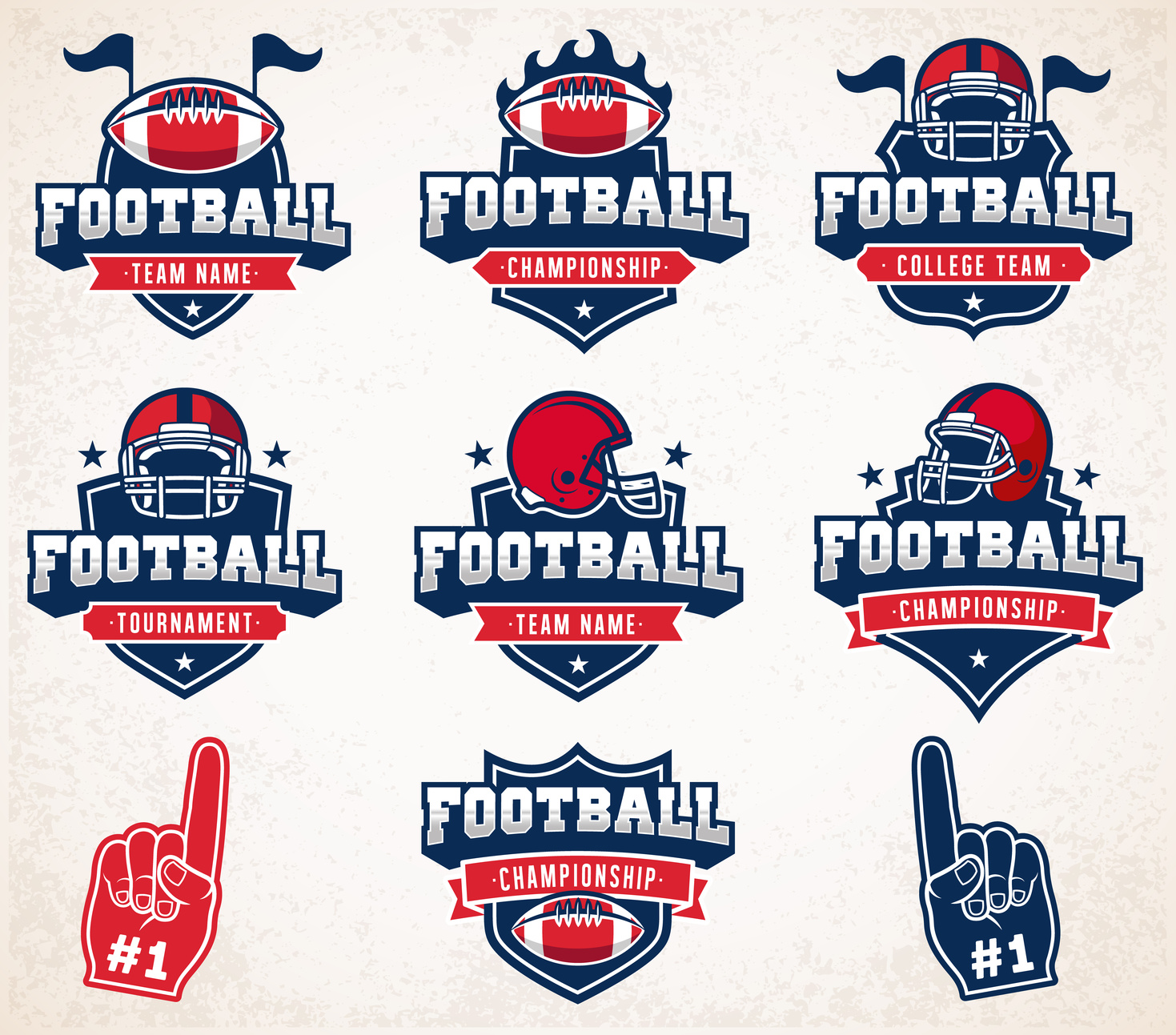
How to Create A Sports Logo Design The Team And Fans Will Love
Posted on August 30, 2017 by Logo Design Tips and Tricks

Does your current logo communicate the right message? Logos are how fans recognize your team, so they should be handled with great care and attention.
Looking to revamp your sports logo design? Want to design a logo that perfectly portrays the heart of your team?
If so, read on for useful tips for creating a sports logo.
1. Focus on Timelessness
Logos cannot be changed easily. While players and coaches may come and go, your sports team logo stays the same.
Your logo will be the longest player on the team!
This means your logo needs to be timeless. It should be meaningful now and in the future and adapt to your evolving team.
2. Color Matters
Color is one of the most important pieces of a sports logo design. Chances are your team has set colors already. These colors are the starting ground for your design.
When working with colors, the scheme you choose should flow nicely and compliment rather than distract. Use colors that flow with each other and the original team colors.
3. Think About Variations
Rarely do sports teams have just one logo. While your team will have one primary logo, having variations can better your brand.
When creating variations, ensure you make subtle changes such as:
- A different background color
- Adding text
- Making a small change to the team mascot
4. Focus on the Sport
Your logo should easily identify the sport that your team plays.
Need a logo for a baseball team? Consider using a baseball bat or a ball. You could also use a diamond shape to represent the field.
If you’re creating a basketball team logo, incorporate a ball or a net. Court lines are also a fun idea.
5. Focus on Uniqueness
Chances are there are dozens of local sports teams. What will make your team’s logo memorable?
You definitely don’t want your logo to be confused with another team’s!
Before designing a logo, take a look at other sports organizations. Make note of their mascots and colors. This helps to narrow down your design options and can give you inspiration.
No matter if your logo is on an AFL Premiership odds website or on football jerseys, it must communicate the right message.
6. Represent Motion
Movement and sports go hand-in-hand. Use your logo to mimic motion.
Unsure how to portray motion in a flat image? There are plenty of options including:
- Images
- Colors
- Shadowing
- Lines
- Gradients
- Outburst graphics
Do a quick Google search for more ideas.
7. Use a Bold Font
Aside from the team mascot, the identification of the team name is most important. This should be front and center in the sports logo you create.
The font you choose for your logo should be bold. Thin and cursive fonts don’t pop on jerseys or hats.
Need font ideas? There are tons of free fonts online.
Sports Logo Design Made Easy
Logo design doesn’t have to be rocket science. With Online Logomaker, we make designing a logo fast and easy.
Our logo generator makes branding much less time-consuming.
In just 10 minutes, you can create an amazing sports logo. The best part? We also offer full branding!
Display your new logo on your team website, jerseys, and more.
Don’t go any longer with a less than stellar logo!
Contact us today to get started.
5 Classic NFL Logos to Inspire Your Fan Shop Brand
Posted on August 21, 2017 by Logo Design Tips and Tricks

Want your piece of the $20 million dollar sports merchandise pie?
Then, now’s the time to get serious about branding your NFL fan shop. Specifically, you need a logo that speaks to football fans just like yourself.
Fortunately, you don’t even need to be a graphic designer to pull off a professional logo.
But you do need inspiration.
Let’s take a look at 5 timeless NFL logos to make yours go the extra mile.
San Francisco 49ers
The San Francisco 49ers logo is an ode to the Bay Area’s gold rush beginnings.
Back in the mid 19th century, a group of pioneers embarked on a long, arduous journey to California in search of gold.
The teams’ original logo famously depicted a drunken gold miner shooting guns, but the team eventually adopted their signature red and white-lettered logo in 1962.
The team’s current design is one of the most recognized NFL logos in the game. Since the 60’s, the team also added some gold trim around their logo’s signature oval shape.
While the 49er’s red logo evokes passion and adrenaline, that extra splash of gold represents the high calibre of the team.
Buffalo Bills
This team earned their name and logo from the legendary bison hunter, William Frederick “Buffalo Bill” Cody.
But what truly makes this logo a classic is its simple yet bold red buffalo design.
This logo encapsulates the “less is more” approach, and it translates clearly across apparel, toys, digital products, and more.
Like all Successful NFL logos, Buffalo Bills’ design falls right in line with the following logo principles:
- Memorable
- Simple
- Versatile
- Appropriate
- Timeless
Make sure to keep these principles on hand as you design your NFL UK merchandise logo.
Let’s quickly take a look at three more classic NFL logos that hit the mark.
Pittsburgh Steelers
Six-time NFL champions, the Pittsburgh Steelers, check every box on the 5-point logo design checklist.
The Steelers 3-diamond logo design was originally inspired by the American Iron and Steel Group and was intended to mean the following:
“Steel lightens your work, brightens your leisure and widens your world.”
Oakland Raiders
While the Raiders have notoriously flipped back and forth between Oakland and Los Angeles, their iconic logo has remained in tact.
And who doesn’t love pirates?
This classic logo features a memorable pirate or “raider” with two crossed swords in the background. Rumor has it that his look was inspired by legendary Hollywood actor, Randolph Scott.
St. Louis Rams
The Rams’ logo makes a fantastic case study for colour psychology.
Color plays an instrumental role in how your logo is received and interpreted by sports fans because it elicits an emotional response. In fact, it’s even proven to impact consumer motivation by a staggering 80%!
The Rams’ simple blue and yellow logo creates a balance of both power (blue) and positivity (yellow). These are two emotional responses that encourage fans to believe and participate with the brand.
Ready to Design Your NFL Logos?
With this information fresh in your mind, now’s the perfect time to starting crafting your new sports merchandise logo.
Need even more inspiration for your design?
Learn more about how you can encourage team spirit with your sports logo and check back often for updates.
5 Awesome Design Tips for Your Bike Shop Logo
Posted on July 25, 2017 by Logo Design Tips and Tricks

If you’ve opened a bike shop or any business, chances are you’ve had to deal with the most important decision outside the business model. The logo.
Easy in theory, difficult in execution.
It goes without saying that in 2017 the words “Bike Shop” with a stock image bicycle centered underneath does not cut it.
Think of McDonald’s, Apple, and Coca-Cola.
These logos are engrained in people’s minds. They have transcended the business and hold a place in pop-culture. There is a reason for this.
Every word, angle, color, and shape can evoke an emotion. The key is turning those emotions into conversions.
5 Awesome Bike Shop Logo Tips
1. Color Choice
Humans have a natural reaction to colors, and these reactions play a big role in how businesses brand themselves.
For a bicycle shop, reds and oranges are associated with strength and endurance and have a very high level of readability. This color is ideal in an industry centered around physical activity.
On the other hand, yellow being an unstable color would not be ideal to promote safety. If in the restaurant business it is known that blue suppresses appetite so its use is few and far between.
More logo basics can be found here.
2. Simplicity is Key
The most timeless logos are the most simple.
This is an era of thousands of impressions. With the swipe of a finger, consumers are pulled in a million different directions, each begging for attention.
The simple truth is the busy logos get left in the dust at the expense of those that are user-friendly and easy to understand.
This tip is a by-product of the social media age. The most effective platforms strip it down giving you what you need before wandering to the latest viral cooking video.
3. Something You Can Build Upon
Logos build brands. This is where Nike excels.
The iconic swoosh is found on everything Nike produces and for good reason. This logo represents a standard of excellence and markets the products to every eye it strikes.
For a bike shop, this logo should be able to transition to shirts, stickers, helmets, water bottles, etc. Any way to make your customers brand ambassadors and create conversation.
Try your hand at making something iconic.
4. Synonymous With Your Service
A big mistake in logo design is creating something that doesn’t speak to the service provided.
If your bike shop repairs bikes and doesn’t sell them, think about including a wrench or toolbox. This aids the customer and leaves nothing up to the imagination.
Confusion will often lead to a lost opportunity.
This is also the best opportunity to highlight something that you offer and the competition doesn’t. Say your bike shop offers additional accessories and parts. Give that stock bicycle the works.
5. Tells Your Story
Ultimately, your logo is you. For entrepreneurs, taking that leap of faith to pursue a passion isn’t easy. Everyone’s story is unique.
Passion resonates. People respond to real, and you can deeply connect with people if your logo is indicative of your message.
Intertwining individuality breathes life into a logo, you’ve got 8 children, the rungs of the bike wheel can be their names. Not only is this logo unique, it’s also yours.
Take the Pittsburgh Steelers and Cleveland Browns. The Steelers logo represents the three materials used to make steel, the lifeblood of that city. On the other hand, the Browns logo is simply a helmet.
Many times, the quality of a logo speaks directly to the quality of a business. Keep this and the above tips in mind, your bike shop will thank you.
5 Beach Brands to Inspire Your Surf Shop Logo
Posted on July 07, 2017 by Logo Design Tips and Tricks

Surfers come from all different walks of life and everyone finds their way to the ocean for different reasons. But there are a few unifying characteristics that connect surfers together.
The surf companies that have tapped into those unifying ideas with their surf shop logo and ad campaigns have made successful surf businesses.
If you run a surfing company then curating the right surf shop logo can make all the difference in your success.
Here are 5 beach brands that should inspire and inform your design choices.
The Critical Slide Society
This Australian surf company is relatively new but is taking the surfing scene by storm.
Critical Slide Society has dialed in on the sunbleached, relaxed, and carefree characteristics of surfers. They focus their style on muted colors that don’t flash or clash.
Their logo is a simple and clean black and white diamond shape that doesn’t include cheesy images or graphics.
Steer clear from silly graphics in your final surf shop logo.
Katin Surf Shop Logo
Katin is an old Califonia company that was started back in 1959. It all began with one pair of surf trunks that were made for a local surfer and the business soared from there.
Katin has evolved over the years and realized that California surfers have many interests. They love longboards, walking the boardwalks and hanging out on any beach. Their style is relaxed without being sloppy.
They also have a simple all black logo that just clearly states their name. Don’t over think it with too many colors or images. Simplicity and font are key.
TwoThirds
TwoThirds is a company based in Spain that combines their love for surfing with their love of the environment.
Their motto is “protect what you love” and they strive to make environmentally sustainable products for surfers who want to protect the ocean they love.
Their products are ultra laid back, like both the Spanish and the surfing culture.
The TwoThirds surf shop logo is all black with a simple and artistic incomplete circle design. This is an example of a successful logo that establishes a strong brand identity without being too obvious.
Insight
Insight is an older more classic surf company that has been influencing the look of youth surf culture for decades.
This Australian surf company makes youthful clothing that is designed to look even cooler after the wear and tear acquired by partying at the beach.
Their surf shop logo is an iconic black and white four-circle design that any surfer would recognize.
Saturdays
Saturdays is a totally original and unique surf company that makes clothing that can be worn in a bar, on a date, or at the beach. Their clothing has a distinctive city vibe that is unique from the mostly beachy and breezy surf culture.
Their logo shows their name “Saturdays New York City” in a minimalist white type.
It’s tempting to try and make a themed logo with waves or boards, but the most successful surf companies have kept things simple and clean. Whether you’re launching your company with a fresh logo or looking to relaunch a new logo, consider what is already working in the market.
If you want a successful surf company, pay attention to the trends and follow suit. The most successful surf companies these days are catering to the cool, calm and understated vibe of the surf community.
Start designing a logo online that will elevate your surf shop to the next level of success.
