Art Shoots, It Scores! Sports Logo Ideas That Are a Slam Dunk
Posted on January 19, 2023 by Logo Design Tips and Tricks

Do you want to form a new sports team, sports fashion line, or a related product or service?
You need relevant logo ideas for sports!
Successful logos make an immediate impression, instantly connecting the viewer to the brand without any text. The Nike logo is a perfect example of this process. The logo is so defined, you know exactly what brand you’re engaging with.
Of course, one needs a high-quality product. However, when you isolate logo design, you’ll find that it plays an essential role in marketing psychology.
Here are a few sports logo ideas to get the creative process going.
You Can’t Go Wrong With Sports Equipment
Recognizable sports objects are a great start. These objects are also known as icons.
Suppose you want to start a softball club. You could create a logo with two softball bats that form an “X.” The “X” symbol also implies unity but also exclusivity.
Apply this design template to any sports activity. You could design an “X” logo with two golf clubs, pole vault poles, baseball bats, and Lacrosse sticks.
Do you want to form a boxing club?
Try these sport logo ideas.
Design a simple, straight-to-the-point logo with two boxing gloves facing each other. Plus, boxers touch gloves before starting a match.
Perhaps, you want to start a surfing club. You can do a lot with a surfboard.
You could design a surfboard logo with a board shooting out of the water. A surfboard with a wave in the background may also work for a surf club or surf shop.
Sports Logo Ideas for Text
The previous surf logo ideas present some fun opportunities to play around with text. For starters, you could design a font that wraps around the surfboard itself. You could also create an arch above the surfboard out of font letters.
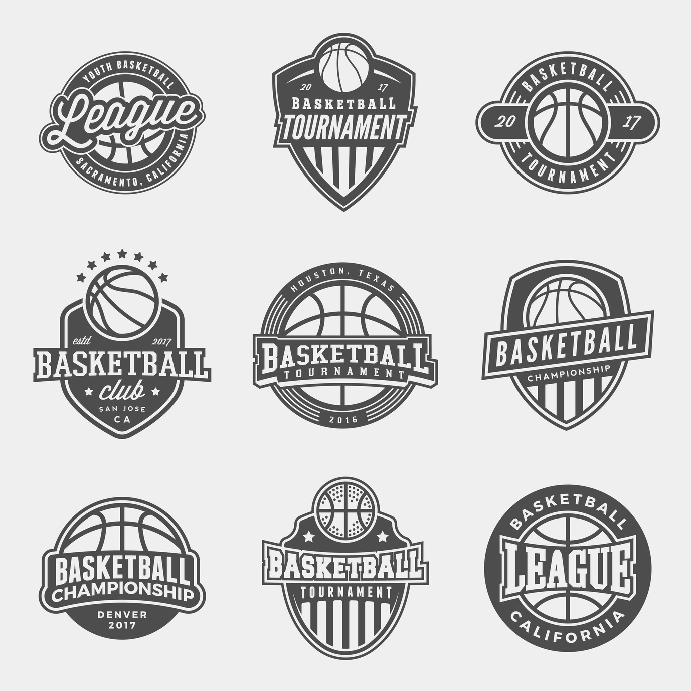
The same applies to basketball logo ideas. Why not have your brand name revolve around the ball like a planet ring? You could also design the letters to outline a ring around the ball like a circle.
Take Inspiration from Sports Brand Logo Ideas
Remember the Nike example earlier?
Research is essential for refining your logo design.
The Adidas logo is another clever logo to study. Like Nike, the logo consists of three simple diagonal lines.
Like Nike, don’t be fooled by the logo’s simplicity. Simple logos are more versatile. You can change their color, size, and material and they still communicate the same message: there’s no question those three lines represent Adidas.
Even better, the logo integrates perfectly into the product itself. Start by simply studying Adidas shoes. When you take a look at these white Adidas basketball shoes, the logos still stand out without distracting from the shoes themselves.
Keep a journal for sketching your logo ideas. You could also use a program like Photoshop for brainstorming.
Discover More Cool Sports Logo Ideas
Your new sports club and brand needs the perfect logo for launch day. These sports logo ideas are only the beginning. Start researching everything from sports teams to fashion to find the ideal fit.
Don’t forget! The blog is updated all the time with project inspiration.
How to Create a Fun Basketball Logo
Posted on October 22, 2018 by Logo Design Tips and Tricks

Have you been asked to design a basketball logo?
With basketball increasing its share in the sports market each year, it’s no surprise new teams are popping up all over the place.
As a result, older teams are looking to refresh their image.
A creative basketball logo helps a team to stand out. Not to mention, it can seriously increase merchandise sales. Here are the top tips for creating a perfect logo for your team, or for refreshing that old logo.
3 Tips for Creating a Fun Basketball Logo
1. Color
It’s key to have colors that stand out. High contrast and distinct color combinations will help the logo pop out on merchandise.
For example, if you visit this site about basketball hoop installation, you’ll see their logo uses yellow and green. The contrast of colors draws in your eye right away.
Try contrasting colors or simple black and white. The logo should also match the team’s uniforms, so it’s easily associated with them.
2. Get Inspired by the Game
Just like these classic NFL logos, you want your basketball logo to be inspired by the game itself.
Think about the classic NBA logo.
It’s a silhouette image of a player, in the dynamic movement of the game, running down the court, ball in hand. The image captures the excitement of the game — but is also clearly about basketball.
Gather inspiration from the game of basketball itself. The ball, the hoop, the players… all these elements can be used to capture the essence of the sport.
Keep in mind the icons you choose don’t need to be an exact depiction. Logos are known for being interpretive in their design. The image can be manipulated and stylized as long as it’s recognizable.
3. Think Simple
While it’s important to use imagery that speaks to the game, it’s equally important to keep it simple.
Choose one basic image and work off its premise. Don’t combine too many elements. The logo will be hard to remember and too crowded.
The most classic logos are extremely basic. Think of the golden arches, Nike swoosh, and classic Apple icon. They all have two things in common — simplicity and memorability.
Words also can be a part of the logo. But when it’s on merchandise or in the fine print, the words need to be easily read. Make sure your logo is recognizable no matter what size it is.
Many amazing logos in the NBA have the name of the team or town incorporated into them.
For example, the team logos for the Lakers, the Nicks, and the Raptors all incorporate their names into their logos.
Their logo, however, is still recognizable without the words. This is great for merchandising purposes.
Make Your Logo
You’re ready to make an awesome basketball logo. Just remember to:
- Think about color
- Get inspired by the game
- Keep it simple
If you use these three logo tips in your design, you’ll be sure to make a logo that resonates with basketball fans.
Need some more inspiration? Check out these sports logo ideas to get the ball rolling.
How To Design An Attractive Football Logo For Your Team
Posted on September 26, 2017 by Logo Design Tips and Tricks

The NFL has been in the news a lot lately, even causing people who wouldn’t consider themselves football fans to pay attention.
Football can teach you skills that will provide benefits throughout your adult life. It can help you to be more disciplined, bring you closer to your teammates, improve your fitness level, and boost your leadership skills. All of which are the basis for success in any career.
Perhaps this is why so many people want to create and join their own football teams.
To build teamwork, spread the word about your team, and just to make your weekend games a little more fun, you should design a football logo.
But what elements do you need to make it work?
Read on to find out.
A Defining Image
The most important aspect of your team’s logo?
It’s central image.
It can be tough to choose the one that’s right for you. However, think about what makes your team unique. If you’re all retirees, you could use a tongue-in-cheek image, like two crossed canes that have sharp, dagger points at the end.
Or, you can choose the image based on your town or neighborhood. Is there a statue that everyone stops to look at on your block?
What about a historic symbol or image that’s close to your team’s heart?
The sky’s the limit here.
Bold Colors
Another crucial part of your logo design?
The colors you choose to fill in your image with. In general, it’s a good idea to stick to just two or three. However, don’t be afraid to go bold!
You want your fans to be able to spot your players on the field.
Plus, choosing specific “colors” for your team also helps you to connect with your fans. Now, they know the colors they should wear on game day, or which shades they should use to paint their signs.
Need some inspiration?
Check out the NFL Matchups feature on the UltimateCapper website. This tool allows you to clearly see the chosen colors of some of the most popular teams. You’ll likely notice that when you see these shades, you instantly know which teams are playing.
Wouldn’t it be nice for your team to have that same brand recognition?
A Logo That’s Easy To Resize
Your football logo will have to go a lot of different places. Think team jerseys, signs, your social media accounts, and even on temporary tattoos fans can wear on game day!
You want to ensure that your design can fit everywhere it needs to go, without becoming muddled.
When creating your logo, make sure that you’ve selected an image that’s easy to resize.
Ready To Design Your Football Logo?
Thanks to this post, you have some great ideas to get you started on the process of designing your own football logo.
In fact, you probably have more than a few ideas floating around in your mind.
Talk to your team, vote on your favorite colors and images, and then use our free online logo maker tool to draw a few mock-ups.
Need more design tips? Check out our website and blog for more advice about how to take your logo to the next level.
Designing a Fishing Logo to Reel in Charters
Posted on September 18, 2017 by Logo Design Tips and Tricks

Charter fishing is a sport that’s fun for participants and lucrative for professionals.
This industry has approximately 50 million licensed fishers, who generate a whopping $48 billion in revenue. Anyone looking to get a slice of this pie needs to make their business stand apart from the competition.
To attract this crowd, charter companies need to create an amazing fishing logo while building a brand.
This guide teaches all about designing a logo with pizazz, in order to generate some revenue and succeed for years.
Consider these tips when hunting down that amazing logo.
Make A Fishing Logo That Is Fun And Inviting
Companies often make the mistake of getting too serious when it comes to their brand.
People want to think about fun and excitement when booking a charter fishing trip, so make sure the logo reflects that. Skip the realism and have a logo designer create something that is fun and cartoony instead.
Don’t forget the smile!
Making the fishing logo smile can be the difference between looking too serious and creating an emotional response in customers. An emotional response is crucial, because it opens the door for ongoing business.
This is especially important for charter fishing companies that cater to the vacation crowd. Companies like Dos Hermanos Charters have thrived in vacation spots like Cabo San Lucas, by bridging that gap and forging a bond with their customers.
Create Some Subtlety In The Message Sent
Avoid being “on the nose” when it comes to creating a logo.
While there’s power in simplicity, it’s important to create double entendres with the fishing logo. Making logos that mean more than one thing plays a fun little psychological game with the viewer.
Think about it. The dance and flirtation are half the battle. By enticing the customer, they’ll be intrigued to find out more about the charter fishing company.
Most importantly, this type of logo will stand out from the rest, making it easier to draw in new revenue.
Work With A Company That Is Familiar With The Fishing Industry
While there are many talented graphic designers, the true results come by getting on the same page with a company that understands fishing.
When searching for a logo design company, ask if they’ve ever done logos for other fishing businesses. Not only does this ensure they understand the nuances of logo creation, but also the intricacies of the fishing business.
Shop around for prices on a brand new logo, to stick to a strict budget.
A fresh new logo can cost anywhere between $85 and more than $300. This price depends on the experience of the logo designer and the amount of work that goes into this particular idea.
The more digging you do, the better understanding you’ll have on how much you can expect to pay for your logo.
Using these three tips will help to find a great logo designer.
The logo is a critical marketing tool, so never cut corners.
Follow these tips and request a meeting with a logo designer today.

