5 Reasons to Integrate Ketubah Designs into Your Wedding Logo
Posted on November 19, 2020 by Logo Design Tips and Tricks

Weddings are the joyous celebration of a new life together, and what better way to express your love and commitment than with ketubah designs. As the ancient document of your commitment, you may be planning to get it designed in an intricate and beautiful way.
By finding a logo maker that can create a logo reminiscent of your ketubah, you’ll have another timeless piece of art to use during your wedding and beyond.
With this in mind, read on to learn our top five reasons why you need to integrate your ketubah into your wedding logo today!
What is a Wedding Logo?
It first helps to know what a wedding logo is and why you need one. Although many of us think of logos as a way to differentiate one business from another, we can also use them as personal symbols. In the case of weddings, logos can be symbols of health and wellness or the commitment you’ve formed with your loved one.
Although logo is a modern word, they’re similar to the coats of arms used centuries ago as a symbol of a family’s proud heritage. In the Victorian era, the wealthy and middle-class had elaborate personal monograms to mark letters and their possessions.
Ketubah Designs for Your Logo
The hardest part about logos is agreeing on a design that you both love. However, if you have a ketubah for your wedding with an intricate, beautiful design that you love, you can use the ketubah designs for your logo as well! Here are a few reasons why:
1. Cohesiveness
When it comes to designing your perfect wedding, creating a cohesive design and color palette is harder than it seems. However, if you’ve had your ketubah designed recently and are in love with its colors and design, you can use it as inspiration!
Choose a few of your favorite colors and use them throughout your wedding. If there are design elements that you enjoy such as trees and birds, you can use these as well.
A logo that looks similar to your ketubah will help your wedding look even more cohesive and united.
2. Beautiful Stationery
Designing wedding invitations, reminders, and programs can be just as hard as the wedding reception itself. However, a logo that’s designed with elements from your ketubah can cut down your workload significantly. A simple logo on the front of your cards can look elegant, minimalistic, and chic.
A logo with your ketubah design on your wedding program can also look beautiful and tasteful.
3. Timeless
Many people shy away from logos because there’s the chance that they might appear tacky or that the wedding is branded. You don’t want your wedding to appear like a networking event! You can blame this on poorly designed logos.
These logos often don’t match the couple’s personality. Logos made from a template may have been used by hundreds of other couples and don’t have any unique features.
A custom logo designed with your ketubah in mind is a timeless reminder of your love for one another.
4. Variety of Uses
One of the best parts of a ketubah logo is that you can use it throughout your wedding. You can offer temporary tattoos of your wedding logo as a fun activity during the reception. You can shine a spotlight on the dance floor with the logo. You can even design party favors featuring your wedding logo.
Your wedding logo can be added to your wedding cake as a topper or as an intricate design directly on the cake itself. Even better, you can even hand out coffee cups, wine bottles, or beer bottles with the log featured.
There are a variety of options that make the design and cohesiveness of your wedding easier.
5. After the Wedding
Last but not least, you’ll be able to use your logo well after the wedding is over. During holidays, you’ll be able to use it on holiday cards. Some couples may opt to have pillow covers made that feature your logo, or you can create a minimalistic piece of artwork that hangs next to the ketubah.
If you want to be more subtle with your logo, you can use it to create beautiful necklaces. Couples can also request that their wedding photographs use the logo on the front cover if they’re purchasing a custom-made wedding album.
Where to Find a Wedding Logo Maker
Designers who created your ketubah design may be able to make you a logo that matches as well. However, if you’re on a tight budget, you can use a logo maker online as well. It’s important to be aware that it can take time to create a logo that you love, especially if you don’t have design experience.
However, if you follow a few tenets of logo design as well as have a variety of inspirational logos saved on your phone or computer, it’s possible to get the look you desire!
A Beautifully Designed Wedding
Prepping for your wedding is no small task, especially if you have no idea where to start. However, by incorporating ketubah designs into your logos and the rest of your wedding, you’ll find that you can easily create a cohesive and timeless looking wedding that you both love.
Even better, find a logo maker that can design your logo based on your ketubah design. This is a great way to enhance your options as well as have a timeless piece of art that you can enjoy.
Ready for more logo tips? Keep reading our blog for more informative articles!
6 Tips for Designing an Escape Room Logo
Posted on November 08, 2017 by Logo Design Tips and Tricks

The popularity of escape rooms is exploding nationwide.
Escape rooms combine the rush of adrenaline from a ticking clock with the patience and brain power of finding clues and solving puzzles. It’s great fun for families, friends, and even groups of co-workers.
As interest in escape rooms grow, more of these adventure companies are popping up across the US.
For entrepreneurs and business owners looking to capitalize on the craze, one of the first marketing tasks for escape rooms is designing a great logo.
So how do you make a memorable escape room logo? Read on for 6 design tips.
Match Your Industry
To start designing your escape room logo, you first need to consider your industry.
Your logo should tell people things about your company. Ideally, people should be able to figure out your logo is for an escape room without needing to see the words “Escape Room” directly included.
Trying to match your logo to your industry should give you a good base to build on.
It might be helpful to scan your environment for inspiration. Take a look at logos used by other escape room companies.
Odds are you’ll discover certain trends and design motifs that span throughout your industry.
These trends can manifest in a number of forms:
Logo Types
Logos generally break down into three different types:
- Wordmarks
- Icons
- Combination
Wordmarks are stylized versions of the written-out company name. The most well-known wordmark is Google.
Icons are pictures or symbols used to represent a company. Apple, McDonald’s, and Target are among the many large corporations that use icons.
Combination marks combine an icon with a wordmark. Walmart and Taco Bell are great examples.
Depending on your industry, a type of logo may be more common. For example, law firms typically have a wordmark or combination mark due to the importance of the names of the lawyers.
Escape rooms are a relatively new and niche type of business. A logo or a wordmark might not say enough on their own, so a combination mark like the one used at http://www.goescapeartist.com might be a good choice.
Typography
The typography used in logos and signage depends significantly on your industry.
Different industries tend to have a certain outward vibe and ideal perception.
Law firms, government organizations, and other suit-and-tie businesses usually use a classic serif font to present a sense of formality and professionalism.
Sports teams, car companies, and tattoo parlors may prefer to use bolder, sharper fonts to show aggressiveness.
Organizations involving children or animals might have more happy, whimsical lettering.
Escape rooms are for people seeking thrills and adventure. An appropriate typeface might be something bold and sans-serif, and perhaps in all-caps.
Symbols
Symbols or objects related to an industry may appear in logos.
Rela estate companies usually include a house or building in their logo. Law firms may use a gavel or scales to represent the legal system.
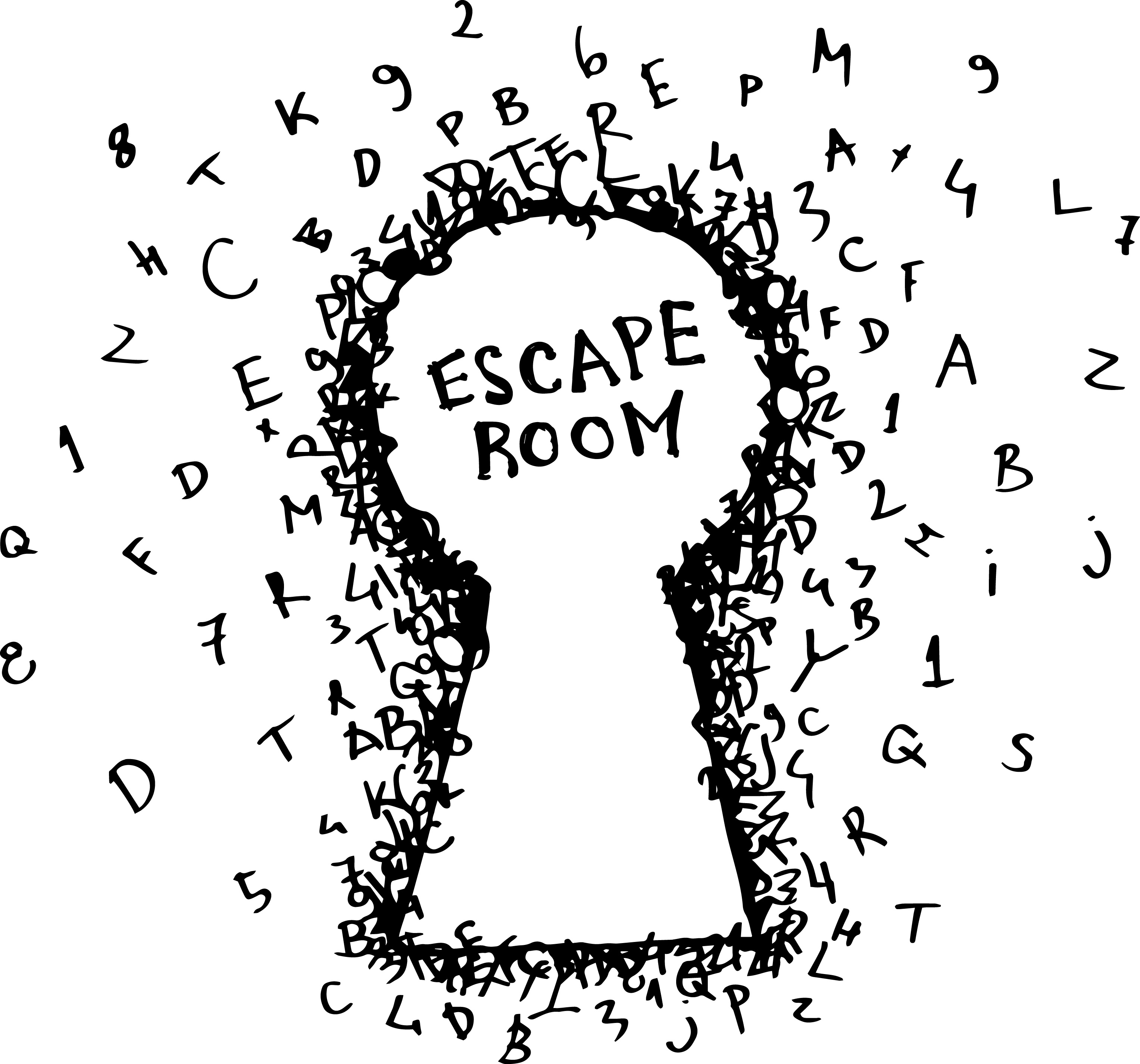
For an escape room, symbols such as a lock, a key, or a door may be appropriate symbols to include in a logo.
Match Your Personality
Once you build a logo foundation around your industry, you can start to add your own twists to make it fit the personality of your individual escape room.
What is the theme of your escape room?
Some escape rooms involve aliens, or pirates, or cowboys. Some are based on American history. Some are for adults, and others are for children.
If there’s a special theme to your escape room, try to represent that in your logo.
Another way to personalize your logo is to represent your location. Escape rooms in Florida or California may use palm trees, the sun, and water in their logos. A room in Colorado might use mountains or snowboarders in their designs.
Use Colors Effectively
Part of personalizing your logo relies upon your use of color.
While not an exact science, the psychology of color is a popular area of study for marketers and psychologists.
Red portrays excitement. Blue evokes feelings of trust. Green indicates health and freshness.
Color is more about what looks cool on a design. It’s about what subconscious emotions you want to tap into.
Take some time to research color and find out how you can most effectively use it.
Stand the Test of Time
A logo should be timeless.
Ideally, your logo today should work as your logo in 40 years.
It’s not smart to constantly change or update your escape room logo every few years. A lack of continuity is like pulling up the roots of a young tree — it will never grow.
And if your brand is lucky enough to become popular, changing your logo could lead to a major backlash from your fans.
Avoid the need to change your logo frequently by staying away from “trendy” design ideas that will only be in style for a limited amount of time.
Put in the time and effort to create a high-quality timeless logo the first time. It will save you from more pain down the road.
Scalability and Versatility
You will use your logo in many ways. Keep that in mind when designing it.
Here’s just a small list of ways you might use your logo:
- Websites and social media
- Printed documents
- Store signage
- Billboards
- Small trinkets like pens and buttons
- Clothing (including screen printing and sewn patches)
Design your logo to be scalable, both to small and massive sizes.
A highly detailed logo may look great in some situations, but the detail will be lost or muddied on small scales.
Your escape room logo should be versatile and usable for any purpose without losing any of its elements.
Back it Up
A logo’s purpose is to make your company recognizable. It represents who you are and what you do.
The key word there is “represents.” A logo isn’t actually who you are and what you do.
Your escape room logo could be the most aesthetically pleasing and iconic logo in the country. But that would mean nothing if your company was poorly run or had bad service.
A logo is your most powerful marketing tool, but it isn’t the only piece to your puzzle. Make sure that your logo is representing a great company.
Create Your Escape Room Logo
Armed with this knowledge, it’s time to start designing your escape room logo.
Online Logo Maker gives you great design tips plus the digital tools to create your own logo for free. Start building your brand today!
What Etsy Can Teach You About Wedding Logo Design
Posted on October 05, 2017 by Logo Design Tips and Tricks

Every spring, fresh editions of magazines flood the shelves. They feature gorgeous new ideas for wedding inspiration for brides-to-be.
As you pour through those glossy pages you will find articles on everything. It can range from the proper way to set a table, to ideas for wedding logo design.
Having a well-themed wedding is the central focus for these magazines and the goal of every new bride.
But what does it take to create one of the stunning images you see gracing dancefloors and envelopes? How can you create a professional looking logo for your own wedding? Continue reading to find out.
Using a Wedding Logo Design
From the moment your guests walk into your wedding venue you will need to give them information about things like where to go and what the seating arrangements are.
Creating a custom sign to place outside the venue is a great way to give your guests information they need about the event.
Some venues host multiple weddings on the same day and giving your guests this extra hint will make sure everyone finds everything they need. By including your logo you are ensuring that they know they are going to the right place.
Wedding Attire
You might be surprised to find that there are multiple opportunities for you to feature your wedding logo design in your outfit.
In fact, some innovative brides have even begun to create personalized jewelry featuring their logo.
Other brides have chosen to embroider their veils and handkerchiefs. If that is still a little too obvious for you then embroidering your wedding logo design in blue on the inside of your dress is a beautiful option. For many women this makes their dress feel truly unique.
Dining
The most obvious place to use your image is on the paper products you use for the day of the event. From cocktail napkins to menus, there will be plenty of opportunities for you to feature your beautiful design.
Accent plates could also be purchased that feature your chosen design. You can use it to trademark your party favors, adorn your wedding cake with it, or simply use it to embroider the tablecloths.
Some women have even used it on glass jars from sandsationalsparkle.com. Sand ceremonies are popular and work for any wedding. This personal touch really takes it to the next level.
The Importance of Consistency
After you have chosen to design a logo for your wedding, you will want to head over to Etsy to get some inspiration. Once you have scanned many of the options there, you will have a better idea of what you want yours to look like.
You will see design ideas for different fonts and sizes that can shape the most basic outline of what you want to make. The angle of every item in your logo is very important. By changing it you will change the way the eye moves over it and this has a significant impact on perception.
If you are ready to begin creating today, try this online logo maker. It has some really great and easy-to-use features that will allow you to create a custom design that will leave all your guests dazzled.
How to Design an Inviting Nightclub Logo
Posted on October 03, 2017 by Logo Design Tips and Tricks

Why is the logo you choose for your business so important? It’s the same reason why your business name is important.
If you can make it memorable, it will make your brand easier to stick in the minds of your audience. And that’s the top priority of marketing – to make consumers think of your company when they need your product or service.
As for your logo, its sole purpose is to help consumers identify your company and its products. If you own a nightclub, then you know how brightly lit signs and logos can attract party goers.
But the question here is how should you design your nightclub logo?
Well, let’s review a few tips to help you along.
Brainstorming Your Nightclub Logo Design
What’s great about logos is that you can place them anywhere. Once you design one, you can use it for your pens, magnets, business cards, fliers, t-shirts, signs and other marketing collateral.
This also means you need to give a lot of thought to your nightclub logo design. After all, you don’t want to have to rebrand your business with a new logo down the road, especially if you’ve already gained some recognition.
So as you’re planning out your logo, consider the niche area of your nightclub, the customers you want to attract and location of the club.
For instance, if you’re a high-end restaurant bar with rich clientele, you could go with a logo that’s classy. Then if it’s in a prestigious neighborhood or an urban area, the logo would vary greatly.
Keep your customers in mind; what’s acceptable to one group may not be acceptable to another. For instance, a lasso and horse may be attractive in urban Texas communities, but wouldn’t fly in a prestigious neighborhood.
Selecting the Colors and Font
If you haven’t done so already, you should read into the psychology of colors and even font styles. The type of letters and colors you choose play a big role in the branding of your company.
For instance, you may want to go with bold colors for a nightclub that has pizzazz. Red and gold are great options in this case. For instance, you may find this being used to promote the Scandal Guestlist.
Or if you want to get people excited about your new nightclub, you can use varying textures in your logo. This will make it interesting and hopefully intrigue folks to check out your club.
Other than going with flashy logos, you can opt for something that’s dignified and strong. This is ideal for brands that have a more serious tone and atmosphere.
DIY Logo Design
Now, it’s time to decide how you’re going to create your nightclub logo. If you know exactly what you want, you don’t need to hire someone to design it for you.
All you need is the right software to create it yourself. The DIY route is popular these days, thanks to tools like Onlinelogomaker.com.
This is a quick and easy-to-use online software made specifically for designing logos. If you’re trying to redesign or design a new logo for your nightclub, then check out Onlinelogomaker.com today.
