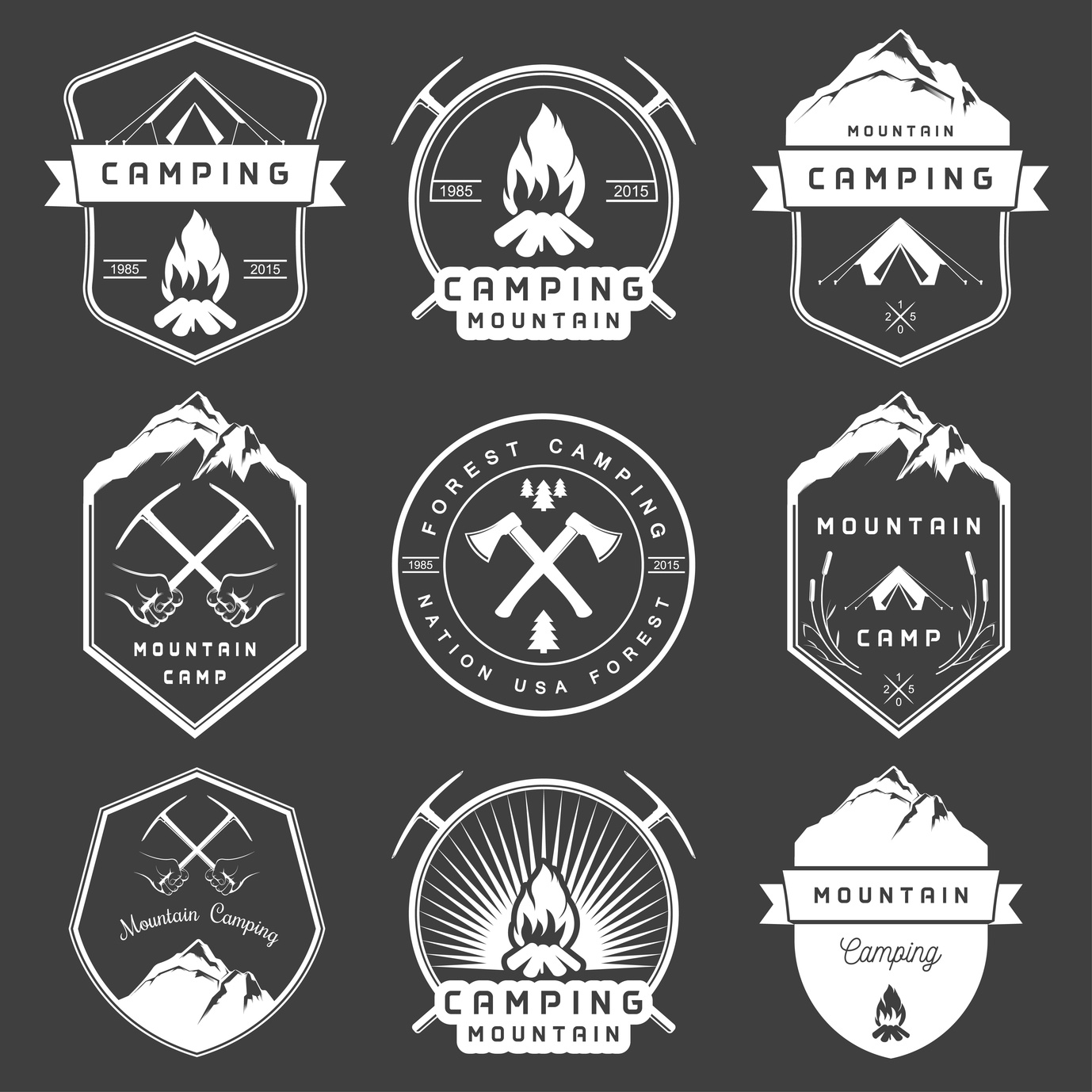
5 Smart Logo Design Tips for Camping Supplies Companies
Posted on October 08, 2017 by Logo Design Tips and Tricks

In designing a logo for a camping supply company, it is important to use SMART logo design tips to make the process easier.
What does the acronym “SMART” stand for?
Simple, Memorable, Appropriate, Resizable, and Timeless.
These rules are the perfect guidelines for how to create a quality logo for a camping or outdoor supply company. Keeping things “SMART” provides a way to double check a logo once it is finished.
Read on to learn tips based on this easy logo lingo.
1. Keep it Simple
Simplicity is key in developing a logo and increasing brand recognition.
Simpler logos are easier for consumers to recognize. It’s difficult to convey any clear message through a complicated logo.
Think of some of the most familiar logos that we are see daily: Apple, Starbucks, and McDonald’s. One of the key components of these logos is that they are all straightforward and clean.
Adopt a “less is more” mentality in designing a logo.
2. Make it Resizable
There is no telling where your logo will end up. Promotional materials could range from small pens and t-shirts to stickers and large posters.
This means that it’s important to design a logo in vector format. This ensures that it can be resized to fit anything perfectly, without loss of picture quality.
3. Ensure it’s Memorable
Human attention spans today are comparable to that of goldfish.
Most of that information we process will never be remembered. When it comes to smart logo design, simplicity helps with a person’s memory. Other factors could include color, icons, or font.
Think about the design, and consider the different shapes and colors that will be used.
Frame it for the audience of outdoor-friendly people. Don’t overestimate the attention span or memory of individuals.
4. Consider if it’s Appropriate
Your target demographic should be on the forefront of your mind during the design process.
A simple swap of logos from different brands can convey an entirely new message to the consumers.
You don’t want the logo to be too fancy for the audience that loves the sun and the dirt of the outdoors. You want the brand’s message to come through.
Think about what they like, and try to encapsulate their interests into the style of your logo.
5. Keep it Timeless
The last thing you want is to create a smart logo design that doesn’t stand the test of time.
Memorable logos change little as decades pass. Don’t design something that is “trendy.” Instead, make something that is going to stay relevant and on-brand for many years to come.
Keep it unique to your brand, and never worry too much about what others are designing.
Smart Logo Design for Camping Supply Companies
One example of a camping supply company with an excellent logo is everstryke pro.
It is simple, timeless, appropriate, resizable, and memorable. It also promotes the brand of everstryke firestarter well.
All and all, the is no one system of designing a logo, and that is the beauty of creativity.
The best thing to do in the design process is to consider all the points you would like to accomplish with the design through this basic SMART outline.
Ready To Get Started?
If you need help creating your camping logo, feel free to check out our free logo maker. Or, you can choose from one of our hundreds of templates.
What’s your favorite method to creating the best logos? Let us know in the comments below.
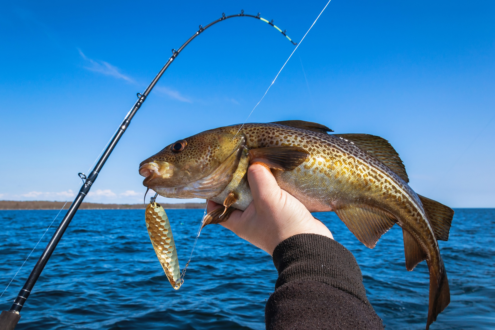
Designing a Fishing Logo to Reel in Charters
Posted on September 18, 2017 by Logo Design Tips and Tricks

Charter fishing is a sport that’s fun for participants and lucrative for professionals.
This industry has approximately 50 million licensed fishers, who generate a whopping $48 billion in revenue. Anyone looking to get a slice of this pie needs to make their business stand apart from the competition.
To attract this crowd, charter companies need to create an amazing fishing logo while building a brand.
This guide teaches all about designing a logo with pizazz, in order to generate some revenue and succeed for years.
Consider these tips when hunting down that amazing logo.
Make A Fishing Logo That Is Fun And Inviting
Companies often make the mistake of getting too serious when it comes to their brand.
People want to think about fun and excitement when booking a charter fishing trip, so make sure the logo reflects that. Skip the realism and have a logo designer create something that is fun and cartoony instead.
Don’t forget the smile!
Making the fishing logo smile can be the difference between looking too serious and creating an emotional response in customers. An emotional response is crucial, because it opens the door for ongoing business.
This is especially important for charter fishing companies that cater to the vacation crowd. Companies like Dos Hermanos Charters have thrived in vacation spots like Cabo San Lucas, by bridging that gap and forging a bond with their customers.
Create Some Subtlety In The Message Sent
Avoid being “on the nose” when it comes to creating a logo.
While there’s power in simplicity, it’s important to create double entendres with the fishing logo. Making logos that mean more than one thing plays a fun little psychological game with the viewer.
Think about it. The dance and flirtation are half the battle. By enticing the customer, they’ll be intrigued to find out more about the charter fishing company.
Most importantly, this type of logo will stand out from the rest, making it easier to draw in new revenue.
Work With A Company That Is Familiar With The Fishing Industry
While there are many talented graphic designers, the true results come by getting on the same page with a company that understands fishing.
When searching for a logo design company, ask if they’ve ever done logos for other fishing businesses. Not only does this ensure they understand the nuances of logo creation, but also the intricacies of the fishing business.
Shop around for prices on a brand new logo, to stick to a strict budget.
A fresh new logo can cost anywhere between $85 and more than $300. This price depends on the experience of the logo designer and the amount of work that goes into this particular idea.
The more digging you do, the better understanding you’ll have on how much you can expect to pay for your logo.
Using these three tips will help to find a great logo designer.
The logo is a critical marketing tool, so never cut corners.
Follow these tips and request a meeting with a logo designer today.
5 Outdoor Branding Tips for Your Hiking Logo Design
Posted on July 11, 2017 by Logo Design Tips and Tricks

Whether it’s summer or winter, there will always be dedicated hikers. They’ll pack their bags and head to some faraway place with their favorite gear in tow.
But what makes this gear their favorite gear? Is it the quality? The price?
While quality and price are certainly important to buyers, sometimes selecting favorite gear comes down to simple branding strategies. One of the simplest of these strategies revolves around logo design.
So what are some branding tips for companies that wish to design an effective hiking logo design? Continue reading to find out.
What’s in a Name?
A company that sells outdoor gear surely needs a name that appeals to hiking fanatics. And why does this name matter when it comes to logo design?
Well, to put things simply, a business’s name sometimes ends up being very present in its logo design. As a matter of fact, sometimes a name is a central part of a logo.
That said, if a business is going to use its name in its logo, it should hope that its name includes words such as “path,” “mountain,” or “quest.” Furthermore, it should do some research to avoid making some common mistakes.
Animals and Scenery
Nothing says a company sells outdoor gear like the mountain lion or bear in that company’s logo. There is something about animals that just epitomizes the great outdoors.
As a result, if a company can get away with slapping an animal in its design, perhaps that business should go for it. This goes for hunting logos as well as hiking logos.
Modernizing Logos
Some businesses have been around for more than a few years. A few of these businesses eventually decide to upgrade their logos by modernizing them.
This move definitely isn’t a mistake. Businesses should definitely try to ride the wave as certain designs overtake others in popularity. Of course, these businesses shouldn’t eliminate any identifying features from their logos.
Color Scheme
Every logo design, be it a hiking logo design or a beauty logo design, needs an appropriate color scheme. Those in the hiking industry have a few options available to them.
Earthy colors such as brown and green are obvious choices for some companies. Blue might also work for companies that cater to those who hike near bodies of water.
A company could even go with choosing a color based on a different type of messaging. Red, for instance, exudes passion and might work well for some businesses.
Location, Location, Location
Where a company is located (or the demographic it wants to market to) can determine a lot about its logo. A company, for example, located near Mount Kilimanjaro might create a logo which features someone climbing Kilimanjaro.
There are all sorts of fun ways to incorporate location into logo design, so companies shouldn’t shy away from it.
Fine-Tune Your Hiking Logo Design
Hiking season is still going strong, so businesses shouldn’t waste any time fine-tuning their hiking logo designs. The time is just right to make a great impression on hikers who are ready to hit the trails.
If you need a little extra help with designing your logo, get in touch with us. We live and breathe logos, so we’d be happy to help.
Green Means Grow: Create the Ideal Lawn Care and Landscaping Logo
Posted on July 05, 2017 by Logo Design Tips and Tricks

No matter what type of business you run or brand you own, a quality eye-catching logo is important.
When it comes to landscaping and lawn care companies, a logo has to really reflect the products, services, and niche of that company.
Are you ready to make the best landscaping logo for your business? Check out our handy guide to creating lawn care logos below!
Create the Ideal Lawn Care and Landscaping Logo
Whether you sell weed eater products or provide amazing landscaping services, your logo needs to reflect who you are.
Keep it green– but don’t make it boring
The color green is heavily associated with nature, lawns, and landscaping. You should definitely incorporate the color green into your logo, but overdoing it can make your logo (and your business) disappear into crowds of another run of the mill landscaping companies.
Try using green variations that are typically seen, like dark forest green or lime green. Use it sparingly and be sure to use color theory to really make those colors pop. Most quality online logo makers will offer wide ranges of colors to use in your logo art.
Check your focus
What is your business’s main focus? Do you provide landscaping services? Do you sell nursery plants?
Really zone in on what it is you do. If you commit to providing multiple services and goods, look at your most successful or most consistent service. Base your logo around that.
Choose imagery that fits your brand
This is common sense for the most part. If you sell pine trees, don’t look for a stock image from an online logo maker that features flowers or oak trees.
The images used in your logo should be specific. You provide a niche service, so show it off in your logo!
Find a happy medium with detail
Landscaping companies will more than likely use their logos in large formats for their trucks, billboards, or offices. Since you don’t have to worry too much about small-scale design, in this case, you can get pretty detailed with your logos.
However, there is such a thing as too much detail. Logos should still be relatively simple, eye-catching, and easy to read. You don’t need to incorporate a full photo of a landscape into your logo.
If anything, a landscaping logo with vector art or simple illustrations work best.
Avoid cliches
Landscaping logos, in particular, can fall victim to cliches. Does your design in mind feature a big green globe? How about a simple tree?
These are cliches in the logo world. As a general rule, a basic symbol of what your business is shouldn’t be the entire logo. A cupcake bakery shouldn’t just boast a big pink cupcake for its logo, and neither should a landscaping company show off a big basic green tree.
Get creative! You’re making a piece of commercial art for your business. Incorporate nature elements that apply to your niche, but don’t oversimplify it or get lazy with thinking outside the box.
How was our guide to landscaping logos? Got a logo you’re proud of that you’d like to share? Show it off in the comments below!


