5 Attorney Logo Designs to Make Your Firm Look Polished
Posted on August 09, 2017 by Logo Design Tips and Tricks

According to the American Bar Association, there are over 1.3 million active lawyers across the nation.
Each law firm needs to have a special logo design that is clean yet refreshingly new.
These are 5 different attorney logo designs that you need to consider for your own firm.
1. Attorney Logo Designs With Your Neighborhood In Mind
To attract local business, you need to have an appealing logo that is easily recognizable in your city. For example, if your firm is based in Florida, you should show off your hometown with a bright orange or an alligator as the main image. If your law firm is located in New York City, then choosing an apple or a city skyline would be best.
Pick an image that represents your hometown to draw in a local feeling of establishing yourself as a trustworthy law firm.
2. Keep The Images Simple
When it comes to colors, images, and lines in your attorney logo design-it’s best to keep things simple.
No, this doesn’t mean stick to the same overused fonts. Try researching to find a new font that can be specific to your law firm. Your logo is your firm’s branding and it needs to be clean and easy to read. Keeping things simple will make sure your clients will remember your law firm for years to come.
3. Focus on the Meaning of Color
Color psychology plays a role in choosing the right colors for branding purposes. Certain colors will evoke happiness while others show danger to the human brain. You need to know the power of color when deciding how to design your firm’s attorney logo.
Most people make decisions based on the visuals that they see. Your clients need to identify with your firm’s logo on an emotional level. If you want to have a logo that matches the level of work that is produced at your firm, then develop a high-quality logo to represent it. If you have someone who needs a personal injury lawyer, he or she will look at different logos to feel out the right choice.
Colors are important features to any logo. Think about the yellow arches that McDonald’s famously prides itself for. Take your logo to the top of the attorney logo design charts by including colors like blue, which can represent security and order, or yellow which can represent happiness.
4. Use Law Symbols
Besides lawyers themselves, most average people know a few symbols that tell them about the law. These symbols will strike interest in potential clients. Choosing the right images for your firm’s logo is key to boosting clientele.
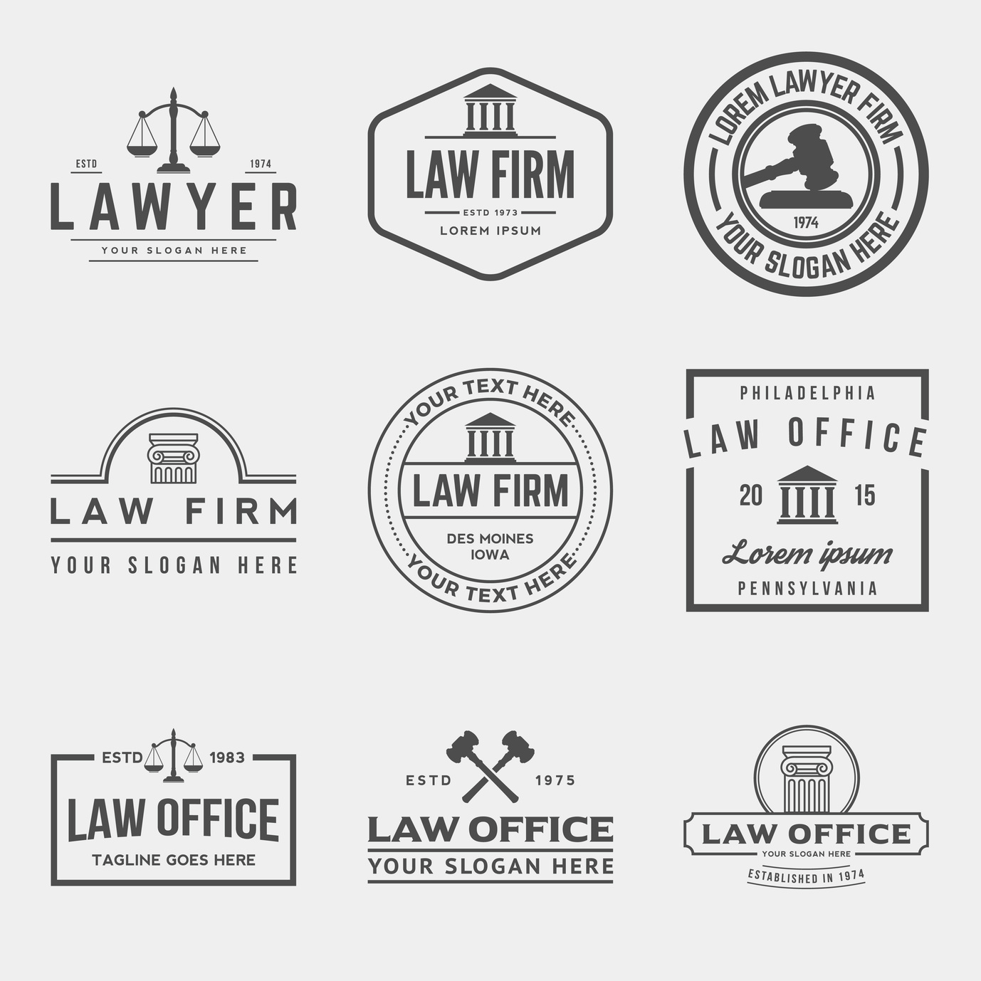
Images that come to mind when we think of the law are the scales of justice or a gavel. By taking these simple images and adding them to your logo design, you will guarantee a response from the public because the images help recognize your law firm.
5. The Power of Contemporary Fonts
Whether you focus on the images included on your logo or just stick to a bold font, make sure the text leaves a lasting impression. Fonts can be just as helpful as images can in logo design. Our free online logo maker includes dozens of cool fonts to choose from. Research what other law firms are using for their logo fonts to see what looks good.
Bringing It All Together
At Online Logo Maker, we specialize in all things logo related. Please feel free to contact us if you need assistance in creating your own law firm logo design today. Check out our helpful blog for even more information on quality design tips.
Is Your Asbestos Law Firm Lacking the Logo it Needs?
Posted on August 08, 2017 by Logo Design Tips and Tricks

Asbestos is a problem that many law firms have chosen to tackle. Because of this, they need to be able to market themselves in a unique way.
The more asbestos law firms, there are, the harder it can be to stand out. A unique logo can solve this issue, as it enables law firms to stick in the minds of potential clients.
Here are some signs that your logo just isn’t cutting it:
Your Colors Don’t Represent Your Service
Color is an understated part of creating a logo. It is possible that your utilization of colors in your logo that misrepresent the services that you provide.
For example, brighter colors usually indicate a company whose services are jovial or revolve around happiness and entertainment in some way. These colors should not be present in your law firm logo.
Asbestos in homes is a serious problem that has caused the deaths of many people over the years. You want the colors in your logo to reassure your clients of your professionalism. Subdued colors can accomplish this.
Your Font Choice is Not Appropriate
Along with colors, your font choice should accurately communicate the importance of your service to your clients. If your font is too bubbly, you may not be taken seriously as a law firm.
Decide on a font that is regal and understated, without being boring. Having someone design a new font for you is often a better option than choosing a default font.
It’s Too Complex
All a logo needs to do is spread your message. That’s it. A law firm does not necessarily need a logo that is flashy, especially when dealing with something as serious as asbestos.
A simple, contemporary logo is all you need to communicate your brand and instill trust in your clients. They are looking to you to potentially end some of their hardship.
You should show them that you are serious and that you will be able to handle the responsibility. A complex logo can distract clients from the main service that you provide.
You can still utilize a simple logo that is unique enough to stand apart from your competitors. Do some competitive analysis and check out what other asbestos law firms are doing.
Bringing It All Together
It is likely that the best logos you come across are subtle, yet memorable. This is a balance that is hard to strike, but it can pay off big in the long run.
Employing an online service to help guide you through the logo design process can be very valuable, because they may be able to provide you with the insight and professional talent that it takes to design a logo like those of your competitors.
An effective logo is the best way to market yourself as an asbestos law firm. It can let your clients know that you provide a professional service that will be able to get them the compensation that they deserve.
Do you need help designing a logo for your asbestos law firm? Please contact us to start the process!
4 Elements to Include in an Attorney Logo Design
Posted on July 25, 2017 by Logo Design Tips and Tricks

So you’ve set up your practice after having years of experience in the field. Now how do you market yourself to a potential client base?
It starts with an effective attorney logo design. A logo is an image that they will come to identify with your service.
These are some elements that you should absolutely include in your attorney logo design:
Colors that Reflect Your Personality
Colors are a very important part of logo designing. You should select colors that match the personality of your business. How do you want to be represented?
If you want to have the reputation as a company with a serious tone, you should use simple colors, like white, black, or brown in your logo.
If you want your company to be represented more playfully to your clients, choose brighter colors like red, blue, green, or yellow.
An Accessible Font
Choosing the right font can be difficult, as it can be hard to decide on a font from a long list that all look very similar to each other.
If you choose the wrong font, it can actually hurt your brand’s reputation with your potential clients.
You should choose a font that is current but make sure it will stay relevant for as long as possible. It should also be relatively unique, but somewhat familiar to a wide audience.
A Design that Communicates Your Brand
It’s important to make sure that the design you decide on communicates your brand effectively.
A design that communicates trust and understanding is a good option for a law firm. As far as what your specific design is, there isn’t really a right answer.
What kind of law firm do you want to be? Who are your potential clients? What is your message? These are all important questions that will factor into the design you ultimately choose.
Whether you practice criminal defense, patent law, corporate law, intellectual property law, or provide cannabis legal advice, you need to find a way to connect with your customers.
The Key to Any Attorney Logo Design: Creative Thinking!
Be creative. Sometimes, the first logo you think of is not the best option. If you are advertising attorney services, you might be thinking of including the graphic of a judge’s gavel in your logo.
But think of your audience. Will this choice be beneficial for your business?
Remember, some of the most successful businesses in history have had logos and advertising campaigns work for them even if they have nothing to do with the actual product.
For example, what do horses have to do with beer? Think outside the box and try to develop a logo that addresses the desires of your client base while engaging with their intelligence.
Deciding on a logo for your legal practice is not an easy task to undertake. There are many things to consider, including whether or not your logo is ethical.
Do you want to continue the discussion, or do you have any questions about your attorney logo design? Please leave a comment below!
Top 5 Law Firm Logos
Posted on July 18, 2017 by Logo Design Tips and Tricks

Your logo can be the first and last thing a prospective customer sees of your company.
As part of your branding, your logo should speak of the authority and expertise your injury and disability law firm has to offer.
Need some inspiration? Check out these five law firm logos from real firms around the country.
5. Ozarks Family Law
Although not an injury or disability firm, Ozarks Family Law’s logo is worth emulating. It’s stark with its white background and plain black tree. The white owl in the tree is a nice touch, too.
The background, with its scales, is a little busy, so maybe skip that element in your own logo design. It’s hard to tell what you’re even looking at. You have to look beyond the main logo to see the scales, which takes away from the logo’s efficiency.
This logo creates a sense of authority and justice with its legal imagery.
4. Eltringham Law Group P.A.
The Eltringham Law Group P.A. logo also promotes a strong sense of justice.
Unlike Ozarks Family Law, Eltringham has its firm’s tagline right in the logo: “guiding your path to health and justice.”
This tells you what this firm is about upfront. You don’t have to guess if they can serve you. It appears their clientele are those who suffered personal injuries, workplace injuries, or auto accident injuries.
The black background, which is a law office, is not designed to capture attention. Instead, the center white logo draws the eye first, as it should.
3. Thrive Workplace Consulting & Legal
The logo for Thrive Workplace Consulting & Legal is probably the simplest we’ve covered so far.
There’s not necessarily anything wrong with simplicity. In this case, a plain white background lets the colorful Thrive logo shine. Since the logo includes the full name of the company and a brief tagline (“creative solutions”), the background should not claim visual attention.
Your logo shouldn’t be sterile and cold, though. If a client needs a construction accident lawyer, a personal injury lawyer, or any other type of injury and disability lawyer, they need to know who to call. Your logo can convey that.
2. El Toro Personal Injury Law Firm
Another simple logo to consider is from El Toro Personal Injury Law Firm. Again, the service is in the name. This law firm obviously deals with personal injury cases.
That means there’s no need to use imagery to showcase that. Instead, the company chose a visually catchy logo of a bull.
This represents the name of the company, yes, but it goes deeper than that. Bulls take charge. Having a bull for a logo suggests that these personal injury attorneys will take charge for their clients.
1. Our Top Pick for Law Firm Logos? InjuryLegal
Our favorite of these five logos is the one for law firm InjuryLegal.
Like many of the logos we’ve showcased, it features a plain white background. In the center is a man holding up two scales that measure equally. Underneath that is the company name.
Why is this so effective? It’s all about the imagery.
The man, who’s on a crutch, is holding his hand up. It looks like he’s proclaiming victory. The scales, which are of the same weight, suggests the man got the justice he deserved.
Want to design your own logo for your personal injury or disability law firm? Check out Online Logo Maker. You can register for free today to start making stunning law firm logos.


