5 Tips to Spruce Up Your Carpet Cleaning Logo
Posted on September 18, 2017 by Logo Design Tips and Tricks

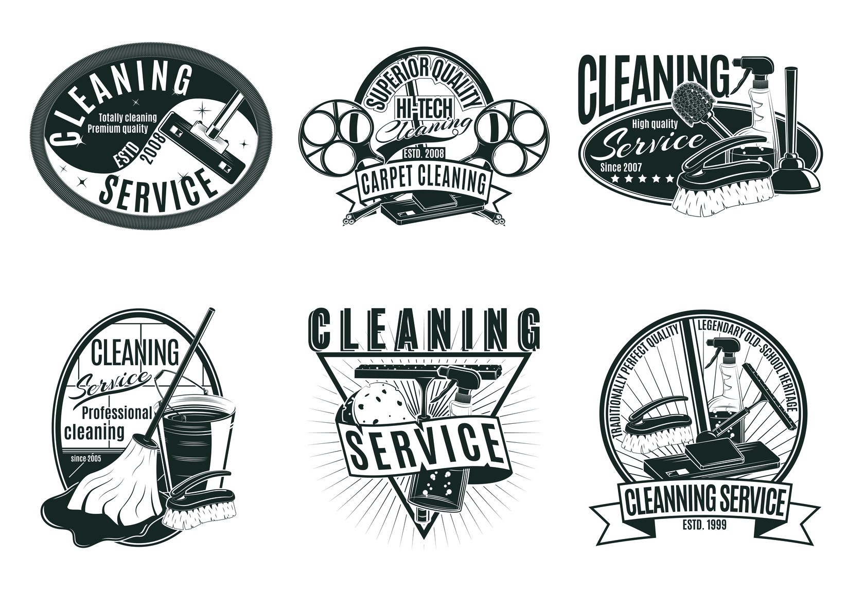
If you’re in the carpet cleaning business, you’re going to want a sharp, clean logo that reflects your superior service.
But coming up with a perfect logo is often harder than you’d think. You’re going to need a bit of help to make the most of your logo making service.
Read on for some quick tips on how you can spruce up your carpet cleaning logo.
5 Tips to Spruce Up Your Carpet Cleaning Logo
1. Think About Color
First, your logo needs to be something that you personally identify with as a business owner. It needs to be something that you take pride in. Something that you’re happy to show off and that you feel really represents your business.
Incorporate a bit of your company’s personality within your carpet cleaning logo. First, you’ll want to come up with colors. Generally speaking, cleaning companies tend to use warmer colors.
Typically, baby blues, oranges, and reds are amongst the most popular. Research shows that color can be hugely influential. Each color brings about a unique emotional effect.
2. Look at Your Competition
It’s a great idea to keep track of the competition. Look at their logo and pay close attention.
What types of colors are they using? If your colors are too similar, you run the risk of confusing customers.
A little similarity isn’t a huge issue. But your logo needs to be different enough that your customer base can clearly tell you apart from the competition.
3. Out With the Old, in With the New
If you’ve already got a logo, you don’t have to scrap all elements of your previous design. Not only can this cut costs, but it can help avoid customer confusion. Changing too much, too fast is a bit of a shock to customers.
There may be aspects of your logo that your audience identifies with, be it a color or image.
Consider how your current logo can be altered. Think about changing specific elements of it instead of changing it entirely.
4. Get Minimal
One of the more popular trends to hit the graphic design market is minimalism. Tons of companies are ditching expensive, convoluted logos in favor of something more simple.
Apple’s logo is a great example of this. It features no text, just a simple white apple with a bite taken out of it. Yet it’s instantly recognizable to millions of people across the globe.
Remember the adage less is more? Well, it’s certainly true when it comes to logo design.
5. Consider How Your Carpet Cleaning Logo Will Scale
Think about how your logo will look when scaled on different platforms. While it may look great at a medium size, images tend to lose clarity when blown up.
Make sure that your logo won’t look too jagged or washed out when made larger.
Conclusion
With these 5 tips, you’ll have a more beautiful carpet cleaning logo in no time! And don’t forget that we offer tons of services to help make your logo more beautiful than ever.
Whether you’re making a complete change or just looking to spruce things up, we can help. Sign up today!
How to Find Your Painting Company Logo Color Scheme
Posted on September 15, 2017 by Logo Design Tips and Tricks

What’s the secret to designing a stellar logo for your company? It all starts with selecting the right color scheme.
Your logo is one of the first things people think of in association to your brand. The right color palette is so instrumental in branding that it can increase brand recognition by up to 80%.
Color has more of an impact on people’s emotions and decisions than you might think. Before landing on a color scheme, you need to first understand how your customers react to certain colors.
Painting companies can’t afford to get their logo’s color scheme wrong. Let’s find the perfect painting company logo colors the first time around. Read on to learn more.
The Best Color Schemes
There’s no one color scheme that creates the perfect painting company logo.
Colors are at their most effective when they fit the companies brand and brand message. Each color evokes a different response in people. You need to be aware of the different responses and if your color scheme fits your brand.
For example, bright colors are a great way to grab a potential customers attention. However, they can also seem aggressive in some peoples eyes.
Conversely, quieter color schemes can make a logo look more professional. They also can be overlooked in favor of bolder colors.
Let’s take a look at an example of a good color scheme. Rhino Shield of California combines both light and dark colors in their logo.
In other circumstances, a large black figure in your logo could spell certain doom. It could prevent the logo from catching anyone’s attention. However, this logo does a great job of contrasting the darkness with light blue and yellow.
This color scheme helps to create a logo that is both on brand and attention grabbing. This is what you should aim for when deciding between color schemes.
Colors and Responses
A painting company logo should have the right mix of colors in their scheme. The best way to approach this is to understand the types of responses associated with each color.
Let’s first consider the bright colors. These are colors that create strong responses – for better or worse. They can make people feel energetic, warm, or aggressive.
Red is a bright color that evokes a strong response. If you’re looking for something more understated, you could consider an orange or yellow.
Orange is an approachable color that’s associated with fun and energetic brands. Yellow can make customers feel cautious, but it’s also warm and inviting.
Blue is a popular choice for businesses trying to give off a corporate or professional vibe. While not the best choice for painting companies, it can be a good fit for more serious brands. Green is typically associated with earthly brands such as landscaping or food companies.
Typically, it’s best to stick to one or two colors in your logo design. Adding too many colors can make logo’s too busy and hard to read.
A popular alternative to having multiple colors is to add different shades to your logo. This is a great way to spice up a logo without altering the brand message.
If you’re still having trouble deciding on your color scheme, try using a logo maker tool. Play around with it until you find a scheme that’s satisfying.
Your Painting Company Logo
Are you ready to make your logo?
Remember that color schemes are only effective when they stay true to your brand. Make sure you pick a color that fits your company and evokes the desired response from your audience.
Contact us to get started making your great logo today.
Making the Case for Wordless Plumbing Logos
Posted on August 30, 2017 by Logo Design Tips and Tricks

Do you own a plumbing company? Do you need inspiration to create a new logo or redesign your old one?
Whether your company is new or it’s been around for a while, a strong logo is crucial to building your brand. Plumbing logos vary in shape, color, and design, but the newest trend is a wordless logo.
Why should you consider a wordless logo for your plumbing company? Read on for more about wordless design and why it’s the perfect choice for plumbing logos.
Increased Recognition
MasterCard recently redesigned its brand, removing all words and taglines from its logo. The new logo features just the company’s iconic yellow and red circles.
How did consumers respond to the new logo design? A full 81% of those polled instantly recognized the logo – even without the word “MasterCard.”
What’s the lesson? First of all, there’s nothing “wrong” with including words in your logo. Many companies do so successfully.
However, if your logo isn’t recognizable without the words, you’re missing out on valuable marketing opportunities. Creating a logo consumers recognize without the words opens the door to stronger advertising.
Streamlined Branding
When it comes to logo design, simplicity is key.
Think about the world’s most powerful companies. What do their logos look like?
Apple uses – well, an apple. Nike uses its famous “swoosh” mark. McDonald’s uses a pair of golden arches.
None of these brands include words in their logo. Yet, anywhere you go, you instantly know if someone’s using an Apple computer or wearing Nike shoes.
And there’s no need to McDonald’s to translate its name. Everyone in the world recognizes those golden arches.
Those simple, streamlined logos have defined each company’s brand. A wordless design can do the same for plumbing logos.
Tips for Plumbing Logos
To design a compelling plumbing logo – especially without words – what your company does should be obvious.
Common elements of plumbing logos include:
- Tools
- Pipes
- Water drops
- Faucets/taps
- A handyman
With one or more of these elements in your logo, customers won’t have to guess what service you offer. The design makes it clear you’re a plumber.
What color should your logo be? The decision is up to you, but many plumbers choose blue to convey the image of water. Blue is also associated with feelings of trustworthiness, sincerity, and integrity.
What better message could you send your future customers?
A mascot is another terrific component of a plumbing logo. You can convey a lot of information through a simple design featuring a handyman mascot.
For instance, you could portray him looking strong and capable or rushing to get a job done. No matter what action your mascot is doing, he should look friendly and inviting.
A terrific example is the cheerful mascot for Benjamin Franklin Plumbing. You can learn more about logo design by studying what successful companies like this one have already done.
Final Thoughts
Creating a compelling logo requires a lot of time and consideration.
With these handy tips, though, you’re on your way to making a powerful logo for your plumbing business.
Are you ready to get started? We invite you to use our free online logo maker to design your wordless plumbing logo.
