Create an Original Garden Logo and Watch Your Business Grow
Posted on September 15, 2017 by Logo Design Tips and Tricks

Do you want to grow your garden business?
Then you need a logo that stands out from the crowd and gets customers excited about your company.
With more people gardening than ever, including millennials, it’s important to create a logo that’s fresh, original, and eye-catching.
A great logo will improve every aspect of your business, from your website to your business cards, your staff uniforms to your price labels.
Ready to watch your business blossom? Then follow the tips below to create the perfect garden logo.
Make Your Logo Clever
A logo that includes a clever visual joke will make customers smile – which is exactly what you want them to do.
Try creating a logo with two meanings that both tie into your business. For example, if you specialize in selling plants online, you could create an image of a flower growing from a computer mouse.
If your garden store is located in an area with an iconic skyline, try recreating the skyline using trees and shrubs, or keep the bottom half of the buildings intact and replace the tops with plants.
Not sure where to start?
Brainstorm words, phrases, and images relating to your business, then try different combinations. The most unlikely combo could well result in the best garden logo.
Avoid copying logos that you’ve seen other businesses use – you want to be original, not stale and dated.
Be Smart with Color
Let me guess what you’re thinking – “It’s a garden logo, of course it’s going to be green!”
Stop right there.
If you want to create a truly original logo, you need to think outside the box. While green might be right for some garden businesses, using it as your first choice means you’re missing a chance to stand out.
Do you specialize in selling solar garden lights? Then why not create a black logo with twinkling yellow accents? Way more interesting than green, and it instantly demonstrates your area of specialty.
Even if you’re selling pretty standard products, you can use color in a smart way.
Instead of using a green leaf in your logo, why not use colors that are relevant to your local area? If you’re close to a mountain, you could choose gray and white to emulate a snow-topped peak.
If there’s an interesting local flag, try using those colors in your design.
It’s not easy being green – especially when you’re trying to create an original garden logo.
Don’t Overcomplicate Your Design
It can be tempting to try and incorporate absolutely everything into your logo, but that never looks good.
The best logos are simple enough to be drawn by a small child and easy to remember after seeing them only once or twice.
Try creating a basic design for your logo, then paring it down as far as you can. That means removing textures and shadows, limiting the color palette, and scrapping any unnecessary elements.
You might be surprised at how much better the minimal version looks.
Who’d have thought that you didn’t need a full diagram of your hydroponic growing systems in there?
How to Create an Original Garden Logo
Want a logo that doesn’t make customers roll their eyes?
We’d recommend using clever visual tricks, avoiding cliche color schemes, and keeping your design simple.
Start your logo design today and give your garden business a whole new lease of life.
Home Furnishing Logo Designs to Inspire Your Business
Posted on August 24, 2017 by Logo Design Tips and Tricks

With a creative and well-designed logo, your business can blossom.
When you think of home furnishings, you may not think of creativity and excitement. But as these home furnishing logo designs will show you, any logo can be an inspiration.
Don’t get stuck struggling to come up with the right logo. Check out these unique designs, and then use that inspiration to create your own.
4 Inspiring Home Furnishing Logo Designs
1. Delta Faucet Company
Kohler shower faucets are one of the most recognizable faucet brands out there, with a logo comprised of the brand’s name in simple, bold font. Delta, on the other hand, uses an image for their branding, proving there is more than one way to successfully market faucets.
The simple black circle features a triangle composed of three water droplets. It’s just abstract enough to be simple and memorable, and the black-and-white color scheme makes it striking. However, the association with water makes this the perfect logo for customers to subconsciously form a positive association with.
2. Shabby Chic Furniture
This logo is the perfect example of using a logo to represent a brand’s corporate identity.
Shabby Chic, as the name implies, trades in vintage furniture for a worn-and-loved look that’s popular with many customers today.
The logo comprises both a creative image and creative font choice. A simple cursive font evokes simpler past times in a beautiful way, just as their furniture does. And an image of a lamp on a small dresser or side table adds to this sense.
The image is dark brown with a hint of “texture”. There’s white filigree design on the dresser symbol and a subtle pattern over the whole thing.
Having a slightly more elaborate logo goes well with this brand’s identity, which includes using furniture to show personality and taste.
3. Toute Suite
This custom decor business uses an abstract, attractive logo to sell to their clientele.
In this creative business logo, a “t” and “s” are stylized to form the shape of a chair. Below this symbol, the name of the brand is spelled out, so that customers are clear on what they’re looking at. But even without this text, the logo itself would be recognizable.
The color choice is another nice touch, with soft shades of teal giving a calm modern touch to this logo.
4. Jofran Furniture
This is another great example of the power of color choice.
Jofran also uses a subtle, stylized logo – this one in the shape of a table. It doesn’t use the initials of the brand name like the Toute Suite logo does, but it does have an attractive orange and yellow color scheme.
Orange and yellow are seen less often in business logos, as they’re usually considered daring choices. In a logo like this, these colors imply excitement and creativity.
The Power of Logos
As you can see, a great home furnishing logo can convey many interesting things about a business.
The same power of image, text, and color choice can be used for your business, too.
Inspired to start designing your perfect logo now? Head over to our logo maker and get creative!
How to Design a Logo for a Rug Company
Posted on August 16, 2017 by Logo Design Tips and Tricks

Are you having trouble putting together a logo design for your rug company?
If you’re struggling with what to do, that’s actually a good thing. Too many companies slap their logo together with little thought. This often leaves them with a logo that doesn’t mesh with their brand and that they quickly end up regretting.
Your logo is a visual representation of your brand, so a lot of thought should go into creating it.
But, you don’t want to be stuck in a rut for too long. Eventually, you need to get something out there so your customers can start recognizing and establishing a connection with your company.
Let’s take a look at what you need to of to design a killer logo for your rug company:
1. Think About Your Audience
Your customers are more than just people who want to buy rugs.
In order to create the perfect logo, you need to think about what makes your customers unique. Knowing what makes them unique will help you design a unique logo that resonates with them on a personal level.
Get to know your target audience demographics for a bit before putting anything down on paper. For example, if your rug company attracts a younger crowd, you may want to design a logo with bold colors and trendy graphics.
If you attract an older crowd, you may want to go for a logo with larger print.
2. Match the Style to Your Industry
You need to make sure the style of your logo matches the type of rugs you sell.
Now, this doesn’t mean you need to replicate a rug design onto your logo design. But, your logo design and your rug design should reflect one another so customers know what you’re all about.
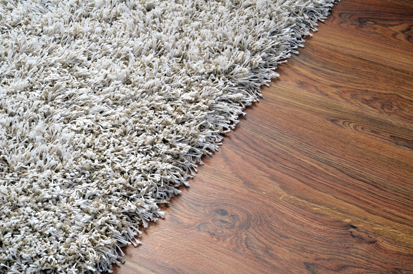
For example, if you sell all oriental rugs, you’ll probably want a design that’s sleek and contains muted colors. If you sell vibrant, shaggy rugs, you’ll want to go for a bolder design.
3. Keep It Simple
You probably see all sorts of crazy and intricate designs on the rugs you sell.
However, a design that looks great on someone’s bedroom floor doesn’t necessarily look great on a business card.
You’ll be putting your logo in small print a lot: on your website, company packaging, company apparel, and business cards.
Therefore, you need to keep it simple. A logo that has too much detail will just appear cluttered and chaotic in small print.
4. Think about Color
Color plays an important role in how people view your logo.
This is because people associate certain colors with certain emotions. For example, people associate red with passion, yellow with cheerfulness, and black with sophistication.
You’ll want to think about what message you’d like to convey to your audience before choosing colors.
5. Check Out the Competition
Checking out your competitors’ logos is a great way to figure out what’s working and what isn’t.
It will help you focus your design so it stands out from the rest and is remembered. It will also help ensure that you’re not infringing on anyone’s design.
Rug Company Logo: Wrap Up
Hopefully, this article provides you with more focus for your logo design.
Once you’ve got an awesome logo, let us know how it turns out! And if you have any questions about the design process, please drop us a comment below.
A Guide to Creating Crystal Clear Window and Door Company Logos
Posted on July 28, 2017 by Logo Design Tips and Tricks

Clear window and door company logos is a boost to any business. It covers products and company material in a way that solidifies the best brands and keeps customers coming back for more.
And nothing is more important than clarity when it comes to the visual properties of your logo. Not only will it be easily recognizable, a clear logo will work wonders on your windows and doors to announce your quality and unique capabilities.
When we think of the most iconic logos they all have clarity in common. They use pictures, colors, and contrast to be clear and bold from any distance.
Make sure your logo is clear and bold too. Here’s how:
Typography for Door Company Logos
The best logos announce quality from a single glance. But they continue to hold value over time and gain recognition and strength.
You may get to a point where your logo design is so recognizable, like Rolex or Target, that you might not need words.
But many logos, from Coca-Cola to Google, embed typography and words into the logos themselves. Most small businesses will need a similar approach at first.
When using words remember you need to make a clear impression right away. A fancy font may look cool but does it have the clarity to carry your company name from a distance?
Don’t let the words get lost. Especially on doors and windows, you need a clear statement that is easy to see.
Color Theory
High contrast colors will make it easier for people to see your logo. And the right colors will also let potential clients start to associate emotions with your brand.
There is a difference between warm and cool colors and the feelings they project. Cooler tones like blues and greens might be more associated with stability and comfort.
Warm tones are exciting and fun.
Whatever emotion you convey, using contrasting colors can make a logo pop and be more clear for any viewer.
Make Sure You Have A Clear Canvas
When we think of McDonald’s we think of the golden arches. When we think of Apple there is a glowing shape beckoning from the back of an iPhone or computer screen.
In logo design, a logo is only as good as its placement. For ultimate clarity in window and door company logos, you need to make sure your logo is on the best quality surface.
Whether your logo is on replacement windows in Ventura County or announcing your company brand anywhere in the world, make sure you match the finest logo with the finest glass.
Make It Yours
Clarity isn’t just a quality of eyesight and vision. Clarity is a quality of singleness of purpose and great branding.
A clear logo doesn’t just look great it announces the unique properties of your brand. Make sure you design a logo that is clear about your brand.
The good news is you can use the latest trends and still come up with a clear logo for your business.
More than 3 million brands have used Online Logo Maker to build their brand. We can help you too.
Check out our tutorial today and see how easy it can be to design a logo for your brand.

