7 Elements of an Exceptional Medical Logo
Posted on July 06, 2017 by Logo Design Tips and Tricks

Think about the logos you encounter on a day-to-day basis. Which ones stand out?
You’re likely remembering these logos because they make use of key elements meant to powerfully represent a particular brand or service, such as color, emotion, and information.
When it comes to medical programs, logos are a great way to attract prospective candidates and sustain your university’s reputation nationally and globally. Whether you’re seeking to represent a doctor of medicine program at a Caribbean medical school or a post-baccalaureate intensive at a northwestern university, keep these seven elements in mind when crafting your medical logo.
7 Elements of an Exceptional Medical Logo
1. Color that means something.
Color is an essential aspect of logos everywhere. It can have a direct emotional impact on any viewer and even induce certain psychological responses. The best medical logos use color intelligently and meaningfully.
What does this mean? Think about all the colors in the spectrum. Each one has a certain connotation if applied to a logo. For example, red in a logo can signify excitement, energy, blood, or passion. White may bring up feelings of cleanliness, calm, or purity. Black can designate something edgy, formal, mature, or unsettling.
The best logos use color to create a unified meaning, pairing certain ones together to have an overall emotional effect. They take into consideration the psychology behind color and work it into the message they are wanting to convey as a program.
These exceptional logos also don’t rely too much on color when attracting viewers. The colors are chosen sparingly and carefully.
2. Accessibility and an intended audience.
Every logo has a specific audience. Strong logos may try to reach just about anyone if that’s what they’re going for, or deliberately attempt to catch the eye of a certain viewer.
Either way, the most powerful medical logos are accessible and specific. They anticipate who will view them: in this case, prospective and current medical students and their families.
When designing your logo, think about where your logo will be most prominent. Will it be digital? Displayed indoors or outdoors, or both? Environment can directly impact who will be seeing your logo and responding to it.
Exceptional logos take environment into consideration as well as audience. They are easily reproduced to any size or interface, and still intelligible.
3. Concise and helpful information.
Logos can convey very specific information beyond emotional impact. On a basic level, they get the name they are representing across in a concise and helpful way.
Exceptional logos keep the information brief, clear, and useful. Often this just means a meaningful image and text that indicates the university or program. The most important information is most prominent so that viewers will be likely to remember it.
Medical logos succeed if they aren’t bogged down with too much information. They don’t put the viewer into sensory overload. They are clear in what they are representing.
4. Ease of reading.
There’s nothing worse than a logo that is impossible or difficult to read. The exceptional logo is easy on the eyes when it comes to images and texts, and doesn’t force the viewer to squint or interpret.
The best medical logos are easy to read and clear in their presentation. Nothing leads the viewer guessing. The takeaway is clear, and the experience of viewing is pleasurable. The most successful ones rely on images over text to convey information.
5. Memorability.
Why do you remember logos again? Oh, yes–because they use all of the elements in this list!
Beyond that, the most successful logos stick in their viewers’ brains because they are unique, clever, or unexpected. They haven’t been seen before. They may startle or surprise. They may merge colors in an unexpected way, or convey a really intriguing image or design.
The best medical logos are one-of-a-kind. They present a new image with a fresh message and interpretation that fits within the medical field itself.
6. A clear and powerful message.
A message that resonates with viewers is at the top of the list when it comes to elements of exceptional logos. Logos that convey a clear and powerful message are more likely to generate an emotional response in viewers and lead to action.
The successful medical logo begins and ends with a message that is central to the program or university’s values. It clearly presents those values and leaves viewers with an understanding of the university mission. This is critical when it comes to attracting prospective students and representing current ones.
If you’re designing your own logo, think about choosing a message that can directly correspond with colors for maximum effect. For example, you may choose the message: “Integrity and Humanity.” Colors that resonate with this are dark blue and purple.
7. Simplicity.
This is the golden rule of logos everywhere, but especially so for medical logos. The simpler the logo, the more effective it will be. There’s something to be said for a university or program that can advertise itself powerfully in just a few words, images, or colors.
Simpler is also more memorable. In many areas of design, it’s even the vogue. Strive for a minimalist, clean, authoritative presentation when designing your exceptional medical logo.
The Exceptional Logo
Logos are essential when it comes to representing your university or company. They can directly impact how prospective students or customers feel about your program or product, and even cause emotional responses in these individuals. When it comes to designing an effective medical logo, it’s important to do so in a way that best represents your program.
Before you even begin designing, think about your program or university message. Consider what audience you’d like to cater to, and what response you’d like to achieve in this audience. Then, choose colors, text, and images that reflect these. Maintain a simple, authoritative, and memorable visual.
At Online Logo Maker, your exceptional medical logo is just a few clicks away. We provide free logo-making services to anyone. People can’t stop talking about the incredible logos generated from our site. Get started on yours today!
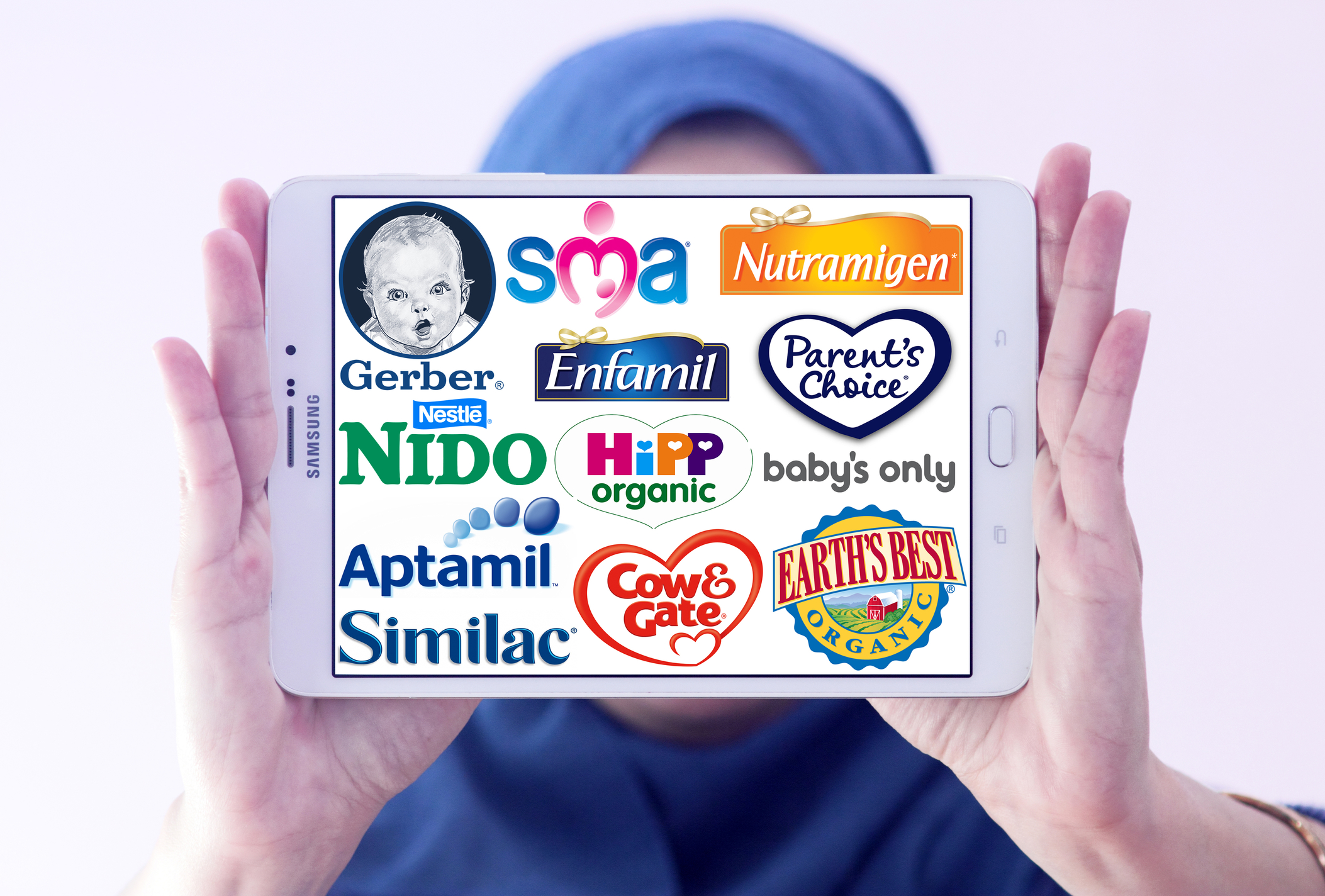
Show Them You Care: The Basics of a Nutrition Logo
Posted on June 30, 2017 by Logo Design Tips and Tricks
After findings reported that the average American is overweight or obese, the health care and wellness industry focused on helping Americans lose weight and improve their health.
A health movement was born. Fitness and exercise became the latest trend while healthy food has become more sought after than ever before.
This health movement has made a significant impact on the design of the common nutrition logo as well as food labeling. To learn the basics of a nutrition logo and the design trends surrounding the health movement, keep reading below!
Emphasizing the Health of Your Food Products
The first thing a food manufacturer will want to do when marketing their product is emphasize the quality of their food. Their labels and logos can emphasize the nutrition of their products.
Right now, the health movement led more consumers to make informed decisions when purchasing groceries. Food labeling may improve the diet of consumers. People are more likely to make informed decisions when looking at the nutritional value of food products.
Some health experts have suggested using a traffic light label on food products. This can help consumers quickly identify whether a particular product is nutritious for their body.
For example, the product Isagenix found at https://www.isatonic.com.au/ would have a green light letting consumers know it is nutritious. One study published in the journal BMC Public Health found that adults in Germany preferred food labeling in the format of traffic light labels.
So if you’re a food manufacturer looking to benefit from the health movement, your food product labels, and nutrition logo needs to emphasize dietary factors.
Your Nutrition Logo Will Need to be Minimalistic
The latest design trends taking place around the country revolve around minimalism. Your logo will need to have only the most important information. Anything extraneous will need to be removed.
Keep only the most essential parts of your food logo. For example, if you sell coffee beans, have a cup of steaming coffee as your logo and do not add any images of a saucer, spoons, or sugar.
Use only a small number of colors. Often, you only need to use two colors for your logo. If you have a specific focus in your logo, you will attract more customers.
Clear and simple logos and food labels will go a long way toward improving your brand.
Your food packaging needs to make it clear just how healthy and nutritious your food is. Your consumers will be looking at labels to determine whether the food will be a good purchase for their family.
Make sure that the font and colors are easy to read. Create labels that are large enough for the average person to see.
Your consumers will need to be able to easily read the nutritional information on your food labels in order to choose your product.
Do you need any advice on how to make the best food logo for your company? If so, contact us here or leave a question in the comments below.
A Beginner’s Guide to Medical Logo Design
Posted on June 27, 2017 by Logo Design Tips and Tricks

While logo design is a crucial aspect of branding across a variety of industries, if you’re in the medical profession, it’s especially important to get it right.
If you’re new to medical logo design, it can be tough to know where to start.
Here, we’ll show you how to create a logo that attracts new patients, clearly indicates your services, and balances trends with professionalism.
Keep It Professional
Following trends is essential when it comes to logo design — especially when attracting a millennial market.
Some trends, such as creating your own typography or using hand-drawn images, will work well within the medical profession. But others, like focusing too much on “hipster” designs or using a variety of neon colors, won’t exactly send a signal of professionalism.
So, how do you keep your medical logo design current without sending the wrong message?
Fortunately, minimalism is a current trend that is likely to stay classic for a long time. This means that your logo appeals to a broad market, while also communicating to potential patients that you’re up-to-date on the latest styles.
It might seem odd to use “trendy” and “medical field” in the same sentence. But stop for a moment to think about what that’s really saying. It lets patients know that your practice is likely to use the latest technology. It says that your office is likely to be clean, comfortable, and patient-focused.
Be honest with yourself: would you feel safe, or like you were getting the best care, from a practice whose logo looked like it was stuck in the 80’s?
Chances are your patients won’t, either.
If you like the vibe of your current logo, but feel it could use a quick makeover, read up on how to update and redesign your medical logo without muddling your branding.
Make Your Services Clear
There are countless fields within the medical industry. How does your medical logo make your practice’s specialization clear to potential patients?
For example, if you provide pediatric services, your logo might include a doctor examining a small child clutching their belly, or an image of a doctor listening to a toddler’s heartbeat.
However, if you’re a pharmacy, your logo will need to make it clear that you don’t provide medical services, but rather medications and specific supplies. You might include images of prescription bottles, a mortar and pestle, or even a First Aid Kit with wound supplies inside of it.
Whatever the focus of your practice, you’ll save both yourself and potential patients time by using your logo to help make it clear what you can and cannot provide.
Create (Or Update!) Your Medical Logo Today
As a beginner, we know it can be tough to navigate the world of logo design.
But if you follow these tips, we know that both you and your patients will be happy with your new logo. However, especially since you’re just getting your feet wet in the world of branding and design, you may not get it right the first time.
Don’t worry — this just means you have plenty of options to choose from! Use our free online logo maker tool to create a variety of designs, then ask your patients and team to pick their favorite.
Be sure to keep reading our blog for the latest trends and tips in logo design.
What Message Does Your Chiropractic Logo Send?
Posted on June 27, 2017 by Logo Design Tips and Tricks

Think about the logo for a huge company like Starbucks.
Now think about all of the possible meanings people assign to that logo. Some may think that logo provides the comfort of a warm cup of coffee. Others might see it as an invigorating start to their day. People might even just associate it with a comfy place to sit and read a book!
The important thing? The logo speaks for itself. It has a visual identity.
Your chiropractic logo also tells patients something about your practice.
However, that logo should stand for something greater: the health of your patients. Health is a big deal — it pays to be careful with what you’re saying to your patients. There’s a reason companies like Apple spend millions on their logo designs.
Come on in — let’s talk about what message your chiropractic logo sends.
Shape matters
Surprisingly enough, the shape of your logo actually matters.
In fact, studies have found that even simple things like the roundness or squareness of a logo can conjure feelings in consumers. They might associate a round logo with a caring, warm company. A rectangle, on the other hand, portrays a trustworthy, familiar company.
With this in mind, you should keep the shape of your chiropractic logo in mind. What kind of practice do you want your patients to believe in? Choosing the right shape might just be the best first step towards creating a practice that upholds those values.
Chiropractic logo fonts
Everyone knows how Google’s font looks, or the characteristic broken lines of IBM’s logo.
Your typographic choices can have an impact on your logo’s perception as well. In fact, there’s even a psychology behind the use of fonts in branding.
For example, if your company is a straight-laced, traditional practice, would you use a very decorative, curly font? Probably not. That’s because that font doesn’t send the type of message you want.
It works the same way in business. If you’re sending a formal email, you wouldn’t use a comic kind of font. You would use a font that portrays exactly the type of person you are — your practice is no different.
Creative imagery
How many times have you seen happy looking families on images for medical services?
Probably too many. These images are cliche and do nothing for your brand or your practice. In fact, they may be actively hurting you.
It’s important to use images that pertain to your practice. For example, if you’re a chiropractor in Bradenton Florida, perhaps your logo can portray the beach or some palm trees. A chiropractic logo for a practice specializing in a certain type of patient should use an image relating to those patients.
When you’re designing a logo, that image becomes a window into your practice and your values as a chiropractor.
Conclusion
Ultimately, your practice’s logo should portray meaning in its image, shape, and font. You want your consumers to trust in both you and your brand image.
Don’t know where to go next? Start with our easy logo maker.


