How to Incorporate a Message Into Golf Logos
Posted on June 29, 2017 by Logo Design Tips and Tricks

Your brand’s logo makes an important statement. Ultimately, it’s your business’s entire mission statement summed up.
It needs to be clean, concise, and show what you’re all about in a second or two. While this sounds simple in practice, it’s far easier said than done.
There’s a ton of work that goes into creating the perfect logo! Especially since you’re already competing for eyes on a nearly minute-by-minute basis.
The golfing industry is no different. Featuring your golf logos can be a great and easy way to get noticed. All you have to do is create a message worth wearing or showing off.
Here are some ways you can cleverly incorporate a message into your golf logos.
How to Incorporate a Message Into Golf Logos
1. The Right Message For the Right Product
The first step in creating a logo that resonates with your audience is to evaluate your business.
What type(s) of product do you sell? What types of people generally use these products?
These are two of the biggest questions you’ll need to ask before coming up with logo placement.
Sometimes, simpler is better. For instance, many golfers associate Tiger Woods with the Nike logo because of his hats and polos.
Obviously, the product you’re trying to sell will play a part in how your logo takes shape.
If you run a golf betting tips website, for instance, you can incorporate a dollar sign into the ‘s’ of the word ‘tips’. Combined with some green font, this makes the consumer think about money.
2. You Don’t Need to Reinvent the Wheel, But You do Need To Reinvent Your Brand
Remember, simplicity is often better. A lot of the more popular logos these days make use of a minimalist style.
In fact, generally speaking, it isn’t necessarily the logo that does the talking. Instead, many companies opt to feature small, subliminal logos or signs within white space.
Or sometimes you can use composite images to create an awe-inspiring effect. Take the Spartan Golf Clubs logo, for instance. At first glance, it’s simply a golfer swinging a golf club with what seems to be a power bar next to him.
But upon closer inspection, note that the power bar, golfer, club, and whitespace create an effect of a Spartan warrior’s helmet.
The best golf logos are ones that are creative enough to warrant a second glance.
3. Incorporate Golf Equipment Into Your Logo
Here’s a fun way you can get a message into your golf logos: feature some golf equipment.
For instance, if your logo contains the letter ‘t’ you could draw the logo to feature a golf tee.
Or if you’re a business that manufactures golf balls, you can use a golf ball as the ‘o’ within your logo.
By using golfing equipment within your logo, you’re letting your audience know what it is you sell. In essence, you’re doing the legwork for them. They won’t need to guess or Google, as your logo does all the talking.
Better Logos for a Better Business
Sometimes it can be difficult coming up with the perfect logo. If you could use some help, or just want to take a swing at creating a logo yourself, be sure to check out our tools.
Your business deserves to be seen by the world, so get creative and have some fun in the process!
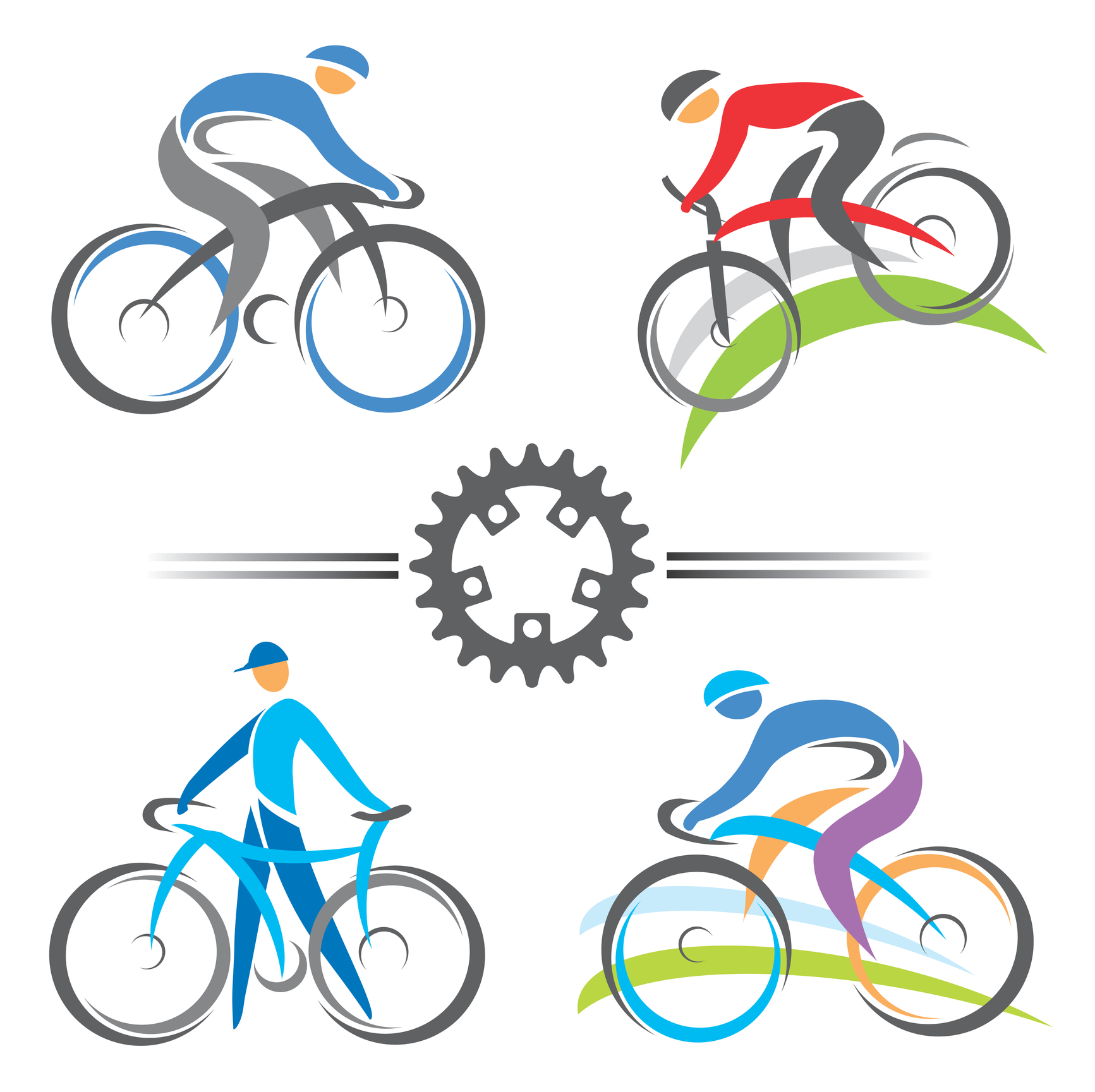
Creating Adventure in a Mountain Bike Logo
Posted on June 27, 2017 by Logo Design Tips and Tricks

Mountain biking isn’t just an incredible way to explore the world around you — it’s also a great workout!
If you’re a company selling mountain bikes and gear, you know it can be tough to highlight all the awesome features of your products while still keeping your logo and branding designs simple.
We’re here to help!
In this post, we’ll show you how to create an impactful mountain bike logo that says all the right things without overwhelming your market.
Focus On Action
When you think of mountain biking, you think first and foremost of movement: zipping down hills, slamming on brakes, maybe even flying through the air.
Your logo should reflect that sense of motion by showing action.
For example, instead of showing a row of mountain bikes, it’s much more effective to depict a singular riding flying down a hill. You can even show the wind moving the rider’s hair!
Remember, you’re trying to sell people on the experience of mountain biking just as much as you’re trying to sell them your products.
Showing motion helps you to do just that.
Use Colors To Entice Customers
Sure, reading a Roadmaster mountain bike review and other customer testimonials can convince your target market to make a purchase.
However, you can also use the psychology of colors to make your customers feel like they’re in the great outdoors — when in reality, they’re just browsing your site on their desktop computers.
When deciding on colors for your logo, you want to combine that sense of adventure with the natural world. This means you’ll need to use multiple colors.
Greens and blues may be closely associated with nature, and make consumers think of taking their bike out on a trail. However, blue and green are also used to help calm consumers.
So on their own, they might not light a fire underneath your consumers — and they don’t match the thrill-seeking market of mountain bikers. To balance things out, we suggest adding a splash of red or orange to your logo.
These colors create excitement — and even raise blood pressure levels — to better replicate the thrill of riding.
Select A Font Consistent With Your Branding
Typography, or font, is the secret weapon of branding.
If you really want to set yourself apart from your competition, you should have a unique font created for your logo. This will help to increase customer recognition and will cause customers to give your site a second look.
Keep in mind that this font shouldn’t exclusively be used on your mountain bike logo. If you really want to build your brand, use this font in every aspect of your marketing strategy.
Create Your Mountain Bike Logo With Us!
Now that have the inspiration and information needed to create a mountain bike logo that’s as epic as your favorite trails, it’s time to bring it to life.
Use our free online logo maker tool to test out several options and to crowdsource your favorite designs with your office and customers.
Looking for more tips on how to create a branding strategy that’s logo-centric? Be sure to check out our blog for more!
Kickstart Your Business With an Online Personal Trainer Logo
Posted on June 22, 2017 by Logo Design Tips and Tricks

Personal training professionals know that the sky is the limit in today’s fitness industry. Americans currently spend over $60 billion annually on fitness and weight loss.
But personal training can also be competitive. Developing your brand is a requirement for being successful and differentiating yourself from the competition.
Whether you are trying to get your business off on the right foot, or know it’s time to breathe some fresh air into your company, a personal trainer logo is one of the best ways to invest your resources.
Not sure how to pair a personal trainer logo design with your brand? We can help.
A Personal Trainer Logo Helps You Focus
Starting a personal training practice can be an intimidating enterprise. Once you prepare to hand up your shingle and build a brand you’ll notice the competition.
Some entrepreneurs find this so intimidating that they opt out of starting. Don’t let this happen to you!
If you know the secrets to building your brand, you know how important it is to build a unique value proposition.
What are you passionate about in training others? Where are you located? Who are your ideal clients?
These are the types of questions you should ask when building your logo. Once you know the answer they can also help you build your business.
You’ve Got The Look
One of the best parts of a logo is that it follows you wherever you go. From website design to social media accounts– calendars, signs, and workout templates— your logo should represent your brand.
But one of the worst parts of your logo is that it follows you wherever you go. This is why it is important to find something that reflects the core values of your personal training business.
Use color theory to help shape your design. Warm colors like reds and oranges can excite your clientele.
Cool colors like blues and greens will calm the most anxious potential clients.
Once you’d got the look down, you’re ready to build your brand.
Your Logo Needs To Stand Out
A personal training logo needs to stand out from the competition. Easily recognizable, the best logos are simple and reflect the needs of your clients.
In today’s customer-centric marketplace it’s wise to think of the needs of your potential clients first.
What’s important to your customers? Do they want to prepare for a bodybuilding contest or simply be more flexible seniors?
Know your clients and you will know how to make your logo design stand out.
Try Out Different Styles
One of the best parts of designing a logo for your personal training business is the wide range of options. Experimenting with images, designs, and images will allow you to pair your business strategy with the core principles of your business.
With the right tools, you can easily mix and match ideas and explore something that’s perfect for you. Online Logo Maker can help you try out a number of options.
Make sure you get it perfect before you commit to a design. Remember, your logo will represent your company as much as your clients, your website, and even you yourself do.
Give it a shot! Come try out our Online Logo Maker tools now.
Personal Fitness Logos: Does Yours Fit Your Brand?
Posted on June 13, 2017 by Logo Design Tips and Tricks

If you work in fitness, you already know how important personal and professional branding is.
Especially as your training program gets larger, and you have more avenues to reach audiences, it’s easy for your brand to get lost.
One way to make sure you stay as consistent as you tell your clients they should be?
By creating unique and motivating personal fitness logos to build your brand.
Learn some of the best ideas on where to get started in this post.
1. Create Designs That Focus On Results
Most clients hit the gym because they want to make a change. They want to look better, improve their fitness, and even fight dangerous diseases like obesity and diabetes.
Of course, if you’ve ever pushed yourself in the gym, you know how tempting it can be to quit. And if you’ve ever struggled to lose weight, you know how tough it can be to take that first step.
Effective personal training logos need to be just as motivational as fitness experts themselves. Through your logo, you want to transform personal training.
They need to advertise and convey that what clients are looking for is possible, and they need to focus on results. We love the idea of having a thinner body outlined in a different color, inside of a larger person. Additionally, images like a client lifting a barbell over their heads or high-fiving with a trainer on a scale are also motivational ideas.
2. Use Colors To Keep Your Logo Welcoming
Lots of people don’t get the fitness expertise and help they need because they’re intimidated by the atmosphere of a gym. Or, they could be embarrassed and insecure about working with a personal trainer.
It’s one of the reasons it can be so tough to get clients.
While your image choice needs to rely on motivation, your color choice can reflect a welcoming, no-judgement vibe.
Bright, festive tones like blues, pinks, oranges, and greens help to keep things positive.
3. Reflect Your Training Style
Every personal trainer has a different, distinct style — and personal training logos need to reflect that.
If you teach barre fitness, it wouldn’t make sense to have a logo featuring weight training. If you’re a kickboxing coach, your logo should illustrate that.
The same goes for your individual training method. Are you a tough love trainer? Your logo could show you cheering on a sweating client on the treadmill. If you have a softer touch, your logo could include an image of you helping a client hold a barbell.
You’re Ready To Create Motivational Personal Training Logos
Thanks to these tips, you know how to create personal training logos for your gym or fitness brand that will convince even the biggest couch potato to make a change in their lives.
If you have several different ideas, we suggest using a free online logo maker tool to see which one looks the best. You could even poll clients and employees to select the favorite.
No matter which logo you choose, these tips will help you create one that grows your brand and your business — while shrinking the waist sizes of your clients.


