Design Inspiration For the Perfect Accounting or Finance Logo
Posted on August 12, 2019 by Logo Design Tips and Tricks

You’ve studied up on the top ways to market your accounting or investment firm online, and you feel confident about your strategy.
You’ve got a great blog, an engaging email campaign, and you’re even active on social media.
But you know that your finance logo is the foundation of your entire branding strategy. It helps to increase your authority, connect you to your target market, and sets you apart from your competitors.
How do you design the perfect logo for your financial firm?
Keep on reading to find out.
1. Recognizable Images vs the Cliches
Yes, you want your finance logo to look authoritative and unique — but you also want to ensure that your logo helps people to understand what your company actually does.
How do you walk the fine line between choosing familiar images that people associate with finance and accounting and relying on cliched images that all your competitors are already using?
By finding a way to make these recognizable images your own.
For example, instead of using just a gold coin, why not personalize the gold coin with a picture of your company’s founder, a bull, or even place your company’s name on the coin? Instead of a dollar sign, include graphics of the things you help your customers to afford: a college degree, a house, a baby carriage, the list goes on.
2. Focus on Legibility
An accounting logo is not the place for loopy fonts or bubble letters — and not just because those fonts aren’t in line with your professional goals.
Remember that your financial logo needs to look just as good on a small business card as it does on a huge billboard.
Choose a legible font, and even break up words with changes in color like the folks at The PayStubs did.
Remember that colors like green, blue, and even red are all colors associated with money and savings. Use them in your logo whenever possible.
3. Future-Proof Your Financial Logo
When you’re designing a logo for your accounting or finance firm, going with the latest graphic trends isn’t the wisest choice.
But it’s not just about looking professional. If you rely too heavily on trends, you’ll likely have to update your logo design within the year so it doesn’t look dated.
This can seriously mess with your brand recognition — and cost you time and money.
Instead, keep it clean, classic, and original. You’re building a reputation that will last for years to come.
Ready to Design Your Finance Logo?
Now that you understand the ground rules of designing your finance logo, it’s time to begin the process!
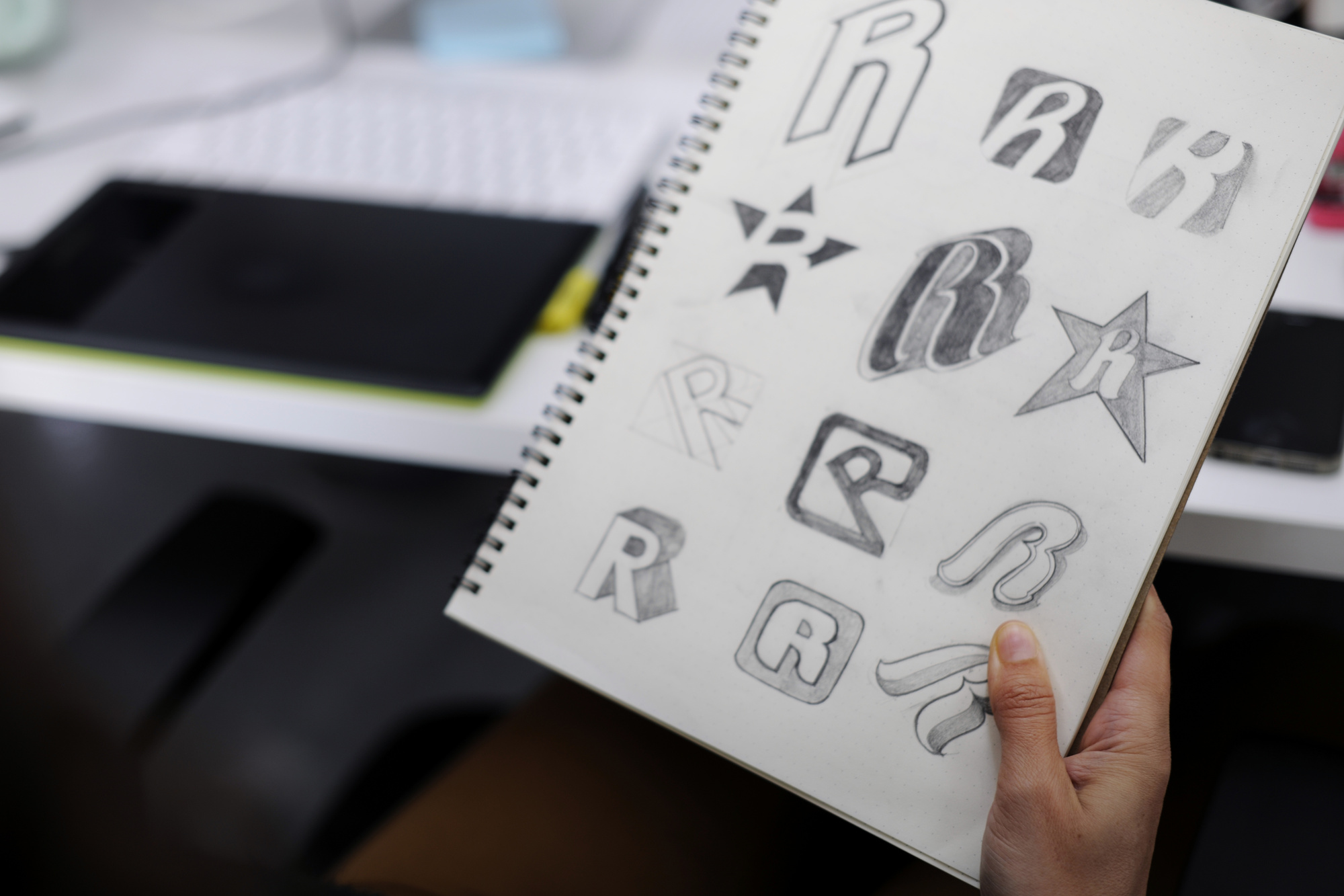
Don’t just go with the first design that pops into your head. Instead, use our free online logo maker tool to test out and refine your top options. You can even ask your social media followers or current clients to help you decide.
In addition to our design tools, keep checking back in with our blog for the latest in logo design.
Together, let’s make your brand a name that everyone knows.
How to Make Your Finance Company Logo Stand Out
Posted on May 01, 2019 by Logo Design Tips and Tricks

When consumers make a choice between competing businesses there are motivations that help them decide.
For business owners, the trick has always been to recognize what their potential customers want ahead of time.
There is nowhere this is more important than in designing a finance company logo. Nearly 30,000 planners exited the business in 2015, a fact that shows how fiercely competitive the industry is.
The right finance company logo can help you attract and retain clients. You will communicate integrity, success, and longevity if you put these design ideas to good use.
Make your logo stand out! Here’s how:
A Finance Company Logo Signals Success
A memorable logo will attract the eye of your clients. It’s not enough to just catch a fleeting glance though.
Your design for a finance company or financial advisor should communicate success. Before you begin to hit the drawing board, ask yourself what signals success to you.
Is it high priced items? Glitter? Gold? Thinking of your symbols of success can help you decide what colors, designs, and textures conjure success in your mind.
Keep Your Clients in Mind
Knowing your audience is a cornerstone of any business. It’s not enough to want more business.
At the center of any marketing campaign is learning to understand your customers and anticipate their needs. This is especially true in financial services.
If your core demographic is younger clients looking to aggressively build wealth, this should inform your logo design. High contrast, warm colors, will signal excitement and strength.
On the other hand, the stability and calming effect of cool tones and stable lines will communicate something different altogether. You may appeal more to older or wealthier customers who require caution.
Would you prefer to attract clients who are drawn to the excitement of wealth building or the assurance of wealth preservation? Knowing what your clients want is important.
Build Your Brand
Companies spend millions of dollars on brand management. They want to control how clients perceive their goods and services.
Every marketing campaign, external outreach, and client interaction affects your brand. And at the heart of brand management is logo design.
A finance company logo should be shaped by what your clients want as well as who you are as a company. A finance company in a tropical paradise could feature a palm tree.
Don’t laugh: Signaling both offshore banking opportunities and a connection to paradise could be a great background to a logo.
Inversely, if you are located in a busy urban area, a skyscraper elevating wealth to new heights could be a key image.
Logo design is about color, line, and image. But just as important is your customer and your brand.
Find the Inspiration
After you spend some time reflecting on the direction of your company, the needs of your clients, and your core principles of success, you are ready to start experimenting.
Finding inspiration is easier than you think.
Online Logo Maker has tools to help you make your own free logo. What could be more simple?
Come try out our tools and find the inspiration you need to make your logo stand out today!
Structured Finance, Structured Logo: Financial Logo Ideas to Inspire Any Finance, Banking, or Accounting Firm
Posted on January 02, 2019 by Logo Design Tips and Tricks

You realize that your financial service firm is not cut from the same cloth as your competition. You are different — and for all of the right reasons. So, shouldn’t you create a logo that makes you stand out accordingly?
Your brand logo helps you to build credibility and create recognition, so how you design your logo isn’t something you should take lightly.
The trick with creating a logo is that you want your firm’s logo to be memorable. But it also needs to be appropriate and simple.
In other words, creativity does have its limits when it comes to financial logo design.
If you’re looking to improve the brand image of your financial services firm, here are some financial logo ideas to inspire you.
Let’s dig in!
Promote Stability in Your Financial Logo
The logo you create for your financial service firm should represent your brand well. For this reason, stability is one of the most critical traits that your logo should exude.
Your customers entrust their business profits or life savings to you. In addition, they trust you with their data (which is why using a data management solutions provider like Umlaut is a good idea). Because your customers place so much trust in you, they have to ensure that your firm has the stability necessary to fulfill your promise to them of keeping their assets safe.
This is why you should use symbolism representing firmness, strength, and longevity to make your firm’s logo.
Promote Professionalism
In addition to making your company appear strong, your logo should make you look professional.
Modern bankers are now accepting the idea of incorporating colors into their brand logos. However, your symbols and images should still look sophisticated.
Let’s take a look at a few examples of financial service firm logs that illustrate both stability and professionalism.
Deutsche Bank Example
First up is Deutsche Bank. The bank’s logo is essentially a white square outlined in blue and with a blue rising line inside it.
This company’s logo, designed by Anthony Stankowsky in the 1970s, stands out because it is striking yet simple, representing sustainability, stable growth, and financial gain. It’s the type of logo that generates recognition.
Note that squares are often used in the banking industry to build stability and trust, as they represent a controlled and secure environment. Also, the bank logo’s rising line surrounded by the square symbolizes financial gain and stable growth.
TD Bank, N.A. Example
This famous bank’s logo is basically a light-green square with the dark green letters “TD” inside of it, followed by a dark-green “Bank” after it on a white background.
The square represents a settlement, enclosure, or home idea and thus symbolizes stability. Meanwhile, the green color symbolizes money and vitality. And the ligature symbolizes coherence and connection.
Incorporating these types of elements into your firm’s logo design can help you to draw clients and keep them long term.
How We Can Help
We are a leading online logo maker, offering the tools you need to create high-quality logos without spending a lot of money and time doing so.
With our tool, you can simply add text, add a symbol and upload an image to produce a logo.
Get in touch with us to find out more about our services and how we can help you to create the perfect financial logo for your financial service firm in 2019.
5 Fantastic Financial Logo Design Ideas
Posted on January 11, 2018 by Logo Design Tips and Tricks

Last year financial satisfaction hit a 24-year high in the United States. With the stock market in great shape and more income for investing there has never been a better time to grow your financial company.
For branding purposes, a financial logo can communicate the strengths of your experience and create a bigger customer base. The old adage that a picture is worth a thousand words comes into play when designing a logo.
When done properly your financial company logo will stand out and catch the eye. What’s more, it will help your company stand out from the competition.
Here are 5 ideas to make your logo the best for your brand:
1. Understand Your Brand Strategy
The first ideas for a logo design begin close to home. It is important you understand your brand and strategy to create a logo to reflect your goals.
If you cater to a specific clientele, type of investment, or geographic location, you may want to incorporate these ideas into your logo.
2. Study What Works for Your Financial Logo
Taking a look at the competition can be a big help when designing a logo. Too many newcomers to graphic design get overwhelmed when they look at winning designs though.
They think, “all the great ideas are taken” when they study good examples. The truth is, there are unlimited possibilities when creating a great logo design.
A firm like FutureAdvisor depends on a combination of lines, colors, and perspective to carry their branding to new and existing clients. Your firm can use existing ideas and change them to fit the unique qualities of your company.
Don’t feel limited by logo examples in finance either. Winning logos in every market sector might inspire your new design.
3. Animal Themes
One of the benefits of using animals is that they already connotate ideas for any audience. A lion may convey being king of the jungle while an eagle can soar above the landscape and bring perspective.
Wouldn’t you consider an advisor who has an “eagle eye” to help you see more clearly?
4. Symbolic Graphics
As with animals, there are a great many logos that depend on symbols to carry the message about a brand. Money and wealth are often associated with financial services and can be used to attract clients.
But it’s important to think out of the box. You may want to convey stability or creativity. Younger investors may respond better to the imagery of going fast or being revolutionary.
5. Colors and Lines
There are no limits to creating a great logo design. While a pyramid can symbolize stability and tradition, it can also be tilted, warped, and cracked in a design.
Taking a traditional design and altering with bold colors or dramatic lines is a good way to bring the best of both worlds.
Get the Help You Need
In every case, it’s important to experiment and find the graphic that works for you. Online Logo Maker can help.
Use our tutorial now to discover how easy it is to create a financial logo that looks great and attracts new business.


