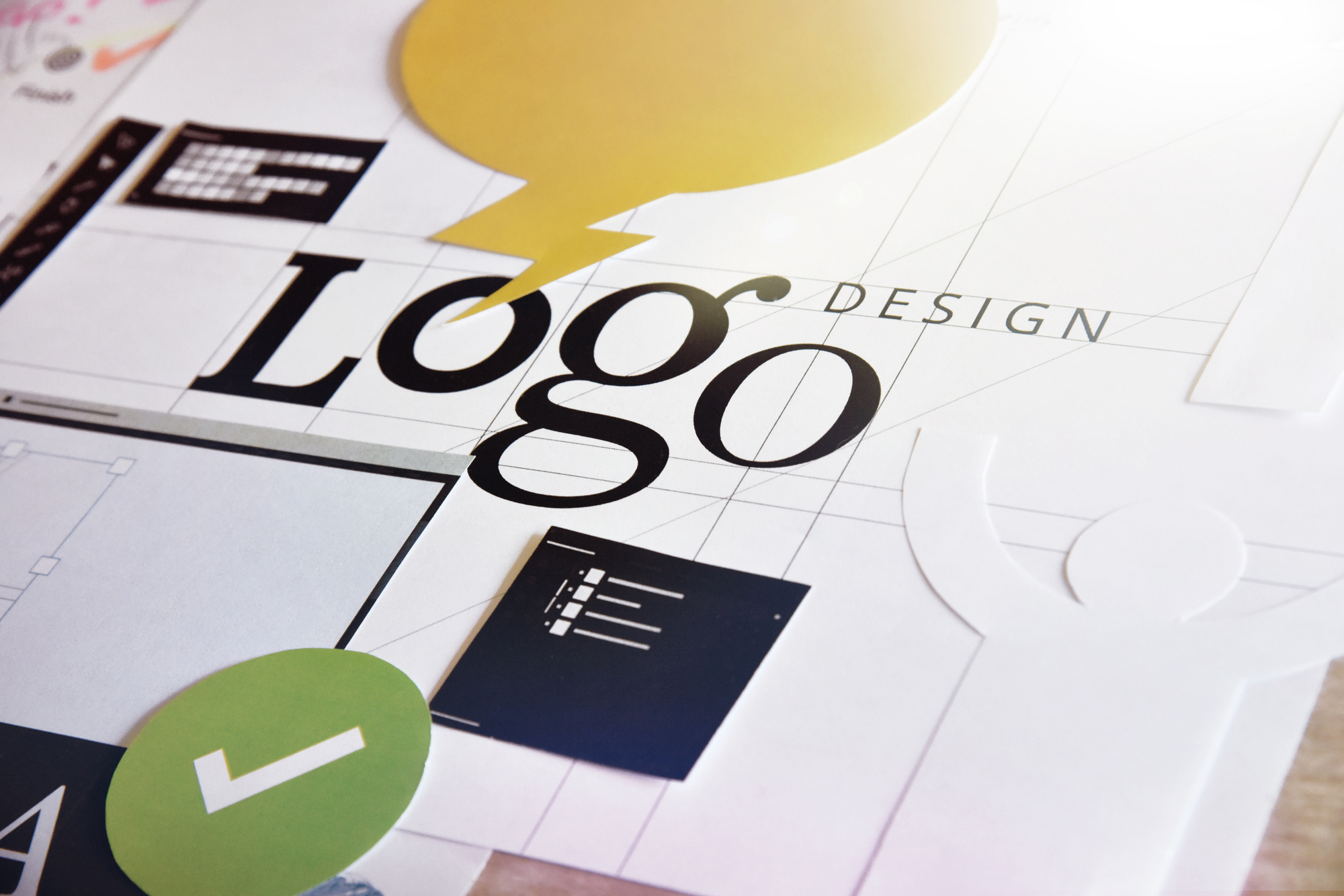
A Logo Designer’s Guide to Logo Development
Posted on March 14, 2018 by Logo Design Tips and Tricks
Every business needs a logo. Sometimes a business is just starting out and building out their marketing collateral. Other times, the business is rebranding and looking for a fresh take.
No matter who your client is or how old the company, the logo development process is fairly consistent. There’s always some competitor research involved. There are brand-related questions you’ll ask every client.
That said, there are some tricks that speed the process along and leave your clients happier in the long run.
So let’s dig deep into some areas of logo development and see if we can help to streamline your process.
Start Logo Development with Competitor Research
Before you draw your first sketch, you must research your client’s competitors. It won’t matter how great your design is if it resembles an existing logo.
This isn’t just a question of avoiding confusion, though that matters. A new logo that resembles an existing, better-established logo just works as a marketing tool for another business. You don’t help your client by advertising for someone else.
There’s also a legal issue at play. Many businesses trademark their logo. Give your client a logo that looks like someone else’s and you create a potential legal problem.
No one will thank you for opening up that can of worms.
Of course, you can’t possibly research every logo in existence. There’s just too many of them. The best you can offer is a good faith effort at not recreating a competitor’s logo.
Make Sure You Understand Your Client’s Brand
You can’t design an effective logo if you don’t get what your client’s brand is about. That doesn’t mean you must read their mission statement, but it does warrant a conversation. Make sure you ask a few key questions, such as:
- What are your brand values?
- How do you communicate those values to customers?
- Do customers perceive your brand that way you intend?
The answers to those questions will inform almost all of your design choices. A company that aims for a light, cheery brand isn’t well-served by a heavy font or dark colors. A business with a reputation for cool professionalism is best served by capitalizing on that reputation.
Simplicity
There is no greater friend in logo development than simplicity. There are a few important reasons for that.
Remembering simple things is easier than remembering complex things. For example, almost everyone knows that 2 + 2 = 4. On the other hand, how many people remember the Quadratic Equation from their high school math classes?
It’s more complicated and that makes it harder to remember.
Think of any images you create as symbolic. You’re trying to evoke an idea, rather than paint a scene.
You can see a great example of simplicity at work in a logo over at The Marine Battery. The anchor image is incredibly simple, but it evokes the idea of the sea.
Play Around with Several Ideas
Another key element of good logo development is not getting hung up on your first idea. Coming first doesn’t make an idea good or even viable. On the whole, first ideas are either vague or overly ambitious.
The brain is pretty lazy when you get right down to it. If it can work less in reaching a goal, it will.
Say your new client is a self-employed bricklayer. Your brain probably jumped straight to a picture of a brick or brick wall.
What about a freelance writer? Your brain probably conjured an image of a keyboard or a pen.
The problem is that you almost certainly share most of the same cultural and social touchstones as your competitors. That means their brains also went straight to some variant of those images.
Think of your first few ideas as cobweb clearing exercises. They let you deal with the obvious and the derivative. Once you get through those, you can start the real creative work.
Color
There is always the temptation to avoid color in logo development, but don’t go there too fast. Color is a primary reason around 85% of customers choose a product.
Again, the goal here is simplicity. Limit your palette to a few colors. If the business already uses specific colors for it’s marketing collateral, most of the decision is made for you. Consistency in branding more or less requires you stick with those colors.
If the business is new or hasn’t settled on a color scheme, reference their answers about what their brand represents. Choose colors that dovetail with their intentions.
If all else fails, look at broader industry trends. Is there consistency in color choices? If so, start with those colors.
The client can always ask for different colors if they aren’t happy.
It Must Scale
You can’t predict where a client will use a logo these days. For now, it might just go on their business cards and letterhead. It could turn up almost anywhere down the road, such as:
- The client’s website
- Social media accounts
- Product packaging
- Billboards
- Television ads
- Brochures
That means the logo must scale and still look good. The less complicated the image is, the better it scales. So there’s another argument for simplicity.
The real trick here is making sure you give the client the logo image in a scalable file type, like Scalable Vector Graphics. That lets them use it at any size without any grainy pixelation.
Parting Thoughts
Good logo development is about striking a balance between conflicting forces.
You must balance creativity against the practical reality of existing logos. You must balance your own view of a brand against the company’s stated brand values.
You should strive for simplicity, even when your imagination takes you toward complexity. Developing multiple ideas is more difficult, but first ideas are often stale.
Using color requires some restraint because it’s easy to go overboard. Yet, it also helps drive sales when done well.
The one straightforward part is that you should always use a file format that lets the image scale. It simplifies your clients’ lives in the long run.
Looking for another way to streamline your logo development process? Instead of building logos from scratch on your own computer, try out our free logo maker.
7 Tips For Creating An Awesome Online Business Logo Design
Posted on December 30, 2017 by Logo Design Tips and Tricks

Online brand positioning has a direct effect on a business’s exposure, and thus, a direct effect on revenue. Creating a brand people remember all starts with a good logo.
However, coming up with and designing a memorable one isn’t easy. There’s an art behind it.
Furthermore, it’s essential to create something that properly represents your business and that you’re proud of. You don’t want to put something out there quickly only to realize six months down the road that it’s not effective.
Given the number of advertisements we see every day, it’s more important than ever to establish something unique. This seems like an impossible task, but there are techniques that will help you out.
Before you begin the design process, consider the following 7 tips for creating a quality online business logo design.
1. Stand Out From the Crowd
Just about every major business has a logo. Although it’s increasingly difficult to be original with so much company branding out there, you should always attempt to stand out in your industry.
It’s important to take a look at what your competition is doing with their logos. Which logos do you think work? Which ones don’t?
Looking at the competition gives you an idea of what kind of creative level you should strive for. Keep in mind this doesn’t mean you should imitate. In fact, you want to do what nobody else is doing.
Remember, in order for a logo to be successful, it needs to be appropriate for its industry. Think about what you do and what imagery it triggers. Then, find a unique take on that imagery.
2. Understand Your Audience
You’re branding to a specific audience, so you must know exactly who that audience is. This goes further than just simple demographics. What does your audience care about and why do they need your product?
Create a customer profile by asking yourself some questions and taking notes. What are your target audience’s interests? What are their spending habits and what other products and services are they interested in?
These things may seem trivial, but if you know your audience, you’ll create an online business logo design more likely to catch their attention—especially when you’re designing for an aliexpress dropshipping store.
Think of it this way. A bakery wouldn’t create a logo that’s more fitting for a nightclub. Doing so would confuse people, so know your audience intimately before you start designing.
3. Consider Your Colors
Color choice is a crucial decision and has a huge effect on a consumer’s perception. Every color creates a feeling in our minds, so you need to consider a few things when choosing yours.
Extremely bright colors are good for catching the eye, but if overused can overwhelm a potential customer. More muted and subtle tones achieve a certain level of sophistication. They can also go unnoticed.
Think about the philosophy behind your product or service. What do you represent? Then, think about the following colors and how humans perceive them.
- Orange – happiness, enthusiasm, creativity
- Red – energy, power, love
- Green – growth, fertility, money
- Blue – stability, wisdom, truth
- White – purity, cleanliness, safety
These are just the basics. Look for more exhaustive information on color before getting started.
4. Simplicity
The last thing you want from your online business logo design is for someone to have to try to dissect it. You also shouldn’t try to get too much information across at once.
Keep in mind that your logo will need to display well across a number of devices such as laptops, tablets, and smartphones. A web company like RdyToGO web design incorporates responsive design for this reason.
You also want to try to design something that will look good against different backgrounds. Keeping it simple is the best approach.
Simplicity goes a long way when trying to achieve something memorable. In an instant, your logo should tell someone who you are and give them an idea of what you do.
5. Think About Your Typography
We may not realize it, but the typography of a logo does a lot to our perception of a brand. Your business name is central to your logo, so you need to pick a font style that’s both interesting and represents who you are.
There are seemingly countless font styles out there. It’s easy to portray yourself as classy and sophisticated with a cursive typeface. Or, be bold and to the point with block letters.
The most important thing to consider here is that your brand name needs to be unique and also easy to read. Online consumers are impatient. If a font style is hard to read or turns them off, they’ll go to a competitor.
6. Negative Space
Sometimes it’s what’s not there that makes a logo great. Negative space is the area in a logo that’s not being used. In addition to creating a very clean look, negative space creates a sense of motion and immediacy.
It also helps call attention to the actual brand name or imagery. A few great examples are the NBC and FedEx logos. By using white space, they actually achieve a more impactful response.
Negative space is also great for creating a very minimal look, which is popular right now. This goes back to remaining modern and relevant with your branding.
Years ago, online logos resembled billboards or storefront signs. Today, however, your online business logo design needs to be fresh and up-to-date with modern trends.
7. A Good Balance
It’s been found that the shape of a logo impacts the way consumers react to it. Circular shapes evoke feelings of softness and comfort while angular shapes induce harsh or hard feelings.
Aside from shapes, it’s important your logo has a good balance. If too much emphasis is put on one side of your logo, it could be off-putting to a consumer.
Instead, try to achieve a consistent balance across the entire design. It’s fine to have a prominent element to one side as long as it’s balanced out by something else.
Start Creating Your Online Business Logo Design
Taking the tips above into consideration will drastically improve your end result. Remember, a logo isn’t just an image, it’s your business identity. It’s important you create something that speaks to consumers about who you really are.
For more information on creating quality logos, check out our tutorial today.
How to Design an Elegant Financial Logo
Posted on November 16, 2017 by Logo Design Tips and Tricks

In 2013, the Edelman Global Trust Survey found that financial companies have a hard time getting consumers to trust them. However, one small thing can make a huge difference in how trustworthy a company looks: its logo.
Whether or not you know a lot about the financial industry, you can learn what you need to know to great an elegant financial logo. With a great logo, consumers will automatically have a positive view of the company and be more likely to remember it for the future.
We’ve put together this essential guide to designing an effective financial logo. Read on to find out how to gain customers’ trust and satisfaction through a simple image.
1. Know Your Audience
First and foremost, you need to know the kind of person you’re hoping to reach with this logo.
Not all financial companies are created equal. Depending on the type of company, there will be a different target audience.
Think about the age, lifestyle, habits, careers, and location of the people that you want to connect with through this logo. A younger target audience might respond better to brighter colors, like orange, while an older audience may do best with more conservative colors, like blue.
We’ll talk more about the specifics of color and other design elements later. However, for now, start jotting down some adjectives that you’d like your logo to bring to customers’ minds. For example, “trustworthy,” “reliable,” and “successful” are all things that you might hope people associate with a financial logo.
2. Look for Design Inspiration
You might look at design websites or the logos of other financial companies. However, it’s just as likely that you’ll find inspiration in more unexpected places, too.
What kinds of imagery inspires feelings of trust and success? Maybe the architecture of a brick-and-mortar bank will inspire the design of your financial logo. Or maybe a strong, stable oak tree has the design elements you want.
In short, inspiration can be found in unexpected places. It’s also a good idea to look at the logos of other financial companies, but you don’t want to end up with a logo that looks too much like one of theirs. Your logo should be unique, so it won’t get confused with another.
3. Consider Color
As mentioned above, the colors that you choose can make a big difference as to how your logo reads.
Bright colors, like red and orange, are often associated with risk – not something that’s usually good for a financial company to convey. However, if you want to appeal to a younger audience and make finance seem exciting to them, that might be just the way to go.
No matter what, you’ll want to avoid using too many colors in your logo, as that can make it seem too busy and distracting to the eye. Pick just one, two, or at most three colors, and make sure they will be easy to reproduce in different formats (more on that later).
4. Be Creative
Creativity might not be the first thing that comes to mind when you think about finances. However, a clever, creative logo can actually be a great thing for a financial company.
For example, look at the logo design of Pretty Penny Loans. It looks abstract at first, but upon closer look, you see that it merges the two “Ps” from its name in a creative way.
Seeing a logo like this makes customers think that this company has creative, innovative solutions. Just like with their innovative and surprising logo, that business will seem likely to have innovative solutions to financial issues, as well.
5. Consider Formats
When you design a financial logo, you need to take into consideration the format that people will be reading it in most of the time.
If you design a logo that looks great on the side of the building but doesn’t shrink well to fit on a business card, then it’s not a very effective logo. Many people will be reading a logo in a smaller form, including online.
Your logo should look good in larger scale, but also be easy to shrink to fit everything from a branded pen to a Twitter profile picture. You might also consider other things, such as whether the logo can be reproduced in black and white if necessary.
6. Make it Timeless
One of the most important considerations for an elegant financial logo is how well it will stand the test of time.
You want your logo to be elegant, not trendy or shocking. This doesn’t mean it can’t be creative or even colorful. But it needs to be the kind of logo that will still look good 100 years from now, with only minor changes.
A timeless logo won’t reference something too modern. For example, what if a financial company incorporated an image of a smartphone in its logo? It might make sense now, but in the future, the way we communicate will probably change drastically.
The best timeless logos often incorporate an element of the company’s name, such as the Pretty Penny Loans logo mentioned above. No matter what other changes happen to the industry, the company’s name will likely stay the same, so the logo will always be relevant.
You can also consider using a timeless abstract design. Abstract images often read as elegant, because they give an impression of fine art. However, because they aren’t attached to a literal depiction of something, they can also remain relevant for longer.
Ready to Design a Financial Logo?
A beautiful, elegant financial logo should incorporate many different design elements to give the right impression to customers.
You need to start with the research – think about your target audience and what kind of impression you want to convey about the business. After that, the design process can begin.
From color to size to imagery, there are many different considerations to have in a logo design. Ultimately, as long as it gives the right impression, is easy to reproduce in different sizes, and will always be relevant, there are many logo designs that can be effective.
Ready to start working on a financial logo design? Use our easy Logo Maker to get started today!
5 Things All Ecommerce Logos Must Have
Posted on November 10, 2017 by Logo Design Tips and Tricks

There are more than 110,000 ecommerce websites earning significant revenue online.
How is yours going to stand out among all that competition?
To make a name for yourself, establish a brand community, and build customer trust, you’ll need a logo that leaves an impression.
Yet, with so many design options, how can you know which elements ecommerce logos should have?
Today, we’re breaking down five components you can’t afford to do without. Incorporating these into your design can be the ticket to success you’ve been looking for.
Ready to learn more? Let’s get started.
1. Simplicity
Sure, an intricate logo might look cool. There are tons of fancy fonts to play around with, and you can get as creative as possible with your imagery.
Yet, think of some of the most iconic retail logos you know. The Nike swoosh. That Apple with a bite taken out of it. The mirrored “Cs” in Chanel.
You want your logo to be synonymous with your brand. It should be sticky enough that your consumers can remember it, even long after they log off their computer.
This may mean using a single image to portray your company. You could even make the logo simply reflect your brand name, as The Kratom Connection smartly chose to do.
Ecommerce logos shouldn’t be bogged down with complicated or elaborate designs. Choose the best element of your shop and highlight it with a logo that’s straightforward and clean.
2. Mobile Responsiveness
Experts predict that by 2020, mobile commerce will be a $284 billion market, comprising 45% of total ecommerce spending in the U.S. alone.
That’s less than three years away. Is your website ready?
Today, it’s not enough to just have a dynamic website that looks great on a laptop. Now, you must ensure that your site is optimized for mobile use and that all components are responsive in any viewing environment.
If your logo image takes too long to load or looks wonky when viewed on a handheld smart device, take another look at your design. Use Google’s handy Mobile-Friendly Test to check it out!
3. Connection to Your Unique Selling Proposition
You wouldn’t use a logo of a fish for a bookstore, would you?
You could, but you’d likely leave customers scratching their heads. You could also convolute your identity and lose sales in the process.
It’s important that the image or words used in ecommerce logos give first-time viewers a sense of what each company provides.
This is known as your Unique Selling Proposition. It’s what sets you apart from the masses and encourages customers to patronize your ecommerce site over others.
Are you faster than your industry peers? Is your product the first of its kind? Do you offer specific services that most don’t?
If so, highlight those differentiators in your design or slogan so you don’t bury the lead.
4. Above-the-Fold Optimization
When shoppers visit your website, they will usually land on your homepage first.
As such, it’s important to grab their attention at the onset.
To do so, it’s helpful to deploy ecommerce logos that are horizontally designed, rather than vertically.
If your logo stretches along the top of the page, you still have plenty of room below to reveal your products and display key company information. Otherwise, web visitors will be required to scroll down to get the entirety of your logo — and may lose track of your offerings in the process.
5. Color Correctness
Think the colors you choose in your logo design don’t make too much of a difference? Think again.
Scientists reveal we have an emotional connection to certain shades. For instance, red can evoke anger, while yellow encourages happiness.
While you don’t need to pick apart every single tone you incorporate into your ecommerce logo, keep this concept in mind if you’re highlighting one color strongly over the other.
Need Help with Your Ecommerce Logos? Start Here!
Designing your logo is a critical first step for any ecommerce company. We know you’ve got tons of options (and even more ideas), which can make it difficult to get started.
That’s where we come in.
Our free online logo maker makes it easier than ever to design the logo you need to succeed.
Get started today and don’t hesitate to reach out for support. Let’s create something great together!


