What Makes Car Company Logos So Iconic?
Posted on July 03, 2017 by Logo Design Tips and Tricks

It’s likely a person can recall with precision what car company logos look like by just hearing the name of the manufacturer, or riff the names of auto companies by looking solely at their emblems.
Such is the power of having a great logo.
Car companies seem particularly good at creating memorable symbols for their products. The truth is, many of them follow a simple set of rules that help make their logos iconic. These rules can be applied to any company looking to elevate its brand with a sleek new logo.
Here are a few key elements of car company logos that make them so iconic.
Make it relevant
The logo a company uses must fit the business for which it’s associated. It must get the point across, while also being tasteful. A funeral home, for example, doesn’t want a fun and fluffy logo.
Mercedes-Benz does an excellent job of this. The three-pointed star represents the company’s goal of dominance over land, air, and sea. The colors black and silver represent style, creativity, and perfection.
Incorporate tradition
Trends are fleeting, and the last thing a company wants when designing a new logo is for it to appear dated seemingly overnight. It’s best to go with something that is held up by history and tradition.
Ford, the company that built the first affordable cars and opened travel to millions of Americans in the early 20th century, hasn’t changed its logo much since that time. It’s proud of the history it made and has kept that spirit alive by maintaining the same basic logo design that’s adorned its cars since the beginning.
Go for distinction
Focus on a design that is distinct and recognizable. Try to make it so that even just the outline gives it away.
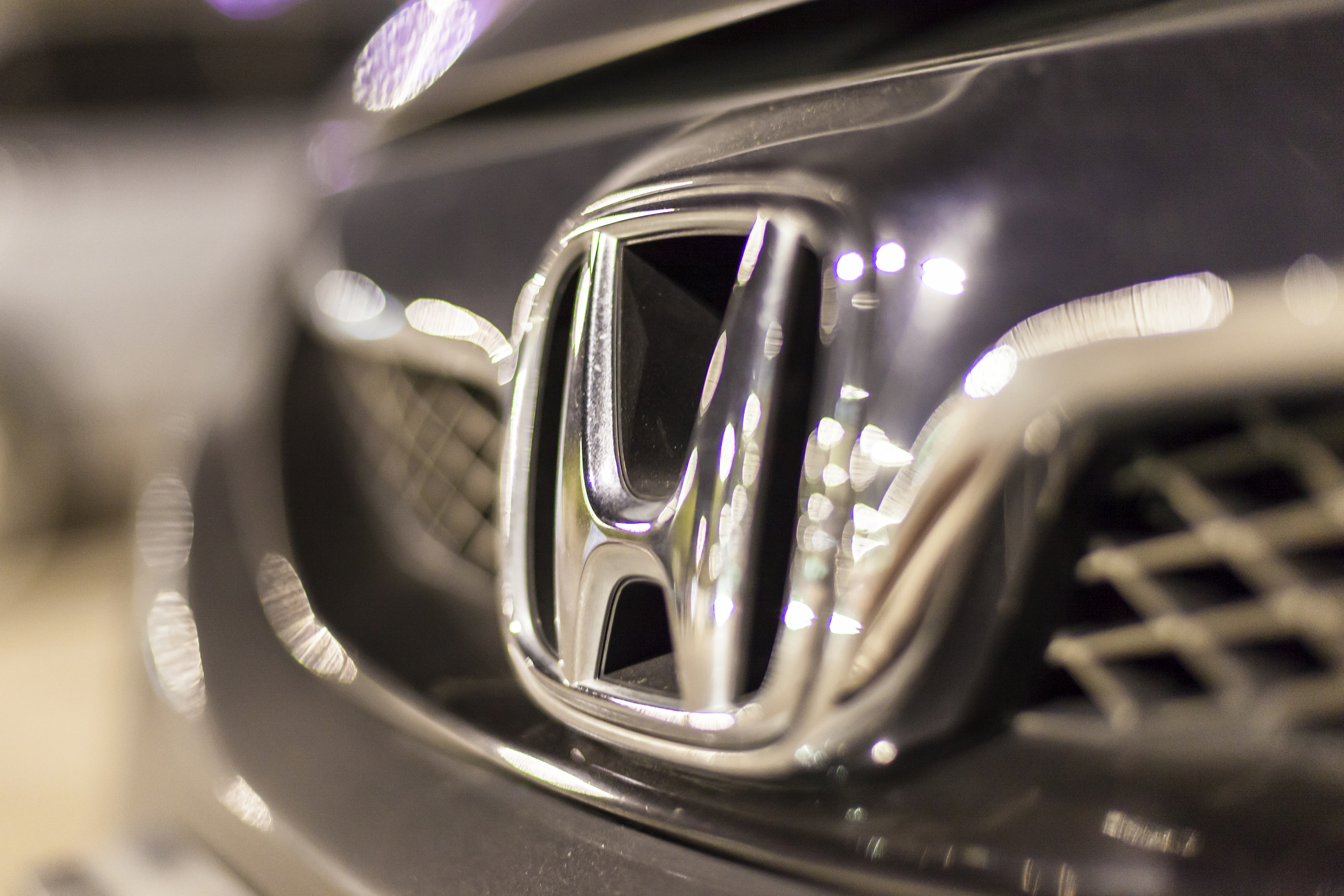
Honda’s logo, for example, is simple and easy to identify. It also reflects the company’s philosophy toward manufacturing. Anybody who walks by, for example, a Honda Odyssey service sign will see that wide and thick ‘H’ and associate it with durability and reliability.
Make it memorable
Often a person will only take a quick glance at something before moving on. By making a logo memorable, that one moment is enough to make a positive impression.
BMW’s logo design is simple yet eye-catching. The thick black circle outlined in silver with the company’s name contrasts with the blue and white center in a way that pops off the car. It’s hard to not notice when a BMW passes by.
Focus on one thing
The simplest logos are the best logos. Putting the attention on one aspect of the design is enough for it to stand out. There’s no need to divide one’s attention.
Volkswagen has kept things neat with its logo. The ‘VW’ represents the company name, while the blue background represents class and the white letters stand for purity.
Car company logos made easy
Looking to create the next iconic logo? Online Logo Maker has some great design tips available. Check out the free online logomaker to help you get started in no time.
5 Characteristics of Memorable Auto Repair Logos
Posted on June 28, 2017 by Logo Design Tips and Tricks

Everyone likes an attractive face, right?
Well, a logo is the face of a company. Because consumers take only around 10 seconds to form their first impression of a shop’s logo, it better be a good one!
Since auto repair logos find their way on to nearly every piece of marketing material including key tags, repair forms, and service stickers, it’s important that the visual representation of a company’s brand leaves a lasting impression with customers.
Read on to learn the five characteristics that lead to designing great auto repair logos.
1. Recognizable
When an auto repair shop designs a logo they want to use a bit of foresight.
Does their logo stand out among the competition? Is it distinct enough that people remember their brand?
Try highlighting one area of expertise in a logo.
For example, maybe a shop specializes in repairing linear actuators. Can this element be worked into a logo to make it memorable?
A great place to get feedback is by asking current customers. Did they recall seeing a certain logo and choose services when the time came because of it?
The way they answer is a great indicator of whether a logo is identifiable or not.
2. Simple
It’s easy for things to get complicated when it comes to designing an auto repair logo.
A lot of shop owners believe (incorrectly) that elaborate logos are a must to convey as much as possible about their business. Ultimately, this just proves to be distracting to customers.
Keep the design of auto repair logos clean and uncluttered. This is the best way to give customers a clear idea of your company.
3. Relevant
Ever see a cool logo but think “What does that have to do with their business?” Yep, that’s what relevant designs strive to avoid.
Auto repair shop logos should target their specific prospects with the design.
Does the logo emphasize the qualities customers hope to find in a reputable repair shop? Quality? Timeliness? Reliable?
Find out what target markets look for in the repair shops they choose and design a logo around those elements.
4. Versatile
Remember those marketing materials we touched on? This is where versatility comes in.
When designing an auto repair logo, keep in mind how it will look on each business document. Will it look great plastered as an advertisement on the side of a vehicle? A billboard?
Make sure any text, as well as the symbol, are balanced in regards to size and readability.
It can be helpful to create logos in black and white first to get a feel for the design, before adding in color.
5. Timeless
There’s no quicker way to waste time and resources than by designing a logo with trendy elements that will become outdated fast.
Color choice, for example, can make a big impact. Like bright tones? Opt for a muted version to increase the shelf life of a logo.
Picking a font for an auto repair logo can seem daunting but there is a place for a classic style that will stand the test of time.
Design components like these can provide the longevity owners look for in their logos.
Go Forth and Create Great Auto Repair Logos
Armed with the knowledge from this post, shop owners can take the reigns and create logos that leave customers with a positive impression of their business.
Looking for a way to design auto repair logos? Start here with our online logo maker tool – it’s free!
5 Must-Know Facts About Famous Motorcycle Logos
Posted on June 13, 2017 by Logo Design Tips and Tricks

Whether you’re obsessed with motorcycles or just want to know more about the history of logo design, this is the post for you.
In it, we’re sharing the top 5 facts behind famous motorcycle logos.
1. Harley-Davidson’s Shield
Of course, this is probably the most recognizable of all motorcycle logos.
But did you know it actually depicts a shield, and that it has been around since 1909?
Additionally, Harley-Davidson had its own special font created just for the logo. Now, it’s been used by multiple companies and designers to give a tough, chrome-filled look to countless products.
2. The History of Honda
Everyone can instantly recognize the gleaming, chrome silver “H” of the Honda logo. But the logo the company uses for its cars is different than the one it places on its motorcycles.
The main difference?
An upward-facing, bright red wing. Over the years (and during special occasions or limited releases) the wings have been many different colors. We especially like the basic black, or the more patriotic red, white, and blue.
It seems like a great excuse to keep collecting more motorcycles!
3. Ducati’s Evolution
If you’re a motorcycle buff, you may have noticed that Ducati’s logo has changed several times over the years.
When the company was first created in the 1920s, the logo included a bolt of thunder. Later on, Ducati’s motorcycles were branded with a bird in flight. Soon, red and green, the colors of the Italian flag, were added to the mix.
Today, Ducati’s logo is a red shield shape, with silver writing and a depiction of a slightly curved road.
Who knows what will be next?
4. Yamaha’s Musical Past
You’ve seen the Yamaha logo countless times, but do you actually know what it is?
Interestingly, it’s actually a tuning fork! This is because the founder of Yamaha wasn’t initially in the motorcycle business. In fact, he was a celebrated piano maker.
If you fall during a bike ride, this would be a great story to tell your motorcycle injury attorney!
5. The Truth About the BMW Logo
Lots of people wrongly think that one of the most famous motorcycle logos, the BMW logo, is an airplane propellor.
Well, it turns out, they’re wrong.
However, it’s not too much of a stretch, as the logo does have something to do with aviation. This is because the colors of the logo are actually based on the flag of the Bavarian region in Germany.
But while BMW actually did make airplanes during World War I, afterwards, it switched to making motorcycles.
How’s that for a fun cocktail party fact?
You’re Now an Expert in Motorcycle Logos!
Thanks to this post, you know much more about motorcycle logos than most — and you can use this knowledge to inform your own logo design.
What this article teaches us is that great care went into crafting these logos. Nothing was done randomly. Apply that same intention to your own creations.
For more design inspiration, check out our blog. If you’re ready to start making your own design, use our free online logo maker tool.


