Challenge Coins: 8 Tips for Creating the Perfect Logo for Your Custom Coins
Posted on April 01, 2018 by Logo Design Tips and Tricks

Making a beautiful logo is a fundamental part of running any business.
Whether you operate in the financial sector, run a travel company, manage a local restaurant, or do home renovations, the right logo can help you stand out. This is something that goes on everything from your company’s branded apparel to business cards and unique promotional items.
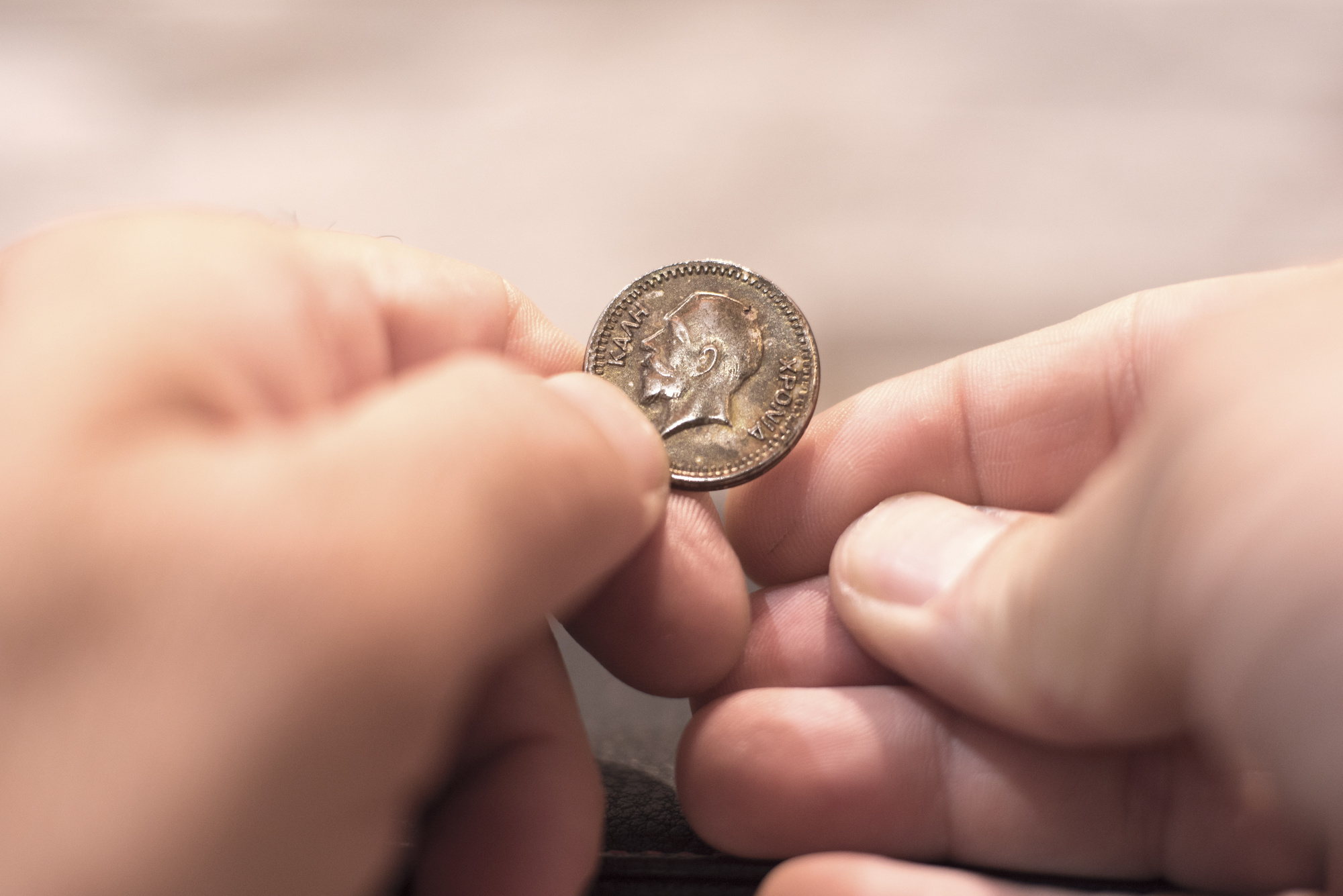
Promotional items include classic tools like pens and stress balls, but also distinct pieces that you can give out, like custom coins or special pins. If you’re exploring the option of making custom challenge coins, you can’t pursue this idea without the proper logo.
That’s where we come in. Our design system is here to help you turn your current logo into something that is coin-ready, considering challenge coins are pretty small!
First, though, you need to know a thing or two about logo design.
Below are all the tips you need.
1. Try to Be Timeless
No matter if you’re building a logo from scratch or manipulating your current logo to something that is suitable for custom coins, focus on one thing: being timeless.
This is the only way your logo will be remembered. Many people collect custom challenge coins because they are fun, unique items that are hard to come across. But, they don’t always remember the company that provided a certain coin in the first place.
That’s why your logo design matters so much. The more memorable your logo is, the more likely someone is to remember the actual products and services offered by the company a logo represents.
2. Brainstorm, Brainstorm, Brainstorm
How do you come up with a timeless logo?
By taking the brainstorming stage of the design process seriously. Take a moment to sketch out a few logo ideas before you start the digital version. This helps you get out of your head and visualize which ideas work and which don’t.
To make the brainstorming process even more effective, draw a circle around each logo. This allows you to conceptualize how it will look on the custom coins you want to create.
3. Manipulate Colors and Shapes
Once you have a few quality design ideas, develop them even further.
Take your sketches from pen and paper to a digital screen. Use the online tools provided to play with different colors and shapes. The shapes you use don’t have to be exact representations of a square, triangle, or so on.
But, using shapes as a basic outline for the design of your logo makes a big difference. This puts the concept of shape psychology to work. In logo design, certain shapes can exude a sense of trust, balance, or community – depending on what you want your company’s custom coins to stand for.
Similarly, there’s also a different set of color psychology for logo design. Educate yourself on these matters in order to send a message that is loud and clear (and effective!) to your audience.
4. Make Something Eye-Catching
While you’re figuring out how to relay your company values or purpose through shapes and colors, make sure the logo as a whole can turn heads.
If you aren’t creating a design that is eye-catching, you won’t get the results you’re looking for. Think about how your logo will stand out among many others. This goes for when it’s used on challenge coins, lanyards, and all other kinds of promotions.
Wherever you put your logo, it has to be easy to notice.
5. Brand Your Heart Out
It’s one thing for someone to notice your logo and another for them to recognize it as part of your brand. This is especially true if you have one variation of a logo for regular business purposes and another for your custom coins and other promotional items.
To build brand recognition, you have to make a logo that is a clear representation of your brand. A brand is a complex thing to identify. It’s both the signature colors of your company, as well as the products you offer and the quality of service you provide.
All of these details have to be summed up in your logo.
It can sound like a hard thing to do. But the longer you work at it, the more your brand will become front and center of your logo design.
6. Add a Special Touch
To further encourage brand recognition, think outside the box.
There is bound to be an element of your company that is entirely unique, no matter how many competitors or the amount of exposure you have. Think about things like office traditions and phrases that guide your culture.
Does your company have some sort of mascot or another internal symbol that isn’t necessarily a part of your logo yet? Add it to the design you’ve created and see how much more unique the overall look of the logo becomes.
7. Consider Use and Placement
At the end of the day, regardless of what your logo looks like, it’s going to have a limited amount of space when placed on custom coins. Keep this in mind throughout your design process.
The final version of your logo should be something that is scalable down to the smallest coin, and up to a big poster or even a billboard, too. The best way to achieve this is to keep it from being too busy.
A simple design turns heads when displayed on small pieces and is easy to understand. More so, it’s a classic look that can be used on bigger canvases, too.
8. Don’t Be Afraid to Edit
Throughout the logo-making process, you’re going to make plenty of edits.
This may have you thinking that once all the pieces come together, you’re done. In reality, the “final version” of your logo will go through many edits before it is actually complete.
It’s true that edits can be time-consuming. But, the more attention you pay to the small details and the effort you put into tweaking them, the better the true final edit will be.
Design Your New Logo for Your Custom Coins
Whether you’re building a logo for custom coins or figuring out how to display your logo for bigger uses, you need the right system to do so. Having access to a logo maker turns edits from a big hassle into a simple design process.
To discover just how easy logo making can be, click here.
How to Create the Perfect Logo for Your Postcard Business
Posted on February 20, 2018 by Logo Design Tips and Tricks

Designing a logo is deceptively difficult. You need more than just a cool name or object to grab attention. In fact, you don’t exactly want to be too flashy with your logo, it can have the opposite effect.
As a postcard business, your logo needs to be memorable and pleasant on the eyes. The perfect logo encompasses many key design aspects while complimenting the brand. As such, 72% of marketers agree, branded content is more effective than advertising in a magazine.
We’ll show you how to take your postcard business to the next level with a strong logo design.
Target Your Target Audience
Your logo needs to represent all the characteristics of your target demographic.
Are they young? Blue collar? Conservative? Sports fans?
These traits must somehow be present in your postcard business logo.
Take the logo for Disney, for instance. While there are plenty of adults who enjoy their movies, children are their target demographic. The logo reflects fun, magic, and creativity. These traits cannot be reflected in a basic comic sans or script font.
For your logo to be successful, it needs to capture your branding as well as the attention of your most valued customers. Subtlety goes a long way when you’re talking about a logo that you want to be remembered for, hopefully, the life of the company.
A Perfect Logo, Big or Small
A great design translates well on nearly any canvass, big or small. It needs to be recognizable on the postcards of your postcard business, as well as the billboards on the side of the highway. This demonstrates the versatility and clarity of a logo’s design.
The perfect logo can convey two ideas or messages at the same time without losing any of it when shrunk down to a postcard. How does one achieve that level of fidelity? Well, you might be surprised to hear that the simpler the design, the easier it becomes.
While logos with a lot of detail, shadowing, or special effects may look great on a website or poster, it’s unlikely that same logo can be used on a postcard or business card. You’ll see a lot of small businesses make this mistake. They will hand you a business card with their logo in a muddy mess because:
- They shrank a JPEG
- Their logo was not made to be so small
Try to aim for a logo that works great in a monochromatic scheme as well as a 16-bit web graphic.
Be a Leader, Not a Follower
Playing things safe is a tempting path to take when designing a logo for your postcard business. Keep things conservative, simple, and corporate makes sense. The problem is that you’ll just blend in with all the other competitors if you don’t take any risks.
Set the bar above expectations by avoiding trends and creating your own unique look. Personality shines through and sticks with the customer for a much longer time.
Master Color Theory
Choosing the incorrect color scheme could turn a strong logo into an unappealing and forgettable one. It’s not just about being bright and bold, it’s about finding a balance. A muted color scheme could provide a level of trust and sophistication, or it could blend in with the background and be missed.
Each color on the color wheel pairs with certain moods and emotions, it’s important to take these into consideration when branding.
There is a lot of psychology behind colors and logo design. Read some basic color theory to help you understand how to apply it to your postcard business.
Smart Negative and White Space
Negative space is often overlooked when designing logos for a postcard business.
Space needs to be accounted for if you want a smart and cohesive image. Poor use of white space leads to off-centered logos and lack of eye-catching properties. Good use of negative space tricks the brain into seeing more detail than what is there, thereby drawing the customer’s eyes in longer.
Logos should always be designed with the expectation that they will be placed on a white background at some point. Whether that be a banner, postcard, polo shirt, or a coaster. Strong logos excel at blending with white spaces.
Take Your Time
Craft your logo carefully, make sure it matches your branding. Look for ways to curate your brand and incorporate elements in the logo that reflect that. If you rush and create a logo just for the sake of something new, you might lose your identity.
This goes hand-in-hand with creating trends, not following them. If your competitor just went through a rebranding phase and created a new logo, wait before you decide to match it. If you’ve been with the same logo for over a decade, then that’s different.
Just be conscious of carrying over elements of your brand to your next logo design. Refresh is always better than a rebrand, unless you’re trying to leave behind a tarnished image.
Test and Adjust on Feedback
No matter how amazing your logo design may look to you and your designer, you must find out how it will be received. Of course, you could just throw it out there and get reactions if you prefer to live dangerously. For any postcard business that isn’t swimming in cash, there must be a test run or focus group studies.
Without any survey data, you would either be in the dark as to the impact of your logo design or witness a decrease in sales before going back the drawing board. Not a smart use of the budget, to say the least.
Protect Your Logo
Before you upload that logo to Send Photo Postcards Online, you must remember to go through the proper channels to protect your work. Register it as a trademark to prevent thieves from appropriating your brand.
Considering how small you are as a business starting out, it will be difficult, if not impossible to defend yourself from a larger entity stealing your idea if you don’t copywrite it.
If you live in America, you should look into how to copywrite or trademark your logo. If you delay on protecting your logo, you may become a victim of what are known as “copywrite trolls” which lay in wait to steal other’s work and then in-turn sue your business for infringement.
Avoid Cheesy Cliches
If your postcard business has “world” or “globe” in the name, don’t design a logo with a world or globe as the focal point. This is just taking the easy way out of designing something fresh. You want people to remember your logo and immediately associate it with your brand.
Yes, we know there are some major brands that aren’t following this rule of thumb (we’re looking at you, Burger King and Target). They can afford to have boring, uninspired logos.
Consider a Text-Only Logo
Using an object or image represent your brand can be tough to design from scratch. It can cost a lot to brainstorm and refine a visual-based logo that fits your business perfectly on a postcard. Going text-only may remedy this problem, you’ll just need to focus on creating an amazing font.
Notice that we said “create” an amazing font? That’s because most standard fonts are inadequate and can’t stand on their own as a logo. Instead, use a font you like as a base, then try to design and modify it until its personality matches your branding.
Shape Versus Text
For startups, we need a bit of perspective here. If you’re an unknown brand, take this opportunity to use wordplay by shaping your logo around your text. If your logo just reads like an address label, it will be forgotten. If, however, your logo looks like something you would put on your car bumper, then it will stand out tremendously.
You don’t have to go fancy or ornate as a postcard business, you can play around and have fun with your brand. Just do it within reason and use the above design principles while you’re at it.
Start Designing Your Postcard Business Now!
We hope this guide has helped you get an idea of how you want to design a logo for your business. There’s no real winning formula for logo design because it is a form of artistic expression. You cannot predict how people will react until it’s out there.
With that said, don’t let your good ideas go to waste, we have a great multi-featured logo maker that you can try right now. Even if you have no experience using graphic design tools or photo editors, our online logo maker is for everyone.
An easy-to-follow tutorial shows you all the basic functions, then you can intuitively get your logo ideas down. Whether you plan on doing all the designing yourself or hiring someone to finish the job, our powerful logo maker is a great place to start.
5 Elements of a Compelling Gallery Logo
Posted on June 30, 2017 by Logo Design Tips and Tricks

Just like paintings and other forms of artwork, logos carry a whole lot of meaning.
Designing a logo comes with a lot of responsibility.
If you are designing a logo on behalf of an art gallery, that responsibility doubles. After all, you’re in the business of compelling people through imagery. Your audience is definitely going to hold your gallery logo design under more scrutiny than, say, a restaurant’s logo design.
So how do you make sure you create a logo that your audience will love?
Keep reading to learn about the 5 essential elements of a compelling gallery logo.
1. Research Your Target Audience
You know not everyone is going to have the same feelings about a painting, but there are certain paintings that evoke very similar emotions.
The same can be said about logo design. It’s impossible to create a gallery logo that absolutely everyone finds compelling, but you can certainly create one that the majority of your audience will be interested in.
In order to make that happen, you first need to understand your client base. Considering you work in an art gallery, understanding your client base should be quite easy. You already know the type of people who come in on a day-to-day basis., who invests in memberships, etc.
For example, if you attract an older crowd, you’ll want to go for larger prints. If your crowd is younger, then you’ll want to incorporate vibrant colors and cutting-edge designs.
2. Make Sure It’s Unique
While it can be good to check out what the competition’s doing, sometimes too much snooping can make you a copycat.
Make sure you understand the common styles of your industry without infringing on another gallery’s trademarked look. Not to mention, you don’t want your audience confusing your logo with someone else’s.
3. The Right Color
You know better than anyone to never underestimate the power of color.
Just like an artist carefully selects the right oil paint colors, so too should you carefully select the right colors for your logo.
This is because the psychological power of color can be very persuasive. There are so many color types to choose from- warm, neutral, vibrant, dark, saturated. And all of these will send a different kind of message to your intended audience.
4. Shy Away From Metaphors
In the world of art, everything is supposed to “mean something.”
While it’s nice if your logo does have a special meaning, don’t overdo it. If you focus too much on portraying a certain meaning, your logo won’t appear clever or artistic, it will only appear gaudy and complex.
Remember, you are going to be using your logo in a variety of mediums. Keeping it simple is the best way to ensure it translates onto all of these spaces.
5. Create Multiple Designs
You’re probably not going to nail your logo design on the first try, and that’s okay.
Create a few different designs, and set aside a day or two before sharing them with anyone. This will allow you to see it with fresh eyes the next time you look at it.
Compelling Gallery Logo Wrap Up
We hope this article gets you excited about creating a compelling logo for your gallery.
As you can tell, a lot of thought and consideration goes into creating the perfect logo.
If you are ready to bring your ideas to life, be sure to check out our tutorial for our online logo maker. This exciting tool allows you to create an affordable logo in no time at all.
And of course, drop a comment below with any questions you may have about logo design.
3 Visually Stunning Art Logo Trends for Craft Supply Stores
Posted on June 27, 2017 by Logo Design Tips and Tricks

Are you a craft supply store looking for a visually stunning new art logo to attract shoppers and give your brands some personality?
If so, you’ve come to the right spot.
Today, we’re breaking down three trends dominating the art logo design field today. We’ll show you how they can add the pizazz you need to stand out from the crowd.
Ready to get started? Let’s dive in!
1. Letter Cropping
The late modernist designer Paul Rand introduced the concept that you can still convey a message without showing the entirety of each letter.
Drawing inspiration from this methodology, one hot art logo trend for 2017 is to strategically crop the letters in a logo, showing only the bare necessity to get the point across.
The look is minimalist and simplistic while still adding a creative and thoughtful touch.
A few examples?
Take a look at the cover of this book on the history of Punk magazine. See where the “P” disappears off the bottom of the page?
In addition, the London Design Festival 2016 to its advertising to the next level with promotional materials that hardly fit any of the event’s title on the page but got the message across perfectly.
2. Simplified Forms
This year, logos are taking a step back, scaling their textures, colors, and shadows back in favor of more flat designs.
Art supply stores are especially poised to benefit from this emphasis on simplicity.
Now, even the most intricate and elaborate offerings, such as origami instructions or knitting kits, can be advertised as straightforwardly as possible.
A few trademarks of this art logo design trend?
It tends to focus on just one or two colors, rather than utilizing the whole rainbow. In addition, it stresses neat, straight lines over messy or complicated designs.
In lieu of a more complicated design, these logos are also making use of negative space.
In a nutshell, this design element incorporates the blank space around an object into the overall image itself, turning a simplified logo into anything but.
3. Gradient Overlapping
Want an art logo that’s colorful and simple yet still packs a punch? Overlapping gradients is a subtle yet effective way to achieve that balance.
In short, these logos are ones that incorporate multiple, complementary colors that correspond with each other.
As one color fades, the other picks up in an overlap, creating a visually dynamic, blended image that leaves an impression.
Perhaps the most well-known and iconic example of a logo that utilizes gradient overlapping? MasterCard, with its simple interlocking circle design.
Here, there’s one red circle and one yellow circle that overlap in the middle, creating a sliver of orange. The result? An unfussy, clear approach to branding.
Create Your New Art Logo Now
From art to software and every industry in between, a dynamic logo is an essential part of any brand.
If you’re in need of a new logo design for your company, we’d love to help. Our online logo maker tool is free and simple to use.
Reach out if you have any questions, then register today to get started!
