Does Your Company Logo Pass the Color Psychology Test?
Posted on December 13, 2017 by Logo Design Tips and Tricks

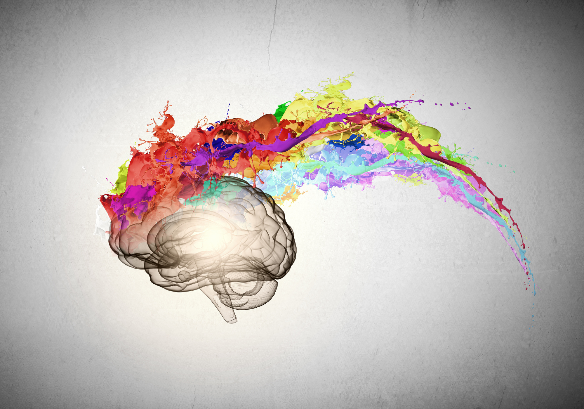
You’ve created a logo design for your company. You’re excited about how it looks, you’ve gotten good feedback from coworkers, and you’re ready to debut your new brand. But have you checked to make sure that it passes the color psychology test?
People tend to have the same reactions to colors, which means that marketing executives can predict how consumers will react to a logo. Every color has a different connotation, and you want to make sure that the colors in your company’s logo are sending the right message.
Read on to discover how to find the right color for your company.
1. Learn How To Pass The Color Psychology Test
Before choosing a color for your company logo, you should know what kind of message you want to send. Do you want people to see your brand as something expensive and exclusive, or do you want to seem affordable? Is your image young and fun, or stable and dependable?
The color that you choose has a huge impact on what people will think of your company. Since green is associated with nature, for example, companies usually use green if they want people to associate health or environmental friendliness with their brand.
On the other hand, companies use red if they want to give the impression of being bold or daring.
If you don’t know the psychology of color, your business could be giving the wrong message without realizing it.
2. Remember Gender
Men and women respond to color differently, so you should know who your target audience is and choose your colors with them in mind.
23% of women list purple as their favorite color, for example, while only 1% of men do. If you’re using purple to market your company towards men, you might be turning customers away without even realizing it.
Similarly, pink is still seen as an exclusively feminine color. If you’re not creating a women’s lifestyle brand or something similar, you should tread carefully using colors in shades of pink.
Colors like blue, white, silver and black are more neutral. You can even combine these colors for great results — check it out!
3. Use Emotion
How do you want people to feel when they see your logo? Emotions are a huge part of marketing, and they’re also an important aspect of the color psychology test.
Yellow inspires people to feel happy, hopeful, and optimistic. Think about the McDonald’s iconic golden arches, for example, and how their marketing always tries to inspire a feeling of happiness.
Blue, on the other hand, is a color that signals to the consumer that they can trust your brand. It’s a common color for finance and healthcare industries to use.
Design Your Logo Today
Now that you know how color can influence what people think of your business, use your new skills to create your logo. Our online logo maker helps businesses create the perfect logo for them, even without graphic design experience.
How will you use color in your business’ logo? Are there any tips that we missed? Let us know in the comments below!
How To Create The Perfect Toy Company Logo
Posted on December 13, 2017 by Logo Design Tips and Tricks

Children are all about visuals. When something pops out at them that they like, it doesn’t matter what it is. They want it!
If you’re marketing to kids, it’s not enough for the toy to look cool. All the branding has to be eye-catching.
Does your toy company have a boring logo? It won’t matter how great your product is if your logo isn’t great, too.
Every toy company needs a great logo to grab children’s attention and bring in sales. Read on to learn how to create the perfect toy company logo.
Think About Your Target Audience
Sure, you know that your target consumers are children. But, to have a really great toy company logo, you should know even more about your target audience.
This will affect other decisions you’ll make for your logo as you work on the design.
What’s the exact age group and gender you’re aiming to sell to? What will appeal to a 4-year-old might not have the same effect on a 7-year-old.
After you know the “who,” you’ll have to figure out the “how.”
How Will Your Logo Be Used?
The way your logo will be used should directly influence your design.
Will you be using your toy company logo on tiny letterhead? Maybe blown up and used on a trade show booth?
If you’re using it across a lot of platforms you have to design accordingly. The logo will have to look just as attractive at all sizes.
A certain font you want to use might only be legible at a large size. Something that looked great on a small logo could look blurry when expanded.
Using a free logo maker can be beneficial if you plan to use your logo for different things. The logo you made doesn’t look perfect blown up to a bigger size? Design another, similar logo that works for the larger size.
When designing a logo on your own, you have more freedom to play around.
Use Other Logos Only for Inspiration
When dreaming up the design for your toy company logo, look to other logos for inspiration.
Look at logos of competing brands. Take note of what you like. Ask yourself what worked for that logo.
Notice the things you would change. You can even get inspiration from logos you don’t like at all. What made that logo so unsuccessful to you?
Consider all of this new information when you’re designing. But, make sure it stops there. The last thing you want to do is make your logo too similar to someone else’s.
Logos are a huge part of brand recognition. When people look at your logo, they should only be thinking about your company.
People will be wondering what that logo reminds them of. The worst case scenario is they confuse your company with another.
The design should be unique and so should the color scheme.
Choose the Right Colors
Choosing the right colors for your logo is one of the most important aspects of design.
Color is a big part of brand recognition. Research shows that consumers make a judgment on a product with 90 seconds of viewing it. Over 60% of that judgment is impacted by the color of the product.
The right color in your logo can make or break how people judge your brand. That’s why you should take some time considering the best color scheme to use.
Go back to thinking about your target audience.
Maybe your primary consumers are 8 to 11-year-old girls. Your first thought might be to make your logo princess pink. Perhaps that’s the right choice for your brand.
But, consider if your product is something boys would enjoy as well. A pink logo will be immediately alienating to them.
Perhaps a more neutral shade would be a better choice.
Click for more inspiration for a toy company logo. It’s a great example of color usage and simple, streamlined design.
Keep it Simple and Streamlined
Think about some of the best logos you’ve seen from the biggest brands in the world: Apple, FedEx, Facebook. One thing they all have in common is that their designs are simple and sleek.
If your logo has too much going on, it will immediately look amateurish. Less is more.
But, that’s great news for you!
You don’t have to be an artist to design a logo. There’s no need to add a bunch of bells and whistles. A simple picture or the name of your company in a nice font will make the biggest impact.
Active vs. Passive Logos
How can a logo be active or passive? They’re two-dimensional, after all.
What makes a logo active or passive is the story that it tells.
Think again about the Apple logo. When it was first designed, it was just an apple. Later on, they revised the logo to have a bite taken out of it.
That’s active. Someone is eating the apple.
The Twitter logo is another example. The original logo design was the bird sitting idle. The revised logo shows the bird in flight.
The Twitter bird is flying off to send your tweet out to the world.
When thinking about your logo, ask yourself, “what’s the story I want to tell about my brand?” How can you make that story more active?
You’re Ready to Design Your Toy Company Logo
With these tips, you’ll be well on your way to designing a great logo for your toy company. Take some time to sketch and brainstorm. The more effort you put into dreaming up a great design the happier you’ll be with the final product.
Are you not sure you’ll be able to figure out how to design a logo on your own? It’s easier than you think.
Before you get started, check out this logo maker tutorial. By the time you’re finished reading you’ll know exactly what you’re doing.
5 Features of a Streamlined POS Logo
Posted on December 06, 2017 by Logo Design Tips and Tricks

Since the point of sale industry is quickly turning into a nearly $100 billion field, you’ll need to offer the best branding to get your name out there.
As with any industry, this begins with finding a great logo.
If you run a point of sale business and don’t yet have a killer POS logo, you’ll need to follow the tips that will help you find that logo.
With this in mind, let’s explore the five features that guarantee a high-quality, streamlined POS logo.
What Makes A Streamlined POS Logo?
Make Your Logo Stand Out
It’s important that you do everything in your power to stand apart from your competition. Since this industry is cracking the $100 billion range, your competition will only continue growing.
Your logo needs to not only be eye-catching in terms of color and design, it should also possess plenty of personality. Doing this will make you a premier company in your field.
For instance, the Harbor Touch POS system logo is subtle, yet recognizable, which is why this company thrives.
Use A Professional Quality Logo Maker
There are a lot of services you can turn to when you need a great POS logo design. However, if you’re in need of a streamlined logo with little hassle, you can’t go wrong using a logo maker.
Having the help of an online logo maker lets you choose the right colors, dimensions, and design on your own, so you can get up and running ASAP.
Be sure that you find a reputable logo maker that gives professional-grade imaging with each file you create.
Hire A Company To Handle Your Logo Design
When you have a bit of a budget and want attention to detail, leave the logo creation process to a professional.
Hiring a professional logo design shop allows you to find the POS logo that will let your company market successfully.
However, don’t think the most expensive logo is the best. Companies like Nike and Twitter have built billion dollar empires with logos that cost them next to nothing.
Choose quality over price when finding your logo design company.
Think About What You’re Trying To Impart
The message is everything when it comes to selling your brand.
Since your POS system will serve as the foundation for a company that chooses to use it, make sure you’re conveying themes of security and trust.
There are endless ways to convey this with your logo, which is why a little creativity goes a long way. But knowing what you want to convey on the front end is half the battle.
Think About Dimensions And Symmetry
Finally, you need to make sure that you’re following some artistic principles that will bode well for your logo.
You need it to be symmetrical, yet not too plain. You’ll also want to emphasize the rights parts of the logo in order for it to stand out.
Get plenty of logo mockups before deciding on the final version.
Interested in learning more about branding and marketing? Check out more of our posts!
How to Design a Welcoming Dental Office Logo
Posted on December 05, 2017 by Logo Design Tips and Tricks

Did you know that there are 195,722 practicing dentists in the United States?
Quite the number, isn’t it?
If you’re a dentist, it’s important to create a welcoming and inviting environment that attracts both current and potential patients. Creating a welcoming dental office logo can help you achieve that sense of warmth and safety.
Unsure how to create your own? Check out our expert tips!
The Tooth Logo
As a dentist, you work with teeth all day long. Whether you focus on restorative dentistry or specialize in pediatrics, all dentists know their way around the human mouth.
There are many ways to create a beautiful dental office logo that features teeth. Play around with using a singular tooth or an entire smile. You can also experiment with different words and shapes.
The great news about having a tooth logo? People automatically associate it with dentists. After all, who else is going to use a tooth for a logo?
Kid-Friendly Shapes and Symbols
Do you work with lots of kids and families?
If so, you already know how scary visiting the dentist can be for young ones. (Although it can be just as scary for adults, too!)
This is where fun animals or shapes can really make a standout logo. Your design can actually impact someone’s mood when he or she walks through your door.
Consider kid-approved animal cutouts like dinosaurs, fish, or dogs. In terms of symbols, you want to do your best to emulate feelings of happiness. These include popular symbols like flowers, the sun, or plants.
Happiness and calmness are the goals here. The image should make you feel good when you see it!
Abstract Designs
With so many shapes, color, and symbol options, making an abstract logo design is easy and fun.
Abstract logos convey a sense of modern elegance. They also convey a sense of classy minimalism, both of which represent timeless marketing trends.
With abstract designs, the sky’s the limit. Play around with different textures, lines, and symbols. Get feedback from a colleague if you’re not sure what is (or isn’t) working.
Mind the Color
Many people fear the dentist, so the experience can provoke a lot of anxiety in some patients.
This means you need to take color palettes into consideration when designing your dental office logo. The following colors are most closely associated with feelings of happiness, calmness, and serenity:
- Yellow
- Silver
- Light blue
- Light green
- Pink
- Lavender
You may want to avoid colors like black, bright orange, and red. These colors can increase feelings of fear or uneasiness.
While color doesn’t necessarily make or break a logo, it’s important to keep in mind when you start designing.
Final Thoughts on Your Dental Office Logo
Your logo is one of the first images a patient sees when he or she walks through your door.
You want the image to be inviting, captivating, and interesting. You also want it to stand out and be unique from your competition.
Ready to get started on making your perfect logo? Check out our extensive tutorial here and let’s get designing!
