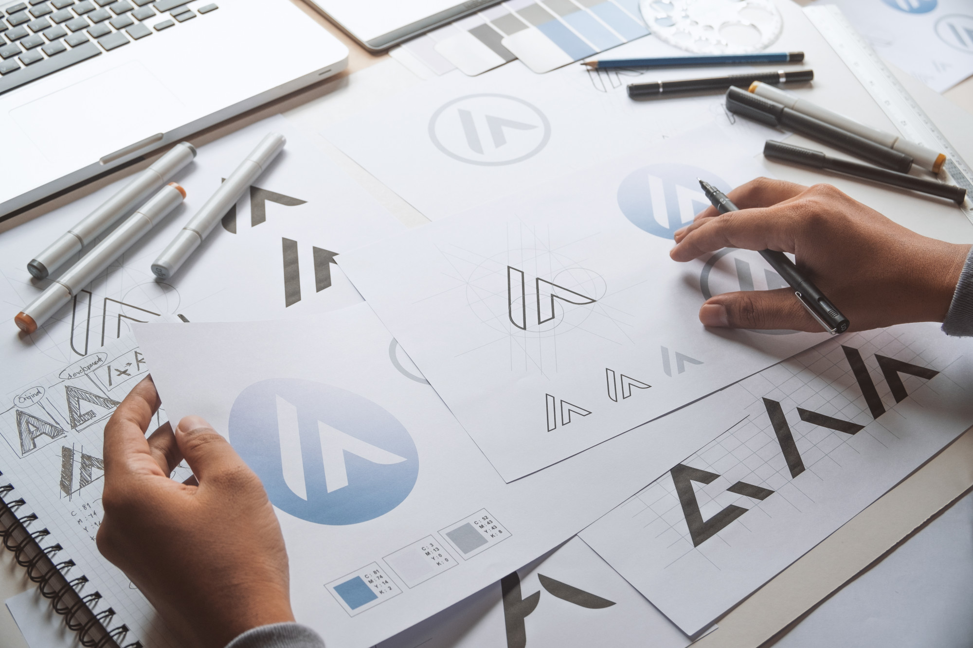
While some brands have spent hundreds of millions of dollars on logos, other brands like Twitter have famously spent around $10 for theirs. When you’re thinking about what types of logos are right for your brand, you have to start by knowing what all of the types are. Logotypes carry with them some meaning and requirements.
Here are some of the most common types of logos that brands around the world are using.
Monogram Logos
These are the logos that are based on the brand’s name. They often entail a unique font put together in a unique way. Usually, companies create their own special fonts for these logos.
Look at NASA, HBO, or CNN for this type of logo. These should be used when the name of the company or brand is much longer than you’d want to have to repeat again and again. When the brand is better known by the acronym or monogram than the full title, more is invested in these logos than full names.
Typography-based logo design relies on just a few letters. These logos are all about minimalism. They help to streamline your brand with a longer than usual name. Remembering the name National Aeronautics and Space Administration is a little more work than NASA.
Wordmarks
While you might have a font for monogram logos, logotypes or wordmarks aren’t focused on the acronym. They use the whole name of the company drawn out.
CocaCola is one of the most famous as well as Disney. Lots of people try to play on these logos or to rip them off as satire. That’s because they’re so powerful and ubiquitous.
A wordmark logo works when a brand has a name that’s unique and easy to remember. Attractive words and things that sound good together really hit home the power of the logo and font.
The point here is to capture the essence of the word or the brand.
Symbols
In these cases, a simple shape or symbol is the main aspect of the logo. While some times the name of the brand is placed side by side with the logo, other times, the logo is a stand-in for the brand name.
Think about the logos for Apple or Target. How often do you just see the logo and know exactly what brand is being depicted?
Choosing a logo symbol means choosing an image to embody your brand. That’s hard when you want to have a broad appeal. How do you showcase a broader meaning with a simple logo?
That’s why so many brands spend millions trying to reinvent their look. For some ideas, take the time to view more options available.
Going Abstract
Logos with pictures but no literal interpretation are common among some of the biggest brands in the world. The Nike logo is one of the famous and most ubiquitous of these types of logos. While it might mean something, the image itself is pretty abstract.
Abstract logos still confine a business to a single pictorial representation, so make sure that you agree with the way that your brand is being depicted. Consider all of the negative consequences or the worse possible interpretations. While it’s unlikely that your representation is going to mean the worst, it’s important to explore the edges of interpretation.
An abstract logo is great for conveying a brand’s purpose symbolically. Look at the Nike logo again. It has freedom and movement all in one simple gesture.
Mascot Logos
Can your brand handle a mascot? Depending on the types of products and services you’re dealing with, it can be a blessing or a curse.
Most of the time, you find them on brands that are more oriented toward kids and families. They’re meant to be cartoonish, vibrant, and exciting. Creating something unique to represent your brand is the goal when you’re choosing a mascot.
The mascot that you choose is an ambassador of your brand. Food brands and sports teams are some of the most common brands using these types of logos. They are fun on t-shirts, hats, and all kinds of swag.
When your goal is to create a positive and fun atmosphere related to your brand, these are the way to go.
Letterforms
Letterforms take the minimalism of monogram logos to another level. They’re also called letter logos. These brand marks have to be bold and beautiful, using powerful colors and memorable shapes. It’s challenging to think of just one letter to represent your brand, but it’s powerful when it works.
These logos are great because they can be used as small images for the web and printed big and bold on billboards. A well-designed letter logo can invoke your brand no matter where they are.
Design is everything when you’re choosing just one letter. It needs to be strong and memorable and use a color that’s bold and exciting. The letter needs to pop and be able to resonate when people see it.
McDonald’s has long been the leader in this type of logo but Yahoo! and Netflix have their own powerful and memorable versions.
Different Types of Logos Bring Different Associations
As stated above, the types of logos available bring certain requirements from brands and designers alike. Using the wrong type could be presumptuous while another type could limit your brand’s reach. It’s all about knowing what you represent as a brand.
When you’re trying to design the perfect logo, consider using a logo maker tool to help support your efforts.


