How to Incorporate Negative Space Into Your Logo
Posted on July 22, 2018 by Logo Design Tips and Tricks
The popularity of reality-bending films give us some clues about people’s interests. Films such as The Matrix, Inception, and Doctor Strange present questions about what is known and what lies beneath.
We become engrossed in talking about concepts of what we see as well as what we don’t see.
When you face the challenge of catching in a potential customer’s mind you want to find a way to front-load and backdoor your message at the same time. You want something that catches the eye immediately.
However, adding in something that takes a minute to reveal itself provides added reinforcement.
For the front-loading, we’ve been coming up with shapes and objects to accomplish that for a while. We know logos have some profound impact on consumers.
For that backdoor into consciousness and lingering appeal, we need to go further into visual psychology with negative space logo concepts. How do you use them in your design? Read on for everything you will need to get started.
Negative Space Logo Design
Negative space design broaches into realms of mysticism. The principles of light and the functioning of the visual cortex play their part in how images are produced.
The interpretation and the fascination we have with them comes down to that gap left for transcendent ideas.
We get a charge out of that ah-ha moment when we notice something that was always there, but not readily apparent. Despite ourselves, we like to both learn and grasp hidden concepts.
So, you may be asking “What is negative space?” Let’s start with that and get you grounded so you can explore the limits of perception.
Go Negative
In a certain sense, negative space is the area between other images. Think of a photographic portrait. The foreground contains the person and the background is usually neutral to not steal focus.
Negative space is that gap between the two components of the image. When no background exist and it is flat, that whole area becomes negative space.
There’s some interesting psychology around what we do and do not see in an image. When negative space is present it can lead us to see something in the nothing between.
Consider the original work of Frank Miller’s Sin City. Instead of drawing in black ink on white paper, he inverted the image by drawing with white ink on black paper. It gives the work a remarkable finished emotional depth.
Which leaves us with the concern of how to create a negative space logo. Start by thinking outside and inside of your boxes.
Be Clever
Utilizing negative space when creating a logo requires you to think about both the seen and the unseen. Modern graphic design programs make this somewhat easier than the mind-bending feats of the past.
Consider how the layers in such a program can be placed on top of or underneath each other.
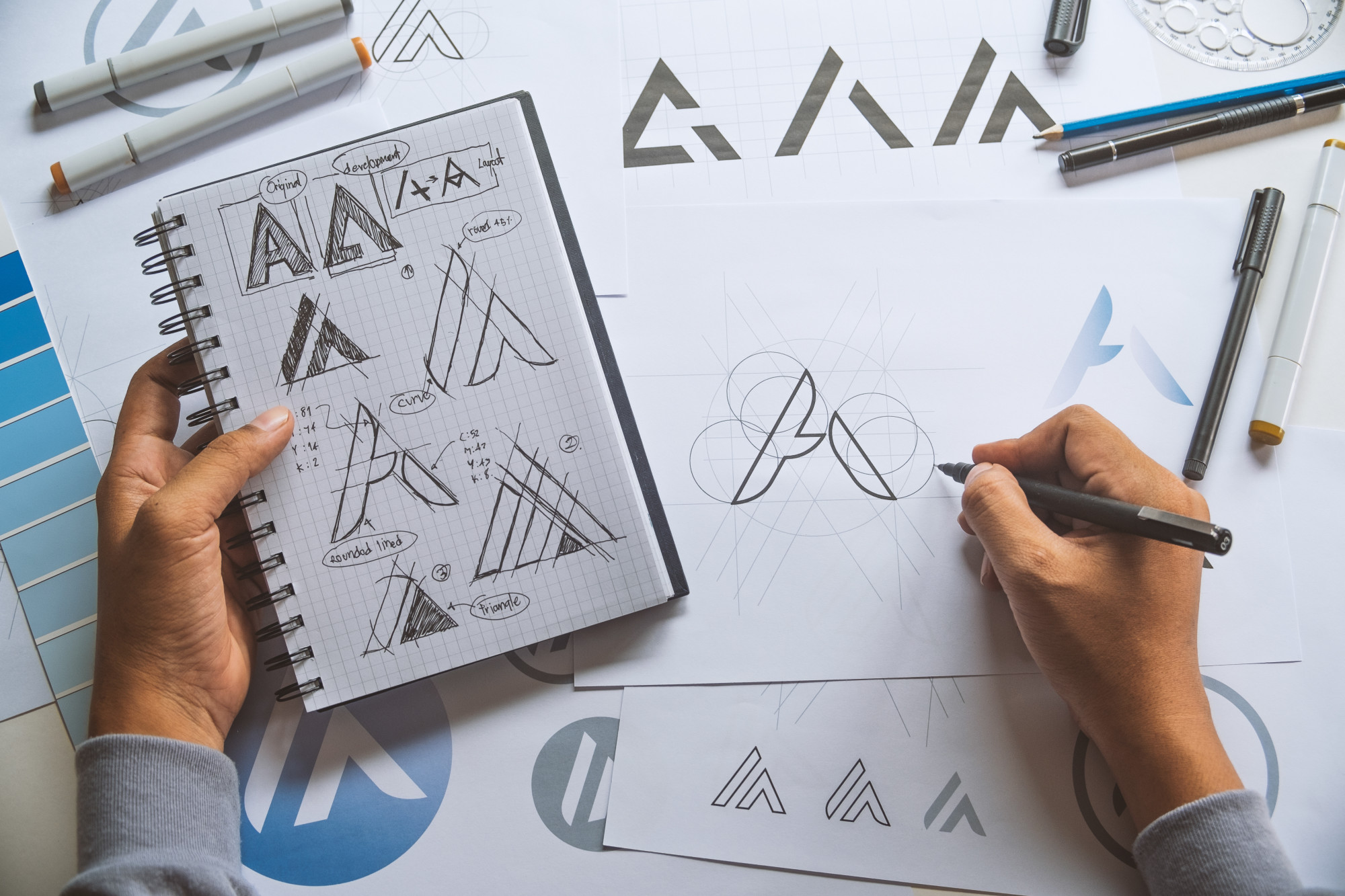
Get clever in placing an image within the shape of a letter o the gap of that letter. Shapes like R, P, and A offer a lot of room to tweak and create a secondary image.
Letters make for good places to manipulate negative space for two reasons. First is that using lettering in logos has a solid track record of efficacy. Second, humans recognize the basic shapes of letters and scan and identify them quickly.
This is part of the basis for how fonts work in the first place. A font takes the basic shapes of letters and changes them. They do so to invoke emotional responses or enhance readability at different sizes.
Different typography allows us to shape a message to be friendly, evoke a sense of unease, or build confidence.
Think Cookie Cutters
When trying to spot logo negative space opportunities, it is best to think about cookie cutters. The shape of the plastic or metal outline creates a negative image.
The space in between, the cookie, can be thought of as the positive space.
As you cut through the dough and pile up your positive shapes, you may notice that the area left sometimes resembles other shapes. This kind of overlapping provides another way to use negative space.
Another classic example is the yin-yang symbol. What exists on one side is seemingly taken out of the other.
A logo can benefit from similar mirroring and enhance its impact. The logo enhances a component by removing it from the positive space and representing it in the negative.
Lurk From the Shadows
Another trick in the box of how to use negative space is shadow enhancing. Much like Frank Miller did with Sin City, reversing the expectations and paint with the white to make the black disappear.
Shadows provide the most black and white way to see negative space. When you see a shadow in the world, you can get an idea of the shape casting the shadow because the shadow resembles, in part, the object.
Shadow puppets work by blocking light and creating an image. You may not have known you spent your childhood figuring out negative space, but there it is.
Creating a negative space logo with shadow effects creates a 3D illusion. It works the same way that drawing a 3D cube on paper does. We imagine what cast the shadow and we ‘see’ that object next to it.
The interplay of shadow and foreground also has a specific psychology to it. We tend to think of things in strict positive/negative of black/white as being serious or professional. It works much like the emotional attachment we have to colors.
Shadow doesn’t have to be only black and white. Two mixed colors can work just as well. The idea of shadow is to represent the quality of blocked or cast light.
Make It Yours
It can take a little bit of time to catch on to the interplay of elements in a negative space logo design. That same difficulty in creating the logo is part of what makes it effective in lingering with consumers.
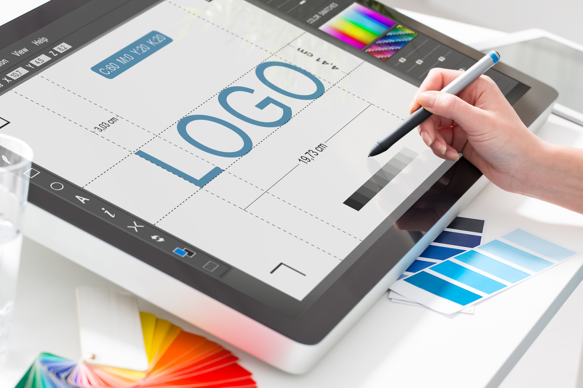
Looking to get started in designing a logo now? Check out our tutorial to learn more about logo design step by step.
How to Balance Negative Space in Finance Logo Design
Posted on July 18, 2017 by Logo Design Tips and Tricks
There has been a shift in logo design within the last decade. More logos are cleaner, easier to identify and involve a balance of negative space and positive space. Graphics are an aspect of your brand that you need to consider polishing up on to reach success.
What is Negative Space?
Negative space is just as important to your finance logo design as many other design features. Negative space is the space that is placed around the logo.
The negative space is used to define the outline of the logo. When negative space is intentionally used, it can command a potential client’s attention by creating shapes that represent exactly what your company stands for.
The key to a beautiful logo design is to find a balance between negative and positive space. Our helpful tips can guide you through the process of creating your own logo design.
Keep Your Finance Logo Design Simple.
Of course, your goal as a company is to make people interested in what your finance business is selling, but keeping things simple will help them remember you better. It’s a proven tactic that keeping a logo simple will attract attention.
The finance logo design for conventional loan companies, for example, use negative space to their advantage. The outline of a house is used as a way to represent their conventional loan company. The negative space used for mortgage companies made it easier for potential clients to identify.
If there are too many elements in your logo (too many colors, symbols, shapes), then your potential client will be turned off by the complexity of your logo. Keep things simple so everyone can understand the message you are sending!
Use One Visual Trick.
Combining two or three visual tricks into your one finance logo design can complicate things. You want to draw attention to your customers so they can associate your company with a professional logo.
For an accounting firm, we suggest including your company name with text that has just one or two colors. To distinguish yourself from the 130,000 other firms, pick an object to use a calculator that has enough negative space on the border to really make it stand out.
Stick to The Traditional Route.
Unlike other industries, like art and retail, finance logo design works best when it takes a traditional route.
Consider companies like banks that rely on a basic logo design that becomes well-known to all customers. Chase Bank, for instance, uses a stylized octagon in a bold blue color with the word “Chase” in an uppercase black font. The level of professionalism that you need to take into account with your finance logo should be considered when drafting your first few potential options.
Final Thoughts
At Online Logo Maker, we offer the best tools for you to create your own individual logo work of art! Make sure to try it out for yourself, because you never know what you may end up creating.
There are a lot of reasons why negative space can be vital to your next logo design, so make sure you think about it during the designing process for your finance company logo.
The Secret Behind Successful Brand Logos
Posted on January 11, 2023 by Logo Design Tips and Tricks
Did you know that 75% of people recognize a brand by its logo?
Brand logos are one of the most important marketing tools for businesses. They help build a company’s reputation, reinforce its identity, and make it memorable.
The best brand logos are simple and easily recognizable. They represent the company’s values and personality in a way that both customers and potential clients can understand.
But how do you create a great logo? And what makes a good logo?
If you are wondering how to create a great brand logo, here are some helpful tips.
A Great Logo Is Simple
One secret behind successful logo design is its simplicity. When you look at the logos of some of the most successful brands in the world, they’re simple.
Think about Coca-Cola or Apple. Their logos are easily recognizable and don’t have a lot of bells and whistles.
When you go to create your logo, think about what is important for people to recognize your brand.
A Great Logo Is Flexible
One of the best things about a great brand logo is that you can use it in many ways.
It doesn’t have to be just on your website or business card. You can also use it in advertisements, on the packaging, and more.
Think about how you want to use your logo and make sure it’s versatile enough for all those applications. If you need to print brand assets, visit the local print shop found here.
A Great Logo Reflects the Brand
A great brand logo should reflect the brand itself. If you want your logo to be recognizable, then it needs to be something people can associate with you and what you do.
A good example of a logo that does this well is Nike’s swoosh.
It’s simple and sleek but also conveys speed and movement. All things that Nike represents.
A Great Logo Uses Negative Space
A good logo makes use of negative space.
What this means is that it’s more than just a single design or shape. It also has space around it to place other elements.
This allows you to use your logo in different ways and on different mediums. This includes print materials, websites, and more.
A Great Logo Is Timeless
A good logo isn’t just something pretty or trendy. It’s something that will last and is timeless.
This means that you can use it as you develop your business. It also means that people won’t get bored with it after only a year or two.
Brand Logos: This Is What You Need to Know
Brand logos are important. They’re an essential part of any brand, whether you’re a small business or a large corporation.
A good brand design can help your business reach new heights. It can also establish itself as a brand that’s recognizable and trustworthy.
Don’t forget to browse our site for advice on business, products, services, and more.
Top 10 SEO Logos of 2020
Posted on January 10, 2021 by Logo Design Tips and Tricks
The McDonald’s logo is worth $110 billion, which is the equivalent value of 275 White Houses.
Top brand logos are worth much more than even the most expensive real estate in the world but many companies hardly give their designs a second thought.
While logos in the digital marketing world may not be worth dozens of White Houses, there are still some good ones around. Let’s look at the top 10 SEO logos of 2020.
Common Design Cues in SEO Logos
If you compare different companies’ logos in the SEO and digital marketing space, you’ll see some common design cues. They often focus on abstract shapes and symbols that indicate growth or ideas.
Abstract Shapes
Illustrated logos aren’t very common with digital marketing services. Most logos use abstract geometrical shapes and designs meant to illustrate their technological focus.
These shapes also tend to have some kind of relevance to business growth, website traffic growth, revenue growth, or other things that would be a logical goal for any companies working with them.
Images of Graphs
Graph imagery is also popular with SEO companies. You’ll see a lot of line or bar graphs in logos, alluding to the company’s ability to increase your conversion rates, revenue, website traffic, and so on. These logos always show an upward trend in the graph.
Strategy and Idea Metaphors
Images like lightbulbs and mind maps are also popular with digital marketing firms. These logos are meant to show how they can help you come up with new ideas and strategies to grow your business.
Communication Symbols
Communication symbols like speech bubbles, messaging icons, and envelopes are also popular in SEO branding. The internet is all about communication in one form or another so this is a natural fit for any web-based service, digital marketing or otherwise.
Top 10 Digital Marketing Logo Ideas
There is quite a bit of variety in the top SEO logos for 2020. Some use abstract symbols, others typographic or mascot-based logos, while some are quite unusual.
Abstract Symbols
Abstract logos often use symbols that have a symbolic meaning in addition to looking good. This helps them stand out from their competition and become more memorable in their market.
1. True North Digital Marketing
True North’s logo uses a line-based design similar to a mind map but also includes a “compass” arrow in the center. This arrow is pointing up, naturally — to true north.
2. Growth Pro
Growth Pro has an image of a plant or flower growing out of what looks like a stack of coins. This is a good metaphor for SEO and PPC marketing, with the money you put into your campaigns creating growth for your company.
3. Hammer and Stone Agency
The Hammer and Stone logo uses iconography that looks exactly like a hammer and stone. Neither one is a literal interpretation but there’s little doubt that’s what the design is meant to be. It uses negative space effectively to create the handle of the hammer within the stone icon.
Typographic Logos
Typographic logos focus on the brand name by making it the focus. But they use fonts and type designs to make the name itself into an icon for the logo.
4. BRND.TV
BRND TV is a video-based digital marketing platform. Their logo is simply the name of the company but it focuses your eye on the BRND name by using a smaller font for “TV”. The logo also adds a bit of color by way of a green highlight under the “TV” text. That green is used throughout their website to create a consistent look and feel.
5. SearchQuake Marketing
SearchQuake Marketing uses a simple two-letter “SQ” design for their logo. The letters are two different colors and overlap slightly. The line where they overlap uses a jagged style that’s meant to look like a fault line or the tracking line on seismic equipment, bringing to mind an earthquake.
6. Befrank Digital Marketing
Befrank Digital uses a simple logo design that incorporates the “B” and “D” from its name into a single shape. That shape also looks like a magnet, indicating how they can help you draw in more website visitors and clients.
Animal Mascots
Companies that have animals in their name often use that animal in their logo in some way. Sometimes it’s a major part of the logo and sometimes it’s more subtle.
7. Bear Fox Marketing
Bear Fox Marketing uses both animals in its logo. The fox is superimposed on the bear using negative space. With a quick glance, it looks like the bear is stepping forward, indicating how the agency can help move your business forward.
8. Dog Bite Media
Dog Bite Media has a simple text-based logo design with a caricature of a dog’s head. This design is about as straightforward as you can get, with an easy-to-read name and a simple graphic to help improve its branding.
Unusual Designs
Some logos are a little more offbeat. They may use humor as part of the logo or they sometimes combine two seemingly unrelated ideas in the design.
9. Clever Digital
Clever Digital’s logo is an egg with glasses. This evokes the stereotypical “egghead” that knows a lot about computers and technology. The idea here is that they’re those eggheads that can help you grow your business online.
10. Hyper Ghost Media
Hyper Ghost Media has a mostly typography-based logo but the “H” in Hyper has a ghost instead of the horizontal line. This is a straightforward way to create a brandable logo from the company’s name.
Which Logos Are the Most Memorable for You?
Which of these SEO logos are the most memorable for you? If you’re thinking about a new logo for your company, consider what makes you remember these and see if you can work something similar into your own design.
Be sure to check out the rest of our blog for more helpful ideas about designing great logos.


