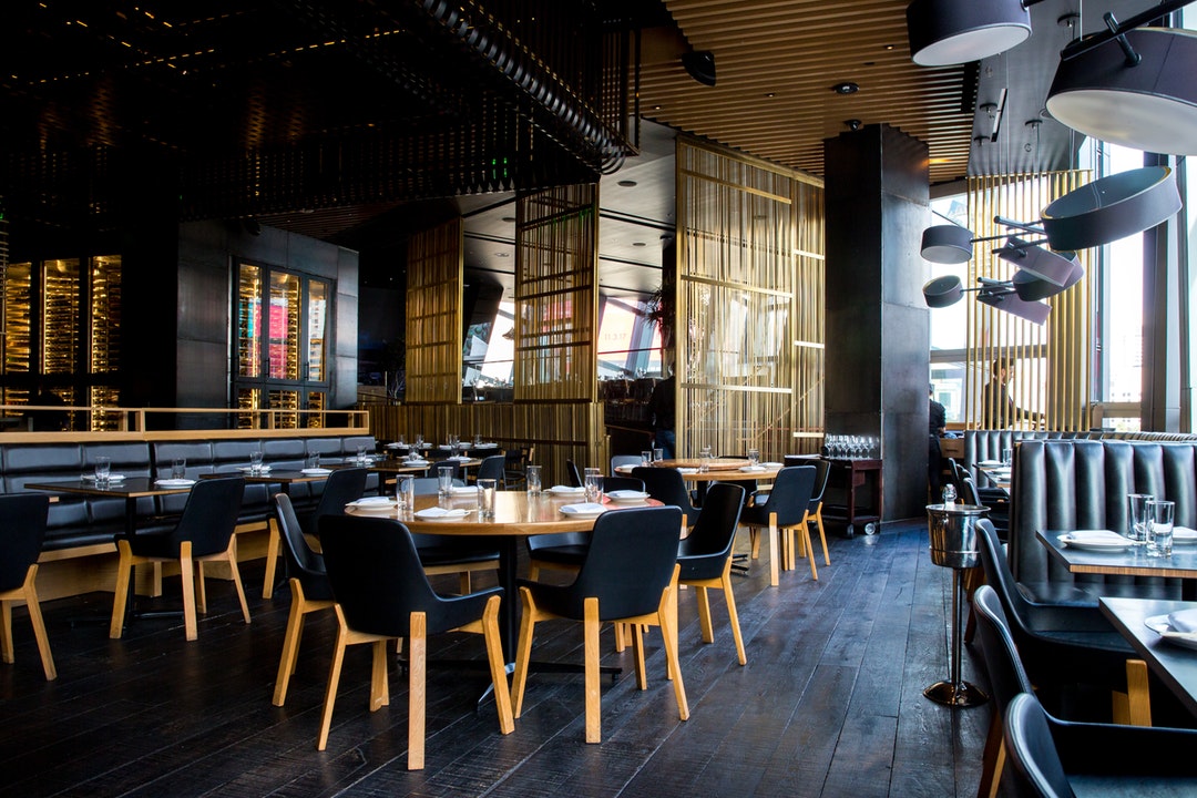
Dining outside of the home has become one of America’s favorite commodities. In fact, the average household spends over $3000 a year at restaurants, which is a huge chunk of salary.
The market is hot and ready for restaurants to succeed. But, you do have to be aware of how steep your competition is. The restaurant industry is actually quite over-saturated, making it hard to captivate new diners.
You have to deliver more than just quality food. Everything from your aesthetic to your brand needs to be on point at all times. Let’s focus on the latter, as branding is imperative to the success of all businesses.
When building a brand, a logo is a great place to start. It gives customers an eye into your company while telling a unique story. These 7 restaurant logo designs will give you inspiration for your own product.
1. Olive Garden
Everyone’s favorite chain Italian restaurant can teach us a bit about color appropriation. When designing a logo, you need to keep in mind how well your color scheme works together.
Olive Garden makes use of an olive green, which is often associated with Italian culture. Many Italian restaurants use this dark green or even a red to emphasize their flair. We indirectly ascribe meanings to colors, which is why greens and blues send different messages than pinks and purples.
What colors can help an audience resonate with your brand? If you’re a fast food restaurant, you may consider red or orange, as they allude to joy and speediness. A more high-end restaurant should consider a purple, black, or white.
2. Cracker Barrel
Cracker Barrel is a perfect example of how to use imagery to tell a story. You see an elder man leaning against a barrel, with the words “Old Country Story” in the center. This is because Cracker Barrel started as a small country store long ago.
So, how can you capture your own story? A good place to start is to consider why your audience chooses you over other restaurants. Are you freaky fast? Family-friendly? Fresh? Finger licking good?
Use an anecdotic to drive home what your brand sells. Finding a unique selling proposition is essential to finding brand identity.
3. Denny’s
What makes America’s favorite diner so ubiquitous in mainstream culture? No, it’s not that you can find one at nearly any exit off the freeway.
It’s how Denny’s props itself as an iconic brand that withstands through time. Part of its timeless appeal comes from its typeface logo, that only states the company’s name.
It’s not fancy or gaudy. It’s not overly decorative or complex. It doesn’t get crazy with colors or symbols. It simply states ‘Denny’s’ in a bold, red font with a yellow background.
This is one of the best examples on how to keep a logo simple, yet expressive. Sometimes the most creative logos aren’t the ones that are so in-your-face.
4. Oodles Noodle Bar
You’re probably not familiar with this Thai-influenced cafe unless you live in Seattle. But, Oodles can teach us all about getting creative with a logo through balanced shapes.
It’s advised to not use unfamiliar shapes when designing a logo, as it’ll confuse your audience. Instead, go with a symbol that is recognizable, and that ties your brand neatly together.
As a noodle bar, it makes sense why Oodles chose two chopsticks and a bowl in its logo. They took their creativity one step further by situating their main offering in the middle of the image. It’s familiar, yet innovative, and leaves no confusion amongst consumers.
5. Bottle + Kitchen
Another restaurant that’s probably unbeknownst to you is Bottle + Kitchen, an American gastropub based out of Portland. What makes this logo so special? Despite having a mix of different shapes, Bottle + Kitchen keeps a clean, symmetrical look.
Having a symmetrical logo doesn’t always mean you’re going to have a balance of shapes on each side. What’s important is optimizing the space, so one side isn’t filled while the other is completely blank.
You can measure this by imagining a rectangle or circle surrounding your logo. Would the edges of your logo meet the outer part of the encompassing shape? This can also help if you need better alignment.
6. Wendy’s
Since Dave Thomas opened this iconic burger chain in 1969, his redheaded daughter has been apart of the logo. Not only was the founder a family oriented man, but he also prided himself in old-fashioned values.
This logo exemplifies all of those qualities. Despite being one of the largest burger chains in America, we still get that homegrown feel from the Wendy’s logo. The inclusion of Thomas’ daughter has resonated so well because it sends that unique message.
We feel confident in the product we’re getting because of that family tie. This is the type of differentiator brands should look for to set themselves apart.
7. Roka Akor
You can find Roka Akor throughout Scottsdale, Chicago, and San Francisco. It’s a luxurious, award-winning sushi and seafood brand whose logo says just that.
Their logo is neatly tied together with a discernible black font and modern Japanese typeface. There isn’t a ton of words, symbols, or other shapes, which keeps it from looking cluttered. Still, when you see this logo, you can tell the message it’s trying to convey.
Sometimes familiarity isn’t such a bad thing, and Roka Akor uses this to their advantage. We get the feel that it’s an elegant restaurant, and it’s uniqueness still shows through expressive font.
In Need of a Restaurant Logo?
Designing your own restaurant logo doesn’t have to be so challenging. With our easy-to-use logo maker, you can become your very own graphic designer!
Get started by registering with us today!


