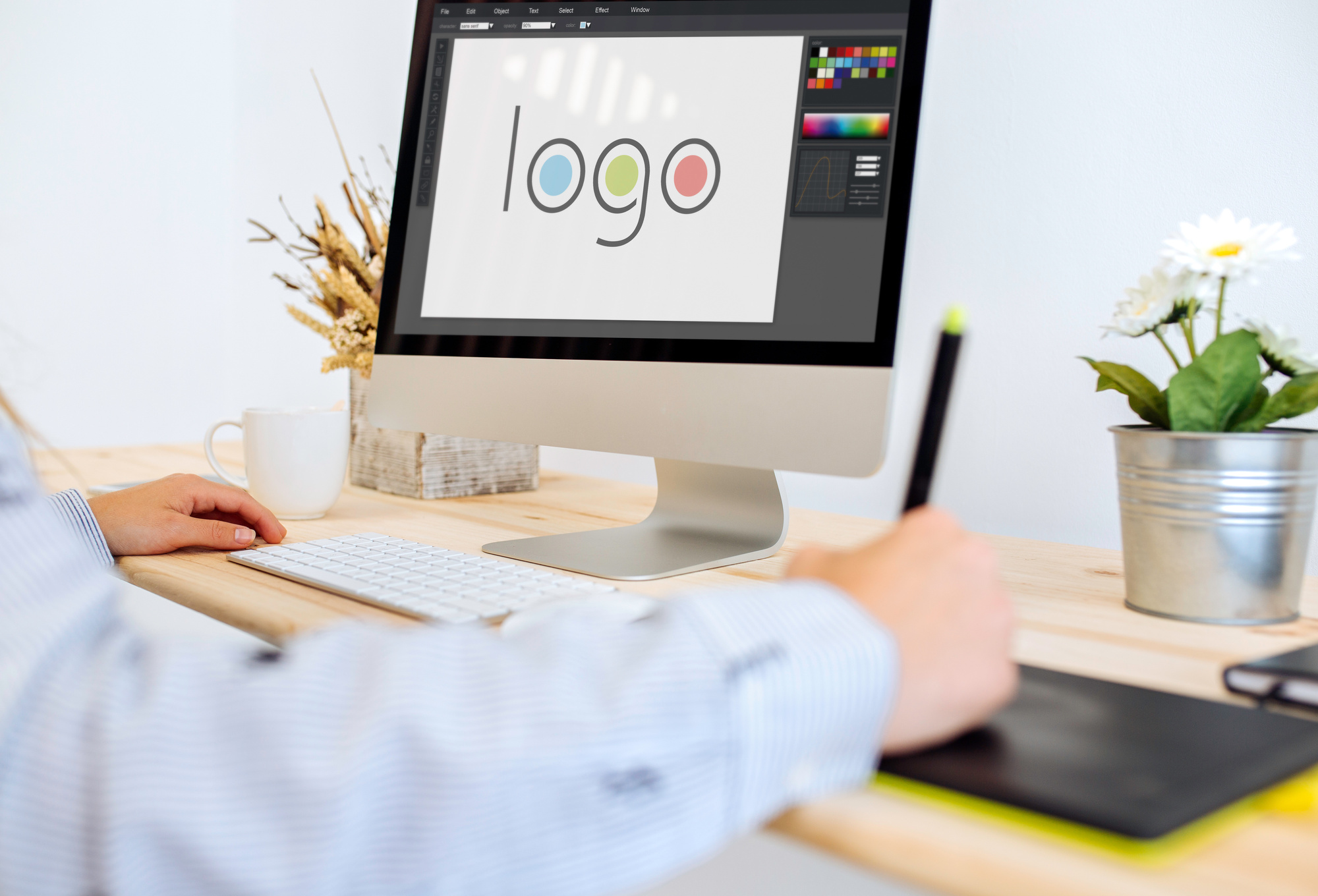
Branding is the best way to get your company noticed. It’s what you could call the summation of your marketing campaign, or even the face your company. What image you choose to project can make or break your business.
One of the biggest aspects of branding is your logo. Your chosen graphic becomes the figurehead for your company and makes your first impression.
Flashy logos project a different brand vision than subdued, text-only logos. It’s up to you what type of logo you want to project to consumers; just ensure it’s unique and representative of your vision.
However, despite the enormous variety in logo making, there are some hard and fast rules that good logos should follow. Deviate from the standard too much and you’ll send customers running in the opposite direction.
To help you get started we’re breaking down 7 rules for logo making that every business should follow. Let’s get started.
Logo Making 101
Logos are more important today than ever to represent your company. The explosion of the internet and web-enabled devices mean we’re becoming more and more visually oriented. U.S. adults spend over 10 hours per day looking at screens, and thus inevitably looking at logos.
Think tech companies for a second. Facebook, Twitter, Instagram, etc. You’re probably picturing either the website itself or its logo. They’re one excellent example of the capitalizing on screen-time with memorable logos.
So it all begs the question, what goes into a successful logo? What do you need to succeed? How do you create a logo as ubiquitous as Facebook’s or Twitter’s?
Well…
Hire a Professional
First and foremost, it’s best to consult a professional. This doesn’t mean you can’t have control over the creative process. In fact, it’s important that you do remain in control over most aspects of your logo.
However, complete control doesn’t mean shutting down suggestions from the people who design logos day in and day out. Professional logo designers know what works and what doesn’t.
Plus, they have the expertise in actually creating your logo. Chances are your staff doesn’t have an in-house graphics professional. Logo design programs like InDesign and Illustrator take years to learn, and even longer to master.
Unique to Your Brand
Though just because you need to find a professional doesn’t mean you can’t start brainstorming in the interim. As we touched on above, keeping your logo unique is priority number one when it comes to initial design.
Think of it this way. You want your logo to remind people about your company. If it’s too similar to another company’s logo, the entire premise is gone before it started.
If you’re selling cars you want people to think of your dealership when they see tour logo. Not your dealership and the one right down the road. You need to capture as much consumer attention as possible.
Balance
So how do you keep your logo unique? Balance makes a good starting point. By balance, we mean keeping the elements of your logo proportional to one another. You don’t want the text to overpower the graphics, and vice versa.
Likewise, you don’t want color to overtake your entire design. Too much color can actually distract from parts of the logo. If someone only sees florescent yellow they might miss the text-based branding.
Scaling
After balance you’ll want to take into account how your logo scales. By scaling, we’re referring to how it looks in small, medium, and large formats. It’s almost certain that you’ll use your logos across different mediums that require different logo sizes.
The key to creating something that scales well is two-fold. First, you need to ensure the logo elements scale. This means text that doesn’t become unreadable and graphics that still look reasonable, small or large.
Second, ensure the logo gets created in the vector file format. Vector graphics use mathematical designs to create your image, and also so don’t distort when scaled.
Typography Matters
We already mentioned text several times above. While we are talking about text (again) we’re focusing this time specifically on the font. The font you choose can make or break your overall design, including your scaling.
Always strike a balance between eye-catching and readable. You want to draw in consumers but also ensure your writing is legible no matter the logo’s size or the consumer’s distance from the logo.
Match Your Brand
You can have a unique, scaling, balanced, logo with high-quality typography but still find it’s worth nothing if the logo doesn’t match your brand. After all, your chosen design needs to represent your brand in the eyes of the consumer.
The way you choose to make this happen is entirely up to your creative team and the professional you’ve hired. Twitter’s logo reminds people they’re “tweeting” with a small bird.
Facebook’s logo consists of just a blue styled “F”. It’s less direct than Twitter, but still invokes the same universal thought, “Oh, that’s Facebook.” Google, on the other hand, takes the most direct approach. Their logo is simply “Google.”
The variance in some of the most prominent logos shows that despite your choice, it’s all about capturing your brand image. Google doesn’t need much of an image, while Twitter keeps it whimsical with their bird.
Keep it Simple
Finally, just keep it simple. People need to think about your company when they see or remember your logo. You want to stay memorable, but not as the brand that has that one cool logo.
Why? While it does sound great that you’re memorable, chances are nearly 100 percent (ok, they’re 100 percent) that your company doesn’t sell logos.
Choosing a Logo Maker
Choosing a professional logo maker means finding someone known for high-quality work who has the time, experience, and resources to make sure your logo fits your vision. Logo making is time-consuming; let a professional do the work while you focus on other parts of your business.


