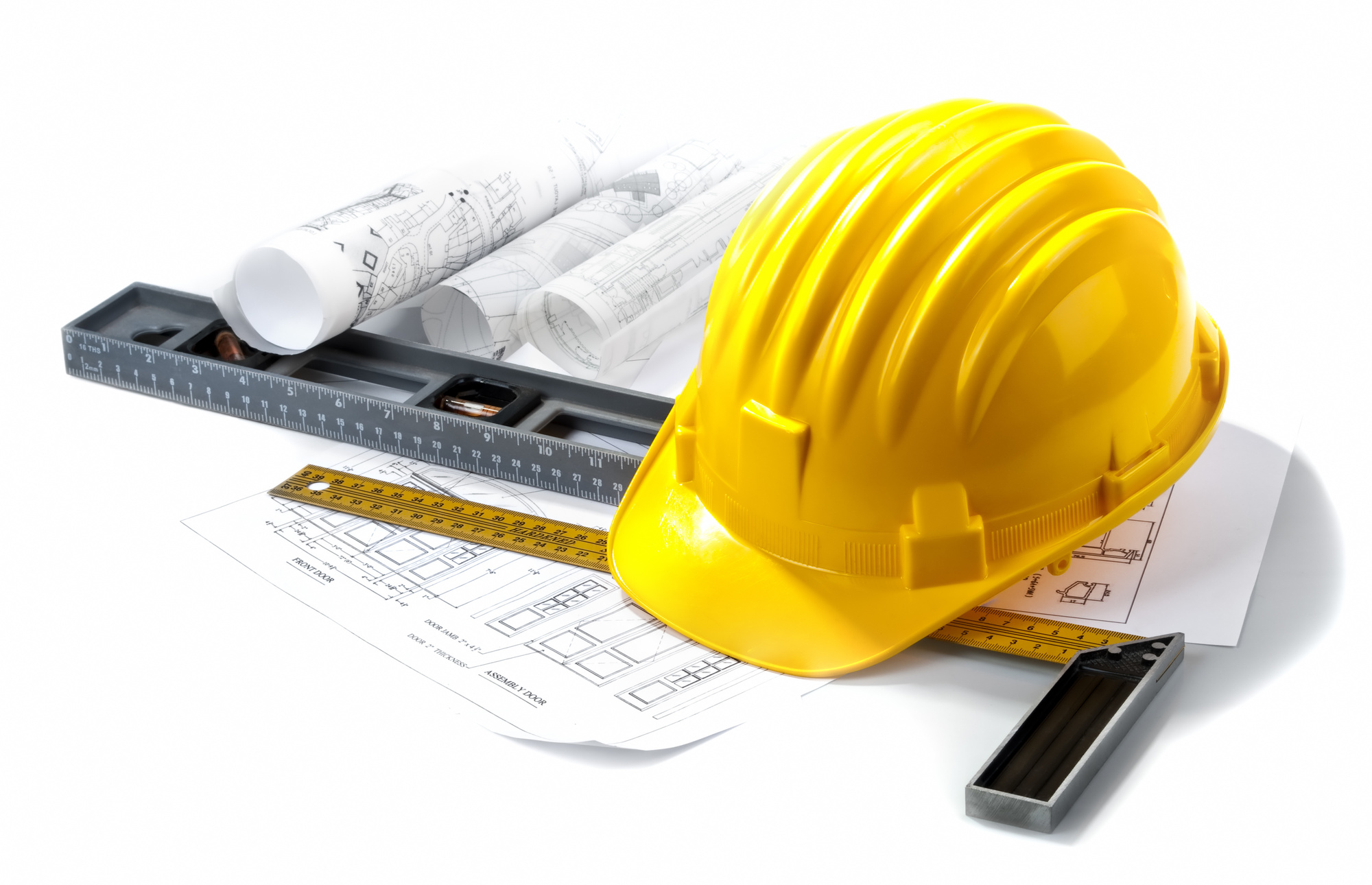
Looking to design the perfect home builder logo for your construction-based company?
Having a great logo can help present your company in a trustworthy, positive, and appealing light. These are all good things for your business.
If you want to design a logo that looks great and appeals to your customers, you’ve come to the right place. Designing a logo can seem daunting, but we’ve made it easy.
Here, we give you five tips for creating a great home builder logo. Use these recommendations to put together a logo you and your company can be proud of.
1. Pick the Right Font
One of the first steps in designing your logo should be picking the right font. This will be one of the main items that will help your logo make a great first impression.
Using an ugly or basic font will immediately turn viewers off. No matter how great the rest of your logo design is, if your font is off, your whole design will be compromised.
There are many fonts that should simply be retired from use. Comic Sans, Papyrus, and Wingdings are among the list of fonts that simply do not need to appear anywhere in the modern world.
Designers who use these fonts are not the designers you want to work with.
Picking the right font is an essential step in creating a home builder logo that really works. Use something modern yet relatable, and do not be afraid to try something different.
You may even start a new font trend if you really get it right!
2. Use Sharp Elements
When creating a home builder logo, you do not want to use curvy lines and flowery script. Using sharp elements rather than more feminine ones will convey the vibe of your company much better.
Plus, using sharp and strong elements in your design process will help potential customers to trust you more.
If you and your company seem capable and professional, people are much more likely to keep you in mind for their needs.
Using sharp, strong, and bold elements in your logo design will go a long way in communicating your company’s core values to your potential customers.
Remember that your logo will be a visual representation of your company on all kinds of materials and for years to come, so you want to make sure to design something you feel proud to show off.
3. Keep It Simple
Keeping it simple may seem contrary to your goals. However, it is actually very important to keep your logo as simple as possible.
You do not want to complicate or clutter your logo design with too many elements.
Trying to add in accessories like home building tools, a motto, your company name, and cutesy details will only serve to drag down the overall appeal of your logo.
If you must, repeat this mantra to yourself while designing your logo: keep it simple.
This will help you to eliminate elements that are not necessary, or even refrain from adding them all together.
4. Visual Appeal Is Key
Keep in mind that above all, your logo should be visually appealing. It is the first thing many people will see when hearing about your company for the very first time.
A bad logo can make them never take a second glance. Don’t let this happen to you.
Including a lot of information in the logo may seem helpful, but really this just confuses the eye and crowds the brain of your logo viewer.
Take a step back after a draft of your logo is designed.
What’s the first thing you think of when you glance at the logo? What images or ideas does it call to mind, and how does it make you feel when you look at it?
These simple reactions can provide important insight into how well your home builder logo will be received. It must be visually appealing in addition to being a great representation of your brand.
5. Use the Right Colors
They may seem like a minor detail, but choosing the right colors for your home builder logo is key. Nothing can make or break a logo quite like the color choices can.
For example, check out the logo of Now Living. The orange and black colors convey the traditional construction colors while the modern fonts bring the company into the modern age.
While orange and black are the traditional colors associated with the construction world, you do not have to limit yourself to only these choices. Branch out and do something different.
Stay with colors that are somehow relevant to what your company does, but do not feel confined to only using the usual colors that most other companies do.
Your logo should be unique and recognizable, but must also be a good representation of your company’s values and mission.
Need Help Designing A Home Builder Logo?
If you need help designing the perfect home builder logo for your construction company, you have come to the right place.
Our logo-making platform will help you to design a logo in less than 10 minutes, even if you’re not a designer. The interface is not complicated and there are tons of options to choose from, making sure you’ll get your logo just right.
Plus, if you need a break, you can always save your design and come back later. You will also be able to download your logo an unlimited amount of times.
There are countless logo assets and design templates to choose from, so just scroll through the library of available elements if you need some logo design inspiration.
Check out our online logo-maker tutorial to get a feel for how it works.


Leave a comment