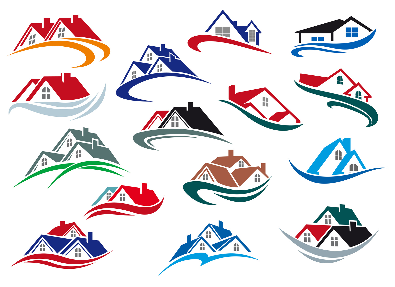
According to recent statistics, there are over 80,000 real estate brokerage firms in the United States. In order to stand out from the competition and make yourself known, it’s important to build a trustworthy brand. Spending time on your real estate logo design is one way to do this.
Your logo makes it easier for potential clients to remember your firm. They’ll see the logo posted on “For Sale” signs, and printed on business cards. This recognition will help build your credibility.
So what are you waiting for? Here are five easy tips for designing a great real estate logo.
1. Keep it Simple
One of the most important rules to remember when designing a new logo is to be simple. Complex logos that use too many colors or design features are hard to understand quickly. Also, it is easier for customers to remember simple logos.
When designing your logo, choose a basic color palette with 2-4 colors. If you decide to use a combination of graphics and text, select one graphic feature and one font for the logo.
2. Think about the Medium
No logo exists in a vacuum. Your logo will be used everywhere from your website, to your pens, to billboards. When designing the logo, make sure it will fit well and look good where you plan to use it.
If you plan to use the logo in many different kinds of places, you may want to consider making more than one version. This way, you can use the smaller or shorter version in places where there is less space to print.
3. Make Use of Colors
One of the factors that make logos so recognizable is the choice of colors. For instance, Coca-Cola is instantly recognizable because of its famous red and white color combination.
When choosing colors, consider what you want those colors to say about your brand. Colors like blue tend to communicate trustworthiness, while green indicates new beginnings, nature, or wealth.
4. Choose Your Font Carefully
No matter how interesting your color is, it will not be useful unless folks who see it associate it with your brand. For this reason, you want to make sure that the font you use to include your company’s name in the logo is clear and easy to read.
5. Don’t be too Generic
While your logo design should always err on the side of simplicity, it is possible to be too minimalistic. You want to add enough unique features so that your logo represents your brand specifically.
For instance, if your real estate business specializes in rent to own homes in Utah, it shouldn’t look the same as a business that sells luxury homes in Palm Springs. Make sure that the color and design choices align with your company’s image and mission.
Developing the Perfect Real Estate Logo Design
With these tips in mind, you will be able to create a unique logo that makes your real estate business stand out.
Ready to work on your new real estate logo design?
Check out our free online logo maker to get started today!


Leave a comment