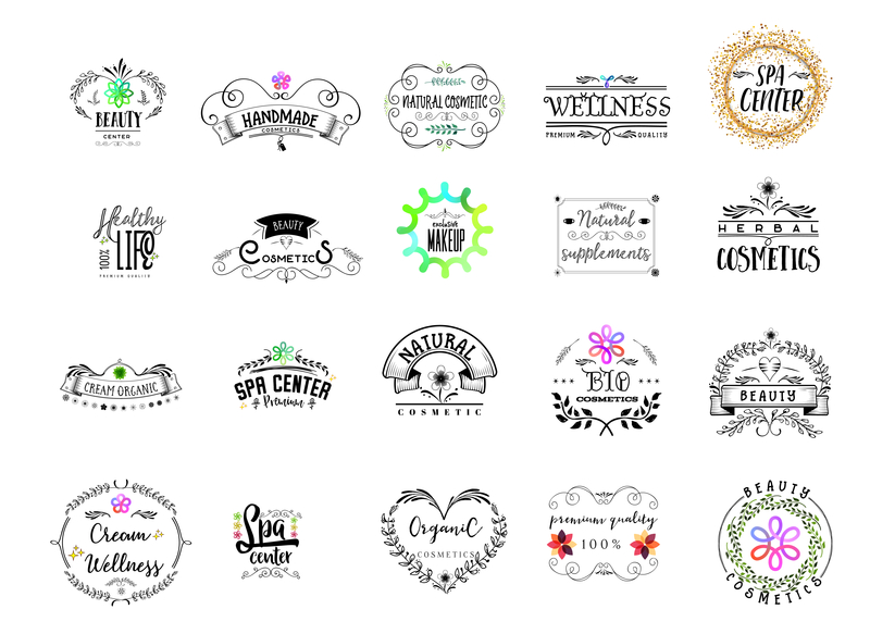
Is trying to make a logo driving you crazy? It’s hard to create a great logo when you’re unaware of what works.
We’ve researched the logos of the most popular cosmetic brands so you know what to do — and what to avoid — when creating your cosmetics logo.
We’ve also researched the psychology behind the branding strategies of some of the most iconic cosmetic companies around.
A logo doesn’t have to be complex. Many great logos feature a simple font and a few colors. You might be surprised at what makes a logo click with consumers.
Having the right logo helps your brand rise above the competition. In this article, you will learn what makes a great cosmetics logo.
Choosing the Right Colors for a Logo
You’ll need to choose the right colors for your audience. Multiple studies prove that people connect colors with emotions. Your target audience uses cosmetics to beautify, cleanse, or do both.
You’ll see many blue and white colors in cosmetics. Blue invokes feelings of calmness. White is a color associated with cleanliness.
Natural cosmetic companies may choose to use green in their logo, which is associated with nature. This makes it a wise and on-brand choice for natural and organic cosmetic lines.
However, Don’t be scared to throw in an uncommon color somewhere in your logo.
Adhering too closely to guidelines stifles creativity. However, make sure that the colors you choose are sending the right psychological messages to your customers.
A practice providing Sculptra procedures, for example, will want a trustworthy logo. After all, you’re working directly on your clients’s bodies, where every mistake is visible. Red is a great color choice for establishing trust.
It’s wise to contrast bright and dark shades when combining colors with fonts. Pairing yellow and white combines two bright colors which could be hard to read.
Black is color used frequently in more masculine brands. You’d think leaving the color black out of a cosmetics logo is best.
Two giants of the cosmetic world disagree with your color gender standards. L’Oreal and Chanel are two famous brands with simple black and white logos. After all, their names speak for themselves. They don’t need all the bells and whistles of distracting, elaborate packaging.
A Font is an Important Part of a Cosmetics Logo
The font of a logo must be easily read by consumers. A font, also called typography, is as important as the color of a logo. It’s important that a logo’s font color isn’t a distraction. Nivea uses a white font with a blue background, which pairs together well and is easy to make out.
Complex cursive fonts may work for certain brands but it won’t be easy to read. Dove uses more of a hybrid cursive and print style in their logo.
Most cosmetic companies use a bold and large font.
Keep Your Logo Simple
Forbes recommends a logo that “someone could easily draw…when prompted.” Think about brands like Nike, Adidas, and McDonald’s. You’ll soon have a picture of each of those three companies.
An overly complex logo is hard for people to remember. Keep it simple like the major companies do. Your logo is often the first visual indicator of a company. Creating a great logo creates a perfect first impression.
Creating a logo takes time but it’s worth it. Color and font are two elements of a great cosmetics logo. Choose colors that pair well with your audience. Combine popular colors with easy to read fonts and you’ll have an amazing logo.


Leave a comment