Eight U.S. states have legalized recreational and medicinal marijuana. Today, the legal marijuana market is worth over $7 billion. In short, it’s clear that the pot business isn’t one to take lightly.
The cannabis industry is growing. This means we’ll continue to see new brands of edibles, beauty products, raw marijuana, and more emerge as more and more states legalize it.
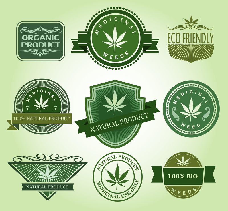
So, why do all marijuana logos look the same? Is the weed leaf logo tired, or should it continue to be used to identify pot-based products? Let’s look at the pros and cons.
Pro: Customers Know Exactly What It Is
Just like glasses for an eye doctor, a tooth for a dentist, or a fruit for fruit juice, when you see a weed leaf logo, you know exactly what it is.
The leaf symbol is unmistakable — you won’t find out your mom accidentally bought some thinking it was basil.
Brands like Pukka Budz have taken advantage of the leaf’s fame to brand their products. Its logo takes the traditional seven-pointed leaf and add a twist to make their brand recognizable as a marijuana producer.
However, there’s only so much you can do to make a pot leaf logo stand out. Plus, it has some negative connotations that you may want to avoid. That brings us to the Cons:
Con: Brands Don’t Stand Out
Your company logo is incredibly important from a branding standpoint. As much as you want it to reflect your product, it also needs to stand out from the competition.
If all of your rivals are using the pot leaf as a logo, then how will customers know what makes you different? One competition for new marijuana logos showed the breadth of creative logos that could come from different pot products.
The results speak for themselves. The sleek, minimalist designs for fictional pot brands were innovative. They were also easily distinguishable from each other. They also looked professional, which brings us to our second Con.
Con: The Weed Leaf Logo Has a Bad Rap
Over the years, in part from the media, weed, and its leaf logo, have become associated with tired old cliches: laziness, stupidity, and low-lives.
What we know now goes against these assumptions. Weed is prescribed by doctors, it’s legal in many states, and the taboo against its use is rapidly fading.
And a $7 million-dollar and growing industry is nothing to laugh about. But if the marijuana industry continues to use the weed leaf logo, it may dig itself into a hole. To move away from the cliches, it may need to move away from the leaf.
Some of the highest-valued brands in the world have logos that look nothing like their product–Apple, Starbucks, and Nike are just a few examples.
Creating a sleek design that identifies your product without using the weed logo is possible. It may be the direction in which the industry should go.
What do you think? Should the marijuana industry drop the weed leaf logo? Or, is it a classic look that should stay put?


Leave a comment