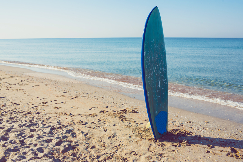
Surfers come from all different walks of life and everyone finds their way to the ocean for different reasons. But there are a few unifying characteristics that connect surfers together.
The surf companies that have tapped into those unifying ideas with their surf shop logo and ad campaigns have made successful surf businesses.
If you run a surfing company then curating the right surf shop logo can make all the difference in your success.
Here are 5 beach brands that should inspire and inform your design choices.
The Critical Slide Society
This Australian surf company is relatively new but is taking the surfing scene by storm.
Critical Slide Society has dialed in on the sunbleached, relaxed, and carefree characteristics of surfers. They focus their style on muted colors that don’t flash or clash.
Their logo is a simple and clean black and white diamond shape that doesn’t include cheesy images or graphics.
Steer clear from silly graphics in your final surf shop logo.
Katin Surf Shop Logo
Katin is an old Califonia company that was started back in 1959. It all began with one pair of surf trunks that were made for a local surfer and the business soared from there.
Katin has evolved over the years and realized that California surfers have many interests. They love longboards, walking the boardwalks and hanging out on any beach. Their style is relaxed without being sloppy.
They also have a simple all black logo that just clearly states their name. Don’t over think it with too many colors or images. Simplicity and font are key.
TwoThirds
TwoThirds is a company based in Spain that combines their love for surfing with their love of the environment.
Their motto is “protect what you love” and they strive to make environmentally sustainable products for surfers who want to protect the ocean they love.
Their products are ultra laid back, like both the Spanish and the surfing culture.
The TwoThirds surf shop logo is all black with a simple and artistic incomplete circle design. This is an example of a successful logo that establishes a strong brand identity without being too obvious.
Insight
Insight is an older more classic surf company that has been influencing the look of youth surf culture for decades.
This Australian surf company makes youthful clothing that is designed to look even cooler after the wear and tear acquired by partying at the beach.
Their surf shop logo is an iconic black and white four-circle design that any surfer would recognize.
Saturdays
Saturdays is a totally original and unique surf company that makes clothing that can be worn in a bar, on a date, or at the beach. Their clothing has a distinctive city vibe that is unique from the mostly beachy and breezy surf culture.
Their logo shows their name “Saturdays New York City” in a minimalist white type.
It’s tempting to try and make a themed logo with waves or boards, but the most successful surf companies have kept things simple and clean. Whether you’re launching your company with a fresh logo or looking to relaunch a new logo, consider what is already working in the market.
If you want a successful surf company, pay attention to the trends and follow suit. The most successful surf companies these days are catering to the cool, calm and understated vibe of the surf community.
Start designing a logo online that will elevate your surf shop to the next level of success.


Leave a comment