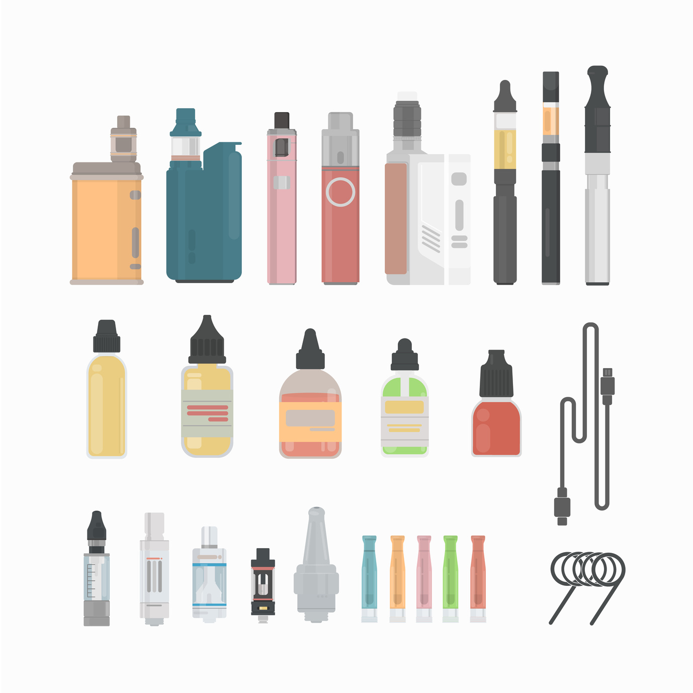
They’ve been around since the 1960’s but E-Cigarettes have only recently taken the world by storm.
With over 500 brands out there and more than $7 billion in global sales, it seems like everyone is vaping. Most are using E-Cigarettes as an alternative to tobacco, while others simply enjoy the scent and taste.
How can you make sure your E-Cigarette brand stands out among the 500 others out there?
A well-crafted E-Cig logo design can help persuade a customer to pick your product over another.
But how do you craft a memorable E-Cig logo design? One that people will recognize and patronize each time they make a purchase.
Here are 5 tips for creating the best logo design possible for your E-Cigarette products.
1. Represent the Brand
When choosing your E-Cig logo design, it’s important to remember that your logo is a representation of your brand.
When people see it, you want them to instantly think of your company and the experience they’ve had with it – exceptional service, high-quality and reasonably priced, or whatever personal connection they’ve made.
Take Coca-Cola for example. The infamous red and white label is simple, yet memorable. The font is unique and appealing. No picture needed.
We can all imagine the adorable polar bears sliding down the snowy hill in one of Coca Cola’s Christmas commercials. Or the iconic glass soda bottle, dripping with ice while being lifted out of a cooler. Reminds you of summer and satisfaction.
So many feelings and memories can be incited by a simple logo. When designing yours, be like Coca-Cola and keep it classic.
2. Use the Right Colors
Colors do more than just bring your logo to life visually. Each color does a special job. Some express trustworthiness, others elicit thoughts of nature and some represent dependability.
Once you decide the type of message you want to convey with your E-Cigarette logo, you can begin the logo design process. This will start with choosing the colors that best suit your needs.
3. Less is More
Your E-Cig logo doesn’t need to be lavish to be memorable or effective. Sometimes, less in more in terms of appeal.
One thing to consider when making your logo is whether it will be typographic (text only), illustrative (a logo that represents what your brand sells – for instance, an enlarged E-Cigarette or THC e-liquid) or abstract graphic (a symbolic picture).
You can even use empty space to your advantage. Take the FedEx logo for example. The empty space between the letter ‘E’ and the letter ‘X’ creates the shape of an arrow.
This symbolizes speed and efficiency. And it was achieved using empty space.
4. Size Up the Competition
To create an E-Cig logo design that gets noticed it needs to stand out from the competition. The best way to size-up your competitor is to evaluate them.
What’s working for your competitor? What features would you like to mirror in your brand logo? What don’t you like about it?
Ask these questions and use the answers to help motivate your design. Just don’t steal your competitor’s ideas! No one likes a copy cat and your audience will notice.
5. Be Flexible
“If at first, you don’t succeed, try, try again!” “Practice makes perfect.”
All those catchy phrases that make you want to gag? Well, they’re true when discussing logo design.
Try not to become so fixated on one idea, that you rule out alternative options. Sometimes slightly changing things around, as far as letter size and font choice, the position of things, or colors (see above), can make or break the success of your logo.
Try not to have tunnel vision and “roll with the punches” (there’s another one of those darn phrases!).
Designing your own logo is now easier than ever before! With free logo makers that you can use right from your home computer, you can draft and edit your logos before showcasing them for the world to see.
So, what are you waiting for? Let’s get designing!


Leave a comment