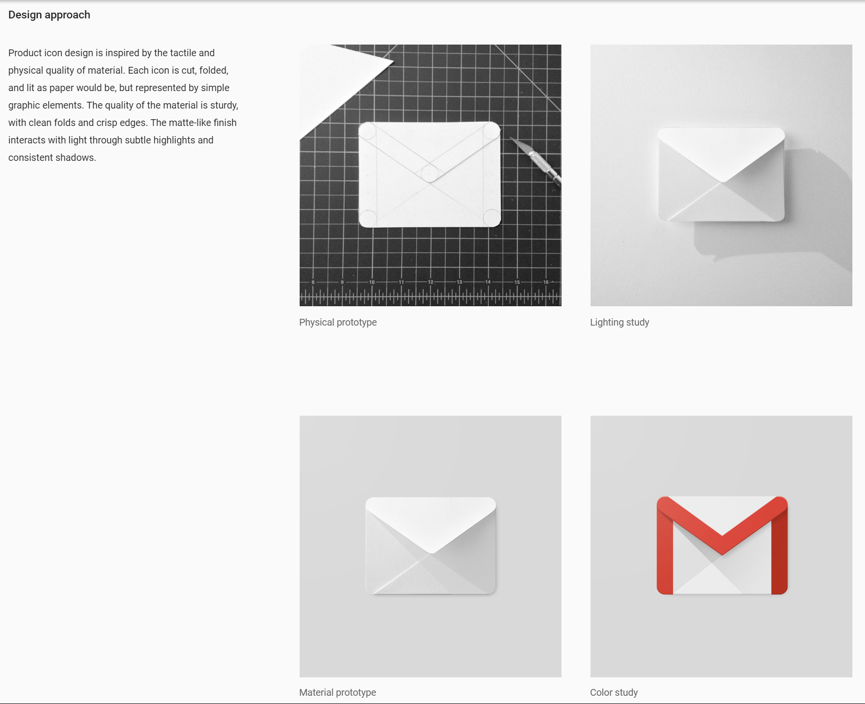
Now that we have already talked about Branding and how you can take advantage of it when using for creating a logo, let’s talk about Design Style Guide. As you know, consistency is key when building a valuable brand, and your company should be really aware of this: The repetition of the same logo, fonts, colors, images and style helps to make a brand not only recognizable but seemingly trustworthy.
And that’s why you must have a Design Style Guide! It helps you and your company to create a more consistent visual experience and appearance. A Style Guide is a set of standards and patterns for the company’s design to ensure complete uniformity in style.
IN A FEW WORDS…
- Makes you look professional;
- You maintain control of the design;
- You’ll have an easy guide to refer to;
- You avoid cheapening the design, message and branding;
- Forces you to define and hone your style.
HOW DO I DO IT?
TIP 1 – Strategic Brand Overview
Decide your kind of communication/design/visual appearance based on the kind of target public you want to conquer and which are their preferences and expectations. Example: Adidas.

TIP 2 – Logos
For print and web, most brands revolve around the logo. Make sure you provide logo variations and clarify minimum sizes for all the options you might face. Example: Starbucks.

TIP 3 – Colors
Always include color palettes and what the colors should be used for, to guarantee organization and clear messages. If you do it, people will know about what you wanna talk just based on the colors. Example: Google.

TIP 4 – Fonts
You’ll need to define the typefaces to use: sizes, line height, spacing before and after, colors, headline versus body font, etc. Make sure to include Web alternatives for non-Web fonts. Example: Hubspot.

Good Luck!


Leave a comment