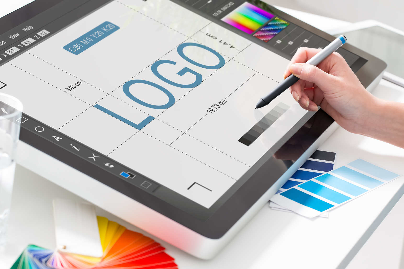
As an automotive company, your brand’s job is to get the audience moving.
They need to know that you’re reliable and you offer quality products. It’s highly important for buyers interested in a vehicle to establish a level of trust with the seller.
Despite its small appearance, your logo packs quite a hard punch. It communicates a message to the consumer, so make sure it’s saying what it should.
Are you in charge of creating an automotive logo design? Well, look no further. We’ve got 5 useful tips to help you get it right.
1. Get Creative with Symbols
When creating an automotive logo design, many companies think they must use a car. Or, they also think it has to be something car-related.
We don’t advise you go with something that’s totally out of the blue (unless it works with your brand of course). But, you don’t have to stick to the cliches either.
Look at Mercedes-Benz (6th best logo of all time) or Kia. Many big name dealers have established successful brands with their unique symbols.
2. Think Long-Term
As mentioned above, since you’re apart of the automotive industry, you need to be trusted. A great way to establish trust is to demonstrate longevity.
You can do that by creating a classic design that remains relevant over the years. You don’t want to create based on trends, but that doesn’t mean it can’t look modern.
A great example of this balance is the sophisticated red design of House of Cars. It’s bold but not overbearing, and warm but not overly passive either.
3. Your “One Thing”
The best logos will leave their audience remembering one thing. It’s the essential piece that helps them strike a resonance with your brand.
So, to resonate with an automobile buyer, you’ll have to carefully consider your targets. What’s the one feature you’d like to leave with your audience?
As an auto shop, it may be your friendliness or quality of service. You must drive those features into your design.
4. Color Matters
The color says it all. Again, you’ll want to reflect back on the message you’re trying to send. How can you send that best through color?
Here are some common examples:
- Red: Bold, active
- Yellow: Friendly, warm
- Blue: Calm, reliable
- Black: Powerful, dependable
- White: Easygoing, simple
- Brown: Rough, strong
5. Keep The Name
The last thing we’ll leave you with is to consider how your name will tie in.
In the automotive industry, there’s endless competition so we recommend including your name. This saves you from being mistaken for one of the other guys.
We also suggest tweaking an already existing font for another unique advantage. Use negative spaces and avoid any font that looks tacky.
Let’s Make Your Automotive Logo Design
You’ve got the tools, now it’s time to go to work. Our online logo maker allows you to create an amazing design for your brand.
Oh, and did we mention it’s free and takes only 5 minutes?
We have countless templates and a large selection of fonts you can choose from. Also, you’re able to save your logo and edit whenever!
Get started today! Click here to start creating your automotive design.


Leave a comment