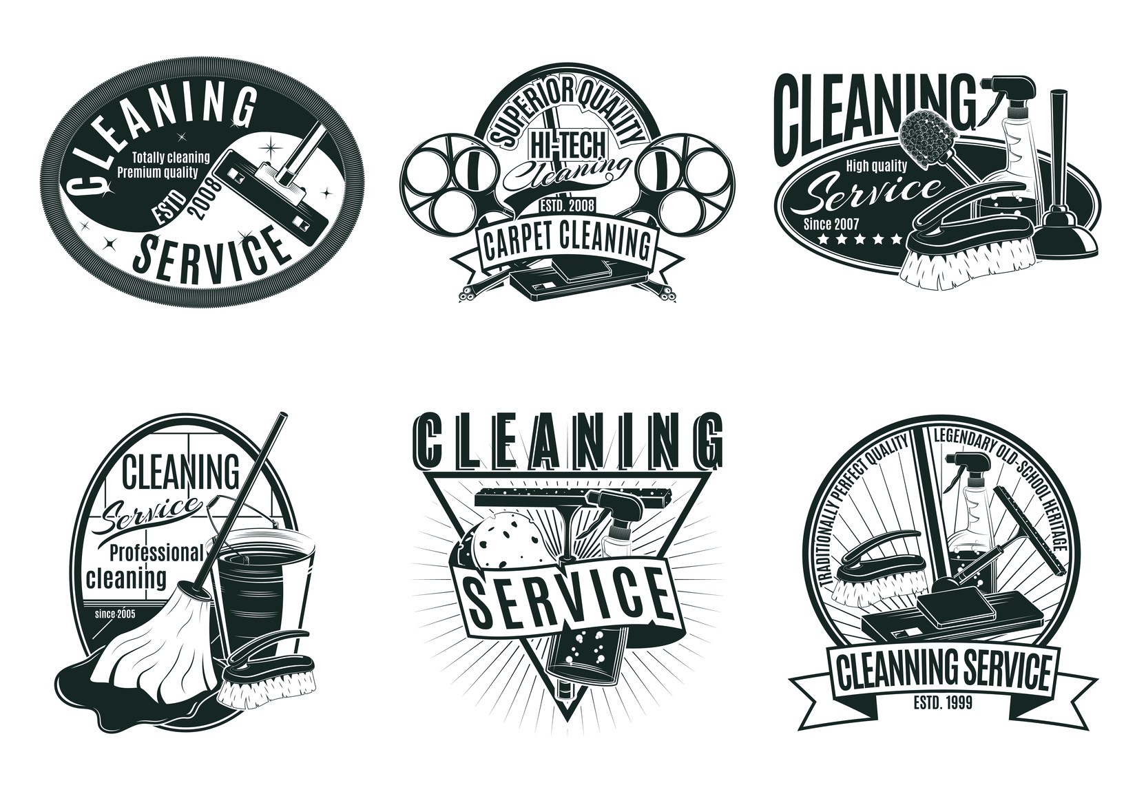
If you’re in the carpet cleaning business, you’re going to want a sharp, clean logo that reflects your superior service.
But coming up with a perfect logo is often harder than you’d think. You’re going to need a bit of help to make the most of your logo making service.
Read on for some quick tips on how you can spruce up your carpet cleaning logo.
5 Tips to Spruce Up Your Carpet Cleaning Logo
1. Think About Color
First, your logo needs to be something that you personally identify with as a business owner. It needs to be something that you take pride in. Something that you’re happy to show off and that you feel really represents your business.
Incorporate a bit of your company’s personality within your carpet cleaning logo. First, you’ll want to come up with colors. Generally speaking, cleaning companies tend to use warmer colors.
Typically, baby blues, oranges, and reds are amongst the most popular. Research shows that color can be hugely influential. Each color brings about a unique emotional effect.
2. Look at Your Competition
It’s a great idea to keep track of the competition. Look at their logo and pay close attention.
What types of colors are they using? If your colors are too similar, you run the risk of confusing customers.
A little similarity isn’t a huge issue. But your logo needs to be different enough that your customer base can clearly tell you apart from the competition.
3. Out With the Old, in With the New
If you’ve already got a logo, you don’t have to scrap all elements of your previous design. Not only can this cut costs, but it can help avoid customer confusion. Changing too much, too fast is a bit of a shock to customers.
There may be aspects of your logo that your audience identifies with, be it a color or image.
Consider how your current logo can be altered. Think about changing specific elements of it instead of changing it entirely.
4. Get Minimal
One of the more popular trends to hit the graphic design market is minimalism. Tons of companies are ditching expensive, convoluted logos in favor of something more simple.
Apple’s logo is a great example of this. It features no text, just a simple white apple with a bite taken out of it. Yet it’s instantly recognizable to millions of people across the globe.
Remember the adage less is more? Well, it’s certainly true when it comes to logo design.
5. Consider How Your Carpet Cleaning Logo Will Scale
Think about how your logo will look when scaled on different platforms. While it may look great at a medium size, images tend to lose clarity when blown up.
Make sure that your logo won’t look too jagged or washed out when made larger.
Conclusion
With these 5 tips, you’ll have a more beautiful carpet cleaning logo in no time! And don’t forget that we offer tons of services to help make your logo more beautiful than ever.
Whether you’re making a complete change or just looking to spruce things up, we can help. Sign up today!


Leave a comment