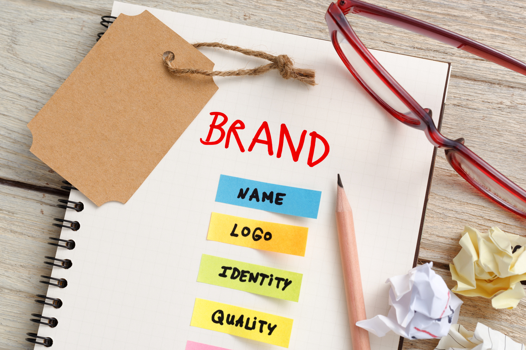
The first step in creating brand recognition is to have an unforgettable logo.
But, you knew that. You’re a marketing professional!
The problem is knowing how to do that. What makes a memorable logo? Something one-of-a-kind that will make potential clients stop in their tracks.
To achieve that, you don’t have to hand over the reigns to a graphic designer. You can create that all on your own. Here are 5 tips for designing a marketing logo that makes an impact.
1. Let Your Logo Tell a Story
The famous Starbucks logo represents a character in the book, Moby Dick. You don’t have to go that far when it comes to telling a story. But, you should have some meaning behind your marketing logo.
Put some thought into it before you get started. What do you want your logo to say, symbolically?
It doesn’t have to be complicated.
For example, the “M” in the McDonald’s logo represents the golden arches. Many McDonald’s restaurants don’t have the arches anymore. But, keeping that “M” tells a story about the history of the company and reminds you of french fries.
2. Choose Active Over Passive
Want to have a logo of an object or living thing? Make sure your design is active, not passive.
Meaning, it should feel like it’s in motion. As if it’s doing something. Because as a business marketing agency, you are always moving forward.
Think about the original Taco Bell logo. It was just a bell in stillness.
Now, the bell is tilted to the side, as if it’s ringing. With just a simple change it went from passive to active. It tells the story that the dinner bell is ringing, and it’s time to eat.
3. It’s All About Balance and Symmetry
The human eye perceives things that are symmetrical as more appealing. When something looks appealing, it’s becomes more memorable. That’s true of a model’s face, and it’s true in logo design.
If you’re creating an abstract logo or a logo of typography, it should feel balanced. There shouldn’t be more happening on one side of the design than the other. It should all flow evenly.
4. Colors Should Grab Attention
Colors are an important part of brand recognition. If you want to be unforgettable, you should use colors that naturally catch the eye.
There’s lots of studies behind the psychology of color in marketing. Experts say that the color yellow is the most effective for grabbing attention.
5. The Design Should Be Completely Unique
It always helps to get inspiration from other logos that you like. But, be careful to keep your design unique.
What happens when your logo reminds a client of another brand’s design? Instead of making them think of your company, they’ll be thinking of someone else’s.
Does Your Marketing Logo Need a Boost?
You don’t need to wait on an expensive graphic artist to craft a killer logo. Take these tips and get to work right now.
With a free online logo maker, you’re in control. You don’t have to be an expert to make something memorable. Take a look at this tutorial and see how easy it can be.


Leave a comment