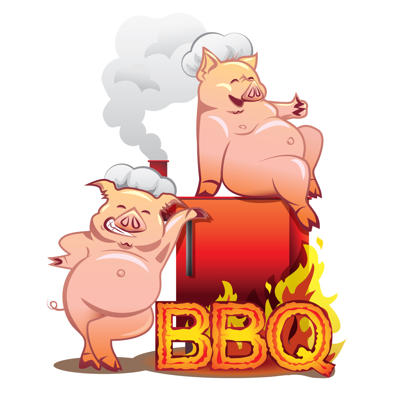
You probably think a stove logo may not be your top priority. If you don’t have a good logo, your brand can suffer tremendously.
Consider any of your favorite companies, regardless of industry, and you’ll probably think of a logo.
Here are five tips to bring your visual game up a few notches.
A Good Stove Logo Is Simple
The golden arches, Nike swoosh, and Pepsi logo all have one thing in common.
They are simple logos that instantly communicate a personality.
When creating a stove logo, you should also focus on simplicity. As great as the artist working on your logo may be, customers will not remember a complex collage.
Simple logos are instantly recognizable and memorable. If you want to be iconic, take advantage of simplicity.
Remember, less is more.
Know Your Niche
Whether you’re making furniture or electronic cigarettes, you need a logo that reflects your niche and brand.
It’s no different while making a stove logo. So ask yourself, what is your niche in the industry?
Do you make high-efficiency electric stoves? Does every stove you make have a double sided log burner? Are your stoves modern, or rustic?
If your logo mismatches your niche and brand, you’ll never establish your identity to customers.
Take Advantage of Color
The color is vital to a logo. Before people even see the shape of your logo, they’ll see the colors pass them by as they scroll past an advertisement on their cell phone.
So it’s important that your logo has strong color contrast and uses colors that reflect your brand.
Not taking advantage of colors makes a logo boring and lifeless.
On the other hand, using contrast and color psychology to your advantage will help you sell in any industry.
Make Your Typography Fit
There’s nothing more jarring than a font choice that doesn’t fit the purpose of a logo or other image.
Whether it’s the use of a cursive font at an MMA gym or the always distasteful Comic Sans on a funeral invitation; fonts and images need to match.
When you’re picking a font for your stove logo, use something tasteful and simple: avoid unreadable cursive fonts or anything else with too much going on.
Beyond that, your choice of typeface needs to be matched to your image design.
If the font doesn’t fit, it can take your logo from memorable to unreadable with a click of the mouse.
Use a Free Logo Maker
There’s a lot to consider while designing a stove logo. And when you combine this already difficult responsibility with the learning curve and financial costs associated with software like Photoshop, it can feel scary.
We offer a free logo maker to businesses looking to associate their brand and product with killer visuals.
It’s fun, free, and, most importantly, easy-to-use.
If you’re worried that you won’t be able to use it because you’re not a graphic designer, you can start with a tutorial. So what do you have to lose?


Leave a comment