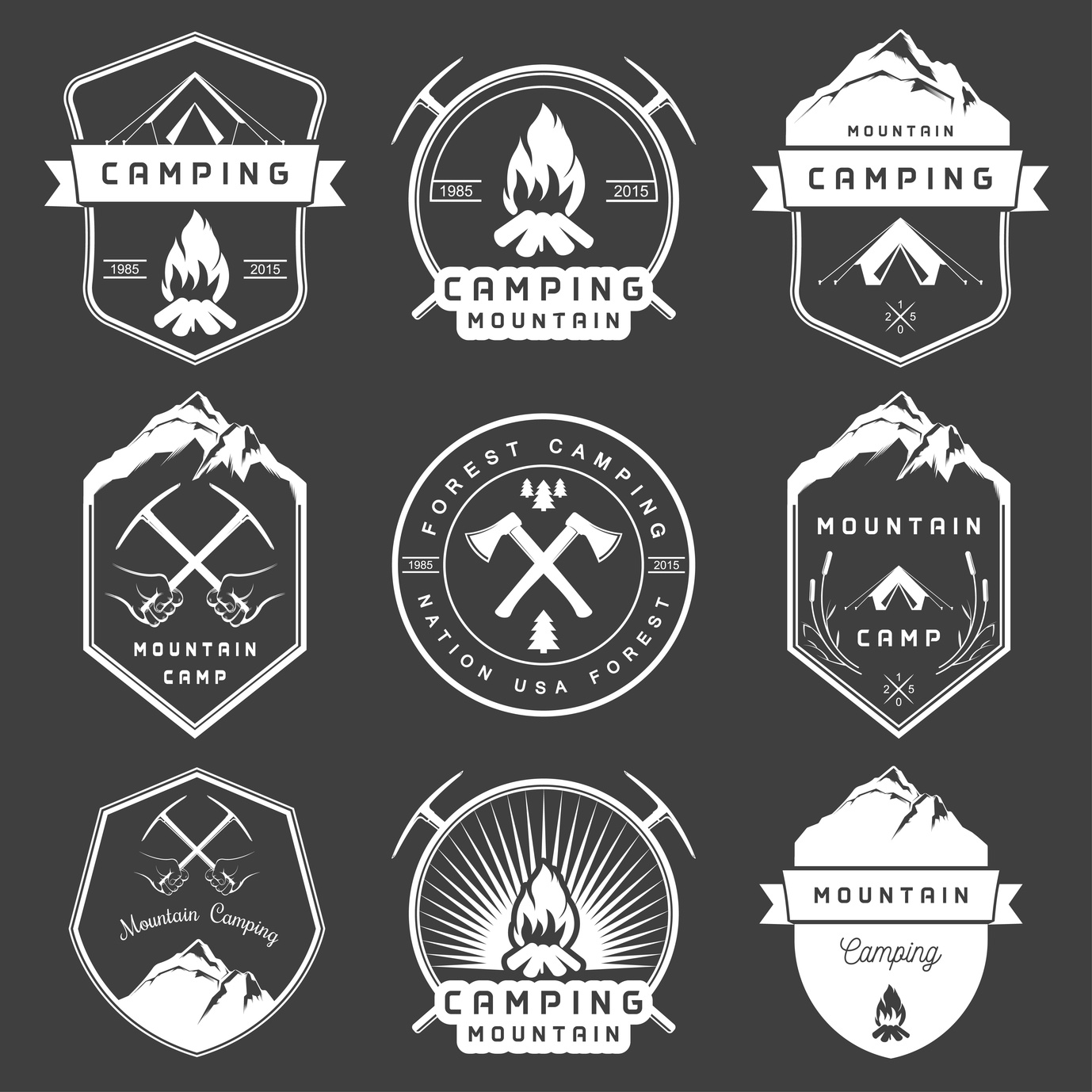
In designing a logo for a camping supply company, it is important to use SMART logo design tips to make the process easier.
What does the acronym “SMART” stand for?
Simple, Memorable, Appropriate, Resizable, and Timeless.
These rules are the perfect guidelines for how to create a quality logo for a camping or outdoor supply company. Keeping things “SMART” provides a way to double check a logo once it is finished.
Read on to learn tips based on this easy logo lingo.
1. Keep it Simple
Simplicity is key in developing a logo and increasing brand recognition.
Simpler logos are easier for consumers to recognize. It’s difficult to convey any clear message through a complicated logo.
Think of some of the most familiar logos that we are see daily: Apple, Starbucks, and McDonald’s. One of the key components of these logos is that they are all straightforward and clean.
Adopt a “less is more” mentality in designing a logo.
2. Make it Resizable
There is no telling where your logo will end up. Promotional materials could range from small pens and t-shirts to stickers and large posters.
This means that it’s important to design a logo in vector format. This ensures that it can be resized to fit anything perfectly, without loss of picture quality.
3. Ensure it’s Memorable
Human attention spans today are comparable to that of goldfish.
Most of that information we process will never be remembered. When it comes to smart logo design, simplicity helps with a person’s memory. Other factors could include color, icons, or font.
Think about the design, and consider the different shapes and colors that will be used.
Frame it for the audience of outdoor-friendly people. Don’t overestimate the attention span or memory of individuals.
4. Consider if it’s Appropriate
Your target demographic should be on the forefront of your mind during the design process.
A simple swap of logos from different brands can convey an entirely new message to the consumers.
You don’t want the logo to be too fancy for the audience that loves the sun and the dirt of the outdoors. You want the brand’s message to come through.
Think about what they like, and try to encapsulate their interests into the style of your logo.
5. Keep it Timeless
The last thing you want is to create a smart logo design that doesn’t stand the test of time.
Memorable logos change little as decades pass. Don’t design something that is “trendy.” Instead, make something that is going to stay relevant and on-brand for many years to come.
Keep it unique to your brand, and never worry too much about what others are designing.
Smart Logo Design for Camping Supply Companies
One example of a camping supply company with an excellent logo is everstryke pro.
It is simple, timeless, appropriate, resizable, and memorable. It also promotes the brand of everstryke firestarter well.
All and all, the is no one system of designing a logo, and that is the beauty of creativity.
The best thing to do in the design process is to consider all the points you would like to accomplish with the design through this basic SMART outline.
Ready To Get Started?
If you need help creating your camping logo, feel free to check out our free logo maker. Or, you can choose from one of our hundreds of templates.
What’s your favorite method to creating the best logos? Let us know in the comments below.


Leave a comment