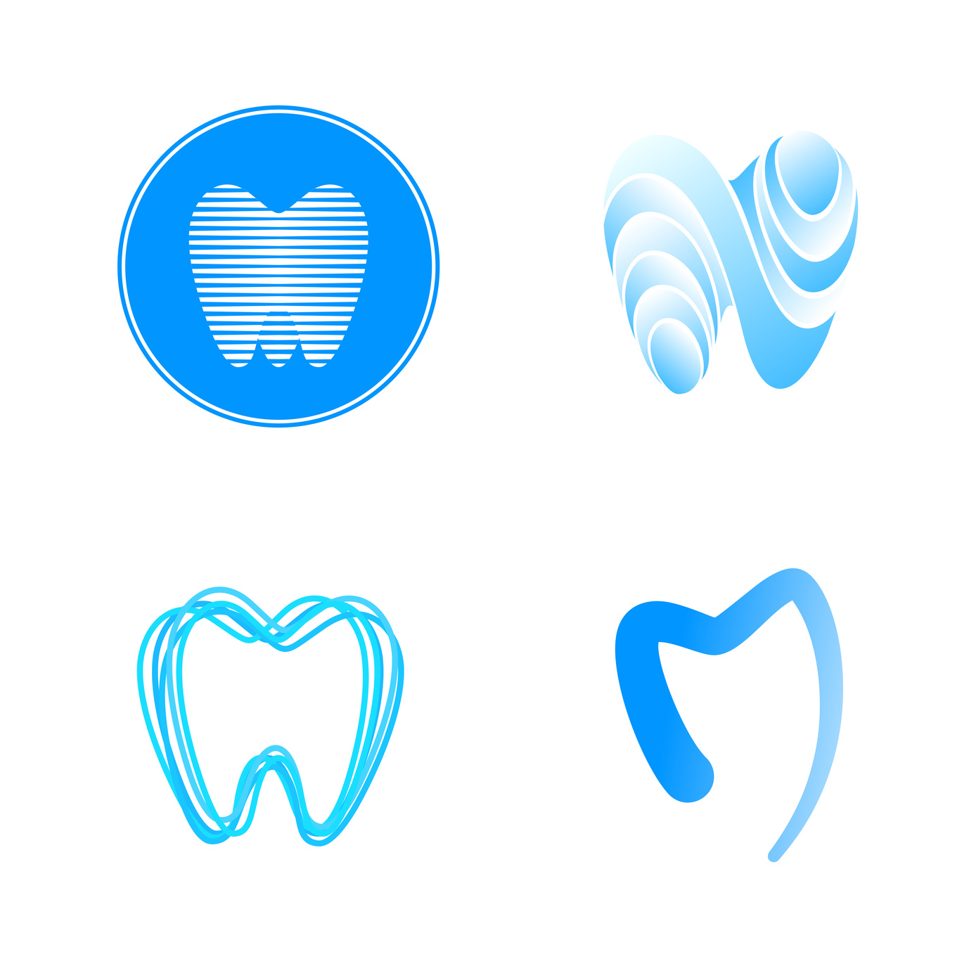
Are you interested in creating a new logo for your orthodontics office? Do you know how to make it stand out and appeal to potential patients?
Keep these five tips in mind when designing your orthodontist logo to make it as effective and eye-catching as possible!
Keep It Simple
A simple, streamlined design is going to have a much stronger impact on potential clients compared to an overcomplicated one.
Keeping your orthodontist logo simple and straightforward will ensure that it is easily recognizable.
You might think your logo is simple enough, but it’s important to know what other people think of it as well.
If you’re unsure about how your logo is coming across, ask a friend or coworker — preferably someone who hasn’t been seen the design before — if it is easy to describe. Does it take too long (more than a couple seconds) to explain what it looks like or what it involves? If so, you should probably scale it back a bit.
Make It Versatile
A simple logo design will also benefit your orthodontics office because it will be easier to recreate.
When your logo is simple, it can be used on the sign for your office, embroidered on your coats and uniforms, and printed at the top of all your important documents. When you’re designing your logo, make sure that it will be easy to recreate across all kinds of surfaces.
Use The Right Colors
A logo’s color is one of the first things that people notice, so choosing the right color will be one of the most important design decisions that you make.
Many orthodontics offices, including Davis Orthodontics, utilize colors like blue and green in their logos. The reason for this is that these colors are associated with trust, care, calmness, and health.
Make It Different
It’s true that the majority of orthodontics office use the same colors in their logos, but it’s important to make sure that your logo still stands out from the competition.
Think about your competition and ask yourself what you can do to separate yourself from them. Whether it’s using a lighter or darker color or utilizing a rounded shape instead of straight lines, there are lots of simple things you can do to distinguish your practice from others in the area.
Make It Timeless
A good logo will never go out of style. Think about how long the McDonalds logo has been around.
While you should make your logo unique, you also should focus on longevity rather than simply trying to make it as trendy as possible.
Ask yourself if your design will still be relevant in five years. What about 10 or 15 years?
Although popular logos can be redesigned from time to time, the basic structure remains the same, and they’re always recognizable. Can the same be said about your logo?
Create Your Orthodontist Logo Today
Now that you understand a bit more about what goes into a great orthodontist logo, it’s time to create your own. Give our online logo maker a try today and create the perfect logo for your practice!


Leave a comment