What do most people think of when they hear the word “hunter”?
Probably some grizzled, camo-covered guy who’s been hiding in a tree for the last two nights trying to bag some game. The kind of guy who spends weeks out in the wilderness just for one shot, who cures his own meat, and who lives in an actual cave.
While that person probably exists, the stunning fact is that more and more young people are taking up hunting.
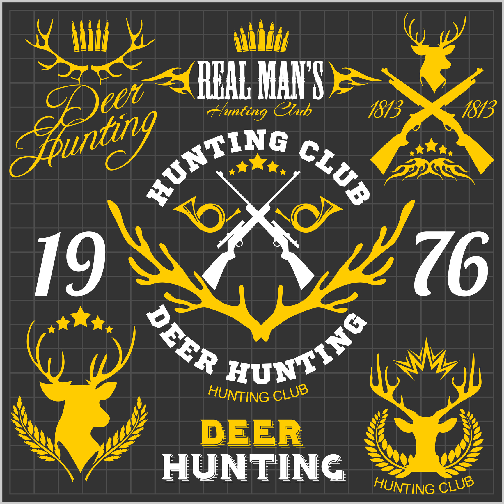
Naturally, that means that companies selling outdoor and hunting apparel need to rethink the way they do business. They’re no longer just catering to the old guard anymore. With rethinking comes rebranding, which usually involves creating a strong hunting logo.
Wondering how to design a trendy, modern-looking logo? That’s why this guide exists.
Let’s talk about the 5 hunting logo design tips for outdoor startups.
1. Full of information
Think about the logo for companies like FedEx or Starbucks. Everyone recognizes these brands instantly, but that’s not the only good thing — they also convey information about the brand. If your brand is selling 3D camo, for example, it’s best to have a logo that tells the consumer that.
This is how products like Yolk’s Solar Paper or Free Range Equipment do things. Their logos are full of information and meaning to their brand and are recognizable, too.
2. Modern style
The modern hunting logo design should be modern and simple.
Gone are the days in the past when logos were complicated monstrosities. Today’s logos are sleek, unique, and simple.
Forsake, a hiking shoe company, is a great example of a modern logo. Plus, it’s unique and recognizable, which means people easily associate it with the shoes.
3. Get creative
How many people know that there’s a bear in the Toblerone logo? Not many.
Part of creating a strong hunting logo is creating something that is interesting and fun to look at. There are tons of ways to do this; double entendres are very popular and create interesting, funny meanings for brands.
Be warned: always avoid cliches and bandwagon logo styles.
4. Less is more
It needs to be said again: keep the hunting logo design simple.
Complex logos provide too much visual information and it can be overwhelming to look at. The Nike swoosh, for instance, is both super simple and recognizable.
If a company sells hunting bows, a simple execution could be an arrow flying to hit its target, or even a bullseye. No need to overcomplicate things.
5. Use a colorful hunting logo design
Color is an important part of the outdoors and hunting, so it should be important to a hunting logo design as well. Color can make a logo pop and catch the eye, so there’s no reason not to experiment.
Still lost on how to get started on a logo?
Let Us Help
Our service provides you with an easy-to-use, intuitive logo designer to help your outdoor startup succeed and become a household name.
Don’t damage your business with an overused, poorly-designed logo. Let us help you create the brand recognition your business deserves.


Leave a comment