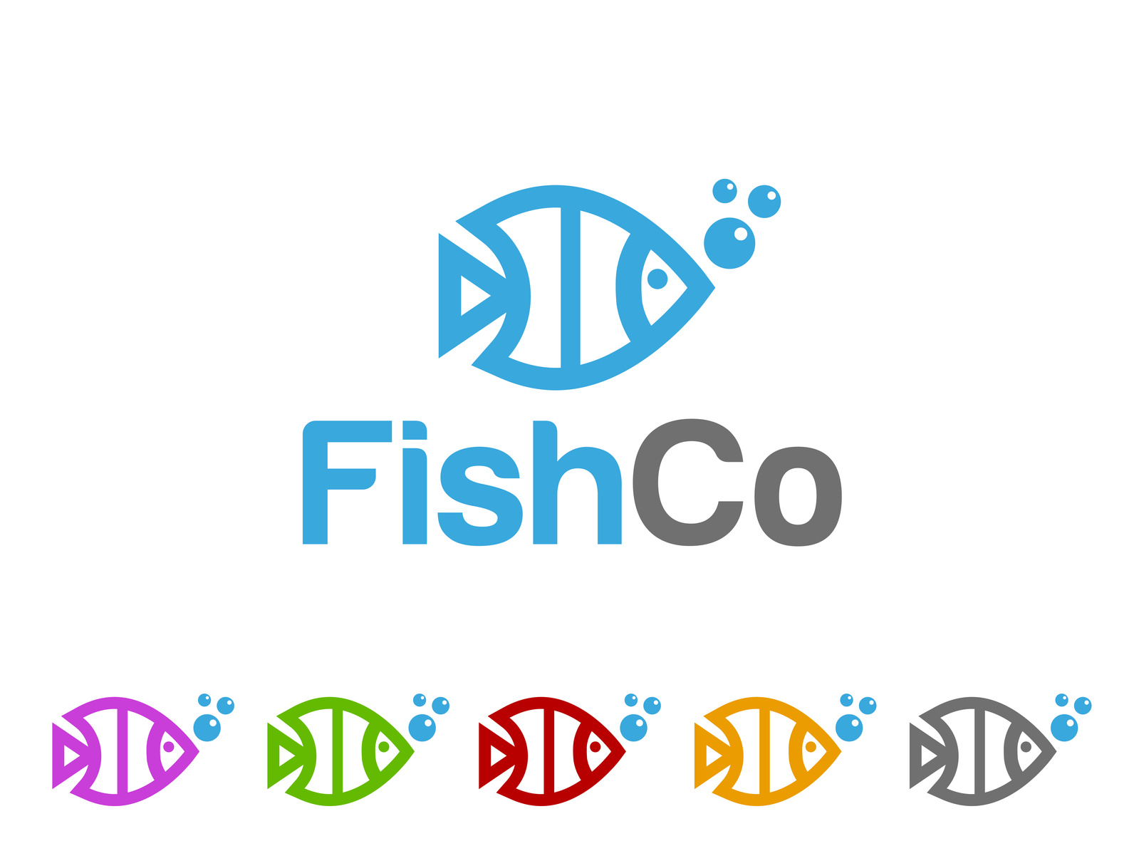
Never discount the importance of a good logo! A logo visually tells the story of your brand, showing off your company’s values and unique voice.
It also helps if your logo is based on a symbol that reflects your actual business. So, whether you have a seafood restaurant or sell column aquariums, using a fish logo can help tell your brand story instantly. Plus, the diverse types of fish mean that with a bit of research, you can create something beautiful and unique.
But, fish are so interesting visually, any company can use them!
We’ve gathered five great ideas for fish logos that you can put your own unique spin on. Read on and get inspired.
1. Make a Friendly Cartoon
A cartoon logo gives you a lot of freedom to exaggerate the interesting appearances of different types of fish. With their big eyes and diverse but simple body shapes, there is a lot of room for you to have fun with your logo design.
You can go the full cartoon route and create a mascot for your brand at the same time. Or, you can make it more subtle and understated, and use the style of the cartoon to show that your company is fun and quirky.
2. Pick the Best Piece
An interesting and unexpected way to use a fish in your logo is to artistically just use a piece of one. If a fish has a unique feature, just showing that off can be subtle and eye-catching.
For example, your logo could be based just on the claw of a crab, or the fin of a shark. Since these designs may end up being more simple, your choice of colour will be especially important. Consider the psychology of colours for your logo. With a simple logo and a great colour choice, you can create something very memorable since colour increases brand recognition by 80%.
This works great for companies that want to show off that they are sophisticated and creative.
3. Mix Your Fish Logo With Text
This one takes step 2 even further. You can creatively incorporate the shape of a fish into your actual brand name.
The round shape of most fish means this can work especially well with curved letters, like C and U. But, when it comes to typography, the world is your oyster!
This is great for brand recognition because your logo and company name work seamlessly together to tell your story.
4. Go Minimalist
Minimalism is incredibly popular at the moment. With their simple shapes, fish lend themselves perfectly to a minimalist logo.
Consider scaling back your colour scheme, keeping it to just two colours or even shades of the same colours. Use as few lines as possible in your illustration, just bringing out the key shapes.
5. Add In Scenery
To further build the aquatic feel of your logo, add in some other watery symbols. Waves, fish hooks, shells and seaweed can all add a little extra flair to your logo.
Just make sure that it doesn’t get too busy or out of control. A strong logo is simple enough to be memorable and instantly recognisable. Don’t try to build a whole scene. Just pick one or two extra elements to add in.
Wrapping Up
These are some great tips to get started designing your fish logo. Want to get it done today?
Check out our online logo maker and build your logo now, no design programs required!


Leave a comment