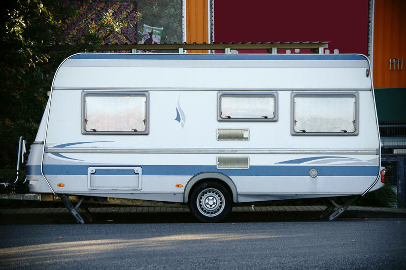
Is your trailer logo lacking a certain something? It’s easy to feel overwhelmed when first creating a logo. Knowing which tips make a better logo will make this process much easier.
A logo is often the first visual someone has of your company. First impressions are important.
Creating the right logo is the first step for providing an amazing first impression. Knowing the right tips will make creating your logo a breeze.
You don’t want to make logo creation mistakes that end up costing you business. In this article, you will learn five easy ways to make your trailer logos stand out.
1. Appeal to Your Audience
Most trailer companies want a logo to reflect their products. People using trailers will need them for work situations. Teardrop camping trailers are powerful devices.
Your trailer logos should not have a cutesy appearance. People using trailers want a machine that will help them get the job done.
Make sure your logo reflects a serious and realistic tone to match the wants of your audience.
2. Colors Make or Break Trailer Logos
Consumers tie color with emotions. You’ll want to think about what your customers value.
Many trailer companies utilize the color black for its masculine feel. Blue is a color associated with trust that you’ll see in many company logos.
It’s generally recommended you avoid feminine colors including pink and purple.
3. Choose the Right Font
A font is important for having an effective logo.
Your trailer company will likely want a logo with sharp and bold lettering. Rounded letters sometimes provide a font that lacks seriousness. Rounded letters look great for toy stores but you’ll need something more rugged.
Always choose fonts that are easy to read without a second of hesitation. White Mountain Footwear noticed a 20% sales increase by changing their logo font.
4. Avoid a Busy Logo
You’ve chosen the right color and font but you don’t want to go overboard. It might seem nice to include many elements to have your logo stand out.
Having a logo with too much going on only creates distractions. A logo should be simple, to the point, and memorable.
Iconic companies create logos to stick in the minds of consumers. Including too many words, colors, and images makes a logo clash, steering away potential customers.
5. Consider Multiple Platforms for Logo Placement
Your trailer logo might look great on a business card but how about on a billboard? It’s important that you choose a logo that works in any situation.
The best way to have an adaptable logo is to create designs on different platforms.
Adjust the size of your mock logo to see how it looks on small and large surfaces. In some cases, a logo that looks great on a billboard looks smudged on a business card.
Don’t forget about online logo creation programs. These programs give you the ability to create, edit, and complete your trailer company logo. Following these tips will help to ensure you have a great looking logo for your trailer company.


Leave a comment