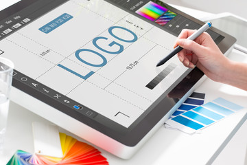
What if you could make every customer take a second look at your online store?
It may sound impossible. However, an amazing logo design is your key to winning more customers and really selling your brand.
And making a better logo is easy. Just follow these four tips for a better design!
1. Keep It Simple
It may be tempting to jam a bunch of ideas and even words into your logo. After all, you want an image that fully encapsulates you and your brand.
However, this just makes your logo look cluttered. Think about famous logos like those of Apple or Coca-Cola: they are elegant while still being simple.
Try to focus on a single image and the name of your brand. And make sure that image represents your business in some significant way.
Ultimately, this idea is pretty simple: the simple image catches the customer’s eye and your business name associates your brand and that image!
2. Understand the Colors
Ironically, color is something that many logo designers don’t think about until the end of the process. However, the colors you will use should guide the entire design process.
Customers associate certain colors with certain ideas. For example, red is associated with romance and confidence, while blue is associated with professionalism and tranquility.
Try to pick colors that naturally go with your brand while evoking customer emotions. For instance, green is a natural choice for a lawn service due to the business itself. However, customers also have positive associations with green and being environmentally-conscious, making them likelier to choose you!
For a crash course in the importance of color, check out www.ecigwizard.com. Notice how each product makes unique use of color to appeal to different kinds of audiences!
3. Understand Brand and Audience
An amazing logo design has one real purpose. It helps your specific brand to reach a very specific audience.
Despite this, many businesses don’t fully understand either their brand or their audience. And this leads to mixed and muddled logo designs.
Start with your brand. Figure out how you want to be perceived: are you serious or are you funny? Do you want customers to think about your utility or your creativity?
Next, think about what your audience wants. Do you want to be the tool they turn to for specific solutions? Or do you want them to simply have a fun emotional attachment to a recreational product?
Once you know these things, you can create a logo that merges your goals and their needs into one perfect design.
4. The Extra Twist
This is easier said than done, but your logo should have an extra twist. This twist draws attention to what you do best.
Amazon has an arrow that shows how they have products from A to Z. FedEx uses color and font to connote a speedy delivery.
Whatever it is, add an extra twist to show your company’s extra value!
The Bottom Line of Amazing Logo Design
You want a better logo to reflect your company’s value. And you don’t have to design it on your own.
OnlineLogoMaker provides the tools you need to make the perfect logo. To see how we can transform your design, come check out our logo maker today!


Leave a comment