Are you looking to design or redesign your realtor logo, but not sure which direction to take?
Whether you’re a first-time realtor or a seasoned vet looking to do some rebranding, your logo is one of the most important things to consider.
Creativity alone is not enough to make an awesome logo. You need to make sure your logo is sending the right message to clients.
There are a few common mistakes that people make when designing logos. And if you’re making one of these mistakes, there’s a good chance you’re costing yourself some clients.
Keep reading to find out the top 3 mistakes you’re making with your realtor logo — and how to avoid them.
Mistake #1: Your Logo is Too Cluttered
Crazy fonts, bright colors, multiple images. With everything you need to consider, it certainly can be easy to get carried away when designing a logo.
While it’s important to make sure your logo conveys a message to your target audience, you don’t want to go overboard.
If your logo has too much going on, it can be hard for your audience to make out the texts and the images. Not to mention, a cluttered logo can make you appear unprofessional and even somewhat desperate. No business wants that!
But how do you fix a logo that’s too cluttered?
If you want to make a great impression on your clients, you need to create a realtor logo that is clear and concise. Take a hard look at your logo. Then, go ahead and remove anything that isn’t necessary. Stick to only one font. Try to pick only a couple of colors that work well together.
While minimalistic logos may seem boring, they send the message that you rely on your services to make the sale.
Mistake #2: Sticking to Cliches
Obviously, if you’re in the business of selling houses, you want to create a logo that lets your audience know that’s what you do.
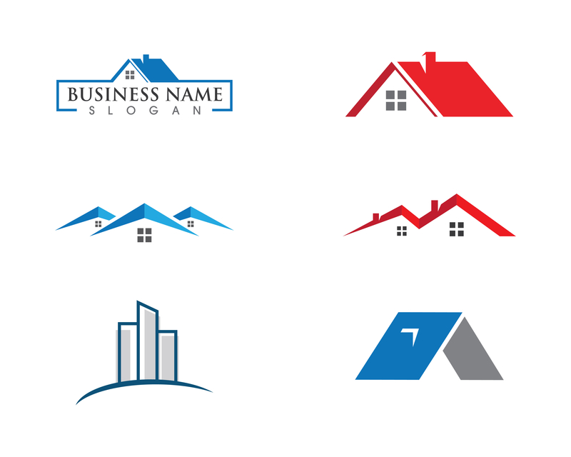
However, the real estate industry is already littered with logos that contain pictures of houses.
To avoid this cliche, try to think of ways you can take the house image to another level. Or, pick a different image that speaks to the name of your brand. Great Blue Real Estate did this with their logo, and it works flawlessly.
Mistake #3: Following Trends
Remember the unicorn color trend that everyone was excited about for all of five minutes?
While it’s fun to hop on trends as a consumer, you don’t want to be using them as inspiration for your logo design. This is because, as we all know, trends come and go.
If you try to make your design too trendy, you run the risk of becoming dated.
Instead, go with classic, timeless designs that you won’t need to update every few months.
Realtor Logo: Wrap Up
We hope this article helps you get on the right track for your logo design.
If you have any questions regarding your real estate logo, please do not hesitate to get in touch with us.


Leave a comment