The great part of a designer’s work is to find right combinations. But how to match font and image on your design? Images and fonts need to connect with its context. But how? When we work with images and texts at the same time, we need to take special care to match the elements. A classic concept in Comic Sans would be at least weird, right?
Of course Comic Sans is not very indicated for most of the designs and has become a joke between designers. But instead of judging your design, we will give you some hints to get better results at matching fonts and images.
Classic/Serious Images
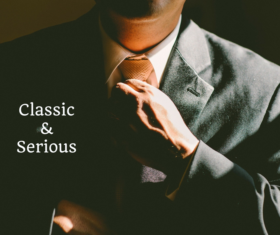
For example, if your project use serious or classic photos for a message of tradition, authority and respect. We highly recommend serif fonts. They will probably fit better. This type of fonts transmit a connexion to classic and traditional. So in this case, fonts like:
- Oranienbaum
- Valentina Regular
- Abraham Lincoln
- Quando
- Arvo
Would be a great choice. As in the image below:
Elegant/Romantic Images
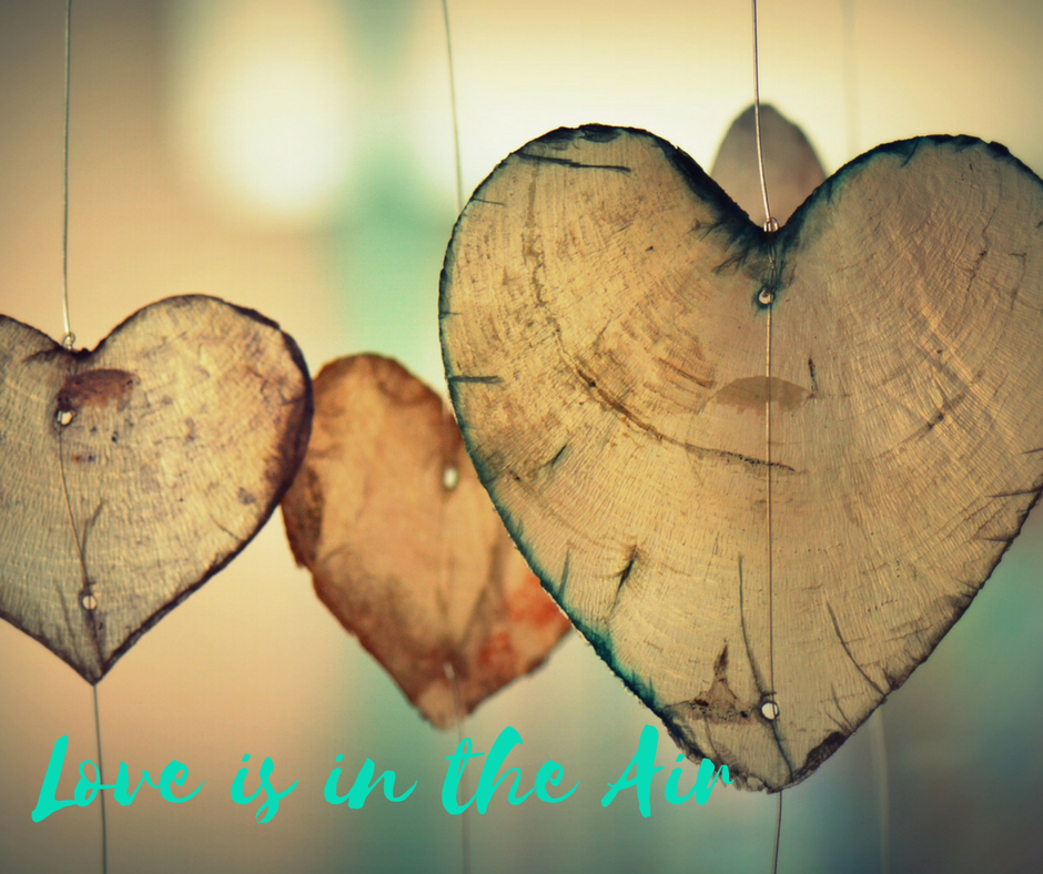
When you have a specific project that has the goal to bring romance and elegance, go to Script fonts, that are also known as manuscripts/handwritten fonts. These fonts give something personal to the image and transmit sensibility, creativity to your design.
See how it works for the font Selima:
You could also search for:
- Nickainley
- Handletter
- Master Of Break
- And many other Script fonts.
Cool/Young Images
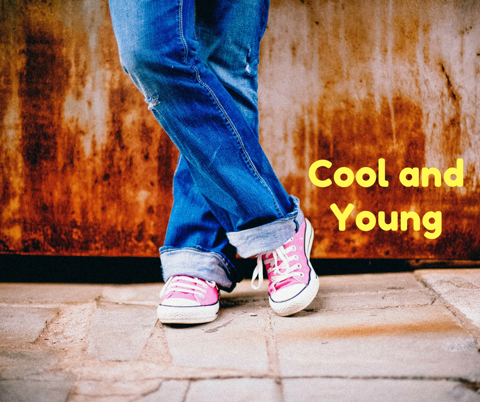
To talk to a younger target, many companies or campaigns use images like this one below. So, despite not being a rule, modern fonts usually work really well. Giving a light and cool interpretation. Like on this photo where I used Fredoka.
Also these options give a very stylish vibe to your projects:
- Happy Fox Condensed
- Break
- Modeka
- Reckoner
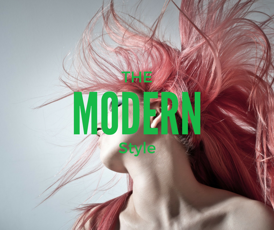
Modern Images
Many projects are based on modern images as a way to show objectivity, stability and independence. On these cases, sans serif fonts are very recommended. They can be very versatile and go along really well on any publicity and clean layouts. It has a great legibility and it calls people’s attention. How about this modern look by League Gothic?
There are also other excellent options that you can search for and download for free:
- Dense Regular
- Coolvetica
- Stellar
- Akrobat
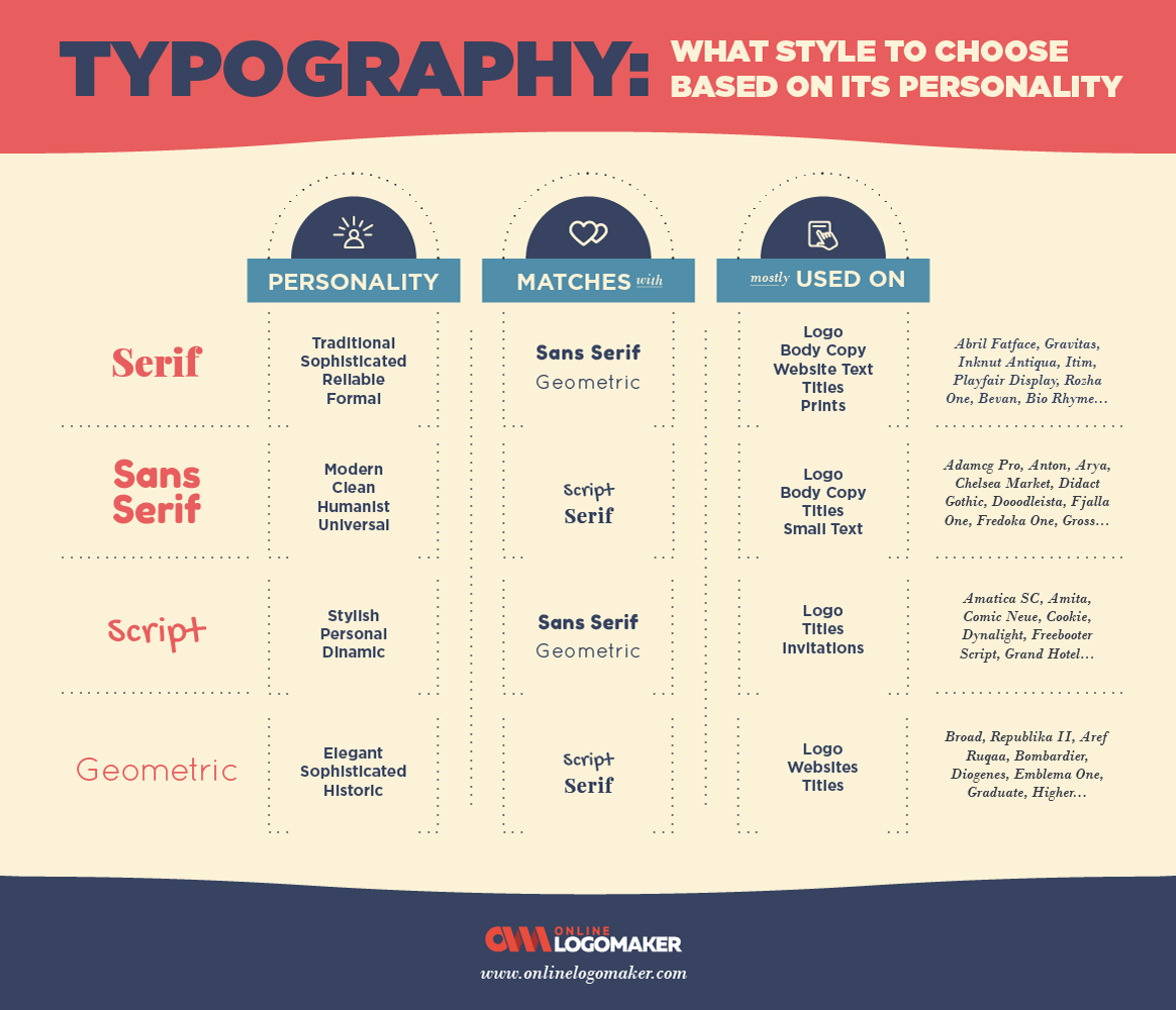
Choosing the right font and matching with an image is already hard. But matching both in order to achieve a goal is even harder. You need to take a time for a little research and dedicate yourself on trying as many options as you can. Instead of letting you work that hard, I decided to make a nice infographic to sum up information of personality, matches and uses of main fonts.
Of course it is not a rigid rule or something you cannot break or change. It always depends on the type of message you want to say through your design. However when we don’t have many experience on the design field, it is more likely to make mistakes, so following the rules is a safe path.



Leave a comment