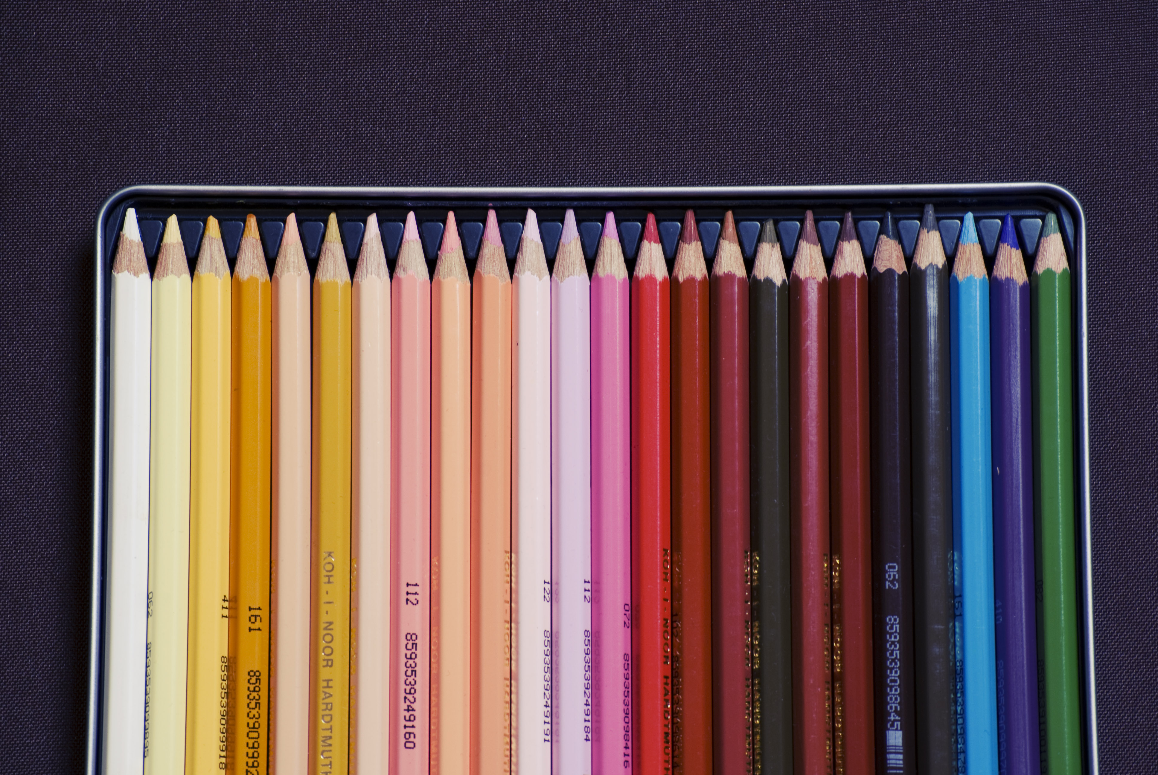
Yeah, we have come to our last part: Colors. If you followed all the steps and articles towards the credible logo – which is the best option – you know it’s just missing colors. It’s not about being the most shiny, creepy or cool, it’s about meanings and relation to your brand personality (again!).
Colors
The power to affect feelings and emotions. That’s why you need to understand how colors work and what they mean to make the right approach. Tip: Try not to exceed three colors unless it’s the intention. Look at your logo in one-, two- and three-color versions before you decide.
The Loyola University in Maryland showed that 80% of brands are more recognized because of their colors and the way it relates to emotions. Keep in mind that the color you choose will stablish the way you are noticed. For example, luxury brands use silver, gold, black and white for a sophisticated image. And restaurants like Pizza Hut and Burger King abuse of red as a stimulation to hunger.
In brief we have this general guidelines:
Beige or Tan: Conservative, Piety, Dull
Black: Mystery, Elegance, Evil
Blue: Calm, Responsible, Sadness
Brown: Nature, Wholesomeness, Dependability
Cream or Ivory: Calm, Elegant, Purity
Gray: Moody, Conservative, Formality
Green: New Beginnings, Abundance, Nature
Orange: Energy, Happiness, Vitality
Purple: Creativity, Royalty, Wealth
Red: Passion, Love, Anger, Hunger
White: Purity, Cleanliness, Virtue
Yellow: Happiness, Hope, Deceit
But here is my table again to help you out a bit more:
| Concept | Colors |
| Vibrant | Colorful, hot, intense, strong, saturated, gradient (3D), solid |
| Catchy | Hot colors (human heat) |
| Engaged | Hot colors (heat, united), vibrant, intense, monochrome, darker |
| Multi | Colorful, contrasting, mix up |
| Amazing | Intense and vibrant colors |
Guide yourself through the tips above to define your palette taking into consideration the personality of your brand as in every step we took. What are the qualities included in your DNA? Innovation, flavour, quality, security, trustworthy? This should reflect in your choice.
Then, inside the range of colors defined by the company’s characteristics, try as many options as you feel like. For example, if your main attribute is happiness, you could use orange (vibrant, intense colors). But where? Try on your background, image, text and save all your options, to analyse later on. If you are concerned about the shade of the color, just take a look at Color Theory for Designers.
Don’t try to get the perfect logo at first. It’s a process of getting to know your business and defining your objectives to incorporate them in your creation. It usually takes weeks, so be patient and try to get the most of the experience, because each logo is a new adventure.
Happy Logo!


Leave a comment